如何用css3实现简单旋转的风车
2019-01-20 20:01
169 查看
如何用css3实现简单旋转的风车
在DW中想要实现旋转的风车就要使用关键帧keyframes来设置旋转,其实也没什么难度的。先设置它的样式,然后要用定位把它放到合适的位置就可以了。
HTML的代码如下:
<div class="fengche">
<div class="zhu"></div>
<div class="zhuan">
<div class="z"></div>
<div class="x
4000
iaoyan"></div>
<div class="z1"></div>
<div class="z2"></div>
<div class="z3"></div>
<div class="z4"></div>
</div>
</div>
名字你们不要学我这样给啊,命名一定要标准,我这个是刚学的时候打的,只是懒得改了。
Css的代码如下:
.fengche{
position: relative;
}
.zhuan{
width: 300px;
height: 300px;
position: relative;
clear: both;
animation: zhuan 6s linear infinite;
}
@keyframes zhuan{
0%{
transform: rotate(0deg);
}
100%{
transform: rotate(360deg);
}
}
.z{
width: 50px;
height: 50px;
margin: 0px;
background: #B5B5B5;
border-radius: 50%;
position: absolute;
top: 126px;
left: 125px;
}
.xiaoyan{
width: 20px;
height: 20px;
margin: 0px;
background:#C8C8C8;
border-radius: 50%;
position: absolute;
top: 140px;
left: 140px;
}
.z1,.z3{
width: 40px;
height: 135px;
background: #EBF453;
border-radius: 50%;
}.z1{
position: absolute;
top: -35px;
left: 110px;
}
.z3{
position: absolute;
bottom: -35px;
left: 110px;
}
.z2,.z4{
width: 135px;
height: 40px;
background: #EBF453;
border-radius: 50%;
}
.z2{
position: absolute;
top: 115px;
left: 160px;
}
.z4{
position: absolute;
top: 115px;
right: 160px;
}
.zhu{
width: 30px;
height: 300px;
background: #82BDD5;
position: absolute;
top: 81.5%;
left: 135px;
border-radius: 35% 35% 0 0;
}
代码就这么多,下面让我们看下实现的效果图:
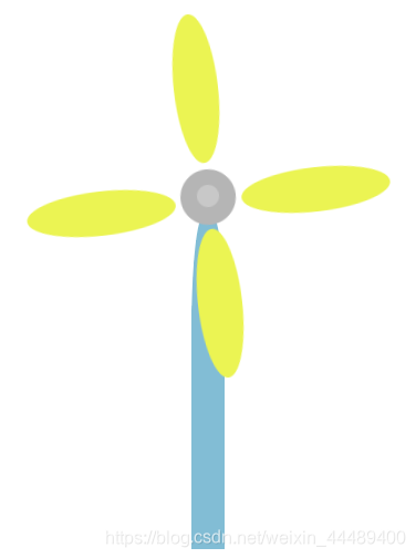
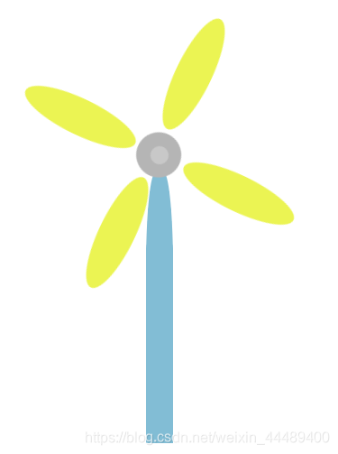
不要问我为啥那么丑,我的技术还不够,你们要是有什么更好的方法一定要跟我说一下,大家一起进步嘛,毕竟,我也是初学者,所以欢迎大家来评论(づ ̄3 ̄)づ╭❤~

相关文章推荐
- CSS3 实现简单的hover旋转放大,撤销hover渐变还原
- 如何用css3实现风车效果
- 仿网易聚合新闻 - 超简单实现 - 刷新按钮CSS3旋转效果
- 如何用css3实现风车效果
- 【微信支付】分享一个失败的案例 跨域405(Method Not Allowed)问题 关于IM的一些思考与实践 基于WebSocketSharp 的IM 简单实现 【css3】旋转倒计时 【Html5】-- 塔台管制 H5情景意识 --飞机 谈谈转行
- 如何用css3实现风车效果
- 如何简单实现可执行文件的自我删除
- CSS3transition实现的简单动画菜单
- 如何实现一个简单的工作流审批引擎——请看
- linux下如何实现简单刷屏
- 如何在ns2中实现一个简单的网络协议
- RotateAniamtion_实现Android简单动画旋转案例
- 如何:实现简单的 Forms 身份验证
- ASP.NET 如何:实现简单的 Forms 身份验证
- 如何在C语言中实现简单的泛型编程(二)
- 数据访问(如何实现 - C#)演练:创建简单的数据应用程序
- OpenGL 鼠标3D旋转简单实现
- 单片机(不基于os)下如何实现简单的内存管理(malloc,realloc和free函数的重新实现)
- 如何设置ImageButton按键按下去后的 特效----(如类似风车旋转的动画特效)
- python中如何简单的实现decorator模式--由django admin源码所得体会