ant design Table实现可编辑的单元格
2018-12-21 21:06
2106 查看
需求
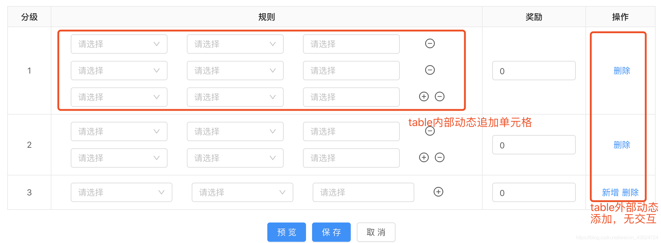
最近接到的一个需求,在table栏中实现属性的可编辑单元格,并且table内部可动态删减的单元格,外部操作新增或删除一行新旧数据的操作,无交互的前端实现,这篇文章希望对你有帮助。
想法或思路
如何去实现这一功能,无非是数组的增删改查
1、规则模块单独抽离出来,封装成一个公共组件,实现代码的可用性,在今后的开发中,没有局限性的限制,整个团体都可以使用你开发的东西,这是一个循序渐进的过程。
2.开发了解,react 的传参机制,react组件化封装,ant design提供的api多元化的使用,不受限。
3.我的实现方法可能复杂了一点,利用了两个table实现,考虑到后期多个联动的地方,未使用ant design里面的form来实现,form实现同理。
代码展示:
主界面,定义我们的初始化界面
import TableFromList from '../Component/TableFromList';
state = {
dataSource: [{  // 初始化我们的数据保证有一条数据渲染
key: 0,
dataList: [{
name: '',
age: '',
selected: '',
needAdd: true,
needRemove: true,
}],
age: '',
needAdd: true,
needRemove: true,
}]
}
render() {
return (
<Card bordered={false} title="活动参与条件">
{getFieldDecorator('plans', { // 使用getFieldDecorator用于进行双向绑定,存取我们需要的value
initialValue: dataSource, // 设定我们的初始值,模块化的开发,
// 让我们更有利的维护我们的开发成本,只需要维护当前主界面
})(<TableFromList />)} // 自定义组件名称
</Card>
)
}
模块化公共组件式开发,先封装我们的内部增删改查,也可外用的组件。
import React, { PureComponent } from 'react';
import {
Table,
Icon,
Select,
} from 'antd';
import styles from './style.less';

const { Option } = Select;

const columns = (props) => {
const { handleChange, handleAdd, handleRemove } = props;
return [{
dataIndex: 'name',
width: 120,
render: (text, record, index) => {
return (
<Select
allowClear
value={text}
style={{ width: '100%' }}
placeholder="请选择"
onChange={(value) => { handleChange(value, 'name', index); }}
>
<Option key={1} value={1}>名字</Option>
<Option key={2} value={2}>年龄</Option>
<Option key={3} value={3}>性别</Option>
</Select>
);
},
}, {
dataIndex: 'age',
key: 'age',
width: 120,
render: (text, record, index) => {
return (
<Select
value={text}
style={{ width: '100%' }}
placeholder="请选择"
onChange={(value) => { handleChange(value, 'age', index); }}
>
<Option key={1} value={1}>名字</Option>
<Option key={2} value={2}>年龄</Option>
<Option key={3} value={3}>性别</Option>
</Select>
);
},
}, {
dataIndex: 'selected',
key: 'selected',
width: 120,
render: (text, record, index) => {
return (
<Select
value={text}
style={{ width: '100%' }}
placeholder="请选择"
mode="multiple"
onChange={(value) => { handleChange(value, 'selected', index); }}
>
<Option key={1} value={1}>名字</Option>
<Option key={2} value={2}>年龄</Option>
<Option key={3} value={3}>性别</Option>
</Select>
);
},
}, {
dataIndex: 'delete',
key: 'delete',
width: 10,
render: (text, record) => {
const arr = [];
if (record.needAdd) {
arr.push(
<Icon
key="add"
type="plus-circle"
onClick={() => handleAdd(record.key)}
style={{ fontSize: '16px', cursor: 'pointer' }}
/>,
);
}
if (record.needRemove) {
arr.push(
<Icon
key="edit"
onClick={() => handleRemove(record.key)}
type="minus-circle"
style={{ fontSize: '16px', cursor: 'pointer', paddingLeft: '10px' }}
/>,
);
}
return arr;
},
}];
};

export default class DataListFrom extends PureComponent {
constructor(props) {
super(props);

this.state = {
dataSource: props.value,
};
}

componentWillReceiveProps(nextProps) {
if ('value' in nextProps) {
this.setState({
dataSource: nextProps.value,
});
}
}

handleChange = (value, name, index) => { // 依据需求而定,各个选择框可实现联动
const newValue = value;
const { onChange } = this.props;
const { dataSource } = this.state;
dataSource[index][name] = newValue;
const newDataSource = dataSource.map(item => ({ ...item }));
onChange(newDataSource);
};

handleAdd = (key) => {
const { dataSource } = this.state;
const newData = dataSource.map(item => ({ ...item, needAdd: false, needRemove: true })); // 后端返回存储数据
newData.push({
key: key + 1, // 声明唯一的key值,保证数据不污染,这块的写法可以抽离出来放在主界面
name: '',
age: '',
selected: '',
needAdd: true,
needRemove: true,
});
this.setState({
dataSource: newData,
});
}

handleRemove = (key) => { // 删除的显示依据你的需求而定
const { dataSource } = this.state;
const newData = dataSource.filter(item => item.key !== key);
newData[newData.length - 1] = Object.assign(
{},
newData[newData.length - 1],
{ needAdd: true, needRemove: true },
);
if (newData.length === 1) {
newData[0] = Object.assign({}, newData[0], { needAdd: true, needRemove: false });
}
this.setState({
dataSource: newData,
});
}

render() {
const { dataSource } = this.state;
return (
<Table
className={styles.TableHeaderCss}
columns={columns({
handleAdd: this.handleAdd,
handleChange: this.handleChange,
handleRemove: this.handleRemove,
})}
pagination={false}
showHeader={false} // 去除我们的title。
dataSource={dataSource}
/>
);
}
}
最外层子组件封装同理,同上。
import DataListFrom from './DataListFrom'; // 引入我们封装好的子组件
其他原理不变,只需在我们的columns对应的头下render的时候添加使用From.item包裹的<DataListFrom />即可。
反思怎么实现多人化的使用并且可动态维护的公共化组件
写完上面两层的子组件开发,我们会在意到,不管是添加还是删除,都是对我们的数组做一些操作,而且,如果别的模块也使用到,我们内部的columns就是写死的,并不是可灵活性的动态渲染的,所以我们对columns与添加删除等方法,再一次抽离,react组件间的信息可以通过props传递,将我们的columns书写在主界面,传递给子组件,其余封装成一个方法引入,这时你可以随意定义自己的单元格,而我们的模块化组件就起一个中间层的作用,只需处理逻辑的实现。实现的方法有很多,有兴趣的同学,可以自己研究一下怎么去写。

相关文章推荐
- Jquery使用tbody编辑功能实现table输入计算功能
- bootstrap table实现单击单元格可编辑功能
- jQuery实现鼠标双击Table单元格变成文本框及输入内容后更新到数据库的方法
- ant-design 实现一个登陆窗口
- BootStrapTable.JS 单元格不换行的实现
- HTML Table 空白单元格补全的简单实现
- dategridview控件怎么实现编辑单元格弹出下拉选项实现自动查找功能?
- JS实现在UltraWebGrid 中勾选Checkbox 禁止/允许 编辑单元格
- Jquery实现鼠标双击Table单元格变成文本框
- Ant-Design-Pro中Table组件rowSelection方法的一些坑
- 如何实现双击GridView 单元格编辑单元格内容
- JS 实现Table相同行的单元格自动合并示例代码
- sap abap alv 实现某行,单元格可编辑与不可编辑 REUSE_ALV_GRID_DISPLAY_LVC
- TableView编辑中实现多行删除方法以及注意
- css实现table中td单元格鼠标悬浮时显示更多内容
- rcp的table单元格设置为可编辑
- bootstrap-table的一些基本使用及表内编辑的实现
- [置顶] element-ui 表格实现单元格可编辑的方法
- Android实现Ant Design 自定义表单组件
- javafx TableView中的TableColumn如何填充的自带类,以及编辑单元格