WPF入门教程(8)之绑定和绑定的各种使用场景
一、绑定:
主要包含元素绑定和非元素绑定两种。
1、元素绑定,是绑定的最简单形式,源对象是WPF的元素,并且源对象的属性是依赖项属性。
根据我们之前的知识 ,依赖项属性具有内置的更改通知支持。所以当我们的源对象中改变依赖项属性的值时,会立即更新目标对象中的绑定属性。
以上篇的例子来重写,我们不用额外定义全局公开的属性来支持数据的显示。
如下:
[code]1  <StackPanel Orientation="Vertical" HorizontalAlignment="Left" >
2         <TextBox x:Name="WelcomeText" Width="200" Margin="10,10,0,0"></TextBox>
3         <TextBlock Text="{Binding ElementName=WelcomeText,Path=Text,StringFormat='Hello \{0\}'}" Margin="10,10,0,0"></TextBlock>
4  </StackPanel>
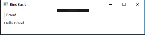
TextBlock 绑定了名称为WelcomeText的元素,并且将Path指向Text属性,所以他的值会跟着 WelcomeText的变化而变化。
2、非元素类型绑定:
2.1 Source属性:绑定具体的数据对象:如系统信息跟我们定义的资源数据。
定义Window下的全局资源
[code]1     <Window.Resources>
2         <SolidColorBrush x:Key="BorderBrush">Red</SolidColorBrush>
3     </Window.Resources>
应用到视图中
[code]1   <StackPanel Margin="10,50,0,0" Orientation="Vertical" >
2                 <TextBlock Text="{Binding Source={x:Static SystemFonts.IconFontFamily},Path=Source}" ></TextBlock>
3                 <TextBlock Text="{Binding Source={StaticResource BorderBrush}}" Foreground="{Binding Source={StaticResource BorderBrush}}"  ></TextBlock>
4   </StackPanel>
结果:

2.2 RelativeSource 属性:设置该属性 可以根据当前目标对象的相对关系指向源目标。比如获取当前对象的父亲对象、兄弟对象或者自身的其他属性等一些数据。
[code] 1            <StackPanel Margin="10,50,0,0" Orientation="Vertical" ToolTip="top" >
2
3                 <StackPanel Orientation="Horizontal" >
4                     <TextBlock Width="150" Text="获取自身宽度:"  ></TextBlock>
5                     <TextBlock Width="200" Text="{Binding Path=Width,RelativeSource={RelativeSource Mode=Self}}" ></TextBlock>
6                 </StackPanel>
7
8
9                 <StackPanel Orientation="Horizontal" ToolTip="parent" >
10                     <TextBlock Width="150" Text="查找上一层ToolTip:" ></TextBlock>
11                     <TextBlock Text="{Binding Path=ToolTip,RelativeSource={RelativeSource Mode=FindAncestor,AncestorType={x:Type StackPanel}}}"></TextBlock>
12                 </StackPanel>
13
14
15                 <StackPanel Orientation="Horizontal">
16                     <TextBlock Width="150" Text="查找上二层ToolTip:" ></TextBlock>
17                     <TextBlock Text="{Binding Path=ToolTip,RelativeSource={RelativeSource Mode=FindAncestor,AncestorType={x:Type StackPanel},AncestorLevel=2}}"></TextBlock>
18                 </StackPanel>
19
20             </StackPanel>
[code]2.3 DataContext 属性:如果想将一个对象绑定到一个由多个元素组成的视图块或者复合元素中,用DataContext 会更好开发和维护。如下
[code] 1             <StackPanel Orientation="Vertical" DataContext="UInfo" >
2
3                 <StackPanel Orientation="Horizontal" >
4                     <TextBlock Text="名称:" Width="100" ></TextBlock>
5                     <TextBox Text="{Binding Name}" Width="100" ></TextBox>
6                 </StackPanel>
7
8                 <StackPanel Orientation="Horizontal">
9                     <TextBlock Text="性别:" Width="100" ></TextBlock>
10                     <TextBox Text="{Binding Sex}" Width="100" ></TextBox>
11                 </StackPanel>
12
13             </StackPanel>
二、绑定的各种使用场景:
数据绑定有普通的控件绑定应用:比如 下拉框、单选框、复选框、普通文本框 、日期框等;
复杂的绑定有数据列表绑定,用户控件信息绑定等,比如 ListBox,DataGrid,UserControl绑定等。
1、下拉框:
1)创建一个Model:
[code]using GalaSoft.MvvmLight;
using System;
using System.Collections.Generic;
using System.Linq;
using System.Text;
using System.Threading.Tasks;

namespace MVVMLightDemo.Model
{
public class ComplexInfoModel:ObservableObject
{
private String key;
/// <summary>
/// Key值
/// </summary>
public String Key
{
get { return key; }
set { key = value;RaisePropertyChanged(() => Key); }
}

private String text;
/// <summary>
/// Text值
/// </summary>
public String Text
{
get { return text; }
set { text = value;RaisePropertyChanged(() => Text); }
}
}
}
2)创建一个ViewModel
[code]using GalaSoft.MvvmLight;
using MVVMLightDemo.Model;
using System;
using System.Collections.Generic;
using System.Linq;
using System.Text;
using System.Threading.Tasks;

namespace MVVMLightDemo.ViewModel
{
public class ComplexInfoViewModel:ViewModelBase
{

public ComplexInfoViewModel()
{
InitCombbox();
}

#region 下拉框相关
/// <summary>
/// 下拉框选中信息
/// </summary>
private ComplexInfoModel combboxItem;
public ComplexInfoModel CombboxItem
{
get { return combboxItem; }
set { combboxItem = value;RaisePropertyChanged(() => CombboxItem); }
}

/// <sum
4000
mary>
/// 下拉框列表
/// </summary>
private List<ComplexInfoModel> combboxList;
public List<ComplexInfoModel> CombboxList
{
get { return combboxList; }
set { combboxList = value;RaisePropertyChanged(() => CombboxList); }
}
#endregion

private void InitCombbox()
{
CombboxList = new List<ComplexInfoModel>() {
new ComplexInfoModel(){ Key="1",Text="苹果" },
new ComplexInfoModel(){ Key="2",Text="香蕉" },
new ComplexInfoModel(){ Key="3",Text="梨" },
new ComplexInfoModel(){ Key="4",Text="樱桃" },
};
}
}
}
3)创建一个View
[code]<Window x:Class="MVVMLightDemo.View.ComplexInfoView"
xmlns="http://schemas.microsoft.com/winfx/2006/xaml/presentation"
xmlns:x="http://schemas.microsoft.com/winfx/2006/xaml"
xmlns:d="http://schemas.microsoft.com/expression/blend/2008"
xmlns:mc="http://schemas.openxmlformats.org/markup-compatibility/2006"
xmlns:local="clr-namespace:MVVMLightDemo.View"
mc:Ignorable="d"
DataContext="{Binding Source={StaticResource Locator},Path=ComplexInfo}"
Title="ComplexInfoView" Height="300" Width="600">
<Grid>
<ScrollViewer VerticalScrollBarVisibility="Auto">
<StackPanel Margin="10,20,0,50">
<TextBlock Text="下拉框" FontWeight="Bold" FontSize="12" Margin="0,5,0,5">
</TextBlock>
<DockPanel x:Name="CommbItem">
<StackPanel DockPanel.Dock="Left" Width="240">
<ComboBox Width="200" HorizontalAlignment="Left" ItemsSource="{Binding CombboxList}" SelectedItem="{Binding CombboxItem}" DisplayMemberPath="Text" SelectedValuePath="Key">
</ComboBox>
</StackPanel>
<StackPanel DockPanel.Dock="Right" Width="240" Orientation="Horizontal">
<TextBlock Text="{Binding CombboxItem.Key,StringFormat='结果:\{0\}'}" Margin="0,0,15,0">
</TextBlock>
<TextBlock Text="{Binding CombboxItem.Text}">
</TextBlock>
</StackPanel>
</DockPanel>
</StackPanel>
</ScrollViewer>
</Grid>
</Window>
说明:CombboxItem是一个全局的属性,作用在当前页面的数据上下文中,结果显示的内容指向下拉框中的选中值,达到共用一个数据的目的。
这边有四个地方需要注意的:ItemsSource:数据源;SelectedItem:选中的项;DisplayMemberPath:绑定时显示的所属值;SelectedValuePath :绑定时候key的所属值。
结果如下:


2、单选框
[code]<Window x:Class="MVVMLightDemo.View.CompBottonView"
xmlns="http://schemas.microsoft.com/winfx/2006/xaml/presentation"
xmlns:x="http://schemas.microsoft.com/winfx/2006/xaml"
xmlns:d="http://schemas.microsoft.com/expression/blend/2008"
xmlns:mc="http://schemas.openxmlformats.org/markup-compatibility/2006"
xmlns:local="clr-namespace:MVVMLightDemo.View"
mc:Ignorable="d"
DataContext="{Binding Source={StaticResource Locator},Path=CompBotton}"
Title="CompBottonView" Height="300" Width="600">
<Grid>
<StackPanel Margin="10,0,0,50">
<TextBlock Text="单选框" FontWeight="Bold" FontSize="14" Margin="0,5,0,5"></TextBlock>
<DockPanel x:Name="RadioButton">
<StackPanel DockPanel.Dock="Left" Width="240">
<RadioButton Content="{Binding SingleRadio,UpdateSourceTrigger=LostFocus}" IsChecked="{Binding IsSingleRadioCheck,UpdateSourceTrigger=PropertyChanged}">
</RadioButton>
</StackPanel>
<StackPanel DockPanel.Dock="Right" Width="240" Orientation="Horizontal">
<TextBlock Text="{Binding IsSingleRadioCheck,StringFormat='结果:\{0\}'}">
</TextBlock>
</StackPanel>
</DockPanel>
</StackPanel>
</Grid>
</Window>
说明:注意这边使用到了两个属性: SingleRadio,IsSingleRadioCheck,一个用于显示单选框内容,一个用于表示是否选中
3、组合单选框
我们一般会用单选框做组合表示唯一选项,比如性别包含男女,但是只能选择一个。而更多的场景是包含多个选项,但是只能单选的,这时候就需要做单选框组。
[code]<StackPanel Margin="10,0,0,50">
<TextBlock Text="组合单选框" FontWeight="Bold" FontSize="12" Margin="0,5,0,5"></TextBlock>
<DockPanel x:Name="GroupRadioButton" >
<StackPanel DockPanel.Dock="Left" Width="240">
<ItemsControl ItemsSource="{Binding RadioButtons}">
<ItemsControl.ItemTemplate>
<DataTemplate>
<RadioButton Content="{Binding Content}" IsChecked="{Binding IsCheck}" GroupName="RadioButtons"
Command="{Binding DataContext.RadioCheckCommand,RelativeSource={RelativeSource Mode=FindAncestor,AncestorType=ItemsControl}}">
</RadioButton>
</DataTemplate>
</ItemsControl.ItemTemplate>
</ItemsControl>
</StackPanel>

<StackPanel DockPanel.Dock="Right" Width="240" Orientation="Horizontal">
<TextBlock Text="{Binding RadioButton.Content,StringFormat='结果:\{0\}'}" ></TextBlock>
</StackPanel>
</DockPanel>
</StackPanel>
这边使用了ItemsControl,可以根据模板来定义内容,我们在模板中放置我们需要用到的内容。这边需要注意的是:GroupName用一样的,来代表这是一个单选控件组合。
这边有是三个属性进行绑定相关:
RadioButtons:单选框列表数据(循环绑定);Content:单选框显示的内容;IsCheck:单选框的是否选中。
4、复选框,复选框与单选框的使用情况类似:
[code]<StackPanel Margin="10,0,0,50">
<TextBlock Text="复合框" FontWeight="Bold" FontSize="12" Margin="0,5,0,5" ></TextBlock>
<DockPanel x:Name="GroupCheckButton" >
<StackPanel DockPanel.Dock="Left" Width="240">
<ItemsControl ItemsSource="{Binding CheckButtons}" x:Name="cbt" >
<ItemsControl.ItemTemplate>
<DataTemplate>
<CheckBox Content="{Binding Content}" IsChecked="{Binding IsCheck}"
Command="{Binding DataContext.CheckCommand,RelativeSource={RelativeSource Mode=FindAncestor,AncestorType=ItemsControl}}"/>
</DataTemplate>
</ItemsControl.ItemTemplate>
</ItemsControl>
</StackPanel>

<StackPanel DockPanel.Dock="Right" Width="240" Orientation="Horizontal">
<TextBlock Text="{Binding CheckInfo,StringFormat='结果:\{0\}'}" ></TextBlock>
</StackPanel>
</DockPanel>
</StackPanel>
5、树形控件
Model代码
[code]using GalaSoft.MvvmLight;
using System;
using System.Collections.Generic;
using System.Linq;
using System.Text;
using System.Threading.Tasks;

namespace MVVMLightDemo.Model
{
public class TreeNodeModel:ObservableObject
{
public string NodeID { get; set; }
public string NodeName { get; set; }
public List<TreeNodeModel>Children { get; set; }
}
}
ViewModel代码
[code]using GalaSoft.MvvmLight;
using MVVMLightDemo.Model;
using System;
using System.Collections.Generic;
using System.Linq;
using System.Text;
using System.Threading.Tasks;

namespace MVVMLightDemo.ViewModel
{
public class TreeNodeViewModel:ViewModelBase
{
#region 树控件
/// <summary>
/// 树控件数据信息
/// </summary>
private List<TreeNodeModel> treeInfo;
public List<TreeNodeModel> TreeInfo
{
get { return treeInfo; }
set { treeInfo = value;RaisePropertyChanged(() => TreeInfo); }
}
#endregion
}
}
View代码:
[code]<Window x:Class="MVVMLightDemo.View.TreeNodeView"
xmlns="http://schemas.microsoft.com/winfx/2006/xaml/presentation"
xmlns:x="http://schemas.microsoft.com/winfx/2006/xaml"
xmlns:d="http://schemas.microsoft.com/expression/blend/2008"
xmlns:mc="http://schemas.openxmlformats.org/markup-compatibility/2006"
xmlns:local="clr-namespace:MVVMLightDemo.View"
mc:Ignorable="d"
DataContext="{Binding Source={StaticResource Locator},Path=TreeInfo}"
Title="TreeNodeView" Height="300" Width="600">
<Grid>
<StackPanel Margin="10,0,0,50">
<TextBlock Text="树" FontWeight="Bold" FontSize="12" Margin="0,5,0,5">
</TextBlock>
<DockPanel x:Name="TreeButton">
<StackPanel DockPanel.Dock="Left" Width="240">
<TreeView ItemsSource="{Binding TreeInfo}" x:Name="tree" BorderThickness="0">
<TreeView.ItemTemplate>
<HierarchicalDataTemplate ItemsSource="{Binding Children}">
<TextBlock Text="{Binding NodeName}"/>
</HierarchicalDataTemplate>
</TreeView.ItemTemplate>
</TreeView>
</StackPanel>
<StackPanel DockPanel.Dock="Right" Width="240" Orientation="Horizontal" DataContext="{Binding SelectedItem,ElementName=tree}">
<TextBlock Text="结果:"/>
<TextBlock Text="{Binding NodeID,StringFormat='NodeID:\{0\}'}"  Margin="0,0,20,0"  />
<TextBlock Text="{Binding NodeName,StringFormat='NodeName:\{0\}'}"/>
</StackPanel>
</DockPanel>
</StackPanel>
</Grid>
</Window>
6、ListBox
当我们需要用到循环的列表内容,并且模板化程度高的时候,建议使用ListBox来做绑定。
ViewModel代码:
[code]using GalaSoft.MvvmLight;
using System;
using System.Collections.Generic;
using System.Linq;
using System.Text;
using System.Threading.Tasks;

namespace MVVMLightDemo.ViewModel
{
public class FruitInfoViewModel:ViewModelBase
{
public FruitInfoViewModel(String img, String info)
{
this.Img = img;
this.Info = info;
}

#region 属性
/// <summary>
/// 图片
/// </summary>
private String img;
public String Img
{
get { return img; }
set { img = value;/*RaisePropertyChanged(() => Img);*/ }
}

/// <summary>
/// 信息
/// </summary>
private String info;
public String Info
{
get { return info; }
set { info = value; }
}
#endregion
}
}
[code]using GalaSoft.MvvmLight;
using System;
using System.Collections;
using System.Collections.Generic;
using System.Collections.ObjectModel;
using System.Linq;
using System.Text;
using System.Threading.Tasks;

namespace MVVMLightDemo.ViewModel
{
public class ListBoxViewModel:ObservableObject
{
public ListBoxViewModel()
{
InitListBoxList();
}

#region ListBox模板
private IEnumerable listBoxData;
public IEnumerable ListBoxData
{
get { return listBoxData; }
set { listBoxData = value;RaisePropertyChanged(() => ListBoxData); }
}
#endregion

private void InitListBoxList()
{
ListBoxData = new ObservableCollection<dynamic>() {
new {Img="/MVVMLightDemo;component/Images/1.jpg",Info="樱桃" },
new {Img="/MVVMLightDemo;component/Images/2.jpg",Info="葡萄"},
new {Img="/MVVMLightDemo;component/Images/3.jpg",Info="苹果" },
new {Img="/MVVMLightDemo;component/Images/4.jpg",Info="猕猴桃" },
new {Img="/MVVMLightDemo;component/Images/5.jpg",Info="柠檬"}
};
}
}
}
View代码:
[code]<Window x:Class="MVVMLightDemo.View.ListBoxView"
xmlns="http://schemas.microsoft.com/winfx/2006/xaml/presentation"
xmlns:x="http://schemas.microsoft.com/winfx/2006/xaml"
xmlns:d="http://schemas.microsoft.com/expression/blend/2008"
xmlns:mc="http://schemas.openxmlformats.org/markup-compatibility/2006"
xmlns:local="clr-namespace:MVVMLightDemo.View"
mc:Ignorable="d"
DataContext="{Binding Source={StaticResource Locator},Path=ListBoxInfo}"
Title="ListBoxView" Height="300" Width="900">
<Grid>
<StackPanel Margin="10,0,0,50" Orientation="Vertical">
<TextBlock Text="ListBox模板" FontWeight="Bold" FontSize="12" Margin="0,5,0,5"/>
<DockPanel>
<StackPanel HorizontalAlignment="Left" DockPanel.Dock="Left">
<ListBox x:Name="lb" ItemsSource="{Binding ListBoxData}" Width="500" BorderThickness="0">
<ListBox.ItemsPanel>
<ItemsPanelTemplate>
<WrapPanel Width="{Binding ActualWidth,RelativeSource={RelativeSource AncestorType={x:Type ListBox}}}" />
</ItemsPanelTemplate>
</ListBox.ItemsPanel>
<ListBox.ItemTemplate>
<DataTemplate>
<StackPanel>
<Image Source="{Binding Img}" Width="96" Height="96" />
<TextBlock HorizontalAlignment="Center" Text="{Binding Info}" />

24000
</StackPanel>
</DataTemplate>
</ListBox.ItemTemplate>
</ListBox>
</StackPanel>
<StackPanel DockPanel.Dock="Right" DataContext="{Binding SelectedItem,ElementName=lb}" Margin="15" Orientation="Vertical">
<TextBlock Text="{Binding Info,StringFormat='选中:\{0\}'}" />
</StackPanel>
</DockPanel>
</StackPanel>
</Grid>
</Window>
结果:

阅读更多

- WPF入门教程系列(二) 深入剖析WPF Binding的使用方法
- WPF入门教程系列(二) 深入剖析WPF Binding的使用方法
- WPF入门教程系列(二) 深入剖析WPF Binding的使用方法
- 利刃 MVVMLight 4:绑定和绑定的各种使用场景
- WinDbg入门教程(2)-各种调试场景介绍
- WPF入门教程系列十五——WPF中的数据绑定(一)
- WPF入门教程系列十六——WPF中的数据绑定(二)
- WPF入门系列教程(二) 深入剖析WPF Binding的使用方法(上)
- WPF入门教程系列十七——WPF中的数据绑定(三)
- WPF入门教程系列十七——WPF中的数据绑定(三)
- WPF入门教程系列十五——WPF中的数据绑定(一)
- JAVAWEB开发之Lucene详解——Lucene入门及使用场景、全文检索、索引CRUD、优化索引库、分词器、高亮、相关度排序、各种查询
- WPF入门教程系列(二) 深入剖析WPF Binding的使用方法
- WPF入门教程系列(二) 深入剖析WPF Binding的使用方法(下)
- WinDbg入门教程(2)-各种调试场景介绍
- WPF入门教程系列(二) 深入剖析WPF Binding的使用方法
- WPF入门系列教程(二) 深入剖析WPF Binding的使用方法
- WPF入门教程系列十六——WPF中的数据绑定(二)
- 【转】WPF入门教程系列(二) 深入剖析WPF Binding的使用方法
- 利刃 MVVMLight 4:绑定和绑定的各种使用场景