Flutter入门进阶之旅(四)文本输入Widget TextField
上一篇文章中我们一起学习了什么是Text跟如何给Text设置字体样式以及Text Widget的一些常用属性Flutter入门进阶之旅(三) Text Widgets,通过对Text的学习我们了解到Text是用于显示文本的,如果对显示的文本有一些特殊的要求,比如字体样式,文字颜色我们可以通过TextStyle去给Text指定style来做个性化定制,这一点跟原生Android的TextView非常类似,有了文字显示就肯定会有文字输入,今天我们就一起来学习一下Flutter中的文字输入Widget TextField。
先来看下TextField的构造方法
[code]const TextField({
Key key,
this.controller,           ////控制器,控制TextField文字
this.focusNode,
this.decoration = const InputDecoration(),    //输入器装饰
TextInputType keyboardType,   ////输入的类型
this.textInputAction,
this.textCapitalization = TextCapitalization.none,
this.style,
this.textAlign = TextAlign.start,   //文字显示位置
this.autofocus = false,
this.obscureText = false,
this.autocorrect = true,
this.maxLines = 1,
this.maxLength,
this.maxLengthEnforced = true,
this.onChanged,                //文字改变触发
this.onEditingComplete,   //当用户提交可编辑内容时调用
this.onSubmitted,   ////文字提交触发(键盘按键)
this.inputFormatters,
this.enabled,
this.cursorWidth = 2.0,
this.cursorRadius,
this.cursorColor,
this.keyboardAppearance,
this.scrollPadding = const EdgeInsets.all(20.0),
})

通过上面的构造方法跟预览效果图,熟悉android开发的小伙伴们是不是有种似曾相识的感觉,Flutter的TextField跟原生Android中的EditText用法包括部分属性名几乎都是一样的,比如我们可以通过keyboardType来指定唤起软件盘时的输入方式,例如上图的两个输入框属性设置:
[code]import 'package:flutter/material.dart';
import 'package:flutter/services.dart';

void main() {
runApp(new MaterialApp(home: new PullToRefreshDemo()));
}

class PullToRefreshDemo extends StatelessWidget {
@override
Widget build(BuildContext context) {
return Scaffold(
appBar: new AppBar(
title: new Text("文本输入"),
),
body: new Center(
child: new Column(
children: <Widget>[
new Text("简单文本输入框",style: new TextStyle(fontSize: 20.0)),
new TextField(keyboardType: TextInputType.text,),  //指定输入方式为文本输入
new TextField(keyboardType: TextInputType.number,),//指定唤起软键盘时默认显示数字键盘

],
)),
);
}
}
通过上面的构造方法我们留意到TextField给我提供了onChanged、onSubmitted、OnEditingComplete回调方法帮助我们监听输入框的内容变化、编辑提交、编辑完成等事件,我们给输入框绑定上述监听方法做下测试:
[code]   new TextField(
onSubmitted: (value){
print("------------文字提交触发(键盘按键)--");
},
onEditingComplete: (){
print("----------------编辑完成---");
},
onChanged: (value){
print("----------------输入框中内容为:$value--");
},
keyboardType: TextInputType.text,
),
唤起软键盘后在输入框中输入123456,log控制台打印出:

到此对输入框的基本使用你已经完全get到了,但是现实开发过程中,可能我们会需要给输入框指定一些辅助性的说明内容,比如输入框未输入内容时添加hint提示,或者在输入框的旁边添加Icon指示,或者输入框内部文字的显示样式、背景色等等,这些辅助性的设置在Flutter中统一有一个叫做InputDecoration的装饰器来完成操作,我们先来看下InputDecoration的构造方法,然后来简单尝试下几个日常开发中常用的操作。
[code]const InputDecoration({
this.icon, //输入框左侧添加个图标
this.labelText,//输入框获取焦点/有内容 会移动到左上角,否则在输入框内labelTex的位置
this.labelStyle,
this.helperText,
this.helperStyle,
this.hintText, //未输入文字时,输入框中的提示文字
this.hintStyle,
this.errorText,
this.errorStyle,
this.errorMaxLines,
this.isDense,
this.contentPadding,
this.prefixIcon, //输入框内侧左面的控件
this.prefix,
this.prefixText,
this.prefixStyle,
this.suffixIcon,//输入框内侧右面的图标
this.suffix,
this.suffixText,
this.suffixStyle,
this.counterText,
this.counterStyle,
this.filled,
this.fillColor,
this.errorBorder,
this.focusedBorder,
this.focusedErrorBorder,
this.disabledBorder,
this.enabledBorder,
this.border,  //增加一个边框
this.enabled = true,
this.semanticCounterText,
})
给输入框添加输入辅助性输入说明:
[code] body: new Center(
child: new TextField(
decoration: new InputDecoration(
labelText: "请输入内容",//输入框内无文字时提示内容,有内容时会自动浮在内容上方
helperText: "随便输入文字或数字", //输入框底部辅助性说明文字
prefixIcon: new Icon(Icons.print), //输入框左边图标
suffixIcon: new Icon(Icons.picture_as_pdf), //输入框右边图片
contentPadding: const EdgeInsets.only(bottom:15.0)),
keyboardType: TextInputType.number,
),
));

通过给InputDecoration设置border给输入框添加边框:
[code]  body: new Center(
child: new TextField(
decoration: new InputDecoration(
border: new OutlineInputBorder(  //添加边框
gapPadding: 10.0,
borderRadius: BorderRadius.circular(20.0),
),
prefixIcon: new Icon(Icons.print),
contentPadding: const EdgeInsets.all(15.0)),
keyboardType: TextInputType.number,
),
));

其他样式跟属性读者可自行运行体验,我就不逐一列举说明了,总之参考文档再结合原生开发的经验去使用TextField还是比较简单的。下面我分享一个完整的登录UI的例子供大家参考:
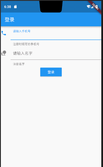
完整代码:
[code]import 'package:flutter/material.dart';

void main() {
runApp(new MaterialApp(home: new MyApp()));
}

class MyApp extends StatefulWidget {
@override
State<StatefulWidget> createState() {
return new MyAppState();
}
}

class MyAppState extends State<MyApp> {
@override
Widget build(BuildContext context) {
TextEditingController _userPhoneController = new TextEditingController();
TextEditingController _userPasswordController = new TextEditingController();

/**
* 清空输入框内容
*/
void onTextClear() {
setState(() {
_userPhoneController.text = "";
_userPasswordController.text = "";
});
}

return new Scaffold(
appBar: new AppBar(
title: new Text("登录"),
),
body: new Column(
children: <Widget>[
new TextField(
controller: _userPhoneController,
keyboardType: TextInputType.number,
decoration: new InputDecoration(
contentPadding: const EdgeInsets.all(10.0),
icon: new Icon(Icons.phone),
labelText: "请输入手机号",
helperText: "注册时填写的手机号"),
onChanged: (String str) {
//onChanged是每次输入框内每次文字变更触发的回调
print('手机号为:$str----------');
},
onSubmitted: (String str) {
//onSubmitted是用户提交而触发的回调{当用户点击提交按钮(输入法回车键)}
print('最终手机号为:$str---------------');
},
),
new TextField(
controller: _userPasswordController,
keyboardType: TextInputType.text,
decoration: new InputDecoration(
contentPadding: const EdgeInsets.all(10.0),
icon: new Icon(Icons.nature_people),
labelText: "请输入名字",
//                  hintText: "fdsfdss",
helperText: "注册名字"),
),
new Builder(builder: (BuildContext context) {
return new RaisedButton(
onPressed: () {
if (_userPasswordController.text.toString() == "10086" &&
_userPhoneController.text.toString() == "10086") {
Scaffold.of(context)
.showSnackBar(new SnackBar(content: new Text("校验通过")));
} else {
Scaffold.of(context)
.showSnackBar(new SnackBar(content: new Text("校验有问题,请重新输入")));
onTextClear(); //情况输入内容,让用户重新输入
}
},
color: Colors.blue,
highlightColor: Colors.deepPurple,
disabledColor: Colors.cyan,
child: new Text(
"登录",
style: new TextStyle(color: Colors.white),
),
);
})
],
));
}
}

- Cocos2d-x 3.4 之 文本输入之 CCTextFieldTTF
- Flutter入门进阶之旅(五)Image Widget
- 如何限制UITextField输入长度(监听textField文本变化的事件)
- ios开发 点击文本(TextField)输入的时候向上推以及输入之后恢复的动画
- Flutter入门进阶之旅(九)StatelessWidget & StatefullWidget
- iOS(Swift) TextField限制输入文本的长度(不是字数)
- textField输入文本不为空与输入文本为空的判断
- Flutter入门进阶之旅(八)Button Widget
- UIAlertView中的textField输入文本过长时偏移
- iOS【textView或者textField文本输入字数限制】
- iOS(Swift) TextField限制输入文本的长度(不是字数)
- Flutter入门进阶之旅(六)Layout Widget
- Qt qml TextField TextInput等文本输入控件中validator属性的设置
- iOS textfield 限定输入的文本长度
- textfield/textview的子类,实现功能:几种不同类型的最大输入字符串字数限制,剩余可输入字符数,emoji表情过滤
- textfield只能输入数字,(登录、注册电话号码的格式判断)等正则表达
- Flutter入门进阶之旅(十五)ListView下拉刷新&上拉加载更多
- Iphone在ScrollView下点击TextField使文本筐不被键盘遮住
- Android中监听EditText文本输入
- ios textfield 拼音输入 完成才录入