Python交互图表可视化Bokeh:4. 折线图| 面积图
2018-10-03 16:04
591 查看
折线图与面积图
① 单线图、多线图
② 面积图、堆叠面积图
1. 折线图--单线图
import numpy as np
import pandas as pd
import matplotlib.pyplot as plt
% matplotlib inline

import warnings
warnings.filterwarnings('ignore')
# 不发出警告

from bokeh.io import output_notebook
output_notebook()
# 导入notebook绘图模块

from bokeh.plotting import figure,show
# 导入图表绘制、图标展示模块

source = ColumnDataSource(data = df) 这里df中index、columns都必须有名称字段
p.line(x='index',y='value',source = source, line_width=1, line_alpha = 0.8, line_color = 'black',line_dash = [10,4])
# 绘制折线图
p.circle(x='index',y='value',source = source, size = 2,color = 'red',alpha = 0.8) # 绘制折点
# 1、折线图 - 单线图
from bokeh.models import ColumnDataSource
# 导入ColumnDataSource模块
# 将数据存储为ColumnDataSource对象
# 参考文档:http://bokeh.pydata.org/en/latest/docs/user_guide/data.html
# 可以将dict、Dataframe、group对象转化为ColumnDataSource对象
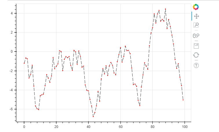
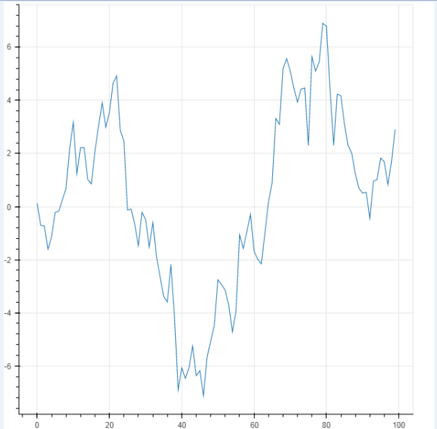
df = pd.DataFrame({'value':np.random.randn(100).cumsum()})
# 创建数据
df.index.name = 'index'
source = ColumnDataSource(data = df)
# 转化为ColumnDataSource对象
# 这里注意了,index和columns都必须有名称字段
p = figure(plot_width=600, plot_height=400)
p.line(x='index',y='value',source = source, # 设置x,y值, source → 数据源
line_width=1, line_alpha = 0.8, line_color = 'black',line_dash = [10,4]) # 线型基本设置
# 绘制折线图
p.circle(x='index',y='value',source = source,
size = 2,color = 'red',alpha = 0.8)
# 绘制折点
show(p)
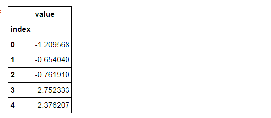
df.head()
可以将dict、Dataframe、group对象转化为ColumnDataSource对象
dic = {'index':df.index.tolist(), 'value':df['value'].tolist()} #一般把它先变成字典的格式
source = ColumnDataSource(data=dic)
#不转换为字典也可以,把index提取出来df.index.name = 'a' --->>> source = ColumnDataSource(data = df)
from bokeh.models import ColumnDataSource
# 导入ColumnDataSource模块
# 将数据存储为ColumnDataSource对象
# 参考文档:http://bokeh.pydata.org/en/latest/docs/user_guide/data.html
# 可以将dict、Dataframe、group对象转化为ColumnDataSource对象
dic = {'index':df.index.tolist(), 'value':df['value'].tolist()} #一般把它先变成字典的格式
source = ColumnDataSource(data=dic)
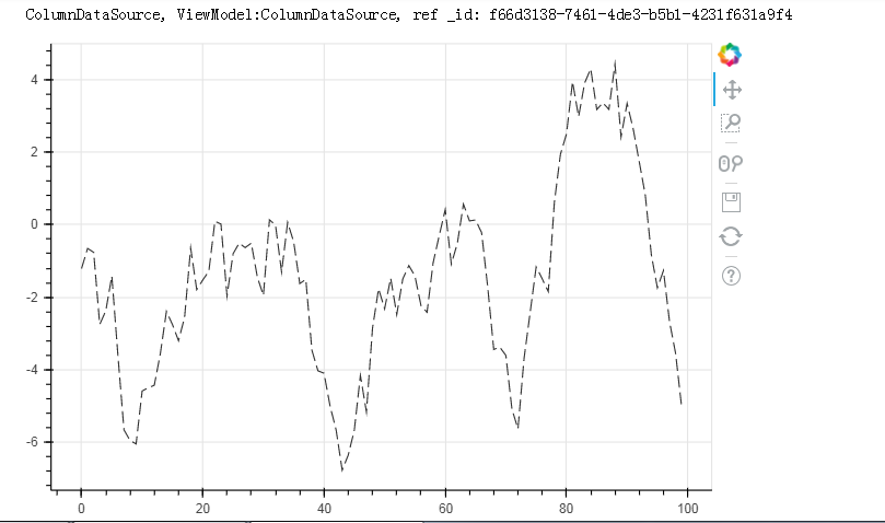
print(source)
p = figure(plot_width=600, plot_height=400)
p.line(x='index',y='value',source = source, # 设置x,y值, source → 数据源
line_width=1, line_alpha = 0.8, line_color = 'black',line_dash = [10,4]) # 线型基本设置
# 绘制折线图
show(p)
df.index.name = 'a'                      #不转换为字典也可以,把index提取出来
source = ColumnDataSource(data = df)
p = figure(plot_width=600, plot_height=400)
p.line(x='a',y='value',source = source,     # 设置x,y值, source → 数据源
line_width=1, line_alpha = 0.8, line_color = 'black',line_dash = [10,4])   # 线型基本设置
# 绘制折线图
show(p)
df.index.name = 'a'
source = ColumnDataSource(data = df)
p = figure()
p.line(x='a',y='value',source = source)     # 设置x,y值, source → 数据源

show(p)
2. 折线图--多线图
① multi_line
p.multi_line([df.index, df.index], [df['A'], df['B']], color=["firebrick", "navy"], alpha=[0.8, 0.6], line_width=[2,1],)
# 2、折线图 - 多线图
# ① multi_line
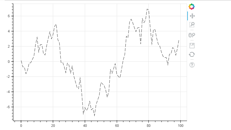
df = pd.DataFrame({'A':np.random.randn(100).cumsum(),"B":np.random.randn(100).cumsum()})
# 创建数据
p = figure(plot_width=600, plot_height=400)
p.multi_line([df.index, df.index], #第一条线的横坐标和第二条线的横坐标
[df['A'], df['B']], # 注意x,y值的设置 → [x1,x2,x3,..], [y1,y2,y3,...] 第一条线的Y值和第二条线的Y值
color=["firebrick", "navy"], # 可同时设置 → color= "firebrick";也可以统一弄成一个颜色。
alpha=[0.8, 0.6], # 可同时设置 → alpha = 0.6
line_width=[2,1], # 可同时设置 → line_width = 2
)
# 绘制多段线
# 这里由于需要输入具体值,故直接用dataframe,或者dict即可
show(p)

② 多个line
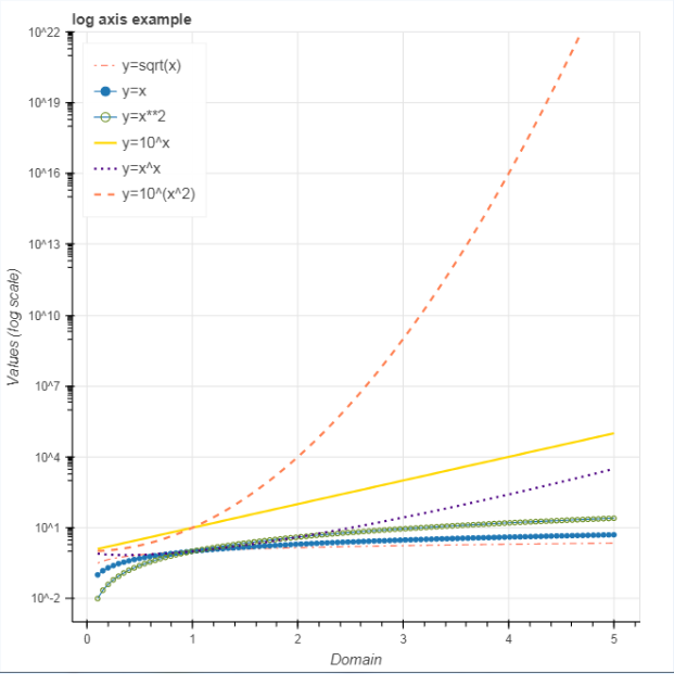
p.line(x, 10**(x**2), legend="y=10^(x^2)",line_color="coral", line_dash="dashed", line_width=2)
# 2、折线图 - 多线图
# ② 多个line

x = np.linspace(0.1, 5, 100)
# 创建x值

p = figure(title="log axis example", y_axis_type="log",y_range=(0.001, 10**22))
# 这里设置对数坐标轴

p.line(x, np.sqrt(x), legend="y=sqrt(x)",
line_color="tomato", line_dash="dotdash")
# line1

p.line(x, x, legend="y=x")
p.circle(x, x, legend="y=x")
# line2,折线图+散点图

p.line(x, x**2, legend="y=x**2")
p.circle(x, x**2, legend="y=x**2",fill_color=None, line_color="olivedrab")
# line3

p.line(x, 10**x, legend="y=10^x",line_color="gold", line_width=2)
# line4

p.line(x, x**x, legend="y=x^x",line_dash="dotted", line_color="indigo", line_width=2)
# line5

p.line(x, 10**(x**2), legend="y=10^(x^2)",line_color="coral", line_dash="dashed", line_width=2)
# line6

p.legend.location = "top_left"
p.xaxis.axis_label = 'Domain'
p.yaxis.axis_label = 'Values (log scale)'
# 设置图例及label

show(p)
3. 面积图
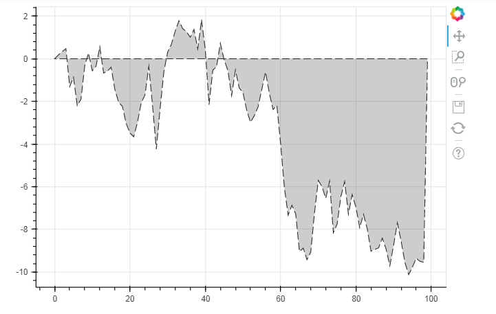
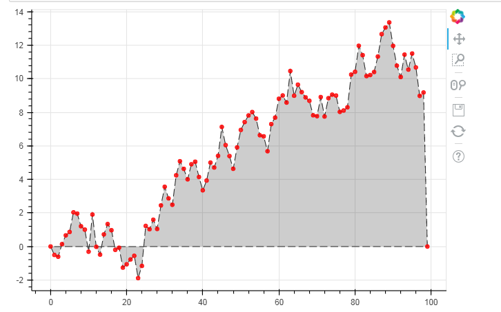
# 3、面积图 - 单维度面积图

s = pd.Series(np.random.randn(100).cumsum())
s.iloc[0] = 0
s.iloc[-1] = 0
# 创建数据
# 注意设定起始值和终点值为最低点
p = figure(plot_width=600, plot_height=400)
p.patch(s.index, s.values,     # 设置x,y值
line_width=1, line_alpha = 0.8, line_color = 'black',line_dash = [10,4],   # 线型基本设置
fill_color = 'black',fill_alpha = 0.2
)
# 绘制面积图
# .patch将会把所有点连接成一个闭合面

show(p)
p.circle(s.index, s.values,size = 5,color = 'red',alpha = 0.8)
# 绘制折点
# 3、面积图 - 面积堆叠图

from bokeh.palettes import brewer
# 导入brewer模块

N = 20
cats = 10 #分类
rng = np.random.RandomState(1)
df = pd.DataFrame(rng.randint(10, 100, size=(N, cats))).add_prefix('y')
# 创建数据,shape为(20,10)
df_top = df.cumsum(axis=1)   # 每一个堆叠面积图的最高点
df_bottom = df_top.shift(axis=1).fillna({'y0': 0})[::-1]    # 每一个堆叠面积图的最低点,并反向
df_stack = pd.concat([df_bottom, df_top], ignore_index=True)   # 数据合并,每一组数据都是一个可以围合成一个面的散点集合
# 得到堆叠面积数据
# print(df.head())
# print(df_top.tail())
# print(df_bottom.head())
# df_stack

colors = brewer['Spectral'][df_stack.shape[1]]    # 根据变量数拆分颜色
x = np.hstack((df.index[::-1], df.index))         # 得到围合顺序的index,这里由于一列是20个元素,所以连接成面需要40个点
print(x)
p = figure(x_range=(0, N-1), y_range=(0, 700))
p.patches([x] * df_stack.shape[1],                       # 得到10组index
[df_stack[c].values for c in df_stack],     # c为df_stack的列名,这里得到10组对应的valyes
color=colors, alpha=0.8, line_color=None)   # 设置其他参数

show(p)
[19 18 17 16 15 14 13 12 11 10  9  8  7  6  5  4  3  2  1  0  0  1  2  3  4
5  6  7  8  9 10 11 12 13 14 15 16 17 18 19]


相关文章推荐
- Python交互图表可视化Bokeh:5 柱状图| 堆叠图| 直方图
- Python交互图表可视化Bokeh:6. 轴线| 浮动| 多图表
- Python交互图表可视化Bokeh:7. 工具栏
- 7080-1.Python数据可视化:各种图表可视化归纳
- 利用Python数据可视化工具plotly从数据库读取数据制作本地图表应用实例
- ECharts-基于Canvas,纯Javascript图表库,提供直观,生动,可交互,可个性化定制的数据可视化图表
- 第四篇:R语言数据可视化之折线图、堆积图、堆积面积图
- Python干货:分享Python绘制六种可视化图表
- Python的可视化包 – Matplotlib 2D图表(点图和线图,.柱状或饼状类型的图),3D图表(曲面图,散点图和柱状图)
- Python-Matplotlib(5) 可视化图表细节
- 交互式数据可视化在Python中用Bokeh实现
- python 可视化包 Bokeh
- Python数据可视化matplotlib(一)—— 图表的基本元素
- graphviz数据可视化 与Python交互
- python可视化分析------折线图、散点图
- 选择合适的图表类型:折线图与面积图
- Python 数据分析微专业课程--项目05 多场景下的图表可视化表达
- R语言数据可视化之折线图、堆积图、堆积面积图
- Echarts基础图表--折线(面积)图_干货
- python数据可视化——利用pyplot绘制折线图和散点图