css3——transition动画过渡(transition动画过渡可作用的属性),animation动画铺垫和@keyframes动画关键帧
css3动画优点:开启GPU加速,不会产生动画队列,即频繁点击按钮时,不会有多个动画在等待执行;
1. transition: property duration timing-function delay;
是个复合属性,包括:
transition-property:设置过渡效果的 CSS 属性,值:all 所有变化的属性都过渡;某个css属性或某些css属性,用逗号隔开属性
transition-duration:设置完成过渡效果需要的时间,值:数字,单位:秒或毫秒
transition-timing-function:设置速度效果的速度曲线
| 值 | 描述 |
|---|---|
| linear | 匀速开始至结束(等于 cubic-bezier(0,0,1,1))。 |
| ease | 慢速开始,然后变快,然后慢速结束(cubic-bezier(0.25,0.1,0.25,1))。 |
| ease-in | 慢速开始(等于 cubic-bezier(0.42,0,1,1))。 |
| ease-out | 慢速结束(等于 cubic-bezier(0,0,0.58,1))。 |
| ease-in-out | 慢速开始和结束(等于 cubic-bezier(0.42,0,0.58,1))。 |
| cubic-bezier(n,n,n,n) | 在 cubic-bezier 函数中定义自己的值。可能的值是 0 至 1 之间的数值。 |
transition-delay:设置过渡效果延迟多久后开始,单位:秒或毫秒
理解:transition作用的属性,当其属性值发生变化,比如:hover时;js点击后值的改变等等,凡是属性值发生变化,均会触发transition过渡属性的过渡效果。
transition 动画过渡可作用的属性:
| background-color | background-position | border-bottom-color | border-bottom-width | border-left-color | border-left-width |
| border-right-color | border-right-width | border-spacing | border-top-color | border-top-width | bottom |
| clip | color | font-size | font-weight | height | left |
| letter-spacing | line-height | margin-bottom | margin-left | margin-right | margin-top |
| max-height | max-width | min-height | min-width | opacity | outline-color |
| outline-width | padding-bottom | padding-left | padding-right | padding-top | right |
| text-indent | text-shadow | vertical-align | visibility | width | word-spacing |
| z-index | 等等等 |
2. animation动画铺垫和@keyframes动画关键帧
animation属性:复合属性。会按照@keyframes动画关键帧里面指定的帧状态而过渡执行
| 属性 | 属性值 |
| animation-name | @keyframes的名字 |
|
animation-duration |
动画过渡时间 |
| animation-timing-function | 动画过渡函数 |
| animation-delay | 动画过渡延迟时间 |
| animation-direction | 动画过渡方向 |
| animation-iteration-count | 动画过渡次数 infinite(无限次) | number(次数) |
|
animation-fill-mode
animation-play-state |
动画开始前和结束后的操作
动画播放状态,running(播放) | paused(暂停) |
用法:
@keyframes + 关键帧名字 :规定开始、中间过程、结束时的属性状态;
选择器中调用animation属性,animation属性设置:某个关键帧名字 、过渡时间、过渡函数、运动次数、运动方向
(1)@keyframes + 关键帧 第一种写法:from 和 to
[code]    <style>
.demo{
position: absolute;
top: 100px;
left: 100px;
width: 100px;
height: 100px;
background: green;
animation: move 3s linear;
}
@keyframes move{
from{
background: red;
}
to{
background: blue;
}
}
</style>
背景颜色:动画起始值:red;动画终止值:blue;当整个animation结束后,背景颜色为green;
如果不设置form,那么动画起始值为green,动画终止值:blue;当整个animation结束后,背景颜色为green
注意:如果不设置背景颜色,那么在动画结束后,背景颜色为空白。
(2)@keyframes + 关键帧 第二种写法:百分比
注意:0% 和 100% 分别对应 form和to;百分比对应的是时间
比如:
[code]    <style>
.demo{
position: absolute;
top: 100px;
left: 100px;
width: 100px;
height: 100px;
background: green;
animation: move 3s linear;
}
@keyframes move{
0%{
background: red;
}
50%{
background: yellow;
}
100%{
background: blue;
}
}
</style>
结果:背景颜色:动画起始值:red,中途变向yellow,动画终止值blue;动画结束后,背景颜色:green;
注意:如果不设置背景颜色,动画结束后的背景颜色为空白;
动画次数:n 播放次数、infinite无限次
动画方向:normal默认值正常播放、reverse 反向播放、 alternate 动画在奇数次(1 3 5...)正向播放,在偶数次反向播放、
alternate-reverse 动画在偶数次(2 4 6...)正向播放,在奇数次反向播放。
[code]    <style>
.demo{
position: absolute;
top: 100px;
left: 100px;
width: 100px;
height: 100px;
background: green;
animation: move 3s linear 10 reverse;
}
@keyframes move{
0%{
background: red;
}
50%{
background: yellow;
}
100%{
background: blue;
}
}
</style>
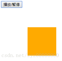
(3)播放和停止:
属性:animation-play-state: running(播放) | paused(暂停)
动画的播放和停止需要结合js来控制animation-play-state属性,进而控制动画的播放和暂停
[code]<!DOCTYPE html>
<html lang="en">
<head>
<meta charset="UTF-8">
<meta name="viewport" content="width=device-width, initial-scale=1.0">
<meta http-equiv="X-UA-Compatible" content="ie=edge">
<title>Document</title>
<style>
.demo{
position: absolute;
top: 100px;
left: 100px;
width: 100px;
height: 100px;
background: green;
animation: move 3s linear 10 reverse;
}
@keyframes move{
0%{
background: red;
}
50%{
background: yellow;
}
100%{
background: blue;
}
}
</style>
</head>
<body>
<div class="demo"></div>
<button id="btn">播放/暂停</button>
<script>
var oDiv = document.getElementsByClassName('demo')[0];
var flag = true;
btn.onclick = function(){
if(flag){
flag = false;
oDiv.style.animationPlayState = 'paused';
}else {
flag = true;
oDiv.style.animationPlayState = 'running';
}
}
</script>
</body>
</html>
注意:播放或暂停,会使整个动画过程暂停在某一时间点 或 在该时间点上继续播放
(4)关键帧的起始位置和终止位置
animation-fill-mode:属性定义动画在开始之前和结束之后发生的操作,主要有四个值:
none:默认值,在动画结束后,属性值会回到原来设置的值,如果原来没有设置该值,那么该值为空。
forwards:动画结束后,属性值会变成关键帧的最后一帧
backwards:在动画关键帧的第一帧,延迟等待,再进行动画过渡(运动);正常情况下,物体在原始位置延迟等待后,再进行动画过渡。
both:动画过渡同时具有forwards和backwards效果
比如:animation: move 3s linear infinite reverse forwards running;
阅读更多
- css3新属性:过渡transition,变换transform(2D,3D),动画animation
- 【CSS3】transition过渡和animation动画
- CSS3中和动画有关的属性transform、transition 和 animation
- CSS3中的动画,animation、transition和transform属性的运用
- css3动画属性详解之transform、transition、animation
- CSS3中和动画有关的属性transform、transition 和 animation
- CSS3的过渡效果(transition)与动画(animation)
- CSS3中和动画有关的属性transform、transition 和 animation
- CSS3中动画属性transform、transition和animation
- 原生js判断css3动画过度(transition)结束 transitionend事件 以及关键帧keyframes动画结束(animation)回调函数 animationEnd
- CSS3变形和动画:旋转、扭曲、缩放、位移、矩阵 、原点 transform-origin、过渡属性 transition-property、过渡所需时间 transition-duration...
- css3动画模块transform transition animation属性解释
- 【CSS3】transition过渡和animation动画
- 【CSS3】transition过渡和animation动画
- CSS3中和动画有关的属性transform、transition 和 animation
- CSS3实践之路(六):CSS3的过渡效果(transition)与动画(animation)
- CSS3中的动画,animation、transition和transform属性的运用
- CSS3中的Transition过度与Animation动画属性使用要点
- CSS3实践之路(六):CSS3的过渡效果(transition)与动画(animation)
- CSS3与动画有关的属性transition、animation、transform对比