Python爬取拉勾网招聘信息并可视化分析
2018-06-01 14:51
323 查看
需求:
1:获取指定岗位的招聘信息
2:对公司地区,公司待遇,学历情况,工作经验进行简单分析并可视化展示
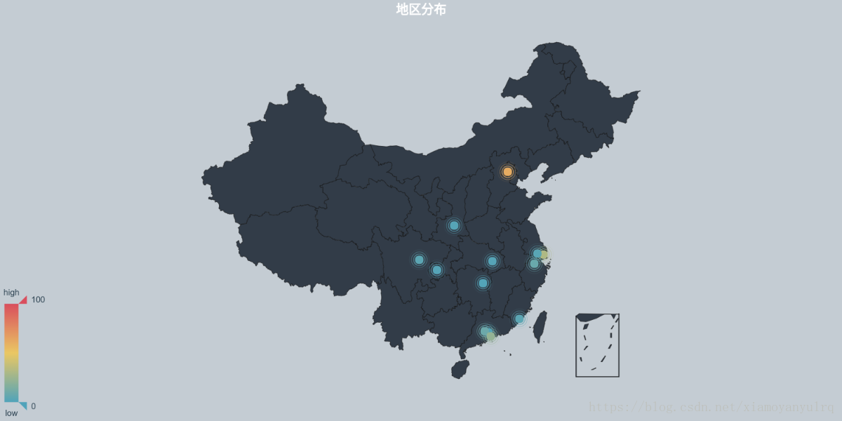
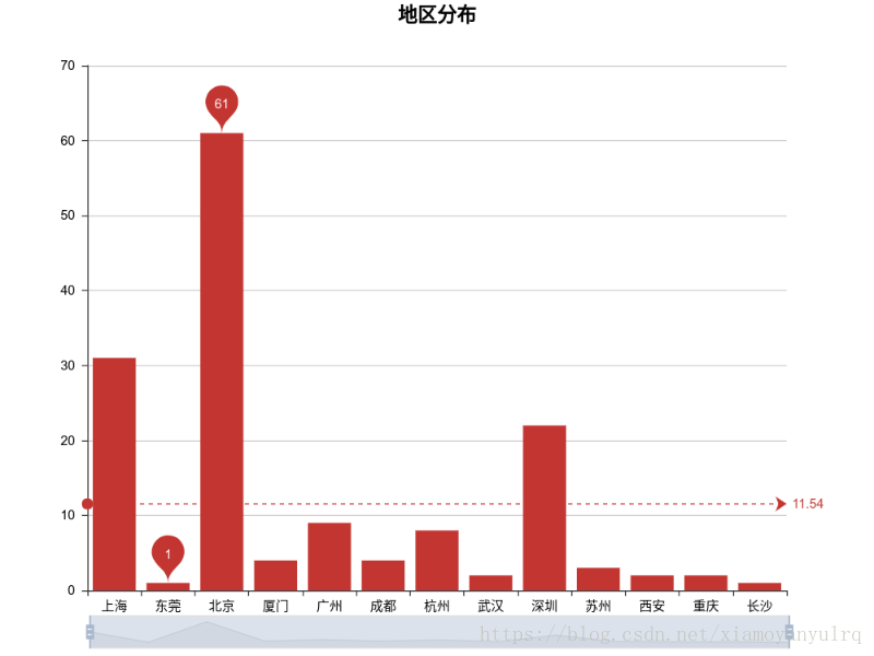
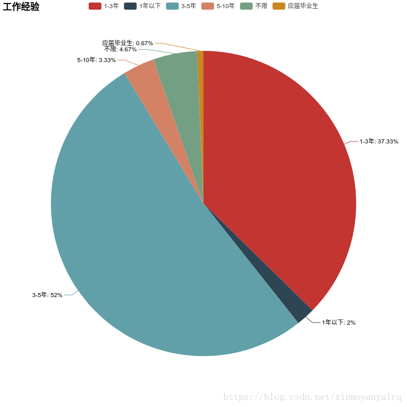
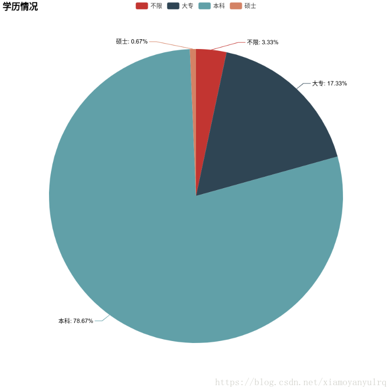
可视化分析:
公司地区:柱状图,地图
公司待遇:云图
公司-学历情况:饼图
公司工作经验:饼图

模块:
request:网络请求
re:正则匹配数据
pyecharts:可视化工具

自定义工具类:map_utils
温馨提示:由于pyecharts中的地图被禁用了,需要安装第三方地图包:安装方法-点这里
源码地址:https://github.com/lrq154439/crawl_web.git
爬取数据模块:
def get_info(name, page_num):
'''获取数据并统计'''
url = 'https://www.lagou.com/jobs/positionAjax.json?needAddtionalResult=false' # url地址
# 请求头信息
headers = {
'User-Agent': 'Mozilla/5.0 (Windows NT 10.0; Win64; x64) AppleWebKit/537.36 (KHTML, like Gecko) Chrome/66.0.3359.139 Safari/537.36',
'Host': 'www.lagou.com',
'Referer': 'https://www.lagou.com/jobs/list_%E6%95%B0%E6%8D%AE%E5%88%86%E6%9E%90?labelWords=&fromSearch=true&suginput=',
'X-Anit-Forge-Code': '0',
'X-Anit-Forge-Token': 'None',
'X-Requested-With': 'XMLHttpRequest'
}

# 保存参数的字典
city_all = {}
money_all = {}
education_all = {}
workyear_all = {}
good_all = {}

for page in range(1, page_num + 1):
if page % 6 == 0:
time.sleep(60)
# 请求参数
my_data = {
'first': 'true',
'pn': page,
'kd': name}
# 获取网页源码
html = requests.post(url, headers=headers, data=my_data)
html.raise_for_status()
html.encoding = 'utf-8'
# print(html.json()['content']['positionResult'])
result_json = html.json()['content']['positionResult']['result']

for index, result in enumerate(result_json):

# 统计地区分布
city_all[result['city']] = city_all.get(result['city'], 0) + 1
# 统计公司-薪资
money_all[result['companyFullName']] = result['salary']
# 统计学历需求
education_all[result['education']] = education_all.get(result['education'], 0) + 1
# 统计工作经验情况
workyear_all[result['workYear']] = workyear_all.get(result['workYear'], 0) + 1
# 待遇情况
good_all[result['positionAdvantage']] = random.randint(1, 20)

print('完成{}页.'.format(page))
# {'杭州': 5, '深圳': 15, '苏州': 5, '广州': 5, '上海': 5, '北京': 40}
return city_all, money_all, education_all, workyear_all, good_all

----------

**数据分析展示模块:**
”’pyecharts工具类”’
1):地图模块
def create_geo_charts(data, title):
'''地图'''
page = Page()
# 样式
style = Style(
title_color="#fff",
title_pos="center",
width=1200,
height=600,
background_color='#c4ccd3'
)
# 创建地图模型
chart = Geo(title, "", **style.init_style)
# 数据 ['上海', '北京', '广州', '深圳', '苏州'] [5, 40, 10, 15, 5]
attr, value = chart.cast(data)
# 添加数据
chart.add("", attr, value, maptype='china', is_visualmap=True, type="effectScatter", is_legend_show=False,
geo_emphasis_color='c4ccd3',
visual_text_color='#2f4554')

page.add(chart)

return page
2):柱状图模块
def create_Bar_charts(data, title):
'''柱状图'''

page = Page()

style = Style(
width=800, height=600,
title_pos="center",
)

chart = Bar(title, **style.init_style)
attr, value = chart.cast(data)
chart.add('', attr, value, mark_line=["average"],
mark_point=["max", "min"], is_datazoom_show=True, datazoom_range=[50, 80])

page.add(chart)
return page
3):饼图模块
def create_Pie_charts(data, title):
'''饼状图'''
page = Page()

style = Style(
width=800, height=800
)

chart = Pie(title, **style.init_style)
attr, value = chart.cast(data)
chart.add("", attr, value, is_label_show=True)
page.add(chart)
return page
4):词云图模块
def create_clound_charts(data, title):
'''词云图'''
page = Page()
# print(data)

style = Style(
width=2000, height=1000,
title_pos="center",
)

chart = WordCloud(title, **style.init_style)
attr, value = chart.cast(data)
chart.add("", attr, value, shape='circle')
page.add(chart)

return page


相关文章推荐
- python爬取拉勾网招聘信息并利用pandas做简单数据分析
- 使用Spark分析拉勾网招聘信息(四): 几个常用的脚本与图片分析结果
- 使用Spark分析拉勾网招聘信息(二): 获取数据
- Python爬虫:爬取拉勾网招聘信息
- Python scrapy 爬取拉勾网招聘信息
- 使用Spark分析拉勾网招聘信息(四): 几个常用的脚本与图片分析结果
- python3爬取拉勾网招聘信息存为excel格式
- 使用Spark分析拉勾网招聘信息(一):准备工作
- Python实战--抓取拉勾网招聘信息
- Python 招聘信息爬取及可视化
- Python爬取拉勾网招聘信息
- 使用Spark分析拉勾网招聘信息(一):准备工作
- 对拉勾网招聘信息做一次数据分析(上)--40行代码拿下所有数据
- Python爬虫之实习僧招聘信息及数据分析
- 通俗易懂的分析如何用Python实现一只小爬虫,爬取拉勾网的职位信息
- 使用Spark分析拉勾网招聘信息(二): 获取数据
- 【python爬虫02】使用Scrapy框架爬取拉勾网招聘信息
- 拉勾网爬取全国python职位并数据分析薪资,工作经验,学历等信息