浏览器缩放检测
2018-05-30 15:19
399 查看
在pc端项目的开发中,经常会遇到用户浏览页面却发现布局出现混乱的情况,这时候排查可能是网页的缩放引起的,所以在页面加载的时候添加了浏览器的缩放检测提示功能。
采用的检测方式里用到一个属性 window.devicePixelRatio ,以下是摘自张鑫旭的 设备像素比devicePixelRatio简单介绍,有兴趣可以看下;
window.devicePixelRatio是设备上物理像素和设备独立像素(device-independent pixels (dips))的比例。
公式表示就是:window.devicePixelRatio = 物理像素 / dips
和screen.deviceXDPI 、 screen.logicalXDPI 都是为了计算缩放率
代码如下:
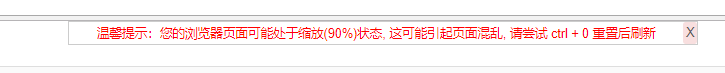
之后可以使用这个比率来进行提示重置缩放,
另外经过检测的是chrome浏览器 win系统本身的缩放也会影响此缩放判断
采用的检测方式里用到一个属性 window.devicePixelRatio ,以下是摘自张鑫旭的 设备像素比devicePixelRatio简单介绍,有兴趣可以看下;
window.devicePixelRatio是设备上物理像素和设备独立像素(device-independent pixels (dips))的比例。
公式表示就是:window.devicePixelRatio = 物理像素 / dips
和screen.deviceXDPI 、 screen.logicalXDPI 都是为了计算缩放率
代码如下:
// 浏览器缩放检测
function detectZoom (){
var ratio = 0,
screen = window.screen,
ua = navigator.userAgent.toLowerCase();

if (window.devicePixelRatio !== undefined) {
ratio = window.devicePixelRatio;
}else if (~ua.indexOf('msie')) {  // ie
if (screen.deviceXDPI && screen.logicalXDPI) {
ratio = screen.deviceXDPI / screen.logicalXDPI;
}
}
else if (window.outerWidth !== undefined && window.innerWidth !== undefined) {
ratio = window.outerWidth / window.innerWidth;
}

if (ratio){
ratio = Math.round(ratio * 100);
}

return ratio;
};
之后可以使用这个比率来进行提示重置缩放,
另外经过检测的是chrome浏览器 win系统本身的缩放也会影响此缩放判断

相关文章推荐
- 浏览器缩放检测的js代码
- 浏览器缩放检测的js代码
- javascript检测浏览器的缩放状态实现代码
- Broswer:浏览器缩放的检测
- javascript检测浏览器的缩放状态实现代码
- javascript检测浏览器的缩放状态实现代码 是指浏览器网页内容的百分比缩放(按Ctrl和+号键或者-号键的缩放)
- js浏览器缩放比例检测
- javascript检测浏览器的缩放状态实现代码
- javascript检测浏览器的缩放状态
- 浏览器在DPI缩放时变化问题
- 屏蔽掉Google Chrome 浏览器 textarea 单词拼写检测
- [原创][开源]跨浏览器的JavaScript性能检测工具 - 至于你信不信,我反正信了
- 用jQuery实现检测浏览器及版本的脚本代码
- as3——影片的缩放,检测显示设置
- DOM(十四):代理检测和事件处理(跨浏览器)
- web测试--浏览器的页面不小心被缩放后如何还原
- Android 手势检测实战 打造支持缩放平移的图片预览效果(上)
- js检测浏览器版本、核心、是否移动端示例
- 使用meta属性禁用手机浏览器的缩放功能
- 网页的宽高时时随浏览器缩放而缩放