Kaggel House Price 数据预处理及其可视化
2018-03-13 11:51
316 查看
参考原文链接 https://www.kaggle.com/pmarcelino/comprehensive-data-exploration-with-python
数据预处理源码(详细注释)git 地址:
https://github.com/xuman-Amy/kaggel
引入要用的包import pandas as pd
import numpy as np
import matplotlib.pyplot as plt
import seaborn as sns #统计绘图
from sklearn.preprocessing import StandardScaler
from scipy.stats import norm
from scipy import stats #统计
import warnings
warnings.filterwarnings('ignore')
#画图直接显示
%matplotlib inline 加载数据 ——训练集 测试集 train test#bring in the six packs
df_train = pd.read_csv('G:Machine learning\\kaggel\\house prices\\train.csv')
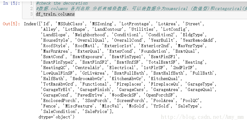
df_test = pd.read_csv('G:Machine learning\\kaggel\\house prices\\test.csv') 粗略查看数据各字段 利用常识简单分析之间的联系#check the decoration
#数据.columns 各列名称 分析有哪些数据,可以将数据分为numerical (数值型)和categorical(类别型)
df_train.columns
df_train['SalePrice'].describe()
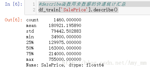
可以看出min大于0,所以不用担心0的问题了
【[b]用直方图看下数据分布】[/b]#seaborn 用法 https://zhuanlan.zhihu.com/p/24464836 #seaborn的displot()集合了matplotlib的hist()与核函数估计kdeplot的功能,
#增加了rugplot分布观测条显示与利用scipy库fit拟合参数分布的新颖用途
sns.distplot(df_train['SalePrice'])
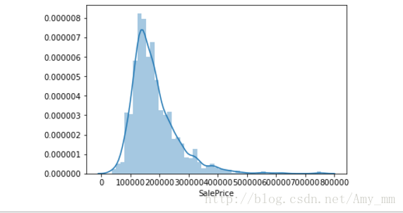
【峰值和偏态】#show skewness and Kurtosis 偏态和峰度
print("Skewness : %f " % df_train['SalePrice'].skew())
print("Kurtosis : %f " % df_train['SalePrice'].kurt())

【 GrLivArea】
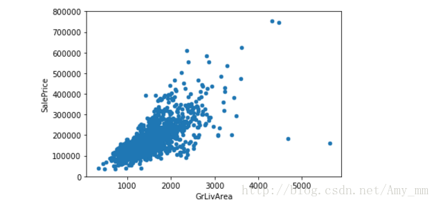
看起来 二者呈线性分布
【TotalBsmtSF】#scatter plot saleprice / totalbsmtsf
var = 'TotalBsmtSF'
data = pd.concat([df_train['SalePrice'],df_train[var]],axis = 1)
data.plot.scatter(x = var, y = 'SalePrice',ylim = (0,800000))
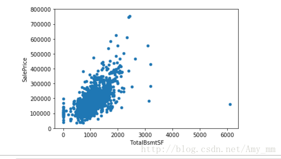
看起来也是很强的 线性关系
【OverallQual 】#box plot overallqual / saleprice
var = 'OverallQual'
data = pd.concat([df_train['SalePrice'],df_train['OverallQual']],axis = 1)
f,ax = plt.subplots(figsize = (8,6)) #subplots 创建一个画像(figure)和一组子图(subplots)。
fig = sns.boxplot(x = var,y = 'SalePrice',data = data)
fig.axis (ymin = 0,ymax = 800000)
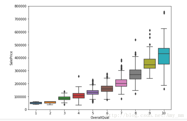
可以看出整体建筑质量越好,价钱越高
【YearBuilt】#boxplot saleprice / yearbuilt
var = 'YearBuilt'
data = pd.concat([df_train['SalePrice'],df_train['YearBuilt']],axis = 1)
f, ax = plt.subplots(figsize = (25,10))
fig = sns.boxplot(x = var,y = 'SalePrice',data = data)
fig.axis(ymin = 0,yamx = 800000)
plt.xticks(rotation = 90) #x轴标签 转90度

虽然没有太大关系,但是新建的价钱稍微有高价钱趋势
总体来说,价钱与grlivarea totalbsmtsf有很强的线性关系
与 yearbuilt没有太大关系,与overallqua有较弱关系
【相关矩阵】#correlation matrix 相关矩阵
corrmat = df_train.corr()
f ,ax = plt.subplots(figsize = (12,9))
sns.heatmap(corrmat,vmax = 8,square = True,cmap = 'hot')
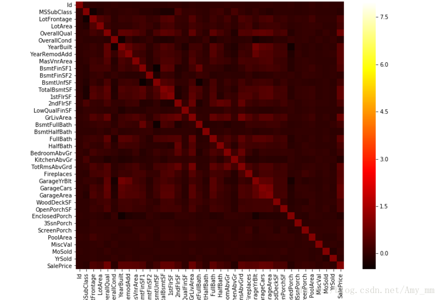
我显示的效果不如原文,也没找到原文的效果是用的什么参数
原文图如下:

可以看出


可以看出很多特征之间有很强的相关性
【SalePrice 与其他特征之间的相关性 Top 10】#saleprice correlation matrix
k = 10
cols = corrmat.nlargest(k,'SalePrice')['SalePrice'].index #取出与saleprice相关性最大的十项
cm = np.corrcoef(df_train[cols].values.T) #相关系数
sns.set(font_scale = 1.25)
hm = sns.heatmap(cm,cbar = True,annot = True,square = True ,fmt = '.2f',annot_kws = {'size': 10},yticklabels = cols.values,xticklabels = cols.values)
plt.show()

从相关矩阵图 top10 中可以看出,OverallQual', 'GrLivArea' and 'TotalBsmtSF'与saleprice有很强相关性garagecar与garagearea 相关性差不多,取其一,取garagecars
TotalBsmtSF' and '1stFloor' 有很强相关性,取其一,取TotalBsmtSF' 同理,'TotRmsAbvGrd' and 'GrLivArea',取grlivarea【saleprice 与相关变量的散点图】#scatterplot
sns.set()
cols = ['SalePrice','OverallQual','GrLivArea','GarageCars','TotalBsmtSF','FullBath','YearBuilt']
sns.pairplot(df_train[cols],size = 2.5)
了解缺失值缺失是随机的还是有规律有原因的
【查看各字段的缺失 以百分比的形式显示 】#missing data
#pandas.isnull() 判断数据是否为空 返回false / true
#sort_values()
total = df_train.isnull().sum().sort_values(ascending = False)
percent = (df_train.isnull().sum() / df_train.isnull().count()).sort_values(ascending = False)
missing_data = pd.concat([total,percent],axis = 1,keys = ['Total','Percent'])
missing_data.head(20)
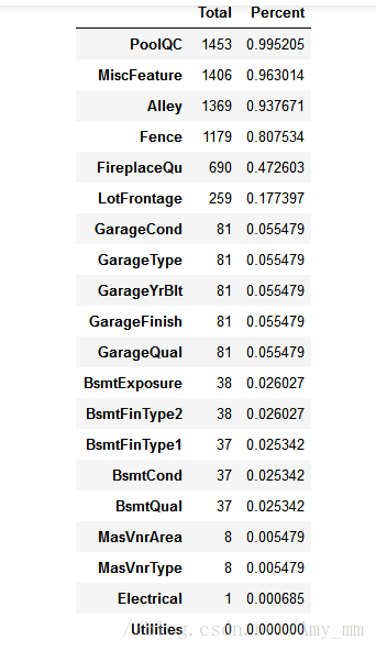
对缺失数据进行分析:
对于缺失大于数据量的15%的字段,可以考虑删掉这一字段()

对于GarageXX项可忽略,因为已经用garageCars代表
同理,BsmtXX不用管,有TotalBsmtSF代表
MasVnrArea' and 'MasVnrType 不重要,可删除
只剩下electric 缺失一项,可以删掉缺失这一项的 【删除无用的缺失项】df_train = df_train.drop(missing_data[(missing_data['Total'] > 1)].index,axis = 1)
接下来 ,另一个比较重要的是outliars
【单变量 离群值 Univariate analysis】
【数据的标准化 】利用StandardScaler #standardizing data --> converting data values to have mean of 0 and standard deviation of 1
#http://scikit-learn.org/stable/modules/generated/sklearn.preprocessing.StandardScaler.html
# fit : compute mean and std deviation
#transform : Perform standardization by centering and scaling
#np.newaxis 增加新维度
#argsort() Returns the indices that would sort an array.将x中的元素从小到大排列,提取其对应的index(索引),然后输出
【双变量数据分析 Bivariate analysis】
(GrLivArea - SalePrice)var = 'GrLivArea'
data = pd.concat([df_train['SalePrice'],df_train[var]],axis = 1)
data.plot.scatter(x = var, y = 'SalePrice',ylim =(0,800000))
删除这两个不符合规律的值。#delete point
df_train.sort_values(by = 'GrLivArea', ascending = False)[:2]
df_train = df_train.drop(df_train[df_train['Id'] == 1299 ].index)
df_train = df_train.drop(df_train[df_train['Id'] == 524].index)
对于正态性,可以用直方图 正太概率分布图 分析
【SalePrice】# in the search for normality
#histogram and normal probability plot 直方图和正态概率图
sns.distplot(df_train['SalePrice'],fit = norm) #fit 控制拟合的参数分布图形
fig = plt.figure()
# probplot :Calculate quantiles for a probability plot, and optionally show the plot. 计算概率图的分位数
res = stats.probplot(df_train['SalePrice'],plot = plt)

图中看出 呈现正偏态, 线性也不好,进行log转换 df_train['GrLivArea'] = np.log(df_train['GrLivArea'])
sns.distplot(df_train['GrLivArea'],fit = norm)
fig = plt.figure()
res = stats.probplot(df_train['GrLivArea'],plot = plt)
呈现出了很好的正态性 以及线性
依次对每个选出来的特征值处理
【TotalBsmtSF】#TotalBsmtSF
sns.distplot(df_train['TotalBsmtSF'],fit = norm)
fig = plt.figure()
res = stats.probplot(df_train['TotalBsmtSF'],plot = plt)
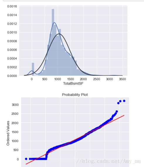
看出 有0值,不能直接进行log转换, 把大于0的筛选出来然后log转换
log处理后#create column for new varible
#if area > 0 ,it gets 1; for area == 0 it gets 0
【方差齐性 】
”The best approach to test homoscedasticity for two metric variables is graphically. Departures from an equal dispersion are shown by such shapes as cones (small dispersion at one side of the graph, large dispersion at the opposite side) or diamonds (a large number of points at the center of the distribution).“
要么是像conic 锥形 ,少量数据分散在一侧,大量数据分散在另一侧,
要么像钻石,集中分散在中间
查看两个变量之间的方差齐性
'SalePrice' and 'GrLivArea'...
#scatter plot
plt.scatter(df_train['SalePrice'],df_train['GrLivArea'])
SalePrice' with 'TotalBsmtSF'.
plt.scatter(df_train[df_train['TotalBsmtSF']>0] ['TotalBsmtSF'],df_train[df_train['TotalBsmtSF'] > 0]
['SalePrice'])

最后 dummy variables
进行非数转换,数据全是数值型#convert categorical variable into dummy
df_train = pd.get_dummies(df_train)
数据预处理至此。博客就是看的原文基本copy下来,跑了一遍,也学到了很多数据预处理 可视化的技巧,希望以后能有更大进步!
数据预处理源码(详细注释)git 地址:
https://github.com/xuman-Amy/kaggel
引入要用的包import pandas as pd
import numpy as np
import matplotlib.pyplot as plt
import seaborn as sns #统计绘图
from sklearn.preprocessing import StandardScaler
from scipy.stats import norm
from scipy import stats #统计
import warnings
warnings.filterwarnings('ignore')
#画图直接显示
%matplotlib inline 加载数据 ——训练集 测试集 train test#bring in the six packs
df_train = pd.read_csv('G:Machine learning\\kaggel\\house prices\\train.csv')
df_test = pd.read_csv('G:Machine learning\\kaggel\\house prices\\test.csv') 粗略查看数据各字段 利用常识简单分析之间的联系#check the decoration
#数据.columns 各列名称 分析有哪些数据,可以将数据分为numerical (数值型)和categorical(类别型)
df_train.columns
1、分析【SalePrice】
#describe函数用来数据的快速统计汇总df_train['SalePrice'].describe()
可以看出min大于0,所以不用担心0的问题了
【[b]用直方图看下数据分布】[/b]#seaborn 用法 https://zhuanlan.zhihu.com/p/24464836 #seaborn的displot()集合了matplotlib的hist()与核函数估计kdeplot的功能,
#增加了rugplot分布观测条显示与利用scipy库fit拟合参数分布的新颖用途
sns.distplot(df_train['SalePrice'])
【峰值和偏态】#show skewness and Kurtosis 偏态和峰度
print("Skewness : %f " % df_train['SalePrice'].skew())
print("Kurtosis : %f " % df_train['SalePrice'].kurt())
【分析 与价钱有关的特征值】
分析价钱可能会与'GrLivArea' and 'TotalBsmtSF'. 'OverallQual' and 'YearBuilt'. 有关分别查看关系【 GrLivArea】
#scatter plot  Grlivearea / SalePrice

var = 'GrLivArea'
#pd.concat 函数 可以将数据根据不同的轴作简单的融合 axis = 0-->代表行  axis = 1 --> 代表列

data = pd.concat([df_train['SalePrice'],df_train[var]],axis = 1)
data.plot.scatter(x = var, y = 'SalePrice',ylim = (0,800000));
看起来 二者呈线性分布
【TotalBsmtSF】#scatter plot saleprice / totalbsmtsf
var = 'TotalBsmtSF'
data = pd.concat([df_train['SalePrice'],df_train[var]],axis = 1)
data.plot.scatter(x = var, y = 'SalePrice',ylim = (0,800000))
看起来也是很强的 线性关系
【OverallQual 】#box plot overallqual / saleprice
var = 'OverallQual'
data = pd.concat([df_train['SalePrice'],df_train['OverallQual']],axis = 1)
f,ax = plt.subplots(figsize = (8,6)) #subplots 创建一个画像(figure)和一组子图(subplots)。
fig = sns.boxplot(x = var,y = 'SalePrice',data = data)
fig.axis (ymin = 0,ymax = 800000)
可以看出整体建筑质量越好,价钱越高
【YearBuilt】#boxplot saleprice / yearbuilt
var = 'YearBuilt'
data = pd.concat([df_train['SalePrice'],df_train['YearBuilt']],axis = 1)
f, ax = plt.subplots(figsize = (25,10))
fig = sns.boxplot(x = var,y = 'SalePrice',data = data)
fig.axis(ymin = 0,yamx = 800000)
plt.xticks(rotation = 90) #x轴标签 转90度
虽然没有太大关系,但是新建的价钱稍微有高价钱趋势
总体来说,价钱与grlivarea totalbsmtsf有很强的线性关系
与 yearbuilt没有太大关系,与overallqua有较弱关系
2. 具体分析问题
原文作者说要“keep calm and work smart“ 哈哈哈 跟着大佬继续学习【相关矩阵】#correlation matrix 相关矩阵
corrmat = df_train.corr()
f ,ax = plt.subplots(figsize = (12,9))
sns.heatmap(corrmat,vmax = 8,square = True,cmap = 'hot')
我显示的效果不如原文,也没找到原文的效果是用的什么参数
原文图如下:
可以看出
可以看出很多特征之间有很强的相关性
【SalePrice 与其他特征之间的相关性 Top 10】#saleprice correlation matrix
k = 10
cols = corrmat.nlargest(k,'SalePrice')['SalePrice'].index #取出与saleprice相关性最大的十项
cm = np.corrcoef(df_train[cols].values.T) #相关系数
sns.set(font_scale = 1.25)
hm = sns.heatmap(cm,cbar = True,annot = True,square = True ,fmt = '.2f',annot_kws = {'size': 10},yticklabels = cols.values,xticklabels = cols.values)
plt.show()
从相关矩阵图 top10 中可以看出,OverallQual', 'GrLivArea' and 'TotalBsmtSF'与saleprice有很强相关性garagecar与garagearea 相关性差不多,取其一,取garagecars
TotalBsmtSF' and '1stFloor' 有很强相关性,取其一,取TotalBsmtSF' 同理,'TotRmsAbvGrd' and 'GrLivArea',取grlivarea【saleprice 与相关变量的散点图】#scatterplot
sns.set()
cols = ['SalePrice','OverallQual','GrLivArea','GarageCars','TotalBsmtSF','FullBath','YearBuilt']
sns.pairplot(df_train[cols],size = 2.5)
3.缺失值处理
了解缺失值是否重要了解缺失值缺失是随机的还是有规律有原因的
【查看各字段的缺失 以百分比的形式显示 】#missing data
#pandas.isnull() 判断数据是否为空 返回false / true
#sort_values()
total = df_train.isnull().sum().sort_values(ascending = False)
percent = (df_train.isnull().sum() / df_train.isnull().count()).sort_values(ascending = False)
missing_data = pd.concat([total,percent],axis = 1,keys = ['Total','Percent'])
missing_data.head(20)
对缺失数据进行分析:
对于缺失大于数据量的15%的字段,可以考虑删掉这一字段()
对于GarageXX项可忽略,因为已经用garageCars代表
同理,BsmtXX不用管,有TotalBsmtSF代表
MasVnrArea' and 'MasVnrType 不重要,可删除
只剩下electric 缺失一项,可以删掉缺失这一项的 【删除无用的缺失项】df_train = df_train.drop(missing_data[(missing_data['Total'] > 1)].index,axis = 1)
df_train = df_train.drop(df_train.loc[df_train['Electrical'].isnull()].index)
df_train.isnull().sum().max()d到这一步 没有缺失项了~~~~
接下来 ,另一个比较重要的是outliars
【单变量 离群值 Univariate analysis】
【数据的标准化 】利用StandardScaler #standardizing data --> converting data values to have mean of 0 and standard deviation of 1
#http://scikit-learn.org/stable/modules/generated/sklearn.preprocessing.StandardScaler.html
# fit : compute mean and std deviation
#transform : Perform standardization by centering and scaling
#np.newaxis 增加新维度
#argsort() Returns the indices that would sort an array.将x中的元素从小到大排列,提取其对应的index(索引),然后输出
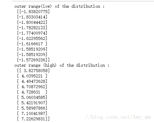
saleprice_scaled = StandardScaler().fit_transform(df_train['SalePrice'][:,np.newaxis])
low_range = saleprice_scaled[saleprice_scaled[:,0].argsort()][:10]
high_range = saleprice_scaled[saleprice_scaled[:,0].argsort()][-10:]
print('outer range(low) of the distribution :','\n',low_range)
print ('outer range (high) of the distribution :','\n',high_range)
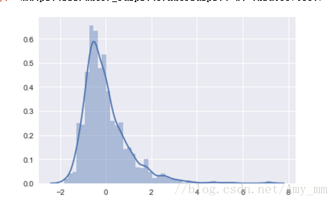
sns.distplot(saleprice_scaled)【双变量数据分析 Bivariate analysis】
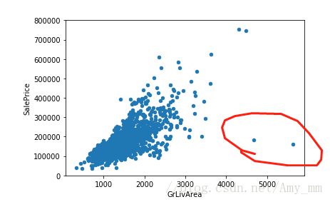
(GrLivArea - SalePrice)var = 'GrLivArea'
data = pd.concat([df_train['SalePrice'],df_train[var]],axis = 1)
data.plot.scatter(x = var, y = 'SalePrice',ylim =(0,800000))
删除这两个不符合规律的值。#delete point
df_train.sort_values(by = 'GrLivArea', ascending = False)[:2]
df_train = df_train.drop(df_train[df_train['Id'] == 1299 ].index)
df_train = df_train.drop(df_train[df_train['Id'] == 524].index)
作者对于数据处理的见解如下:
5 Getting hard core
According to Hair et al. (2013), four assumptions should be tested:Normality (正态性)- When we talk about normality what we mean is that the data should look like a normal distribution. This is important because several statistic tests rely on this (e.g. t-statistics). In this exercise we'll just check univariate normality for 'SalePrice' (which is a limited approach). Remember that univariate normality doesn't ensure multivariate normality (which is what we would like to have), but it helps. Another detail to take into account is that in big samples (>200 observations) normality is not such an issue. However, if we solve normality, we avoid a lot of other problems (e.g. heteroscedacity) so that's the main reason why we are doing this analysis.Homoscedasticity(方差齐性) - I just hope I wrote it right. Homoscedasticity refers to the 'assumption that dependent variable(s) exhibit equal levels of variance across the range of predictor variable(s)' (Hair et al., 2013). Homoscedasticity is desirable because we want the error term to be the same across all values of the independent variables.Linearity(线性)- The most common way to assess linearity is to examine scatter plots and search for linear patterns. If patterns are not linear, it would be worthwhile to explore data transformations. However, we'll not get into this because most of the scatter plots we've seen appear to have linear relationships.Absence of correlated errors (无相关错误) - Correlated errors, like the definition suggests, happen when one error is correlated to another. For instance, if one positive error makes a negative error systematically, it means that there's a relationship between these variables. This occurs often in time series, where some patterns are time related. We'll also not get into this. However, if you detect something, try to add a variable that can explain the effect you're getting. That's the most common solution for correlated errors.对于正态性,可以用直方图 正太概率分布图 分析
【SalePrice】# in the search for normality
#histogram and normal probability plot 直方图和正态概率图
sns.distplot(df_train['SalePrice'],fit = norm) #fit 控制拟合的参数分布图形
fig = plt.figure()
# probplot :Calculate quantiles for a probability plot, and optionally show the plot. 计算概率图的分位数
res = stats.probplot(df_train['SalePrice'],plot = plt)
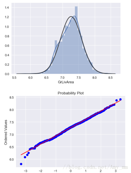
图中看出 呈现正偏态, 线性也不好,进行log转换 df_train['GrLivArea'] = np.log(df_train['GrLivArea'])
sns.distplot(df_train['GrLivArea'],fit = norm)
fig = plt.figure()
res = stats.probplot(df_train['GrLivArea'],plot = plt)
呈现出了很好的正态性 以及线性
依次对每个选出来的特征值处理
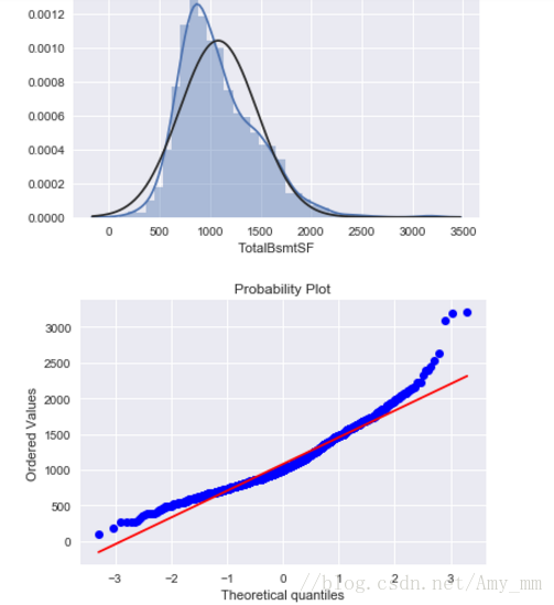
【TotalBsmtSF】#TotalBsmtSF
sns.distplot(df_train['TotalBsmtSF'],fit = norm)
fig = plt.figure()
res = stats.probplot(df_train['TotalBsmtSF'],plot = plt)
看出 有0值,不能直接进行log转换, 把大于0的筛选出来然后log转换
log处理后#create column for new varible
#if area > 0 ,it gets 1; for area == 0 it gets 0
df_train['HasBsmt'] = pd.Series(len(df_train['TotalBsmtSF']),index = df_train.index)
df_train['HasBsmt']  = 0
df_train.loc[df_train['TotalBsmtSF'] > 0 ,'HasBsmt'] = 1
df_train.loc[df_train['HasBsmt'] == 0 ,'TotalBsmtSF'] = np.log(df_train['TotalBsmtSF'])
sns.distplot(df_train[df_train['TotalBsmtSF']>0]['TotalBsmtSF'],fit = norm)
fig = plt.figure()
res = stats.probplot(df_train[df_train['TotalBsmtSF'] > 0 ]['TotalBsmtSF'],plot = plt)
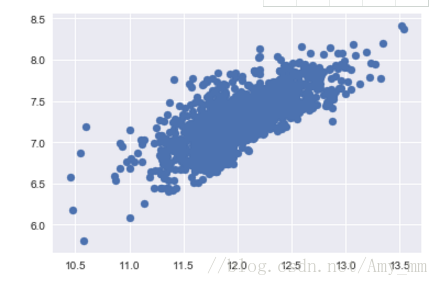
【方差齐性 】
”The best approach to test homoscedasticity for two metric variables is graphically. Departures from an equal dispersion are shown by such shapes as cones (small dispersion at one side of the graph, large dispersion at the opposite side) or diamonds (a large number of points at the center of the distribution).“
要么是像conic 锥形 ,少量数据分散在一侧,大量数据分散在另一侧,
要么像钻石,集中分散在中间
查看两个变量之间的方差齐性
'SalePrice' and 'GrLivArea'...
#scatter plot
plt.scatter(df_train['SalePrice'],df_train['GrLivArea'])
SalePrice' with 'TotalBsmtSF'.
plt.scatter(df_train[df_train['TotalBsmtSF']>0] ['TotalBsmtSF'],df_train[df_train['TotalBsmtSF'] > 0]
['SalePrice'])
最后 dummy variables
进行非数转换,数据全是数值型#convert categorical variable into dummy
df_train = pd.get_dummies(df_train)
数据预处理至此。博客就是看的原文基本copy下来,跑了一遍,也学到了很多数据预处理 可视化的技巧,希望以后能有更大进步!

相关文章推荐
- Kaggel House Price 数据预处理及其可视化
- Kaggel House Price 数据预处理及其可视化
- Kaggel House Price 数据预处理及其可视化
- Kaggel House Price 数据预处理及其可视化
- Kaggel House Price 数据预处理及其可视化
- Kaggel House Price 数据预处理及其可视化
- Kaggel House Price 数据预处理及其可视化
- Kaggel House Price 数据预处理及其可视化
- Kaggel House Price 数据预处理及其可视化
- Kaggel House Price 数据预处理及其可视化
- Kaggel House Price 数据预处理及其可视化
- Kaggel House Price 数据预处理及其可视化
- Kaggel House Price 数据预处理及其可视化
- Kaggel 新手训练赛 HousePrice Predict
- Matlab数据的可视化 -- 极坐标图及其与直角坐标图的转换
- 《慢慢学TensorFlow》微信公众号之TensorFlow 图像数据预处理及可视化
- Python下的数据处理和机器学习,对数据在线及本地获取、解析、预处理和训练、预测、交叉验证、可视化
- TensorFlow 图像数据预处理及可视化
- 从数据预处理开始学习网络可视化——社团发现算法
- TensorFlow 图像数据预处理及可视化