响应式布局 导航条为例
2018-03-12 15:35
239 查看
响应式布局
根据屏幕的不同尺寸,应用不同的CSS规则。让不同尺寸的设备显示不同的效果。
我们可以通过媒体查询实现响应式布局,CSS3提供了媒体查询,可以判断当前的可视区域的大小。
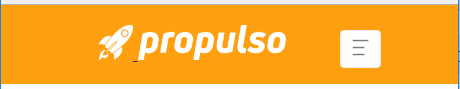
大屏和超大屏幕效果图:即(电脑屏幕尺寸-----大于等于992px)

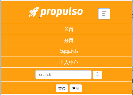
小屏和超小屏幕效果图:(即手机屏幕尺寸----小于768px 和平板屏幕尺寸-----大于等于768px小于992px)
点击按钮后:
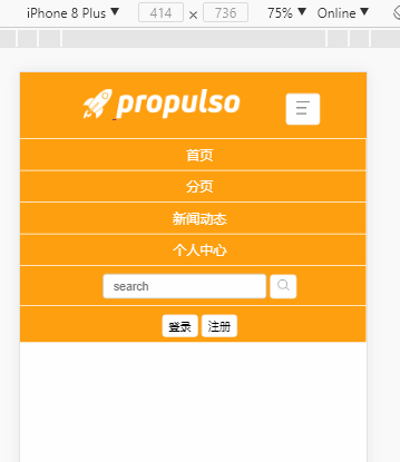
移动端效果图:
HTML代码:
CSS代码:
JS代码:
项目下载地址:
https://github.com/Kawagarbo/Response-navigation-bar
根据屏幕的不同尺寸,应用不同的CSS规则。让不同尺寸的设备显示不同的效果。
我们可以通过媒体查询实现响应式布局,CSS3提供了媒体查询,可以判断当前的可视区域的大小。
大屏和超大屏幕效果图:即(电脑屏幕尺寸-----大于等于992px)
小屏和超小屏幕效果图:(即手机屏幕尺寸----小于768px 和平板屏幕尺寸-----大于等于768px小于992px)
点击按钮后:
移动端效果图:
HTML代码:
<!DOCTYPE html>
<html lang="en">
<head>
<meta charset="UTF-8">
<!-- 如果是在移动端浏览器,需要设置如下元数据 -->
<meta name="viewport" content="width=device-width, initial-scale=1, minimum-scale=1.0, maximum-scale=1.0, user-scalable=no">
<title>纯HTML+CSS实现响应式导航条</title>
<link rel="stylesheet" type="text/css" href="./css/index.css">
<script type="text/javascript" src="./js/index.js"></script>
</head>
<body>
<div class="navbar-container">
<!-- 左边图标和logo -->
<div class="navbar-left">
<a href="">
<img src="./img/logo_rocket.png" class="img1">
</a>
<a href="">
<img src="./img/logo_name.png" class="img2">
</a>
</div>
<!-- 导航菜单-->
<ul class="navbar-list">
<li class="navbar-item">
<a href="">首页</a>
</li>
<li class="navbar-item">
<a href="">分页</a>
</li>
<li class="navbar-item">
<a href="">新闻动态</a>
</li>
<li class="navbar-item">
<a href="">个人中心</a>
</li>
</ul>
<!-- 搜索框 -->
<div class="navbar-search">
<input type="text" class="search" placeholder="search">
<button class="search-btn">
<img src="./img/search.png">
</button>
</div>
<!-- 登录注册 -->
<div class="navbar-sign">
<button>登录</button>
<button>注册</button>
</div>
<!-- 更多按钮 -->
<!--小屏幕显示 -->
<div class="navbar-morebox">
<button class="more-btn">
<img src="./img/more.png" alt="">
</button>
</div>
</div>
<!-- 手机或平板屏幕显示 -->
<ul class="small-list" id="small-list">
<li class="small-item">
<a href="">首页</a>
</li>
<li class="small-item">
<a href="">分页</a>
</li>
<li class="small-item">
<a href="">新闻动态</a>
</li>
<li class="small-item">
<a href="">个人中心</a>
</li>
<li class="small-item">
<input type="text" class="search" placeholder="search">
<button class="search-btn">
<img src="./img/search.png">
</button>
</li>
<li class="small-item">
<button class="sign">登录</button>
<button class="sign">注册</button>
</li>
</ul>
</body>
</html>
CSS代码:
/*大屏或者超大屏显示*/

@media screen and (min-width: 992px) {
html,
body {
margin: 0px;
padding: 0px;
}
.navbar-container {
width: 100%;
background-color: rgba(255, 160, 0, 1);
padding: 0 20px;
}
/*左边图标和logo*/
.navbar-left {
display: inline-block;

4000
text-align: center;
margin: 20px 0px;
margin-left: 25px;
}
.navbar-left .img1 {
height: 35px;
}
.navbar-left .img2 {
height: 35px;
}
/*导航菜单*/
.navbar-list {
display: inline-block;
list-style-type: none;
text-align: center;
margin: 0px;
padding: 0px;
position: relative;
bottom: 10px;
margin-left: 15px;
}
.navbar-list .navbar-item {
display: inline-block;
margin: 0 20px;
}
.navbar-list .navbar-item a {
display: inline-block;
padding: 0px 5px 8px 5px;
color: #fff;
text-decoration: none;
}
.navbar-list .navbar-item a:hover {
border-bottom: 3px solid black;
}
/*搜索框*/
.navbar-search {
display: inline-block;
position: relative;
bottom: 10px;
margin-left: 45px;
}
.navbar-search .search {
padding: 6px 12px;
font-size: 14px;
color: #555;
background-color: #fff;
background-image: none;
border: 1px solid #ccc;
border-radius: 4px;
}
.navbar-search .search-btn {
background-color: #fff;
padding: 0px;
border: 1px solid #eee;
padding: 4px 7px;
border-radius: 4px;
position: relative;
top: 2px;
}
.navbar-search .search-btn:hover {
cursor: pointer;
}
/*登录注册*/
.navbar-sign {
display: inline-block;
position: relative;
bottom: 10px;
left: 125px;
}
.navbar-sign button {
background-color: #fff;
padding: 0px;
border: 1px solid #eee;
padding: 4px 7px;
border-radius: 4px;
position: relative;
top: 2px;
}
.navbar-sign button:hover {
cursor: pointer;
}
/*更多按钮*/
/*大屏隐藏*/
.navbar-morebox {
display: none;
}
#small-list {
display: none;
}
}
/*小屏幕显示  手机屏幕 和平板*/

@media screen and (max-width:992px) {
html,
body {
margin: 0px;
padding: 0px;
}
.navbar-container {
width: 100%;
background-color: rgba(255, 160, 0, 1);
padding: 0 20px;
text-align: center;
}
/*左边图标和logo*/
.navbar-left {
display: inline-block;
text-align: center;
margin: 20px 0px;
margin-right: 50px;
}
.navbar-left .img1 {
height: 35px;
}
.navbar-left .img2 {
height: 35px;
}
/*导航菜单*/
.navbar-list {
display: none;
}
/*搜索框*/
.navbar-search {
display: none;
}
/*登录注册*/
.navbar-sign {
display: none;
}
.navbar-morebox {
display: inline-block;
margin-right: 20px;
}
.more-btn {
background-color: #fff;
padding: 0px;
border: 1px solid #eee;
padding: 4px 7px;
border-radius: 4px;
}
.more-btn:hover {
cursor: pointer;
}
.more-btn img {
width: 25px;
height: 25px;
}
.small-list {
display: none;
width: 100%;
background-color: rgba(255, 160, 0, 1);
margin: 0px;
padding: 0px;
position: relative;
top: 1px;
list-style-type: none;
text-align: center;
}
.small-list .small-item {
width: 100%;
padding: 8px;
border-bottom: 1px solid #fff;
}
.small-list .small-item a {
color: #fff;
text-decoration: none;
}
.small-list .small-item .search {
padding: 6px 12px;
font-size: 14px;
color: #555;
background-color: #fff;
background-image: none;
border: 1px solid #ccc;
border-radius: 4px;
}
.small-list .small-item .search-btn {
background-color: #fff;
padding: 0px;
border: 1px solid #eee;
padding: 4px 7px;
border-radius: 4px;
position: relative;
top: 2px;
}
.small-list .small-item .sign {
background-color: #fff;
padding: 0px;
border: 1px solid #eee;
padding: 4px 7px;
border-radius: 4px;
position: relative;
top: 2px;
}
.small-list .small-item .sign:hover {
cursor: pointer;
}
}
JS代码:
window.onload = function() {
var moreBtn = document.querySelector('.more-btn');
moreBtn.onclick = function() {
var listBox = document.querySelector('.small-list');
var val = listBox.style.display;
console.log(val);
if (val == 'block') {
listBox.style.display = 'none';
} else {
listBox.style.display = 'block';
}
}
}
项目下载地址:
https://github.com/Kawagarbo/Response-navigation-bar

相关文章推荐
- 一个用as做出的FLASH导航条代码
- 搜索引擎翻页导航条页码计算方法
- 简单导航条 JavaScrit
- 一个导航条的例子
- 水平导航条
- 一个更炫的动态加权限管理的导航条(Telerik.RadControls.for.ASP.NET.AJAX.v2008.Q1.SP2.Retail-SSG)
- 一个简单实用而且动太的导航条的例子
- DIV学写带动画的CSS+JS下拉导航条
- 我的第一个DIV+CSS导航条 仿PHP168
- Jquery.TreeView结合ASP.Net和数据库生成菜单导航条
- 半透明状态栏与导航条的错位
- jQuery会翻滚的菜单导航条代码
- iphone自动隐藏和显示工具栏和导航条
- 两个controller 切换 (未用导航条)
- 帝国 cms 导航条栏目切换样式
- ios导航条添加按钮
- 支持响应式布局的超棒颜色选择器 - colorjoe
- 使用jQuery background-position插件来创建超酷的导航条效果
- 在导航条的下方加上阴影 navgationbar
- js、jquery菜单导航条