bootstrap滚动监听插件Scrollspy横向和纵向实例对比
2018-03-01 20:04
507 查看
bootstrap滚动监听(Scrollspy)插件,即自动更新导航插件,会根据滚动条的位置自动更新对应的导航目标。
1.如何创建滚动监听
首先Body的position需要设置为relative.
<body data-spy="scroll" data-target=".navbar" data-offset="50">
<!-- The navbar - The <a> elements are used to jump to a section in the scrollable area -->
<nav class="navbar navbar-expand-sm bg-dark navbar-dark fixed-top">
...
<ul class="navbar-nav">
<li><a href="#section1">Section 1</a></li>
...
</nav>
<!-- 内容 -->
<div id="section1">
<h1>Section 1</h1>
<p>Try to scroll this page and look at the navigation bar while scrolling!</p>
</div>
...
</body>2.横向实例<body data-spy="scroll" data-target=".navbar" data-offset="50">
<nav class="navbar navbar-expand-sm bg-dark navbar-dark fixed-top">
<ul class="navbar-nav">
<li class="nav-item">
<a class="nav-link" href="#section1">Section 1</a>
</li>
<li class="nav-item">
<a class="nav-link" href="#section2">Section 2</a>
</li>
<li class="nav-item">
<a class="nav-link" href="#section3">Section 3</a>
</li>
<li class="nav-item dropdown">
<a class="nav-link dropdown-toggle" href="#" id="navbardrop" data-toggle="dropdown">
Section 4
</a>
<div class="dropdown-menu">
<a class="dropdown-item" href="#section41">Link 1</a>
<a class="dropdown-item" href="#section42">Link 2</a>
</div>
</li>
</ul>
</nav>
<div id="section1" class="container-fluid bg-success" style="padding-top:70px;padding-bottom:70px">
<h1>Section 1</h1>
<p>Try to scroll this section and look at the navigation bar while scrolling! Try to scroll this section and look at the navigation bar while scrolling!</p>
<p>Try to scroll this section and look at the navigation bar while scrolling! Try to scroll this section and look at the navigation bar while scrolling!</p>
</div>
<div id="section2" class="container-fluid bg-warning" style="padding-top:70px;padding-bottom:70px">
<h1>Section 2</h1>
<p>Try to scroll this section and look at the navigation bar while scrolling! Try to scroll this section and look at the navigation bar while scrolling!</p>
<p>Try to scroll this section and look at the navigation bar while scrolling! Try to scroll this section and look at the navigation bar while scrolling!</p>
</div>
<div id="section3" class="container-fluid bg-secondary" style="padding-top:70px;padding-bottom:70px">
<h1>Section 3</h1>
<p>Try to scroll this section and look at the navigation bar while scrolling! Try to scroll this section and look at the navigation bar while scrolling!</p>
<p>Try to scroll this section and look at the navigation bar while scrolling! Try to scroll this section and look at the navigation bar while scrolling!</p>
</div>
<div id="section41" class="container-fluid bg-danger" style="padding-top:70px;padding-bottom:70px">
<h1>Section 4 Submenu 1</h1>
<p>Try to scroll this section and look at the navigation bar while scrolling! Try to scroll this section and look at the navigation bar while scrolling!</p>
<p>Try to scroll this section and look at the navigation bar while scrolling! Try to scroll this section and look at the navigation bar while scrolling!</p>
</div>
<div id="section42" class="container-fluid bg-info" style="padding-top:70px;padding-bottom:70px">
<h1>Section 4 Submenu 2</h1>
<p>Try to scroll this section and look at the navigation bar while scrolling! Try to scroll this section and look at the navigation bar while scrolling!</p>
<p>Try to scroll this section and look at the navigation bar while scrolling! Try to scroll this section and look at the navigation bar while scrolling!</p>
</div>
</body>效果展示
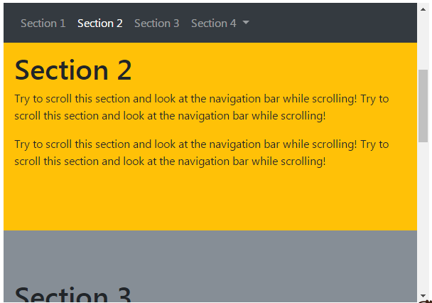
横向使用类.navbar,在屏幕小时就会折叠。
3.纵向实例<style>
body {
position: relative;
}
ul.nav-pills {
top: 20px;
position: fixed;
}
div.col-8 div {
height: 500px;
}
</style>
纵向使用了栅格系统,分别为导航栏和内容区划定了宽度。这里使用的是类.nav,而且为导航栏添加类.flex-column使之可以垂直排列。
1.如何创建滚动监听
首先Body的position需要设置为relative.
<body data-spy="scroll" data-target=".navbar" data-offset="50">
<!-- The navbar - The <a> elements are used to jump to a section in the scrollable area -->
<nav class="navbar navbar-expand-sm bg-dark navbar-dark fixed-top">
...
<ul class="navbar-nav">
<li><a href="#section1">Section 1</a></li>
...
</nav>
<!-- 内容 -->
<div id="section1">
<h1>Section 1</h1>
<p>Try to scroll this page and look at the navigation bar while scrolling!</p>
</div>
...
</body>2.横向实例<body data-spy="scroll" data-target=".navbar" data-offset="50">
<nav class="navbar navbar-expand-sm bg-dark navbar-dark fixed-top">
<ul class="navbar-nav">
<li class="nav-item">
<a class="nav-link" href="#section1">Section 1</a>
</li>
<li class="nav-item">
<a class="nav-link" href="#section2">Section 2</a>
</li>
<li class="nav-item">
<a class="nav-link" href="#section3">Section 3</a>
</li>
<li class="nav-item dropdown">
<a class="nav-link dropdown-toggle" href="#" id="navbardrop" data-toggle="dropdown">
Section 4
</a>
<div class="dropdown-menu">
<a class="dropdown-item" href="#section41">Link 1</a>
<a class="dropdown-item" href="#section42">Link 2</a>
</div>
</li>
</ul>
</nav>
<div id="section1" class="container-fluid bg-success" style="padding-top:70px;padding-bottom:70px">
<h1>Section 1</h1>
<p>Try to scroll this section and look at the navigation bar while scrolling! Try to scroll this section and look at the navigation bar while scrolling!</p>
<p>Try to scroll this section and look at the navigation bar while scrolling! Try to scroll this section and look at the navigation bar while scrolling!</p>
</div>
<div id="section2" class="container-fluid bg-warning" style="padding-top:70px;padding-bottom:70px">
<h1>Section 2</h1>
<p>Try to scroll this section and look at the navigation bar while scrolling! Try to scroll this section and look at the navigation bar while scrolling!</p>
<p>Try to scroll this section and look at the navigation bar while scrolling! Try to scroll this section and look at the navigation bar while scrolling!</p>
</div>
<div id="section3" class="container-fluid bg-secondary" style="padding-top:70px;padding-bottom:70px">
<h1>Section 3</h1>
<p>Try to scroll this section and look at the navigation bar while scrolling! Try to scroll this section and look at the navigation bar while scrolling!</p>
<p>Try to scroll this section and look at the navigation bar while scrolling! Try to scroll this section and look at the navigation bar while scrolling!</p>
</div>
<div id="section41" class="container-fluid bg-danger" style="padding-top:70px;padding-bottom:70px">
<h1>Section 4 Submenu 1</h1>
<p>Try to scroll this section and look at the navigation bar while scrolling! Try to scroll this section and look at the navigation bar while scrolling!</p>
<p>Try to scroll this section and look at the navigation bar while scrolling! Try to scroll this section and look at the navigation bar while scrolling!</p>
</div>
<div id="section42" class="container-fluid bg-info" style="padding-top:70px;padding-bottom:70px">
<h1>Section 4 Submenu 2</h1>
<p>Try to scroll this section and look at the navigation bar while scrolling! Try to scroll this section and look at the navigation bar while scrolling!</p>
<p>Try to scroll this section and look at the navigation bar while scrolling! Try to scroll this section and look at the navigation bar while scrolling!</p>
</div>
</body>效果展示
横向使用类.navbar,在屏幕小时就会折叠。
3.纵向实例<style>
body {
position: relative;
}
ul.nav-pills {
top: 20px;
position: fixed;
}
div.col-8 div {
height: 500px;
}
</style>
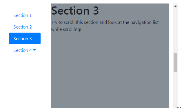
<body data-spy="scroll" data-target="#myScrollspy" data-offset="1">

<div class="container-fluid">
<div class="row">
<nav class="col-sm-3 col-4" id="myScrollspy">
<ul class="nav nav-pills flex-column">
<li class="nav-item">
<a class="nav-link active" href="#section1">Section 1</a>
</li>
<li class="nav-item">
<a class="nav-link" href="#section2">Section 2</a>
</li>
<li class="nav-item">
<a class="nav-link" href="#section3">Section 3</a>
</li>
<li class="nav-item dropdown">
<a class="nav-link dropdown-toggle" data-toggle="dropdown" href="#">Section 4</a>
<div class="dropdown-menu">
<a class="dropdown-item" href="#section41">Link 1</a>
<a class="dropdown-item" href="#section42">Link 2</a>
</div>
</li>
</ul>
</nav>
<div class="col-sm-9 col-8">
<div id="section1" class="bg-success">
<h1>Section 1</h1>
<p>Try to scroll this section and look at the navigation list while scrolling!</p>
</div>
<div id="section2" class="bg-warning">
<h1>Section 2</h1>
<p>Try to scroll this section and look at the navigation list while scrolling!</p>
</div>
<div id="section3" class="bg-secondary">
<h1>Section 3</h1>
<p>Try to scroll this section and look at the navigation list while scrolling!</p>
</div>
<div id="section41" class="bg-danger">
<h1>Section 4-1</h1>
<p>Try to scroll this section and look at the navigation list while scrolling!</p>
</div>
<div id="section42" class="bg-info">
<h1>Section 4-2</h1>
<p>Try to scroll this section and look at the navigation list while scrolling!</p>
</div>
</div>
</div>
</div>

</body>
效果展示
纵向使用了栅格系统,分别为导航栏和内容区划定了宽度。这里使用的是类.nav,而且为导航栏添加类.flex-column使之可以垂直排列。

相关文章推荐
- Bootstrap滚动监听(Scrollspy)插件
- Bootstrap插件(二)——滚动监听(scrollspy.js)
- Bootstrap 滚动监听插件Scrollspy 的选项
- Bootstrap 滚动监听插件Scrollspy 的方法
- Bootstrap 滚动监听插件Scrollspy 的事件
- 响应式前端框架Bootstrap系列(17)滚动监听(Scrollspy)插件
- Bootstrap的js插件之滚动监听(scrollspy)
- Bootstrap 下拉菜单和滚动监听(Scrollspy)插件
- Bootstrap滚动监听(Scrollspy)插件详解
- Bootstrap 滚动监听(Scrollspy)插件
- Bootstrap基础17——滚动监听scrollspy
- Bootstrap滚动监听组件scrollspy.js使用方法详解
- 第二百四十四节,Bootstrap下拉菜单和滚动监听插件
- 滚动监听: bootstrap 的scrollspy
- Bootstrap3.0学习第二十轮(JavaScript插件——滚动监听)
- Bootstrap 滚动监听Scrollspy 调用方式
- 【学习笔记】Bootstrap插件 滚动监听+弹出框+选项卡
- Bootstrap滚动监听插件
- BootStrap 滚动监听插件