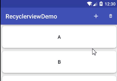
快速掌握 Recyclerview、SwipeRefreshLayout、Cardview
2018-01-11 11:54
98 查看
一、Recyclerview
1.简介
Recyclerview是Android 5.0新增的一个列表控件。顾名思义,recycler view,只负责回收和复用视图,高度的解耦,可灵活定制,轻松实现Listview、GridView、瀑布流的效果。优点:
item复用
把ViewHolder的实现封装起来,规范了ViewHolder,把item的view写入ViewHolder中,可以通过复用ViewHolder来实现view的复用
灵活、可定制化高、可拓展性高
显示方式:通过LayoutManager控制
item分割线:通过ItemDecoration控制
item动画:通过ItemAnimator控制
item点击事件:自定义
2.基本使用
1.添加依赖
compile 'com.android.support:recyclerview-v7:25.3.1'
2.xml引用
<?xml version="1.0" encoding="utf-8"?>
<LinearLayout
xmlns:android="http://schemas.android.com/apk/res/android"
xmlns:tools="http://schemas.android.com/tools"
android:layout_width="match_parent"
android:layout_height="match_parent"
tools:context="com.strivestay.viewdemo.MainActivity">

<android.support.v7.widget.RecyclerView
android:id="@+id/recycler_view"
android:layout_width="match_parent"
android:layout_height="match_parent">

</android.support.v7.widget.RecyclerView>

</LinearLayout>
3.创建item布局文件和适配器
<?xml version="1.0" encoding="utf-8"?>
<FrameLayout
xmlns:android="http://schemas.android.com/apk/res/android"
android:layout_width="match_parent"
android:layout_height="72dp"
android:orientation="vertical"
android:background="#44ff0000">

<TextView
android:id="@+id/tv"
android:layout_width="wrap_content"
android:layout_height="wrap_content"
android:textSize="16sp"
android:layout_gravity="center"/>
</FrameLayout>
package com.strivestay.viewdemo;

import android.content.Context;
import android.support.v7.widget.RecyclerView;
import android.view.LayoutInflater;
import android.view.View;
import android.view.ViewGroup;
import android.widget.TextView;

import java.util.List;

/**
* recyclerview适配器
*
* @author StriveStay
* @date 2017/12/8
*/
public class SimpleAdapter extends RecyclerView.Adapter<SimpleAdapter.ItemViewHolder> {
private List<String> mdatas;
private LayoutInflater mInflater;
private Context mContext;

public SimpleAdapter(Context context, List<String> data) {
this.mContext = context;
this.mInflater = LayoutInflater.from(context);
this.mdatas = data;
}

@Override
public ItemViewHolder onCreateViewHolder(ViewGroup parent, int viewType) {
View view = mInflater.inflate(R.layout.item_recycler, parent, false);
return new ItemViewHolder(view);
}

@Override
public void onBindViewHolder(ItemViewHolder holder, int position) {
holder.mTv.setText(mdatas.get(position));
}

@Override
public int getItemCount() {
return mdatas.size();
}

class ItemViewHolder extends RecyclerView.ViewHolder {
TextView mTv;

public ItemViewHolder(View itemView) {
super(itemView);
mTv = (TextView) itemView.findViewById(R.id.tv);
}
}
}
如果有多种类型的item,则我们继承时是这样的
RecyclerView.Adapter<RecyclerView.ViewHolder>,然后重写
getItemViewType()方法返回不同的item type,创建不同的viewholder,绑定不同的数据。
4.Recyclerview设置
private void initData() {
mDatas = new ArrayList<>();
for (int i = 'A'; i < 'z'; i++) {
mDatas.add(""+(char)i);
L.e(i+"=="+(char)i);
}
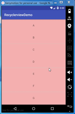
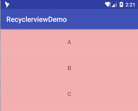
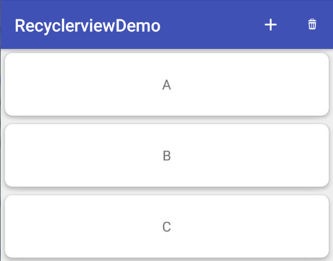
}// 获取recyclerview mRecyclerView = (RecyclerView) findViewById(R.id.recycler_view); // 创建布局管理器,实现listview效果 LinearLayoutManager linearLayoutManager = new LinearLayoutManager(this,LinearLayoutManager.VERTICAL,false); // 设置布局管理器 mRecyclerView.setLayoutManager(linearLayoutManager); // 确定item的大小是固定的,设置为true,recyclerview可以得到优化 mRecyclerView.setHasFixedSize(true); // 添加分割线 mRecyclerView.addItemDecoration(new DividerItemDecoration(this,DividerItemDecoration.VERTICAL)); // 适配器 mAdapter = new SimpleAdapter(this,mDatas); // 设置适配器 mRecyclerView.setAdapter(mAdapter);
3.LayoutManager 布局管理器
1.LinearLayoutManager
Listview效果,普通列表public LinearLayoutManager(@Nullable android.content.Context context,
int orientation,
boolean reverseLayout)
Parameters:
context: Current context, will be used to access resources.
orientation: Layout orientation. Should be HORIZONTAL or VERTICAL.
默认为VERTICAL
reverseLayout: When set to true, layouts from end to start.
默认false
使用示例
注意:数据源顺序是A-z
LinearLayoutManager linearLayoutManager = new LinearLayoutManager(this,LinearLayoutManager.VERTICAL,true);

LinearLayoutManager linearLayoutManager = new LinearLayoutManager(this,LinearLayoutManager.HORIZONTAL,false);

2.GridLayoutManager
Gridview效果,网格列表public GridLayoutManager(@Nullable android.content.Context context,
int spanCount,
int orientation,
boolean reverseLayout)
Parameters:
context: Current context, will be used to access resources.
spanCount: The number of columns or rows in the grid.
当orientaion == VERTICAL时,代表columns; orientaion == VERTICAL,代表rows
orientation: Layout orientation. Should be HORIZONTAL or VERTICAL.
默认VERTICAL
reverseLayout: When set to true, layouts from end to start.
默认false
使用示例
注意:数据源顺序是A-z
GridLayoutManager gridLayoutManager = new GridLayoutManager(this,4, OrientationHelper.VERTICAL,true);
GridLayoutManager gridLayoutManager = new GridLayoutManager(this,4, OrientationHelper.HORIZONTAL,false);

3.StaggeredGridLayoutManager
瀑布流public StaggeredGridLayoutManager(int spanCount,
int orientation)
Parameters:
spanCount: If orientation is vertical, spanCount is number of columns. If orientation is horizontal, spanCount is number of rows.
orientation: VERTICAL or HORIZONTAL
使用示例
横向瀑布流
1.item高度match_parent(填充满行高),宽度随机生成高度,为了区分item边界,加入margin
<?xml version="1.0" encoding="utf-8"?>
<FrameLayout
xmlns:android="http://schemas.android.com/apk/res/android"
android:layout_width="match_parent"
android:layout_height="match_parent"
android:background="#44ff0000"
android:layout_margin="3dp">
<TextView
android:id="@+id/tv"
android:layout_width="wrap_content"
android:layout_height="wrap_content"
android:textSize="16sp"
android:layout_gravity="center"/>
</FrameLayout>
@Override
public ItemViewHolder onCreateViewHolder(ViewGroup parent, int viewType) {
View view = mInflater.inflate(R.layout.item_recycler, parent, false);
view.getLayoutParams().width = new Random().nextInt(150) + 50;
return new ItemViewHolder(view);
}
2.使用StaggeredGridLayoutManager
StaggeredGridLayoutManager staggeredGridLayoutManager = new StaggeredGridLayoutManager(4,StaggeredGridLayoutManager.HORIZONTAL);

竖向瀑布流
1. item 宽度match_parent(占满列宽),高度随机生成,同样加margin
<?xml version="1.0" encoding="utf-8"?>
<FrameLayout
xmlns:android="http://schemas.android.com/apk/res/android"
android:layout_width="match_parent"
android:layout_height="match_parent"
android:background="#44ff0000"
android:layout_margin="3dp">
<TextView
android:id="@+id/tv"
android:layout_width="wrap_content"
android:layout_height="wrap_content"
android:textSize="16sp"
android:layout_gravity="center"/>
</FrameLayout>
@Override
public ItemViewHolder onCreateViewHolder(ViewGroup parent, int viewType) {
View view = mInflater.inflate(R.layout.item_recycler, parent, false);
view.getLayoutParams().height = new Random().nextInt(150) + 50;
return new ItemViewHolder(view);
}
2.使用StaggeredGridLayoutManager
StaggeredGridLayoutManager staggeredGridLayoutManager = new StaggeredGridLayoutManager(4,StaggeredGridLayoutManager.VERTICAL);
发现问题:
可以看到,当来回滑动时,瀑布流中的item的高度、位置都会发生变化,这是因为在onCreateViewHolder()中设置的item的高度,当来回滑动,item被回收复用时,重新走onCreateViewHolder(),又会重新生成高度,导致高度、位置变化。 真实项目中,这个问题不应该发生,列表中的数据是不变的,由数据生成的item高度也不会变化,位置就不会变化。
解决上面的问题,给每个item固定的高度。
1.Adapter构造中生成高度
public SimpleAdapter(Context context, List<String> data) {
this.mContext = context;
this.mInflater = LayoutInflater.from(context);
this.mdatas = data;

mHeights = new ArrayList<>();
for (int i = 0; i < mdatas.size(); i++) {
mHeights.add(new Random().nextInt(150) + 50);
}
2.设置高度
@Override
public void onBindViewHolder(ItemViewHolder holder, int position) {
holder.mTv.setText(mdatas.get(position));
holder.itemView.getLayoutParams().height = mHeights.get(position);
}
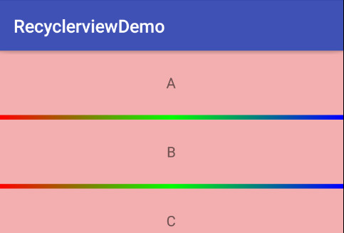
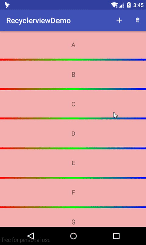
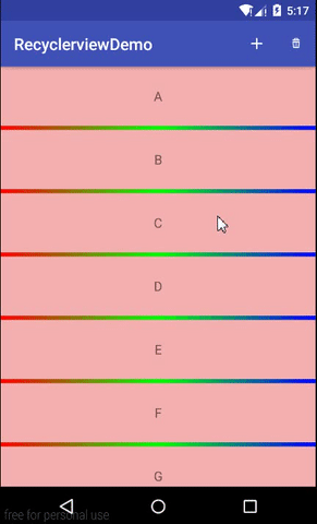
4.ItemDecoration
在基本使用中,我们看到有这样一行代码:添加分割线mRecyclerView.addItemDecoration(new DividerItemDecoration(this,DividerItemDecoration.VERTICAL));
DividerItemDecoration算是v7包中提供的一个分割线的示例吧,继承自 RecyclerView.ItemDecoration,在构造方法中读取系统属性
android:listDivider,获取到一个drawable对象,绘制出来,支持横向、竖向。
我们可以覆盖
android:listDivider属性,自定义drawable图片
<style name="AppTheme" parent="Theme.AppCompat.Light.DarkActionBar">
<item name="android:listDivider">@drawable/divider_recycler</item>
</style>
<?xml version="1.0" encoding="utf-8"?>
<shape xmlns:android="http://schemas.android.com/apk/res/android"
android:shape="rectangle">
<gradient
android:centerColor="#00ff00"
android:endColor="#0000ff"
android:startColor="#ff0000"
android:type="linear">
</gradient>
<size
android:height="5dp" android:width="5dp">
</size>
</shape>
我们也可以在item的布局文件中加入分隔线,或者使用margin来空出分隔线。
5.ItemAnimation
Recyclerview添加、删除时的动画效果,提供一个默认的动画效果DefaultItemAnimator。mRecyclerView.setItemAnimator(new DefaultItemAnimator());
@Override
public boolean onOptionsItemSelected(MenuItem item) {
switch (item.getItemId()){
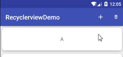
case R.id.menu_add:
mDatas.add(1,"新增条目");
mAdapter.notifyDataSetChanged(); // 没有动画效果
break;
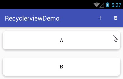
case R.id.menu_delete:
mDatas.remove(1);
mAdapter.notifyItemRemoved(1);
break;
}
return true;
}
可以看到,我们使用notifyDataSetChanged()这种全局刷新方法是没有动画效果的,使用notifyItemInserted、notifyItemRangeInserted、notifyItemRemoved这些局部刷新有动画效果的。
6. item点击事件
感觉最简单的方式就是在Adapter中的onBindViewholder()中设置,如下:@Override
public void onBindViewHolder(ItemViewHolder holder, final int position) {
holder.mTv.setText(mdatas.get(position));
// item点击事件
holder.itemView.setOnClickListener(new View.OnClickListener() {
@Override
public void onClick(View v) {
Toast.makeText(mContext, "点击了"+mdatas.get(position), Toast.LENGTH_SHORT).show();
}
});
// item长按事件
holder.itemView.setOnLongClickListener(new View.OnLongClickListener() {
@Override
public boolean onLongClick(View v) {
Toast.makeText(mContext, "长按了"+mdatas.get(position), Toast.LENGTH_SHORT).show();
return true;
}
});
}同样可以为item中的child view单独设置点击、长按事件。
二、SwipeRefreshLayout
1. 简介
SwipeRefreshLayout是v4包中提供的一个下拉刷新控件,继承自Viewgroup,只支持一个直接的child view,通常与recyclerview搭配使用。2. 基本使用
1.添加依赖(AS自动添加v7依赖,包含v4)
compile 'com.android.support:appcompat-v7:25.3.1'
2.xml引用
<android.support.v4.widget.SwipeRefreshLayout
android:id="@+id/swiperefresh_layout"
android:layout_width="match_parent"
android:layout_height="match_parent">

<android.support.v7.widget.RecyclerView
android:id="@+id/recycler_view"
android:layout_width="match_parent"
android:layout_height="match_parent">
</android.support.v7.widget.RecyclerView>

</android.support.v4.widget.SwipeRefreshLayout>
3.设置
private void initSwipeRefreshLayout() {
// 获取swiperefreshlayout
mSwipeRefreshLayout = (SwipeRefreshLayout) findViewById(R.id.swiperefresh_layout);
// 设置进度条颜色
mSwipeRefreshLayout.setColorSchemeResources(android.R.color.holo_blue_bright,
android.R.color.holo_green_light, android.R.color.holo_orange_light,
android.R.color.holo_red_light);
// 设置进度条背景色
mSwipeRefreshLayout.setProgressBackgroundColorSchemeResource(android.R.color.black);

// 刷新监听
mSwipeRefreshLayout.setOnRefreshListener(new SwipeRefreshLayout.OnRefreshListener() {
@Override
public void onRefresh() {
mDatas.add(1,"刷新");
mAdapter.notifyItemInserted(1);

mHandler.sendEmptyMessageDelayed(0,1000);

}
});
}
Handler mHandler=new Handler(){
@Override
public void handleMessage(Message msg) {
super.handleMessage(msg);
// 是否正在刷新
if(mSwipeRefreshLayout.isRefreshing()){
// 停止刷新
mSwipeRefreshLayout.setRefreshing(false);
}
}
};
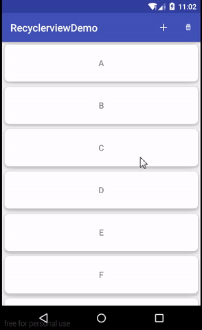
三、Cardview
1. 简介
Cardview,顾名思义,卡片式视图,是5.0提供的MD风格控件,继承自FrameLayout。2. 基本使用
1. 添加依赖
compile 'com.android.support:cardview-v7:25.3.1'
2. xml引用
<?xml version="1.0" encoding="utf-8"?>
<android.support.v7.widget.CardView
xmlns:android="http://schemas.android.com/apk/res/android"
xmlns:app="http://schemas.android.com/apk/res-auto"
android:layout_width="match_parent"
android:layout_height="72dp"
android:layout_margin="5dp"
app:cardBackgroundColor="#ffffff"
app:cardCornerRadius="8dp"
app:cardElevation="5dp">

<TextView
android:id="@+id/tv"
android:layout_width="wrap_content"
android:layout_height="wrap_content"
android:layout_gravity="center"
android:textSize="16sp"/>

</android.support.v7.widget.CardView>
3. 常用属性
| 属性 | 作用 |
|---|---|
| app:cardBackgroundColor | 背景颜色 |
| app:cardCornerRadius | 圆角大小 |
| app:cardElevation | Z轴阴影大小 |
| app:cardMaxElevation | Z轴最大高度值 |
| app:cardUseCompatPadding | 是否使用CompatPadding,V21+的版本和之前的版本仍旧具有一样的计算方式 |
| app:cardPreventCornerOverlap | 是否使用PreventCornerOverlap,在V20和之前的版本中添加内边距,这个属性为了防止内容和边角的重叠 |
| app:contentPadding | 内容的padding |
| app:contentPaddingLeft | 内容左padding |
| app:contentPaddingTop | 内容上padding |
| app:contentPaddingRight | 内容右padding |
| app:contentPaddingBottom | 内容下padding |
4. 点击水波纹效果
测试过,给android:background
app:cardBackgroundColor设置选择器都无效。
设置属性
android:foreground="?attr/selectableItemBackground"
5.0及以上有水波纹,5.0以下前景色改变
自定义前景色
1.在drawable中创建foreground_item.xml,兼容5.0以下
<?xml version="1.0" encoding="utf-8"?>
<selector xmlns:android="http://schemas.android.com/apk/res/android" >
<item android:drawable="@color/red" android:state_pressed="true" />
<item android:drawable="@android:color/transparent" />
</selector>
2.在drawable-v21中创建foreground_item.xml,用于5.0以上水波纹效果
<?xml version="1.0" encoding="utf-8"?>
<ripple
xmlns:android="http://schemas.android.com/apk/res/android"
android:color="#ff00ff"/>
GitHub示例:ViewDemo/RecyclerviewDemo

相关文章推荐
- RecyclerView被嵌套之后无法实现快速滚动
- 快速掌握 Toolbar、ActionMenuView
- Android学习笔记二十九之SwipeRefreshLayout、RecyclerView和CardView
- Android Studio - 第四十三期 RecyclerView存在大量Item时,当滚到底部时快速滑到顶部
- RecyclerView,SwipeRefreshLayout,CardView最新控件的使用
- RecyclerView存在大量Item时,当滚到底部时快速滑到顶部
- RecyclerView的快速滑动,导致程序崩溃
- 3.2.2 完全掌握在 Kotlin 中实现 RecyclerView
- Android RecyclerView 实现快速滑动
- 基于装饰者模式,重构RecyclerView快速适配
- 快速打造 RecyclerView 悬浮吸顶效果
- Android中快速入门RecyclerView
- RecyclerView实现瀑布流,快速滑动,侧滑删除,点击图片放大等效果
- Android RecyclerView 实现快速滚动的示例代码
- Android学习笔记二十九之SwipeRefreshLayout、RecyclerView和CardView
- Android快速开发控件---简单化的RecyclerView
- Android RecyclerView一键快速切换布局样式
- 在android studio中高效快速的搭建RecyclerView和ListView的布局
- Android RecyclerView 快速滑到顶部
- Android RecyclerView 快速滑到顶部