Android 几行代码实现 单选/多选 按钮组
2017-11-16 17:33
369 查看
源码地址:https://github.com/SiKang123/AndroidToolBox
主要功能实现:
TabView:
1、上、下、左、右 四种布局
2、指定icon的大小 和 文字的大小
3、指定选中状态的icon 和 未选中状态的icon
4、指定 选中的字体颜色 和 未选中的字体颜色
5、设置 图片 和文字间的间隔
TabGroup:
1、可使用LinearLayout(LinearGroup)、RelativeLayout(RelativeGroup) 两种方式的Group
2、使用OnTabSelectedListener 管理选中事件
3、可切换 单选/多选 模式
4、可合并多个Group 为一个 单选/多选组
5、自动管理TabView选中状态的还原
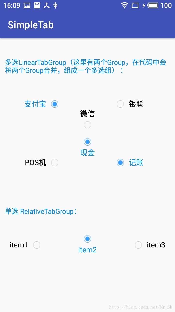
先看看效果图,和使用代码
集成方法:
在project的 bulid.gradle 下添加
在Module的 build.gradle 下添加
下面是一个 线性 布局,简单实现了 有三个item 的单选组,上面的图片是我传到github上demo的截图,有兴趣可以看看源码,很简单的两个View
使用方法:
在布局中使用 LinearTabGroup 或 RelativeTabGroup
Activity中:
主要功能实现:
TabView:
1、上、下、左、右 四种布局
2、指定icon的大小 和 文字的大小
3、指定选中状态的icon 和 未选中状态的icon
4、指定 选中的字体颜色 和 未选中的字体颜色
5、设置 图片 和文字间的间隔
TabGroup:
1、可使用LinearLayout(LinearGroup)、RelativeLayout(RelativeGroup) 两种方式的Group
2、使用OnTabSelectedListener 管理选中事件
3、可切换 单选/多选 模式
4、可合并多个Group 为一个 单选/多选组
5、自动管理TabView选中状态的还原
先看看效果图,和使用代码
集成方法:
在project的 bulid.gradle 下添加
allprojects {
repositories {
...
maven { url 'https://jitpack.io' }
}
}
在Module的 build.gradle 下添加
dependencies {
compile 'com.github.SiKang123:AndroidToolBox:1.0'
}
下面是一个 线性 布局,简单实现了 有三个item 的单选组,上面的图片是我传到github上demo的截图,有兴趣可以看看源码,很简单的两个View
使用方法:
在布局中使用 LinearTabGroup 或 RelativeTabGroup
<android.simple.toolbox.simple_tab.LinearTabGroup
android:id="@+id/tabGroup"
android:layout_width="match_parent"
android:layout_height="wrap_content"
android:orientation="horizontal"
app:maxSelect="1">

<android.simple.toolbox.simple_tab.TabView
android:layout_width="0dp"
android:layout_height="wrap_content"
android:layout_weight="1"
app:contentGravity="right|centerVertical"
app:drawableGravity="right"
app:drawableHeight="15dp"
app:drawablePadding="10dp"
app:drawableWidth="15dp"
app:normalColor="@color/black"
app:normalDrawable="@mipmap/unselected"
app:selected="true"
app:selectedColor="@color/blue"
app:selectedDrawable="@mipmap/selected"
app:tabText="支付宝"
app:textSize="15dp" />

<android.simple.toolbox.simple_tab.TabView
android:layout_width="0dp"
android:layout_height="wrap_content"
android:layout_weight="1"
app:contentGravity="bottom|centerHorizontal"
app:drawableGravity="bottom"
app:drawableHeight="15dp"
app:drawablePadding="10dp"
app:drawableWidth="15dp"
app:normalColor="@color/black"
app:normalDrawable="@mipmap/unselected"
app:selectedColor="@color/blue"
app:selectedDrawable="@mipmap/selected"
app:tabText="微信"
app:textSize="15sp" />

<android.simple.toolbox.simple_tab.TabView
android:layout_width="0dp"
android:layout_height="wrap_content"
android:layout_weight="1"
app:contentGravity="left|centerVertical"
app:drawableGravity="left"
app:drawableHeight="15dp"
app:drawablePadding="10dp"
app:drawableWidth="15dp"
app:normalColor="@color/black"
app:normalDrawable="@mipmap/unselected"
app:selectedColor="@color/blue"
app:selectedDrawable="@mipmap/selected"
app:tabText="银联"
app:textSize="15sp" />

</android.simple.toolbox.simple_tab.LinearTabGroup>
Activity中:
LinearTabGroup tabGroup= (RelativeTabGroup) this.findViewById(R.id.tabGroup);
// 也可以将多个group 合并到一个 group中
// tabGroup2 = (LinearTabGroup) this.findViewById(R.id.tabGroup2);
// tabGroup.addTabGroup(tabGroup2);

tabGroup.setOnTabSelectedListener(new TabGroup.OnTabSelectedListener() {
@Override
public void onTabSelected(TabView tab, int position, TabView[] tabs, TabGroup parent) {
Toast.makeText(MainActivity.this, "第" + (position + 1) + "个被选中", Toast.LENGTH_SHORT).show();
}

@Override
public void onTabCancle(TabView tab, int position, TabView[] tabs, TabGroup parent) {
//多选模式,取消时调用
Toast.makeText(MainActivity.this, "第" + (position + 1) + "个被取消", Toast.LENGTH_SHORT).show();
}
});
属性介绍
<attr name="maxSelect" format="integer" />

<declare-styleable name="LinearTabGroup">
<attr name="maxSelect" /> //最大可选数量(=1代表单选 >1代表多选)
</declare-styleable>

<declare-styleable name="RelativeTabGroup">
<attr name="maxSelect" /> //最大可选数量(=1代表单选 >1代表多选)
</declare-styleable>

<declare-styleable name="TabView">
<attr name="drawableGravity">   //布局方式
<enum name="left" value="0" />//图片在左
<enum name="top" value="1" />//图片在上
<enum name="right" value="2" />//图片在右
<enum name="bottom" value="3" />//图片在下
</attr>
<attr name="contentGravity">  //内容对齐方式
<flag name="left" value="0x03" />
<flag name="top" value="0x30" />
<flag name="right" value="0x05" />
<flag name="bottom" value="0x50" />
<flag name="center0x11" value="0x11" />
<flag name="centerHorizontal" value="0x01" />
<flag name="centerVertical" value="0x10" />
</attr>
<attr name="tabText" format="string" /> //显示文字
<attr name="selectedDrawable" format="reference" />//选中状态图片
<attr name="normalDrawable" format="reference" />//未选中状态图片
<attr name="selectedColor" format="reference" />//选中状态颜色
<attr name="normalColor" format="reference" />//未选中状态颜色
<attr name="textSize" format="dimension" />//文字大小
<attr name="drawableWidth" format="dimension" />//图片宽度
<attr name="drawableHeight" format="dimension" />//图片高度
<attr name="drawablePadding" format="dimension" />//图片文字间距
<attr name="onlyDrawable" format="boolean" />//仅显示图片
<attr name="onlyText" format="boolean" />//仅显示文字
<attr name="selected" format="boolean" />//默认选中
</declare-styleable>

相关文章推荐
- Android listview ExpandableListView实现多选,单选,全选,edittext实现批量输入的实例代码
- Android ExpandableListView单选以及多选实现代码
- Android实现单选与多选对话框的代码
- Android中ImageButton自定义按钮的按下效果的代码实现方法,附网上2种经典解决方法。
- 代码分析-DataGrid实现自增列、单选、多选
- 完美解决Android在listview添加checkbox实现单选多选操作问题
- 【原创】Android中ImageButton自定义按钮的按下效果的代码实现方法,附网上2种经典解决方法。
- JSP单选按钮验证、下拉框验证、复选框验证实现代码
- 完美解决Android在listview添加checkbox实现单选多选操作问题
- Android在listview添加checkbox实现单选多选操作问题
- 转载 :Android中ImageButton自定义按钮的按下效果的代码实现方法,附网上2种经典解决方法。
- Android在listview添加checkbox实现单选多选操作问题
- Android中ImageButton自定义按钮的按下效果的代码实现方法,附网上2种经典解决方法。
- android自定义ImageButton按钮的按下效果的代码实现
- 代码分析-DataGrid实现自增列、单选、多选
- Android中ImageButton自定义按钮的按下效果的代码实现方法,附网上2种经典解决方法。 .
- 代码分析-DataGrid实现自增列、单选、多选
- (android) 在GridView中实现单选或多选功能
- asp.net 自制的单选、多选列表实现代码
- 代码分析-DataGrid实现自增列、单选、多选