张高兴的 Xamarin.Forms 开发笔记:为 Android 与 iOS 引入 UWP 风格的汉堡菜单 ( MasterDetailPage )
2017-08-28 11:29
447 查看
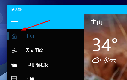
所谓 UWP 样式的汉堡菜单,我曾在“张高兴的 UWP 开发笔记:汉堡菜单进阶”里说过,也就是使用 Segoe MDL2 Assets 字体作为左侧 Icon,并且左侧使用填充颜色的矩形用来表示 ListView 的选中。如下图
但怎样通过 Xamarin.Forms ,将这一样式的汉堡菜单带入到 Android 与 iOS 中呢?
一、大纲-细节模式简介
讲代码前首先来说说这种导航模式,官方称“大纲-细节模式”(MasterDetail)。左侧的汉堡菜单称为“大纲”(Master),右侧的页面称为“细节”(Detail)。Xamarin.Froms 为项目提供了若干种导航模式,“大纲-细节”为其中一种。
二、项目简介
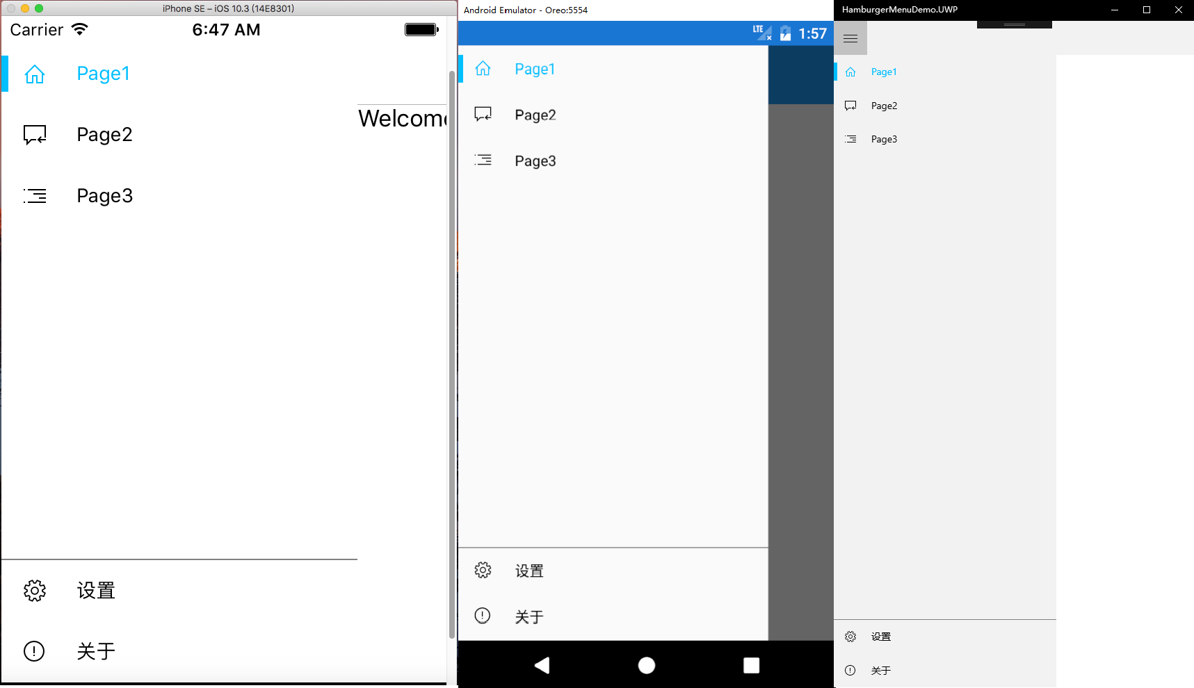
效果图:
不多说废话,看代码实在些。
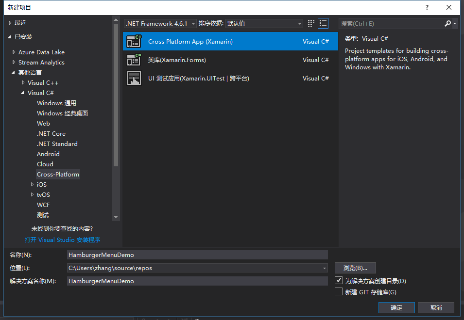
本示例是使用 Visual Studio 2017 创建的 Cross-Platform 项目,项目名为”HamburgerMenuDemo“,模板为空白项目。(GitHub:https://github.com/ZhangGaoxing/xamarin-forms-demo/tree/master/HamburgerMenuDemo)
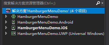
待项目创建完成后,解决方案共包含四个项目:共享代码项目、 Android 项目、 iOS 项目、 UWP 项目。共享代码项目为存放共享页面的地方,个人觉得和类库还是有点区别的。
三、共享代码项目 HamburgerMenuDemo
首先添加几个页面,根目录下添加一个 MasterPage.xaml 页面,用于”大纲视图“。添加一个 Views 文件夹,用于存放子页面,向其中添加3个界面:Page1、Page2、Page3。添加一个 MasterPageItem.cs 类。
1. MasterPageItem.cs
和 UWP 的汉堡菜单一样,首先要创建一个类,作为导航的项目,用来绑定 ListView 。名字叫 MasterPageItem.cs 。
里面的属性有页面的标题 Title,左侧的图标 Icon,图标的字体 FontFamily,目的页面 DestPage,还有左侧的矩形显示 Selected 与 颜色 Color。由于要实现双向绑定,还要实现接口 INotifyPropertyChanged。要注意的是,Color 类型为 Xamarin.Forms 中的。
代码如下
2. MasterPage.xaml
MasterPage 为”大纲“视图,即左侧显示 ListView 的页面。本项目的 MasterPage 分为两栏,分一级菜单与二级菜单,即置顶一个 ListView 与置底一个 ListView 。 ListView 的 ItemTemplate 与 UWP 稍有不同,左侧的填充矩形换成了 BoxView,二级菜单的上边线由 Border 换成了高度为1的 BoxView。代码如下
MasterPage.xaml.cs 代码也需要讲下,不知是怎么回事,以上 Xaml 代码直接运行时两个菜单会显示不正常,只显示一个菜单,<RowDefinition Height="Auto" /> 在这个 ContentPage 里好像无效。因此我在后台代码设置了二级菜单的高度,也就是48 * secondaryItems.Count。两个 ListView 需要通过属性的方式,向 MainPage 传递控件。字体路径各个项目不同,需要单独设置,我后面会说。MasterPage.xaml.cs
代码如下
3. MainPage.xaml
下面来修改一下 MainPage.xaml 。MainPage.xaml 为应用的入口页面,可在 App.xaml.cs 中更改。将 MainPage 中的根元素替换为 MasterDetailPage 。注释很详细,不多说了
同样的 MainPage.xaml.cs 中的代码也很简单,注释很详细
要注意的是 MasterPage.xaml 页面中的 Title 一定要给,要不然会报错,可以在后台 cs 文件中修改 Title 属性,也可以在 Xaml 根元素中修改 Title。Views 中的几个页面 Title 不给可以,但标题栏不会显示页面的 Title,不好看。
四、Android 项目 HamburgerMenuDemo.Android
1. 字体设置
将 segmdl2.ttf 字体文件直接放入 Assets 文件夹下即可
2. 修改 style.xml
”大纲“的默认效果是 DrawerLayout 覆盖状态栏的,不太美观,需要修改样式。在 style.xml 中添加
同时,由于修改了样式,变成了状态栏覆盖 DrawerLayout ,需要给 MasterPage.xaml 中的根 Grid 赋值一个 Padding="0,25,0,-6",但 UWP 项目却不需要,这点我会在文末给出代码。
五、iOS 项目 HamburgerMenuDemo.iOS
1. 字体设置
弄了好久,Xamarin 太坑了,plist 的编辑器很不和谐。。。
(1)将 segmdl2.ttf 字体文件直接放入 Resources 文件夹
(2)更改 segmdl2.ttf 属性,复制到输出目录 =》 始终复制,生成操作 =》 BundleResource
(2)不要双击,右击 Info.plist ,查看代码,添加如下内容
如果要添加其他的资源,可以自己新建一个 .plist 文件,新建的文件是正常显示资源列表的,添加完成后,复制代码到 Info.plist 即可。
2. Padding
和安卓一样,需要给 MasterPage.xaml 中的根 Grid 赋值一个 Padding="0,20,0,-6",我会在文末给出代码。
六、Padding 代码
在 MasterPage.xaml 添加如下代码
别忘了在 Grid 中引用资源
MasterPage.xaml 最终代码
但怎样通过 Xamarin.Forms ,将这一样式的汉堡菜单带入到 Android 与 iOS 中呢?
一、大纲-细节模式简介
讲代码前首先来说说这种导航模式,官方称“大纲-细节模式”(MasterDetail)。左侧的汉堡菜单称为“大纲”(Master),右侧的页面称为“细节”(Detail)。Xamarin.Froms 为项目提供了若干种导航模式,“大纲-细节”为其中一种。
二、项目简介
效果图:
不多说废话,看代码实在些。
本示例是使用 Visual Studio 2017 创建的 Cross-Platform 项目,项目名为”HamburgerMenuDemo“,模板为空白项目。(GitHub:https://github.com/ZhangGaoxing/xamarin-forms-demo/tree/master/HamburgerMenuDemo)
待项目创建完成后,解决方案共包含四个项目:共享代码项目、 Android 项目、 iOS 项目、 UWP 项目。共享代码项目为存放共享页面的地方,个人觉得和类库还是有点区别的。
三、共享代码项目 HamburgerMenuDemo
首先添加几个页面,根目录下添加一个 MasterPage.xaml 页面,用于”大纲视图“。添加一个 Views 文件夹,用于存放子页面,向其中添加3个界面:Page1、Page2、Page3。添加一个 MasterPageItem.cs 类。
1. MasterPageItem.cs
和 UWP 的汉堡菜单一样,首先要创建一个类,作为导航的项目,用来绑定 ListView 。名字叫 MasterPageItem.cs 。
里面的属性有页面的标题 Title,左侧的图标 Icon,图标的字体 FontFamily,目的页面 DestPage,还有左侧的矩形显示 Selected 与 颜色 Color。由于要实现双向绑定,还要实现接口 INotifyPropertyChanged。要注意的是,Color 类型为 Xamarin.Forms 中的。
代码如下
public class MasterPageItem : INotifyPropertyChanged
{
// 字体路径,用于引入 Segoe MDL2 Assets 字体
public string FontFamily { get; set; }

// 字体图标转义
public string Icon { get; set; }

// 标题
public string Title { get; set; }

// 目的页
public Type DestPage { get; set; }

// 用于显示左侧填充矩形,双向绑定
private bool selected = false;
public bool Selected
{
get { return selected; }
set
{
selected = value;
this.OnPropertyChanged("Selected");
}
}

// 选中颜色,双向绑定 ( using Xamarin.Forms )
private Color color = new Color();
public Color Color
{
get { return color; }
set
{
color = value;
this.OnPropertyChanged("Color");
}
}

public event PropertyChangedEventHandler PropertyChanged;

public void OnPropertyChanged(string propertyName)
{
PropertyChanged?.Invoke(this, new PropertyChangedEventArgs(propertyName));
}
}
2. MasterPage.xaml
MasterPage 为”大纲“视图,即左侧显示 ListView 的页面。本项目的 MasterPage 分为两栏,分一级菜单与二级菜单,即置顶一个 ListView 与置底一个 ListView 。 ListView 的 ItemTemplate 与 UWP 稍有不同,左侧的填充矩形换成了 BoxView,二级菜单的上边线由 Border 换成了高度为1的 BoxView。代码如下
<ContentPage xmlns="http://xamarin.com/schemas/2014/forms"
xmlns:x="http://schemas.microsoft.com/winfx/2009/xaml"
x:Class="HamburgerMenuDemo.MasterPage"
Icon="hamburger.png"
Title=" ">

<Grid>
<Grid.RowDefinitions>
<RowDefinition Height="*" />
<RowDefinition Height="1" />
<RowDefinition Height="Auto" />
</Grid.RowDefinitions>

<!--一级菜单-->
<ListView x:Name="PrimaryListView" VerticalOptions="StartAndExpand" SeparatorVisibility="None">
<ListView.ItemTemplate>
<DataTemplate>
<ViewCell>
<Grid HeightRequest="48">
<Grid.ColumnDefinitions>
<ColumnDefinition Width="48"/>
<ColumnDefinition Width="*" />
</Grid.ColumnDefinitions>

<BoxView BackgroundColor="{Binding Color}" WidthRequest="5" HeightRequest="26" HorizontalOptions="Start" VerticalOptions="Center" IsVisible="{Binding Selected}" />
<Label Text="{Binding Icon}" FontFamily="{Binding FontFamily}" TextColor="{Binding Color}" FontSize="16" HorizontalOptions="Center" VerticalOptions="Center" />
<Label Grid.Column="1" Text="{Binding Title}" TextColor="{Binding Color}" FontSize="14" VerticalOptions="Center" />
</Grid>
</ViewCell>
</DataTemplate>
</ListView.ItemTemplate>
</ListView>

<!--BoxView 充当 Border-->
<BoxView BackgroundColor="Gray" Grid.Row="1" HorizontalOptions="FillAndExpand" />

<!--二级菜单-->
<ListView x:Name="SecondaryListView" Grid.Row="2" VerticalOptions="End" SeparatorVisibility="None" Margin="0,-6,0,0">
<ListView.ItemTemplate>
<DataTemplate>
<ViewCell>
<Grid HeightRequest="48">
<Grid.ColumnDefinitions>
<ColumnDefinition Width="48"/>
<ColumnDefinition Width="*" />
</Grid.ColumnDefinitions>

<BoxView BackgroundColor="{Binding Color}" WidthRequest="5" HeightRequest="26" HorizontalOptions="Start" VerticalOptions="Center" IsVisible="{Binding Selected}" />
<Label x:Name="IconLabel" Text="{Binding Icon}" FontFamily="{Binding FontFamily}" TextColor="{Binding Color}" FontSize="16" HorizontalOptions="Center" VerticalOptions="Center" />
<Label Grid.Column="1" Text="{Binding Title}" TextColor="{Binding Color}" FontSize="14" VerticalOptions="Center" />
</Grid>
</ViewCell>
</DataTemplate>
</ListView.ItemTemplate>
</ListView>
</Grid>
</ContentPage>
MasterPage.xaml.cs 代码也需要讲下,不知是怎么回事,以上 Xaml 代码直接运行时两个菜单会显示不正常,只显示一个菜单,<RowDefinition Height="Auto" /> 在这个 ContentPage 里好像无效。因此我在后台代码设置了二级菜单的高度,也就是48 * secondaryItems.Count。两个 ListView 需要通过属性的方式,向 MainPage 传递控件。字体路径各个项目不同,需要单独设置,我后面会说。MasterPage.xaml.cs
代码如下
[XamlCompilation(XamlCompilationOptions.Compile)]
public partial class MasterPage : ContentPage
{
// 向 MainPage 传递控件
public ListView primaryListView { get { return PrimaryListView; } }
public ListView secondaryListView { get { return SecondaryListView; } }

public MasterPage()
{
InitializeComponent();

// 设置不同平台的字体路径
string fontFamily;
switch (Device.RuntimePlatform)
{
case "Android":
fontFamily = "segmdl2.ttf#Segoe MDL2 Assets";
break;

case "iOS":
fontFamily = "Segoe MDL2 Assets";
break;

case "Windows":
fontFamily = "/Assets/segmdl2.ttf#Segoe MDL2 Assets";
break;

case "WinPhone":
fontFamily = "/Assets/segmdl2.ttf#Segoe MDL2 Assets";
break;

default:
fontFamily = "segmdl2.ttf#Segoe MDL2 Assets";
break;
}

// 列表项
var primaryItems = new List<MasterPageItem>() {
new MasterPageItem
{
Title = "Page1",
FontFamily = fontFamily,
Icon = "\xE10F",
Color = Color.DeepSkyBlue,
Selected = true,
DestPage = typeof(Page1)
},
new MasterPageItem
{
Title = "Page2",
FontFamily = fontFamily,
Icon = "\xE11F",
Color = Color.Black,
Selected = false,
DestPage = typeof(Page2)
},
new MasterPageItem
{
Title = "Page3",
FontFamily = fontFamily,
Icon = "\xE12F",
Color = Color.Black,
Selected = false,
DestPage = typeof(Page2)
}
};

var secondaryItems = new List<MasterPageItem>() {
new MasterPageItem
{
Title = "设置",
FontFamily = fontFamily,
Icon = "\xE713",
Color = Color.Black,
Selected = false,
DestPage = typeof(SettingPage)
},
new MasterPageItem
{
Title = "关于",
FontFamily = fontFamily,
Icon = "\xE783",
Color = Color.Black,
Selected = false,
DestPage = typeof(AboutPage)
}
};

// ListView 数据绑定
PrimaryListView.ItemsSource = primaryItems;
SecondaryListView.ItemsSource = secondaryItems;

// 设置二级菜单高度
SecondaryListView.HeightRequest = 48 * secondaryItems.Count;
}
}
3. MainPage.xaml
下面来修改一下 MainPage.xaml 。MainPage.xaml 为应用的入口页面,可在 App.xaml.cs 中更改。将 MainPage 中的根元素替换为 MasterDetailPage 。注释很详细,不多说了
<MasterDetailPage xmlns="http://xamarin.com/schemas/2014/forms"
xmlns:x="http://schemas.microsoft.com/winfx/2009/xaml"
xmlns:local="clr-namespace:HamburgerMenuDemo"
x:Class="HamburgerMenuDemo.MainPage"
xmlns:views="clr-namespace:HamburgerMenuDemo.Views">

<!--大纲视图-->
<MasterDetailPage.Master>
<!--引入 MasterPage 并给个名称,用于后台设置 MasterPage 传递过来的 ListView-->
<local:MasterPage x:Name="masterPage" />
</MasterDetailPage.Master>

<!--细节视图-->
<MasterDetailPage.Detail>
<NavigationPage>
<x:Arguments>
<!--默认显示的页面-->
<views:Page1 />
</x:Arguments>
</NavigationPage>
</MasterDetailPage.Detail>

</MasterDetailPage>
同样的 MainPage.xaml.cs 中的代码也很简单,注释很详细
public MainPage()
{
InitializeComponent();

// ListView 点击事件
masterPage.primaryListView.ItemSelected += MasterPageItemSelected;
masterPage.secondaryListView.ItemSelected += MasterPageItemSelected;

// 设置 Windows 平台的“大纲”显示模式为折叠
if (Device.RuntimePlatform == Device.Windows)
{
MasterBehavior = MasterBehavior.Popover;
}
}

private void MasterPageItemSelected(object sender, SelectedItemChangedEventArgs e)
{
var item = e.SelectedItem as MasterPageItem;

if (item != null)
{
// 遍历 ListView 数据源,将选中项矩形显示,字体颜色设置成未选中
foreach (MasterPageItem mpi in masterPage.primaryListView.ItemsSource)
{
mpi.Selected = false;
mpi.Color = Color.Black;
}
foreach (MasterPageItem mpi in masterPage.secondaryListView.ItemsSource)
{
mpi.Selected = false;
mpi.Color = Color.Black;
}

// 设置选中项
item.Selected = true;
item.Color = Color.DeepSkyBlue;

// 跳转
Detail = new NavigationPage((Page)Activator.CreateInstance(item.DestPage));

// 取消 ListView 默认选中样式
masterPage.primaryListView.SelectedItem = null;
masterPage.secondaryListView.SelectedItem = null;

// 关闭“大纲”
IsPresented = false;
}
}
要注意的是 MasterPage.xaml 页面中的 Title 一定要给,要不然会报错,可以在后台 cs 文件中修改 Title 属性,也可以在 Xaml 根元素中修改 Title。Views 中的几个页面 Title 不给可以,但标题栏不会显示页面的 Title,不好看。
四、Android 项目 HamburgerMenuDemo.Android
1. 字体设置
将 segmdl2.ttf 字体文件直接放入 Assets 文件夹下即可
2. 修改 style.xml
”大纲“的默认效果是 DrawerLayout 覆盖状态栏的,不太美观,需要修改样式。在 style.xml 中添加
<item name="android:fitsSystemWindows">true</item>
同时,由于修改了样式,变成了状态栏覆盖 DrawerLayout ,需要给 MasterPage.xaml 中的根 Grid 赋值一个 Padding="0,25,0,-6",但 UWP 项目却不需要,这点我会在文末给出代码。
五、iOS 项目 HamburgerMenuDemo.iOS
1. 字体设置
弄了好久,Xamarin 太坑了,plist 的编辑器很不和谐。。。
(1)将 segmdl2.ttf 字体文件直接放入 Resources 文件夹
(2)更改 segmdl2.ttf 属性,复制到输出目录 =》 始终复制,生成操作 =》 BundleResource
(2)不要双击,右击 Info.plist ,查看代码,添加如下内容
<dict>
<key>UIAppFonts</key>
<array>
<string>segmdl2.ttf</string>
</array>
</dict>
如果要添加其他的资源,可以自己新建一个 .plist 文件,新建的文件是正常显示资源列表的,添加完成后,复制代码到 Info.plist 即可。
2. Padding
和安卓一样,需要给 MasterPage.xaml 中的根 Grid 赋值一个 Padding="0,20,0,-6",我会在文末给出代码。
六、Padding 代码
在 MasterPage.xaml 添加如下代码
<!--安卓空出状态栏的宽度-->
<ContentPage.Resources>
<ResourceDictionary>
<OnPlatform x:Key="padding"
x:TypeArguments="Thickness"
iOS="0,20,0,-6"
Android="0,25,0,-6"
WinPhone="0" />
</ResourceDictionary>
</ContentPage.Resources>
别忘了在 Grid 中引用资源
Padding="{StaticResource padding}"MasterPage.xaml 最终代码
<ContentPage xmlns="http://xamarin.com/schemas/2014/forms"
xmlns:x="http://schemas.microsoft.com/winfx/2009/xaml"
x:Class="HamburgerMenuDemo.MasterPage"
Icon="hamburger.png"
Title=" ">

<!--安卓空出状态栏的宽度-->
<ContentPage.Resources>
<ResourceDictionary>
<OnPlatform x:Key="padding"
x:TypeArguments="Thickness"
iOS="0,20,0,0"
Android="0,20,0,0"
WinPhone="0" />
</ResourceDictionary>
</ContentPage.Resources>

<Grid Padding="{StaticResource padding}">
<Grid.RowDefinitions>
<RowDefinition Height="*" />
<RowDefinition Height="1" />
<RowDefinition Height="Auto" />
</Grid.RowDefinitions>

<!--一级菜单-->
<ListView x:Name="PrimaryListView" VerticalOptions="StartAndExpand" SeparatorVisibility="None">
<ListView.ItemTemplate>
<DataTemplate>
<ViewCell>
<Grid HeightRequest="48">
<Grid.ColumnDefinitions>
<ColumnDefinition Width="48"/>
<ColumnDefinition Width="*" />
</Grid.ColumnDefinitions>

<BoxView BackgroundColor="{Binding Color}" WidthRequest="5" HeightRequest="26" HorizontalOptions="Start" VerticalOptions="Center" IsVisible="{Binding Selected}" />
<Label Text="{Binding Icon}" FontFamily="{Binding FontFamily}" TextColor="{Binding Color}" FontSize="16" HorizontalOptions="Center" VerticalOptions="Center" />
<Label Grid.Column="1" Text="{Binding Title}" TextColor="{Binding Color}" FontSize="14" VerticalOptions="Center" />
</Grid>
</ViewCell>
</DataTemplate>
</ListView.ItemTemplate>
</ListView>

<!--BoxView 充当 Border-->
<BoxView BackgroundColor="Gray" Grid.Row="1" HorizontalOptions="FillAndExpand" />

<!--二级菜单-->
<ListView x:Name="SecondaryListView" Grid.Row="2" VerticalOptions="End" SeparatorVisibility="None" Margin="0,-6,0,0">
<ListView.ItemTemplate>
<DataTemplate>
<ViewCell>
<Grid HeightRequest="48">
<Grid.ColumnDefinitions>
<ColumnDefinition Width="48"/>
<ColumnDefinition Width="*" />
</Grid.ColumnDefinitions>

<BoxView BackgroundColor="{Binding Color}" WidthRequest="5" HeightRequest="26" HorizontalOptions="Start" VerticalOptions="Center" IsVisible="{Binding Selected}" />
<Label x:Name="IconLabel" Text="{Binding Icon}" FontFamily="{Binding FontFamily}" TextColor="{Binding Color}" FontSize="16" HorizontalOptions="Center" VerticalOptions="Center" />
<Label Grid.Column="1" Text="{Binding Title}" TextColor="{Binding Color}" FontSize="14" VerticalOptions="Center" />
</Grid>
</ViewCell>
</DataTemplate>
</ListView.ItemTemplate>
</ListView>
</Grid>
</ContentPage>
相关文章推荐
- 张高兴的 Xamarin.Forms 开发笔记:为 Android 与 iOS 引入 UWP 风格的汉堡菜单 ( MasterDetailPage )
- 张高兴的 Xamarin.Forms 开发笔记:为 Android 与 iOS 引入 UWP 风格的汉堡菜单 ( MasterDetailPage )
- 张高兴的 Xamarin.Forms 开发笔记:Android 快捷方式 Shortcut 应用
- 张高兴的 Xamarin.Forms 开发笔记:TapGestureRecognizer 的简单介绍与应用
- 使用jQuery开发iOS风格的页面导航菜单
- Xamarin向iOS和Android引入C# Async支持
- 让您可以用C# 开发出iOS 和Android 的Xamarin 开发套件- 第一次启动Android
- Xamarin Mono For Android 4.6.07004 完整离线安装破解版(C#开发Android、IOS工具)
- Android的Master/Detail风格界面中实现自定义ListView的单选
- Xamarin Mono For Android 4.6.07004 完整离线安装破解版(C#开发Android、IOS工具)
- Visual Studio 跨平台开发实战--- Hello Xamarin! [Visual Studio + C# + Xamarin = iOS/Android/Windows Apps ]
- Android应用开发学习笔记之菜单
- Xamarin Mono For Android 4.6.07004 完整离线安装破解版(C#开发Android、IOS工具)
- Android开发学习笔记:浅谈3大类菜单
- [转]Xamarin-Visual Studio开发iOS、Android应用
- 让您可以用C# 开发出iOS 和Android 的Xamarin 开发套件- 第一次启动Android
- Sharepoint学习笔记—Site Definition系列--8、如何在Site Definition中引入Master Page (2、Css等资源的引入)
- IOS开发 Tableview长按弹出菜单,类似android的popwindow
- Xamarin Mono For Android 4.8.00013 完整离线安装破解版(C#开发Android、IOS工具)
- 使用jQuery开发iOS风格的页面导航菜单