精通CSS 第五章 立体按钮
2017-08-09 09:35
288 查看
有效的链接变化
简单按钮
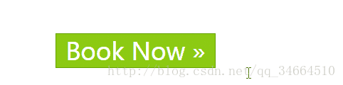
纯图片按钮

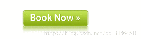
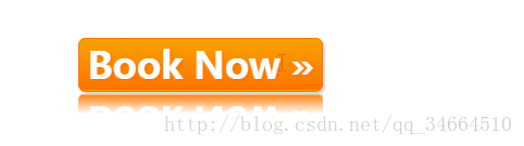
大图片background-position做按钮
纯css做按钮
a:link,a:visited{color:red;}
a:hover,a:focus,a:active{color:blue;}
//顺序调换不起作用
简单按钮
<style>
p{margin: 5em;}
a{ font-size: 30px;font-weight: 500;}
a.button{
display: block;
width: 6.6em;
line-height: 1.4;
color: #ffffff;
text-decoration: none;
text-align: center;
/*初始状态*/
border: 1px solid #66a300;
background-color: #8cca12;
}
/*鼠标浮动*/
a.button:hover{
background-color: #f7a300;
border-color: #ff7400;
}
/*激活*/
a.button:active{
background-color: #a7a7a7;
border-color: #868686;
}
</style>
</head>
<body>
<p><a href="#" class="button">Book Now »</a></p>
</body>
纯图片按钮
<style>
p{margin: 5em;}
a{ font-size: 30px;font-weight: 500;}
a.button{
display: block;
width: 202px;/*根据图片尺寸*/
height: 72px;
background: url("button.png");
}
/*鼠标浮动*/
a.button:hover{
background-image: url("button-over.png");
}
/*激活*/
a.button:active{
background-image: url("button-active.png");
}
</style>
</head>
<body>
<p><a href="#" class="button"></a></p>
</body>
大图片background-position做按钮
<style>
p{margin: 5em;}
a{ font-size: 30px;font-weight: 500;}
a.button{
display: block;
width: 203px;/*根据图片尺寸*/
height: 72px;
background:url("buttons.png") -203px 0 no-repeat;
/*取大图片-203px位置 */
}
/*鼠标浮动*/
a.button:hover{
background-position: right top;
}
/*激活*/
a.button:active{
background-position: left top;
}
</style>
</head>
<body>
<p><a href="#" class="button"></a></p>
</body>
纯css做按钮
<style>
p{margin: 5em;}
a{ font-size: 30px;font-weight: 500;}
a.button{
display: block;
width: 6.6em;
height: 1.4em;
line-height: 1.4;
text-align: center;
text-decoration: none;
font-weight: 600;
border: 1px solid #66a300;
color: white;
background-color: #8cca12;
/*描绘最初效果*/
-webkit-border-radius: 6px;/*圆角*/
-webkit-text-shadow: 2px 2px 2px #66a300;/*文字阴影*/
-webkit-box-shadow: 2px 2px 2px #ccc;/*按钮阴影*/
/*过渡*/
background-image: -webkit-gradient(linear,left top,left bottom,
from(#abe142),to(#67a400));
/*翻转*/
-webkit-box-reflect: below 2px -webkit-gradient(linear, left top,
left bottom, from(transparent), color-stop(0.62, transparent), to(white));

}
/*鼠标浮动*/
a.button:hover{
background-color: #f7a300;
text-shadow: 2px 2px 2px #ff7400;
border-color: #ff7400;
background-image: -webkit-gradient(linear, left top, left bottom,
from(#f7a300), to(#ff7400));
}
/*激活*/
a.button:active{
background-color: #a7a7a7;
text-shadow: 2px 2px 2px #868686;
border-color: #868686;
background-image: -webkit-gradient(linear, left top, left bottom,
from(#a7a7a7), to(#868686));
}
</style>
</head>
<body>
<p><a href="#" class="button">Book Now »</a></p>
</body>

相关文章推荐
- 鼠标浮动过按钮实现立体按钮的效果哦,不需要用JS~~~纯CSS
- 《精通CSS高级WEB标准解决方案》第五章、对列表应用样式和创建导航条
- 纯CSS模拟带有立体效果的圆角按钮,长度自适应,兼容所有浏览器,无CSS Hack!
- 精通CSS+DIV简单小结(一)
- BootStrap--CSS组件--按钮下拉菜单
- 20个学习CSS的绝佳网站——让你从入门到精通
- 读书笔记--精通CSS高级Web标准解决方案(一)---CSS基础
- 用CSS实现的一张图完成的按钮效果
- CSS 美化表格边框为凹陷立体效果的实现方法
- css按钮渐变色
- 精通css 高级web标准解决方案——可视化格式模型-定位模型
- 纯CSS实现的漂亮的立体图片边框效果,阴影代码
- [精通WindowsSocket网络开发-基于VC++实现]第五章——非阻塞模式开发
- 《精通CSS+DIV》学习笔
- css input[type=file] 样式美化,input上传按钮美化
- 炫酷CSS超链接按钮一
- 精通 CSS+DIV 网页样式与布局 133
- 精通 CSS+DIV 网页样式与布局 153
- 精通 CSS+DIV 网页样式与布局 170
- css去掉iPhone、iPad默认按钮样式