前端(各种demo)一:css实现三角形,css实现梯形,pop弹层,css伪类before,after使用,svg使用(持续更新中)
2017-07-26 23:59
1006 查看
各种demo:
1、css实现正方形
思路:width为0;height为0;使用boder-width为正方形的边长的一半,不占任何字节;border-style为固体;border-color为正方形的填充色。
图形


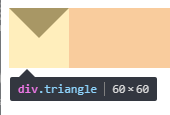
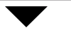
2、css实现三角形
思路:宽度width为0;height为0;border-width为直角三角形斜边的一半;border-color里有四个颜色属性,第一个为上--直角三角形内充填充色,第二个为右--直角三角形内填充色,第三个为下--直角三角形内填充色,第四个为左--直角三角形内填充色。
代码:
图形
代码:
图形

代码:
图形

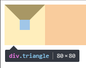
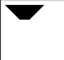
3、css实现正方形外梯形
思路:还是之前的思路,width为20;高度为20;梯形的短底边为div的width;梯形的长边=width+border-width*2;
代码:
图形:
代码:
图形:
4、css实现pop弹层
思路:利用两个三角形进行拼接,一个是背景色,一个是边框色,然后利用定位重叠在一起,定位要相差一个像素。
代码:
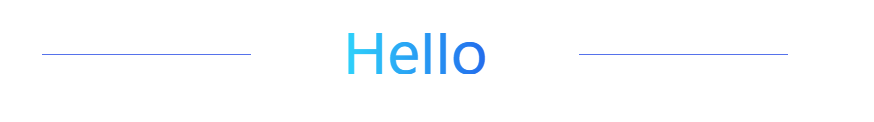
5、css实现字体渐变色
5.1使用gradient属性
存在的不足:IE浏览器都不支持。
5.2使用svg,支持IE9以及以上
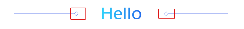
6、css实现一条线
思路:使用span标签,不占文档流,使用背景色background是线条颜色,定位使用position=absolute也是脱离原先的文档流,最主要的是设置高度height为1px,设置使用top来定位,以及宽度来限制线的长度。
7、css使用伪类after实现旋转正方形
思路:在span使用伪类after,第一步设置content为"";第二步增加一个width和height相同的值;第三步使用border边框设定正方形颜色;第四步以及旋转transform等于rotateZ(45deg),设置兼容到webkit,moz,ms浏览器内核;使用position的absolute脱离原先的文档流;使用top来进行定位。
代码:
1、css实现正方形
思路:width为0;height为0;使用boder-width为正方形的边长的一半,不占任何字节;border-style为固体;border-color为正方形的填充色。
<!DOCTYPE html>
<html>
<head>
<meta charset="UTF-8">
<title></title>
<style type="text/css">
.triangle{
width: 0;
height: 0;
border-width: 30px;
border-style: solid;
border-color:#e66161;
}
</style>
</head>
<body>
<div class="triangle"></div>
</body>
</html>
图形
2、css实现三角形
思路:宽度width为0;height为0;border-width为直角三角形斜边的一半;border-color里有四个颜色属性,第一个为上--直角三角形内充填充色,第二个为右--直角三角形内填充色,第三个为下--直角三角形内填充色,第四个为左--直角三角形内填充色。
代码:
<!DOCTYPE html>
<html>
<head>
<meta charset="UTF-8">
<title></title>
<style type="text/css">
.triangle{
width: 0;
height: 0;
border-width: 30px;
border-style: solid;
border-color: #000000 transparent transparent transparent;
}
</style>
</head>
<body>
<div class="triangle"></div>
</body>
</html>
图形
代码:
.triangle{
width: 0;
height: 0;
border-width: 30px;
border-style: solid;
border-color: #000000 #000000 transparent transparent;
}
图形
代码:
.triangle{
width: 0;
height: 0;
border-width: 30px;
border-style: solid;
border-color: #000000 #f50303 transparent transparent;
}
图形
3、css实现正方形外梯形
思路:还是之前的思路,width为20;高度为20;梯形的短底边为div的width;梯形的长边=width+border-width*2;
代码:
<!DOCTYPE html>
<html>
<head>
<meta charset="UTF-8">
<title></title>
<style type="text/css">
.triangle{
width: 20px;
height: 20px;
border-width:30px;
border-style: solid;
border-color: #000000 transparent transparent transparent;
}
</style>
</head>
<body>
<div class="triangle"></div>
</body>
</html>
图形:
代码:
.triangle{
width: 0;
height: 0;
border-width: 30px;
border-style: solid;
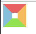
border-color:#e66161 #f3bb5b #94e24f #85bfda;
}图形:
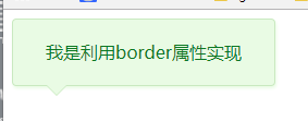
4、css实现pop弹层
思路:利用两个三角形进行拼接,一个是背景色,一个是边框色,然后利用定位重叠在一起,定位要相差一个像素。
代码:
<!DOCTYPE html>
<html>
<head>
<meta charset="UTF-8">
<title></title>
<style type="text/css">
.box{
position: relative;
width: 240px;
height: 60px;
line-height: 60px;
background: #e9fbe4;
box-shadow: 1px 2px 3px #e9fbe4;
border: 1px solid #c9e9c0;
border-radius: 4px;
text-align: center;
color: #0c7823;
}
.triangle-border{
width: 0;
height: 0;
border-width: 10px;
border-style: solid;
position: absolute;
left: 30px;
overflow: hidden;
}
.border{
bottom:-20px;
border-color: #C9E9C0 transparent transparent transparent;
}
.background{
bottom: -19px;
border-color: #E9FBE4 transparent transparent transparent;
}
</style>
</head>
<body>
<div class="box">
<span>我是利用border属性实现</span>
<div class="triangle-border border"></div>
<div class="triangle-border background"></div>
</div>
</body>
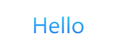
</html>5、css实现字体渐变色
5.1使用gradient属性
存在的不足:IE浏览器都不支持。
<!DOCTYPE html>
<html>
<head>
<meta charset="utf-8" />
<title></title>
<style type="text/css">
.promotion-floor-title {
text-align: center;
margin: 60px auto 40px;
}
.promotion-floor-title .title p {
display: inline-block;
text-align: center;
font-size: 42px;
background-image: -webkit-gradient(linear, 0 0, 0 bottom, from(#2ED4FB), to(#236BEC));
-webkit-background-clip: text;
-webkit-text-fill-color: transparent;
}
</style>
</head>
<body>
<div class="promotion-floor-title">
<div class="title">
<p>Hello</p>
</div>
</div>
</body>
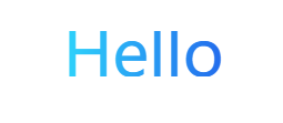
</html>5.2使用svg,支持IE9以及以上
<!DOCTYPE html>
<html>

<head>
<meta charset="utf-8" />
<title></title>
<style type="text/css">
.promotion-floor-title {
text-align: center;
margin: 60px auto 40px;
}

.promotion-floor-title .title {
min-width: 590px;
height: 41px;
display: inline-block;
position: relative;
}

.promotion-floor-title .title svg {
margin: 0 223px;
height: 41px;
}
</style>
</head>

<body>
<div class="promotion-floor-title">
<div class="title">
<svg xmlns="http://www.w3.org/2000/svg" version="1.1">
<linearGradient id="grad1" x1="0%" y1="0%" x2="100%" y2="0%">
<stop offset="0%" style="stop-color:#2ED4FB;stop-opacity:1" />
<stop offset="100%" style="stop-color:#236BEC;stop-opacity:1" />
</linearGradient>
<text text-anchor="middle" x="50%" y="50%" dy=".36em" class="text" font-size="3.6rem" fill="url(#grad1)">Hello</text>
</svg>
</div>
</div>
</body>

</html>
6、css实现一条线
思路:使用span标签,不占文档流,使用背景色background是线条颜色,定位使用position=absolute也是脱离原先的文档流,最主要的是设置高度height为1px,设置使用top来定位,以及宽度来限制线的长度。
<!DOCTYPE html>
<html>

<head>
<meta charset="utf-8" />
<title></title>
<style type="text/css">
.promotion-floor-title {
text-align: center;
margin: 60px auto 40px;
}

.promotion-floor-title .title {
min-width: 590px;
height: 41px;
display: inline-block;
position: relative;
}

.promotion-floor-title .title svg {
margin: 0 223px;
height: 41px;
}

.promotion-floor-title .title span {
background: #5672EB;
position: absolute;
height: 1px;
width: 28%;
top: 50%;
}

.promotion-floor-title .title .left-line {
left: 0;
}

.promotion-floor-title .title .right-line {
right: 0;
}

</style>
</head>

<body>
<div class="promotion-floor-title">
<div class="title">
<svg xmlns="http://www.w3.org/2000/svg" version="1.1">
<linearGradient id="grad1" x1="0%" y1="0%" x2="100%" y2="0%">
<stop offset="0%" style="stop-color:#2ED4FB;stop-opacity:1" />
<stop offset="100%" style="stop-color:#236BEC;stop-opacity:1" />
</linearGradient>
<text text-anchor="middle" x="50%" y="50%" dy=".36em" class="text" font-size="3.6rem" fill="url(#grad1)">Hello</text>
</svg>
<span class="left-line"></span>
<span class="right-line"></span>
</div>
</div>
</body>

</html>
7、css使用伪类after实现旋转正方形
思路:在span使用伪类after,第一步设置content为"";第二步增加一个width和height相同的值;第三步使用border边框设定正方形颜色;第四步以及旋转transform等于rotateZ(45deg),设置兼容到webkit,moz,ms浏览器内核;使用position的absolute脱离原先的文档流;使用top来进行定位。
代码:
<!DOCTYPE html>
<html>

<head>
<meta charset="utf-8" />
<title></title>
<style type="text/css">
.promotion-floor-title {
text-align: center;
margin: 60px auto 40px;
}

.promotion-floor-title .title {
min-width: 590px;
height: 41px;
display: inline-block;
position: relative;
}

.promotion-floor-title .title svg {
margin: 0 223px;
height: 41px;
}

.promotion-floor-title .title span {
background: #5672EB;
position: absolute;
height: 1px;
width: 28%;
top: 50%;
}

.promotion-floor-title .title span:after {
content: "";
position: absolute;
top: -5px;
height: 9px;
width: 9px;
border: 1px solid #5672EB;
border-radius: 1px;
transform: rotateZ(45deg);
-webkit-transform: rotateZ(45deg);
-moz-transform: rotateZ(45deg);
-ms-transform: rotateZ(45deg);
}

.promotion-floor-title .title .left-line {
left: 0;
}

.promotion-floor-title .title .left-line:after {
right: -13px;
}

.promotion-floor-title .title .right-line {
right: 0;
}

.promotion-floor-title .title .right-line:after {
left: -13px;
}
</style>
</head>

<body>
<div class="promotion-floor-title">
<div class="title">
<svg xmlns="http://www.w3.org/2000/svg" version="1.1">
<linearGradient id="grad1" x1="0%" y1="0%" x2="100%" y2="0%">
<stop offset="0%" style="stop-color:#2ED4FB;stop-opacity:1" />
<stop offset="100%" style="stop-color:#236BEC;stop-opacity:1" />
</linearGradient>
<text text-anchor="middle" x="50%" y="50%" dy=".36em" class="text" font-size="3.6rem" fill="url(#grad1)">Hello</text>
</svg>
<span class="left-line"></span>
<span class="right-line"></span>
</div>
</div>
</body>

</html>
相关文章推荐
- 各种demo:css实现三角形,css大小梯形,svg使用
- css伪类 :before和 :after的使用详解 以及实现的一些效果
- android 各种组件使用以及详解和各种小demo地址集(持续更新中...)
- 前端(html,css,js)各种摘抄整理(持续更新ing)
- 使用before、after伪类制作三角形
- 前端(各种demo)三:优惠券,热区,等模块的实现(css方式)
- CSS基础-03 伪类,伪元素,before和after使用案例
- 使用原生JavaScript的Canvas实现拖拽式图形绘制,支持画笔、线条、箭头、三角形、矩形、平行四边形、梯形以及多边形和圆形,不依赖任何库和插件,有演示demo
- css伪类 :before和:after的使用
- 学习使用css中的":before"和":after"
- android ListView各种效果实现总结,持续更新...
- 更简洁的 CSS 清理浮动方式(使用 :after 伪类来提供浮动块后的 clear:both)
- CSS伪类:before在元素之前 :after 在元素之后实例讲解
- css绘制各种图形,三角形,长方形,梯形
- 使用css实现全兼容浏览器的三角形
- 前端攻略系列(一) - 前端各种优化(保证持续更新)
- 利用:before和:after伪类制作CSS3 圆形按钮 含demo
- 使用CSS实现透明边框的效果——兼容当前各种主流浏览器[xyytIT]
- CSS:before和after实现宽度自适应的圆角边框效果
- 【:before与:after】css的伪类与伪元素