老生常谈Bootstrap媒体对象
前面的话
在Web页面或者说移动页面制作中,常常看到图文混排效果,图片居左(或居右),内容居右(或居左)排列。常常把这样的效果称为媒体对象。可以说它是一种抽象的样式,可以用来构建不同类型的组件。本文将详细介绍Bootstrap媒体对象
默认样式
媒体对象一般是成组出现,而一组媒体对象常常包括以下几个部分:
☑ 媒体对像的容器:常使用“media”类名表示,用来容纳媒体对象的所有内容
☑ 媒体对像的对象:常使用“media-object”表示,就是媒体对象中的对象,常常是图片
☑ 媒体对象的主体:常使用“media-body”表示,就是媒体对像中的主体内容,可以是任何元素,常常是图片侧边内容
☑ 媒体对象的标题:常使用“media-heading”表示,就是用来描述对象的一个标题,此部分可选
除了上面四个部分之外,在Bootstrap框架中还常常使用“media-left”或者“media-right”来控制媒体对象中的对象浮动方式
[注意]在 html 结构中, .media-right 应当放在 .media-body 的后面
媒体对象样式相对来说比较简单,只是设置他们之间的间距
.media,
.media-body {
overflow: hidden;
zoom: 1;
}
.media,
.media .media {
margin-top: 15px;
}
.media:first-child {
margin-top: 0;
}
.media-object {
display: block;
}
.media-heading {
margin: 0 0 5px;
}
.media-left {
margin-right: 10px;
}
.media-right {
margin-left: 10px;
}
<div class="media">
<a class="media-left" href="#" rel="external nofollow" rel="external nofollow" rel="external nofollow" rel="external nofollow" rel="external nofollow" rel="external nofollow" rel="external nofollow" rel="external nofollow" rel="external nofollow" rel="external nofollow" >
<img class="media-object" width=100 src="//files.jb51.net/file_images/article/201707/huochai.jpg" alt="...">
</a>
<div class="media-body">
<h4 class="media-heading">小火柴的蓝色理想</h4>
<div>好的代码像粥一样,都是用时间熬出来的</div>
</div>
</div>

嵌套
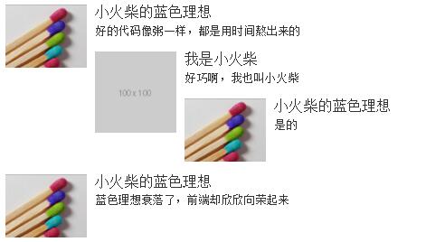
在评论系统中,经常会有媒体对象嵌套的需求。在Bootstrap框架中的媒体对象也具备这样的功能,只需要将另一个媒体对象结构放置在媒体对象的主体内“media-body”
<div class="media">
<a class="media-left" href="#" rel="external nofollow" rel="external nofollow" rel="external nofollow" rel="external nofollow" rel="external nofollow" rel="external nofollow" rel="external nofollow" rel="external nofollow" rel="external nofollow" rel="external nofollow" >
<img class="media-object" width=100 src="//files.jb51.net/file_images/article/201707/huochai.jpg" alt="...">
</a>
<div class="media-body">
<h4 class="media-heading">小火柴的蓝色理想</h4>
<div>好的代码像粥一样,都是用时间熬出来的</div>
<div class="media">
<a class="pull-left" href="#" rel="external nofollow" rel="external nofollow" rel="external nofollow" rel="external nofollow" rel="external nofollow" rel="external nofollow" rel="external nofollow" rel="external nofollow" rel="external nofollow" rel="external nofollow" >
<img class="media-object" src="http://via.placeholder.com/100x100" alt="...">
</a>
<div class="media-body">
<h4 class="media-heading">我是小火柴</h4>
<div>好巧啊,我也叫小火柴</div>
<div class="media">
<a class="pull-left" href="#" rel="external nofollow" rel="external nofollow" rel="external nofollow" rel="external nofollow" rel="external nofollow" rel="external nofollow" rel="external nofollow" rel="external nofollow" rel="external nofollow" rel="external nofollow" >
<img class="media-object" width=100 src="//files.jb51.net/file_images/article/201707/huochai.jpg" alt="...">
</a>
<div class="media-body">
<h4 class="media-heading">小火柴的蓝色理想</h4>
<div>是的</div>
</div>
</div>
</div>
</div>
</div>
</div>
<div class="media">
<a class="media-left" href="#" rel="external nofollow" rel="external nofollow" rel="external nofollow" rel="external nofollow" rel="external nofollow" rel="external nofollow" rel="external nofollow" rel="external nofollow" rel="external nofollow" rel="external nofollow" >
<img class="media-object" width=100 src="//files.jb51.net/file_images/article/201707/huochai.jpg" alt="...">
</a>
<div class="media-body">
<h4 class="media-heading">小火柴的蓝色理想</h4>
<div>蓝色理想衰落了,前端却欣欣向荣起来</div>
</div>
</div>
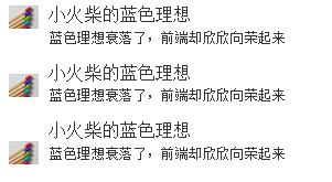
对齐方式
图片或其他媒体类型可以顶部、中部或底部对齐。默认顶部对齐。通过.media-middle或.media-bottom来设置
.media-middle {
vertical-align: middle;
}
.media-bottom {
vertical-align: bottom;
}
<div class="media">
<a class="media-left" href="#" rel="external nofollow" rel="external nofollow" rel="external nofollow" rel="external nofollow" rel="external nofollow" rel="external nofollow" rel="external nofollow" rel="external nofollow" rel="external nofollow" rel="external nofollow" >
<img class="media-object" width=30 src="//files.jb51.net/file_images/article/201707/huochai.jpg" alt="...">
</a>
<div class="media-body">
<h4 class="media-heading">小火柴的蓝色理想</h4>
<div>蓝色理想衰落了,前端却欣欣向荣起来</div>
</div>
</div>
<div class="media">
<a class="media-left media-middle" href="#" rel="external nofollow" rel="external nofollow" rel="external nofollow" rel="external nofollow" rel="external nofollow" rel="external nofollow" rel="external nofollow" rel="external nofollow" rel="external nofollow" rel="external nofollow" >
<img class="media-object" width=30 src="//files.jb51.net/file_images/article/201707/huochai.jpg" alt="...">
</a>
<div class="media-body">
<h4 class="media-heading">小火柴的蓝色理想</h4>
<div>蓝色理想衰落了,前端却欣欣向荣起来</div>
</div>
</div>
<div class="media">
<a class="media-left media-bottom" href="#" rel="external nofollow" rel="external nofollow" rel="external nofollow" rel="external nofollow" rel="external nofollow" rel="external nofollow" rel="external nofollow" rel="external nofollow" rel="external nofollow" rel="external nofollow" >
<img class="media-object" width=30 src="//files.jb51.net/file_images/article/201707/huochai.jpg" alt="...">
</a>
<div class="media-body">
<h4 class="media-heading">小火柴的蓝色理想</h4>
<div>蓝色理想衰落了,前端却欣欣向荣起来</div>
</div>
</div>
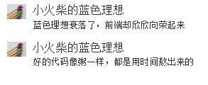
媒体对象列表
媒体对象的嵌套仅是媒体对象中一个简单应用效果之一,在很多时候,我们还会碰到一个列表,每个列表项都和媒体对象长得差不多。Bootstrap框架提供了一个列表展示的效果,在写结构的时候可以使用ul,并且在ul上添加类名“media-list”,而在li上使用“media”
媒体对象列表,在样式上也并没有做过多的特殊处理,只是把列表的左间距置0以及去掉了项目列表符号
.media-list {
padding-left: 0;
list-style: none;
}
<ul class="media-list">
<li class="media">
<a class="media-left" href="#" rel="external nofollow" rel="external nofollow" rel="external nofollow" rel="external nofollow" rel="external nofollow" rel="external nofollow" rel="external nofollow" rel="external nofollow" rel="external nofollow" rel="external nofollow" >
<img class="media-object" width=30 src="//files.jb51.net/file_images/article/201707/huochai.jpg" alt="...">
</a>
<div class="media-body">
<h4 class="media-heading">小火柴的蓝色理想</h4>
<div>蓝色理想衰落了,前端却欣欣向荣起来</div>
</div>
</li>
<li class="media">
<a class="media-left" href="#" rel="external nofollow" rel="external nofollow" rel="external nofollow" rel="external nofollow" rel="external nofollow" rel="external nofollow" rel="external nofollow" rel="external nofollow" rel="external nofollow" rel="external nofollow" >
<img class="media-object" width=30 src="//files.jb51.net/file_images/article/201707/huochai.jpg" alt="...">
</a>
<div class="media-body">
<h4 class="media-heading">小火柴的蓝色理想</h4>
<div>好的代码像粥一样,都是用时间熬出来的</div>
</div>
</li>
</ul>
以上这篇老生常谈Bootstrap媒体对象就是小编分享给大家的全部内容了,希望能给大家一个参考,也希望大家多多支持脚本之家。
您可能感兴趣的文章:

- BootStrap 媒体对象
- bootstrap进度条媒体对象和Well组件
- Bootstrap媒体对象的实现
- 深入理解BootStrap -- 媒体对象(media)15
- bootstrap-媒体对象
- bootstrap-媒体对象-对齐
- Bootstrap 学习之(十五)------ 媒体对象,well
- bootstrap学习24---媒体对象
- Bootstrap学习笔记之进度条、媒体对象实例详解
- bootstrap之媒体对象组件
- 第二百四十一节,Bootstrap进度条媒体对象和 Well 组件
- Bootstrap 媒体对象
- Bootstrap媒体对象
- Bootstrap入门(十四)组件8:媒体对象
- bootstrap之媒体对象组件
- Bootstrap每天必学之媒体对象
- 媒体对象bootstrap组件
- bootstrap-媒体对象
- Bootstrap组件(小图标、下拉菜单、输入框、导航和导航条、媒体对象、列表组、分页导航、缩略图)
- Bootstrap媒体对象学习使用