CSS实现圆角,三角,五角星,五边形,爱心,12角星,8角星,圆,椭圆,圆圈,八卦等等
2017-06-05 17:48
531 查看
新出的html5新增了不少标签,性能更强,原来的很繁琐的功能几个标签就能实现,同时CSS3也推出,更是一大亮点,下面是css3的部分用法,在此总结一下,以供需要的朋友们,总共30个例子
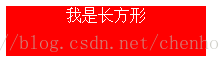
1.长方形
#Rectangle{
width: 200px;
height: 50px;
background-color: red;
color: white;
text-align: center;
}
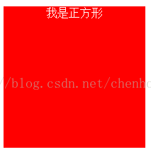
2.正方形
#square{
width: 200px;
height: 200px;
background-color: red;
color: white;
text-align: center;
}
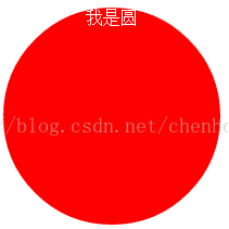
3.实心圆
#perfect-circle{
width: 200px;
height: 200px;
background-color: red;
color: white;
text-align: center;
border-radius: 100px;
/*-webkit-border-radius: 100px;*/
-moz-border-radius: 100px;
}
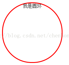
4.圈
#circle{
width: 200px;
height: 200px;
background-color: white;
color: black;
text-align: center;
border-radius: 100px;
/*-webkit-border-radius: 10px;*/
/*-moz-border-radius: 100px;*/
border:3px red solid;
}
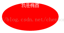
5.椭圆
#ellipse{
width: 200px;
height: 100px;
background-color: red;
color: white;
text-align: center;
border-radius: 100px/50px;
/*-webkit-border-radius: 100px/50px;*/
/*-moz-border-radius: 100px/50px;*/
}
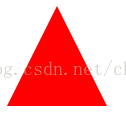
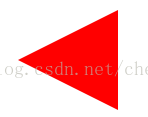
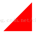
6.上三角
#triangle-up{
width: 0px;
height: 0px;
color: white;
text-align: center;
border-left: 50px solid transparent;
border-right: 50px solid transparent;
border-bottom: 100px solid red;
/*-webkit-border-top-left-radius: 50px solid transparent;*/
/*-webkit-border-top-right-radius: 50px solid transparent;*/
/*-webkit-border-bottom-left-radius: 100px solid red;*/
/*-webkit-border-bottom-right-radius: 100px solid red;*/
}
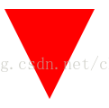
7.下三角
#triangle-down{
width: 0px;
height: 0px;
color: white;
text-align: center;
border-top: 100px solid red;
border-left: 50px solid transparent;
border-right: 50px solid transparent;
}
8.左三角
#triangle-left{
width: 0px;
height: 0px;
color: white;
text-align: center;
border-top: 50px solid transparent;
border-left: 100px solid red;
border-bottom: 50px solid transparent;
}
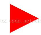
9.右三角
#triangle-right{
width: 0px;
height: 0px;
color: white;
text-align: center;
border-top: 50px solid transparent;
border-right: 100px solid red;
border-bottom: 50px solid transparent;
}
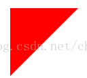
10.顶左
#triangle-topleft{
width: 0px;
height: 0px;
border-top: 100px solid red;
border-right: 100px solid transparent;
}
11.顶右
#triangle-topright{
width: 0px;
height: 0px;
border-top: 100 solid red;
border-left: 100 solid transparent;
}
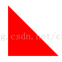
12.底左
#triangle-bottomleft{
width: 0px;
height: 0px;
border-bottom: 100px solid red;
border-right: 100px solid transparent;
}
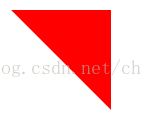
13.底右
#triangle-bottomright{
width: 0px;
height: 0px;
border-bottom: 100px solid red;
border-left: 100px solid transparent;
}
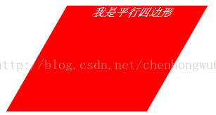
14.平行四边形
#parallelogram{
width: 200px;
height: 150px;
margin-left: 30px;
-webkit-transform: skew(-30deg);
-moz-transform: skew(200deg);
-o-transform: skew(200deg);
background-color: red;
}
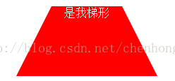
15.
#trapezoid{
border-bottom: 100px solid red;
border-left: 50px solid transparent;
border-right: 50px solid transparent;
width: 100px;
height: 0px;
}
16. #star-five{
width: 0;
height: 0;
color: red;
margin: 50px 0;
position: relative;
display: block;
border-left: 100px solid transparent;
border-right: 100px solid transparent;
border-bottom: 70px solid red;
-moz-transfrom:rotate(35deg);
-webkit-transform:rotate(35deg);
-ms-transform:rotate(35deg);
-o-transform:rotate(35deg);
}
#star-five:before{
width: 0;
height: 0;
border-left: 30px solid transparent;
border-right: 30px solid transparent;
border-bottom: 80px solid red;
position: absolute;
top: -45px;
left: -65px;
color: white;
display: block;
content: "";
-moz-transform:rotate(-35deg);
-webkit-transform:rotate(-35deg);
-ms-transform:rotate(-35deg);
-o-transform:rotate(-35deg);
}
#star-five:after{
width: 0;
height: 0;
display: block;
position: absolute;
color: red;
top: 3px;
left: -105px;
border-left: 100px solid transparent;
border-right: 100px solid transparent;
border-bottom: 70px solid red;
content: "";
-moz-transform:rotate(-70deg);
-webkit-transform:rotate(-70deg);
-ms-transform:rotate(-70deg);
-o-transform:rotate(-70deg);
}

17. #star-six{
width: 0;
height: 0;
border-left: 50px solid transparent;
border-right: 50px solid transparent;
border-bottom: 100px solid red;
position: relative;
}
#star-six:after{
width: 0;
height: 0;
border-top: 100px solid red;
border-left: 50px solid transparent;
border-right: 50px solid transparent;
position: absolute;
content: "";
top: 30px;
left: -50px;
}

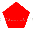
18. #pentagon{
width: 54px;
position: relative;
border-width: 50px 18px 0;
border-style: solid;
border-color: red transparent;
}
#pentagon:before{
content: "";
position: absolute;
width: 0;
height: 0;
top: -85px;
left: -18px;
border-width: 0 45px 35px;
border-style: solid;
border-color: transparent transparent red;
}
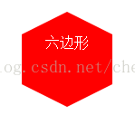
19. #hexagon{
width: 100px;
height: 55px;
background-color: red;
position: relative;
}
#hexagon:before{
content: "";
position: absolute;
top: -25px;
left: 0;
width: 0;
height: ;
border-left: 50px solid transparent;
border-right: 50px solid transparent;
border-bottom: 25px solid red;
}
#hexagon:after{
content: "";
left: 0;
width: 0;
height: 0;
bottom: -25px;
position: absolute;
border-left: 50px solid transparent;
border-right: 50px solid transparent;
border-top: 25px solid red;
}
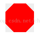
20. #octagon{
width: 100px;
height: 100px;
background-color: red;
position: relative;
}
#octagon:before{
width: 42px;
height: 0;
top: 0;
left: 0;
position: absolute;
content: "";
border-left: 29px solid #eee;
border-right: 29px solid #eee;
border-bottom: 29px solid red;
}
#octagon:after{
width: 42px;
height: 0;
left: 0;
bottom: 0;
position: absolute;
content: "";
border-left: 29px solid #eee;
border-right: 29px solid #eee;
border-top: 29px solid red;
}
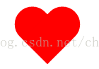
21 #heart{
width: 100px;
height: 90px;
position: relative;
}
#heart:before,#heart:after{
width: 50px;
height: 80px;
left: 50px;
top: 0;
background-color: red;
position: absolute;
content: "";
-moz-border-radius:50px 50px 0 0;
border-radius: 50px 50px 0 0;
-webkit-transform:rotate(-45deg);
-ms-transform:rotate(-45deg);
-moz-transform:rotate(-45deg);
-o-transform:rotate(-45deg);
transform:rotate(-45deg);
-webkit-transform-origin:0 100%;
-ms-transform-origin:0 100%;
-moz-transform-origin:0 100%;
-o-transform-origin:0 100%;
tansform-origin:0 100%;
}
#heart:after{
left: 0;
-webkit-transform:rotate(45deg);
-ms-transform:rotate(45deg);
-moz-transform:rotate(45deg);
-o-transform:rotate(45deg);
transform:rotate(45deg);
-webkit-transform-origin:100% 100%;
-ms-transform-origin:100% 100%;
-moz-transform-origin:100% 100%;
-o-transform-origin:100% 100%;
transform-origin:100% 100%;
}
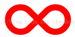
22. #infinity{
width: 212px;
height: 100px;
position: relative;
}
#infinity:before,#infinity:after{
width: 60px;
height: 60px;
top: 0;
left: 0;
border: 20px solid red;
position: absolute;
content: "";
border-radius: 50px 50px 0 50px;
-webkit-border-radius:50px 50px 0 50px;
-moz-border-radius:50px 50px 0 50px;
transform:rotate(-45deg);
-webkit-transform:rotate(-45deg);
-ms-transform:rotate(-45deg);
-moz-transform:rotate(-45deg);
-o-transform:rotate(-45deg);
}
#infinity:after{
left: auto;
right: 0;
border-radius: 50px 50px 50px 0;
-webkit-border-radius:50px 50px 50px 0;
-moz-border-radius:50px 50px 50px 0;
transform:rotate(45deg);
-webkit-transform:rotate(45deg);
-moz-transform:rotate(45deg);
-ms-transform:rotate(45deg);
-o-transform:rotate(45deg);
}
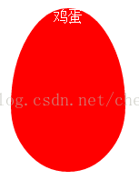
23. #egg{
width: 126px;
height: 180px;
background-color: red;
display: block;
border-radius: 50% 50% 50% 50%/60% 60% 40% 40%;
/*-webkit-border-radius:50% 50% 50% 50%/60% 60% 40% 40%;*/
}
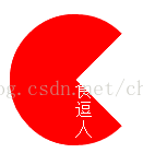
24. #pacman{
width: 0;
height: 0;
border-right: 60px solid transparent;
border-left: 60px solid red;
border-top: 60px solid red;
border-bottom: 60px solid red;
border-top-left-radius: 60px;
border-top-right-radius: 60px;
border-bottom-left-radius: 60px;
border-bottom-right-radius: 60px;
}
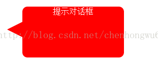
25. #talkbubble{
width: 200px;
height: 100px;
background-color: red;
position: relative;
border-radius: 10px;
-webkit-border-radius:10px;
-moz-border-radius:10px;
-ms-border-radius:10px;
-o-border-radius:10px;
}
#talkbubble:before{
width: 0;
height: 0;
right: 100%;
top: 30px;
position: absolute;
content: "";
border-top: 15px solid transparent;
border-right: 30px solid red;
border-bottom: 15px solid transparent;
}
26. #burst-12{
width: 80px;
height: 80px;
background-color: red;
position: relative;
text-align: center;
}
#burst-12:before,#burst-12:after{
width: 80px;
height: 80px;
top: 0;
left: 0;
background-color: red;
position: absolute;
content: "";
}
#burst-12:before{
transform:rotate(30deg);
-webkit-transform:rotate(30deg);
-ms-transform:rotate(30deg);
-moz-transform:rotate(30deg);
-o-transform:rotate(30deg);
}
#burst-12:after{
transform:rotate(60deg);
-webkit-transform:rotate(60deg);
-ms-transform:rotate(60deg);
-moz-transform:rotate(60deg);
-o-transform:rotate(60deg);
}

27. #burst-8{
width: 80px;
height: 80px;
background-color: red;
text-align: center;
position: relative;
transform:rotate(20deg);
-webkit-transform:rotate(20deg);
-ms-transform:rotate(20deg);
-moz-transform:rotate(20deg);
-o-transform:rotate(20deg);
}
#burst-8:before{
width: 80px;
height: 80px;
top: 0;
left: 0;
background-color: red;
position: absolute;
content: "";
transform:rotate(135deg);
-webkit-transform:rotate(135deg);
-ms-transform:rotate(135deg);
-moz-transform:rotate(135deg);
-o-transform:rotate(135deg);
}

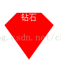
29. #diamond{
width: 50px;
height: 0;
border-style: solid;
border-color: transparent transparent red transparent;
border-width: 0 25px 25px 25px;
position: relative;
margin: 20px 0 50px 0;
}
#diamond:after{
width: 0;
height: 0;
top: 25px;
left: -25px;
border-style: solid;
border-color: red transparent transparent transparent;
border-width: 70px 50px 0 50px;
position: absolute;
content: "";
}
30. #yin-yang{
width: 96px;
height: 48px;
background-color: #fff;
border-color: red;
border-style: solid;
border-width: 2px 2px 50px 2px;
border-radius: 100%;
position: relative;
}
#yin-yang:before {
width: 12px;
height: 12px;
top: 50%;
left: 0;
content: "";
position: absolute;
background-color: #fff;
border: 18px solid red;
border-radius: 100%;
}
#yin-yang:after {
width: 12px;
height: 12px;
top: 50%;
left: 50%;
background-color: red;
border: 18px solid #fff;
border-radius:100%;
content: "";
position: absolute;
}

至此30个例子到此结束,不足之处还请大神多多指正,共同学习进步。
1.长方形
#Rectangle{
width: 200px;
height: 50px;
background-color: red;
color: white;
text-align: center;
}
2.正方形
#square{
width: 200px;
height: 200px;
background-color: red;
color: white;
text-align: center;
}
3.实心圆
#perfect-circle{
width: 200px;
height: 200px;
background-color: red;
color: white;
text-align: center;
border-radius: 100px;
/*-webkit-border-radius: 100px;*/
-moz-border-radius: 100px;
}
4.圈
#circle{
width: 200px;
height: 200px;
background-color: white;
color: black;
text-align: center;
border-radius: 100px;
/*-webkit-border-radius: 10px;*/
/*-moz-border-radius: 100px;*/
border:3px red solid;
}
5.椭圆
#ellipse{
width: 200px;
height: 100px;
background-color: red;
color: white;
text-align: center;
border-radius: 100px/50px;
/*-webkit-border-radius: 100px/50px;*/
/*-moz-border-radius: 100px/50px;*/
}
6.上三角
#triangle-up{
width: 0px;
height: 0px;
color: white;
text-align: center;
border-left: 50px solid transparent;
border-right: 50px solid transparent;
border-bottom: 100px solid red;
/*-webkit-border-top-left-radius: 50px solid transparent;*/
/*-webkit-border-top-right-radius: 50px solid transparent;*/
/*-webkit-border-bottom-left-radius: 100px solid red;*/
/*-webkit-border-bottom-right-radius: 100px solid red;*/
}
7.下三角
#triangle-down{
width: 0px;
height: 0px;
color: white;
text-align: center;
border-top: 100px solid red;
border-left: 50px solid transparent;
border-right: 50px solid transparent;
}
8.左三角
#triangle-left{
width: 0px;
height: 0px;
color: white;
text-align: center;
border-top: 50px solid transparent;
border-left: 100px solid red;
border-bottom: 50px solid transparent;
}
9.右三角
#triangle-right{
width: 0px;
height: 0px;
color: white;
text-align: center;
border-top: 50px solid transparent;
border-right: 100px solid red;
border-bottom: 50px solid transparent;
}
10.顶左
#triangle-topleft{
width: 0px;
height: 0px;
border-top: 100px solid red;
border-right: 100px solid transparent;
}
11.顶右
#triangle-topright{
width: 0px;
height: 0px;
border-top: 100 solid red;
border-left: 100 solid transparent;
}
12.底左
#triangle-bottomleft{
width: 0px;
height: 0px;
border-bottom: 100px solid red;
border-right: 100px solid transparent;
}
13.底右
#triangle-bottomright{
width: 0px;
height: 0px;
border-bottom: 100px solid red;
border-left: 100px solid transparent;
}
14.平行四边形
#parallelogram{
width: 200px;
height: 150px;
margin-left: 30px;
-webkit-transform: skew(-30deg);
-moz-transform: skew(200deg);
-o-transform: skew(200deg);
background-color: red;
}
15.
#trapezoid{
border-bottom: 100px solid red;
border-left: 50px solid transparent;
border-right: 50px solid transparent;
width: 100px;
height: 0px;
}
16. #star-five{
width: 0;
height: 0;
color: red;
margin: 50px 0;
position: relative;
display: block;
border-left: 100px solid transparent;
border-right: 100px solid transparent;
border-bottom: 70px solid red;
-moz-transfrom:rotate(35deg);
-webkit-transform:rotate(35deg);
-ms-transform:rotate(35deg);
-o-transform:rotate(35deg);
}
#star-five:before{
width: 0;
height: 0;
border-left: 30px solid transparent;
border-right: 30px solid transparent;
border-bottom: 80px solid red;
position: absolute;
top: -45px;
left: -65px;
color: white;
display: block;
content: "";
-moz-transform:rotate(-35deg);
-webkit-transform:rotate(-35deg);
-ms-transform:rotate(-35deg);
-o-transform:rotate(-35deg);
}
#star-five:after{
width: 0;
height: 0;
display: block;
position: absolute;
color: red;
top: 3px;
left: -105px;
border-left: 100px solid transparent;
border-right: 100px solid transparent;
border-bottom: 70px solid red;
content: "";
-moz-transform:rotate(-70deg);
-webkit-transform:rotate(-70deg);
-ms-transform:rotate(-70deg);
-o-transform:rotate(-70deg);
}
17. #star-six{
width: 0;
height: 0;
border-left: 50px solid transparent;
border-right: 50px solid transparent;
border-bottom: 100px solid red;
position: relative;
}
#star-six:after{
width: 0;
height: 0;
border-top: 100px solid red;
border-left: 50px solid transparent;
border-right: 50px solid transparent;
position: absolute;
content: "";
top: 30px;
left: -50px;
}
18. #pentagon{
width: 54px;
position: relative;
border-width: 50px 18px 0;
border-style: solid;
border-color: red transparent;
}
#pentagon:before{
content: "";
position: absolute;
width: 0;
height: 0;
top: -85px;
left: -18px;
border-width: 0 45px 35px;
border-style: solid;
border-color: transparent transparent red;
}
19. #hexagon{
width: 100px;
height: 55px;
background-color: red;
position: relative;
}
#hexagon:before{
content: "";
position: absolute;
top: -25px;
left: 0;
width: 0;
height: ;
border-left: 50px solid transparent;
border-right: 50px solid transparent;
border-bottom: 25px solid red;
}
#hexagon:after{
content: "";
left: 0;
width: 0;
height: 0;
bottom: -25px;
position: absolute;
border-left: 50px solid transparent;
border-right: 50px solid transparent;
border-top: 25px solid red;
}
20. #octagon{
width: 100px;
height: 100px;
background-color: red;
position: relative;
}
#octagon:before{
width: 42px;
height: 0;
top: 0;
left: 0;
position: absolute;
content: "";
border-left: 29px solid #eee;
border-right: 29px solid #eee;
border-bottom: 29px solid red;
}
#octagon:after{
width: 42px;
height: 0;
left: 0;
bottom: 0;
position: absolute;
content: "";
border-left: 29px solid #eee;
border-right: 29px solid #eee;
border-top: 29px solid red;
}
21 #heart{
width: 100px;
height: 90px;
position: relative;
}
#heart:before,#heart:after{
width: 50px;
height: 80px;
left: 50px;
top: 0;
background-color: red;
position: absolute;
content: "";
-moz-border-radius:50px 50px 0 0;
border-radius: 50px 50px 0 0;
-webkit-transform:rotate(-45deg);
-ms-transform:rotate(-45deg);
-moz-transform:rotate(-45deg);
-o-transform:rotate(-45deg);
transform:rotate(-45deg);
-webkit-transform-origin:0 100%;
-ms-transform-origin:0 100%;
-moz-transform-origin:0 100%;
-o-transform-origin:0 100%;
tansform-origin:0 100%;
}
#heart:after{
left: 0;
-webkit-transform:rotate(45deg);
-ms-transform:rotate(45deg);
-moz-transform:rotate(45deg);
-o-transform:rotate(45deg);
transform:rotate(45deg);
-webkit-transform-origin:100% 100%;
-ms-transform-origin:100% 100%;
-moz-transform-origin:100% 100%;
-o-transform-origin:100% 100%;
transform-origin:100% 100%;
}
22. #infinity{
width: 212px;
height: 100px;
position: relative;
}
#infinity:before,#infinity:after{
width: 60px;
height: 60px;
top: 0;
left: 0;
border: 20px solid red;
position: absolute;
content: "";
border-radius: 50px 50px 0 50px;
-webkit-border-radius:50px 50px 0 50px;
-moz-border-radius:50px 50px 0 50px;
transform:rotate(-45deg);
-webkit-transform:rotate(-45deg);
-ms-transform:rotate(-45deg);
-moz-transform:rotate(-45deg);
-o-transform:rotate(-45deg);
}
#infinity:after{
left: auto;
right: 0;
border-radius: 50px 50px 50px 0;
-webkit-border-radius:50px 50px 50px 0;
-moz-border-radius:50px 50px 50px 0;
transform:rotate(45deg);
-webkit-transform:rotate(45deg);
-moz-transform:rotate(45deg);
-ms-transform:rotate(45deg);
-o-transform:rotate(45deg);
}
23. #egg{
width: 126px;
height: 180px;
background-color: red;
display: block;
border-radius: 50% 50% 50% 50%/60% 60% 40% 40%;
/*-webkit-border-radius:50% 50% 50% 50%/60% 60% 40% 40%;*/
}
24. #pacman{
width: 0;
height: 0;
border-right: 60px solid transparent;
border-left: 60px solid red;
border-top: 60px solid red;
border-bottom: 60px solid red;
border-top-left-radius: 60px;
border-top-right-radius: 60px;
border-bottom-left-radius: 60px;
border-bottom-right-radius: 60px;
}
25. #talkbubble{
width: 200px;
height: 100px;
background-color: red;
position: relative;
border-radius: 10px;
-webkit-border-radius:10px;
-moz-border-radius:10px;
-ms-border-radius:10px;
-o-border-radius:10px;
}
#talkbubble:before{
width: 0;
height: 0;
right: 100%;
top: 30px;
position: absolute;
content: "";
border-top: 15px solid transparent;
border-right: 30px solid red;
border-bottom: 15px solid transparent;
}
26. #burst-12{
width: 80px;
height: 80px;
background-color: red;
position: relative;
text-align: center;
}
#burst-12:before,#burst-12:after{
width: 80px;
height: 80px;
top: 0;
left: 0;
background-color: red;
position: absolute;
content: "";
}
#burst-12:before{
transform:rotate(30deg);
-webkit-transform:rotate(30deg);
-ms-transform:rotate(30deg);
-moz-transform:rotate(30deg);
-o-transform:rotate(30deg);
}
#burst-12:after{
transform:rotate(60deg);
-webkit-transform:rotate(60deg);
-ms-transform:rotate(60deg);
-moz-transform:rotate(60deg);
-o-transform:rotate(60deg);
}
27. #burst-8{
width: 80px;
height: 80px;
background-color: red;
text-align: center;
position: relative;
transform:rotate(20deg);
-webkit-transform:rotate(20deg);
-ms-transform:rotate(20deg);
-moz-transform:rotate(20deg);
-o-transform:rotate(20deg);
}
#burst-8:before{
width: 80px;
height: 80px;
top: 0;
left: 0;
background-color: red;
position: absolute;
content: "";
transform:rotate(135deg);
-webkit-transform:rotate(135deg);
-ms-transform:rotate(135deg);
-moz-transform:rotate(135deg);
-o-transform:rotate(135deg);
}
29. #diamond{
width: 50px;
height: 0;
border-style: solid;
border-color: transparent transparent red transparent;
border-width: 0 25px 25px 25px;
position: relative;
margin: 20px 0 50px 0;
}
#diamond:after{
width: 0;
height: 0;
top: 25px;
left: -25px;
border-style: solid;
border-color: red transparent transparent transparent;
border-width: 70px 50px 0 50px;
position: absolute;
content: "";
}
30. #yin-yang{
width: 96px;
height: 48px;
background-color: #fff;
border-color: red;
border-style: solid;
border-width: 2px 2px 50px 2px;
border-radius: 100%;
position: relative;
}
#yin-yang:before {
width: 12px;
height: 12px;
top: 50%;
left: 0;
content: "";
position: absolute;
background-color: #fff;
border: 18px solid red;
border-radius: 100%;
}
#yin-yang:after {
width: 12px;
height: 12px;
top: 50%;
left: 50%;
background-color: red;
border: 18px solid #fff;
border-radius:100%;
content: "";
position: absolute;
}
至此30个例子到此结束,不足之处还请大神多多指正,共同学习进步。

相关文章推荐
- 各种css形状 CSS实现圆角,三角,五角星,五边形,爱心,12角星,8角星,圆,椭圆,圆圈,八卦等等
- CSS实现圆角,三角,五角星,五边形,爱心,12角星,8角星,圆,椭圆,圆圈,八卦等等
- CSS实现圆角,三角,五角星,五边形,爱心,12角星,8角星,圆,椭圆,圆圈,八卦等等
- CSS实现圆角,三角,五角星,五边形,爱心,12角星,8角星,圆,椭圆,圆圈,八卦
- CSS实现圆角,三角,五角星,五边形,爱心,12角星,8角星,圆,椭圆,圆圈,八卦
- CSS实现圆角,三角,五角星,五边形,爱心,12角星,8角星,圆,椭圆,圆圈,八卦
- CSS实现圆角,三角,五角星,五边形,爱心,12角星,8角星,圆,椭圆,圆圈,八卦
- CSS实现圆角,三角,五角星,五边形,爱心,12角星,8角星,圆,椭圆,圆圈,八卦
- CSS实现圆角,三角,五角星,五边形,爱心,12角星,8角星,圆,椭圆,圆圈,八卦
- CSS实现圆角,三角,五角星,五边形,爱心,12角星,8角星,圆,椭圆,圆圈,八卦
- CSS实现圆角,三角,五角星,五边形,爱心,12角星,8角星,圆,椭圆,圆圈,八卦
- CSS实现圆角,三角,五角星,五边形,爱心,12角星,8角星,圆,椭圆,圆圈,八卦
- CSS实现圆角,三角,五角星,五边形,爱心,12角星,8角星,圆,椭圆,圆圈,八卦
- CSS实现圆角,三角,五角星,五边形,爱心,12角星,8角星,圆,椭圆,圆圈,八卦
- CSS3实现圆角,三角,五角星,五边形,爱心,12角星,8角星,圆,椭圆,圆圈,八卦
- CSS实现圆角,三角形,五角星,五边形,爱心,圆,椭圆,圆圈,八卦等形状
- 使用CSS实现椭圆,三角形,五角星等图形
- css实现圆角及三角
- css实现三角形,五角星,爱心等原理
- [转]纯css实现带三角箭头带描边带阴影带圆角的兼容各浏览器de气泡层