IE常见bug及其修复方法
2017-04-12 22:54
387 查看
一、双边距浮动的bug
1.1一段无错的代码把一个居左浮动(float:left)的元素放置进一个容器盒(box)2.1在浮动元素上使用了左边界(margin-left)来令它和容器的左边产生一段距离

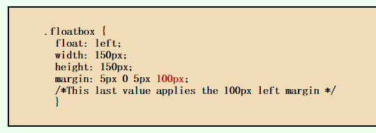
在ie6或更低版本中产生双倍外边距

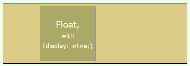
修复方法 在浮动元素上添加display:inline属性即可

二、3像素文本偏移bug
2.1 一段文本与浮动元素相邻的时候,会出现图文环绕,为了不让其文本环绕左边floatBox浮动盒子,我们设置段落外左边距margin-left为floatBox浮动盒子宽度<div class="wrapper"> <span class="floatBox"></span> <p>When people ask me for advice on blogging, I always respond with yet another form of the same advice: pick a schedule you can live with, and stick to it. Until you do that, none of the other advice I could give you will matter. I don’t care if you suck at writing. I don’t care if nobody reads your blog. I don’t care if you have nothing interesting to say. If you can demonstrate a willingness to write, and a desire to keep continually improving your writing, you will eventually be successful.</p> </div>
.wrapper {
width: 600px;
border: solid deeppink 5px;
}
.wrapper p {
margin:0 0 0 100px; /*不让段落环绕floatBox*/
}
.floatBox {
background-color: greenyellow;
float: left;
width: 100px;
height: 100px;
display: inline;
margin-right: -3px;
}
效果
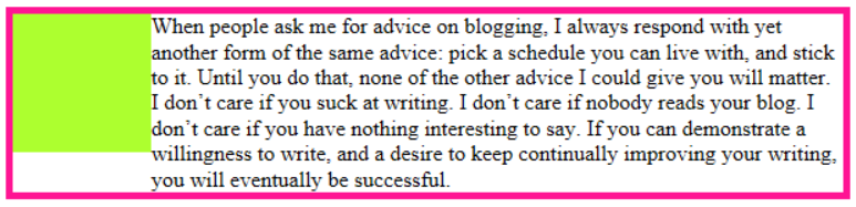
ie6或更低版本浏览器下产生段落文本与浮动元素间3像素bug
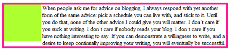
修复方法 为浮动层添加 display:inline 和 -3px 负值margin
三、ie6 最小高度min-height不识别bug
第一种方法 修复方法.demo {
min-height: 100px;
height: auto !important;/*现代浏览器下,内容高度超过100px时自动获得其高度*/
height: 100px;/*此值设置和min-height值一样,因为IE6下元素高度会根据内容自己的高度而定,
所以内容高度低于min-height值时,为了达到min-height效果,需要给元素一个显式的高度值*/
}第二种 采用子选择器方法来修复方法 IE6是不支持子选择器的,所以我们也可以使用这个方式来解决min-height在IE6下效果
.demo {
min-height: 100px;
height: 100px;
}
html>body .demo {
height: auto;/*只有现代浏览器才能识别*/
}
补充于 2017-04-13 21:35:25
最小宽度min-width 兼容IE6写法
/* min-width for IE6 */
* html div.min-width {
width: expression(document.body.clientWidth < 301 ? "300px" : "auto");
}
/* min-width for standards-compliant browsers */
div.min-width {
min-width: 300px;
}
最大宽度max-width 兼容IE6写法
/* max-width for standards-compliant browsers */
div.max-width {
max-width: 300px;
}
/*max-width for IE6*/
*html div.max-width {
_height:expression(this.clientWidth > 299 ? "300px" : "auto");
}
最大高度max-height 兼容IE6写法
/* max-height for standards-compliant browsers */
div.max-height {
max-height: 300px;
}
/*max-height for IE6*/
*html div.max-height {
_height:expression(this.scrollHeight > 301 ? "300px" : "auto");
}四、浮动层错位
当内容超出外包容器定义的宽度时会导致浮动层错位问题。在 Firefox、IE7、IE8 及其他标准浏览 器里,超出的内容仅仅只是超出边缘;但在 IE6 中容器会忽 视定义的 width 值,宽度会错误地随内 容宽度增长而增长。如果在这个浮动元素之后还跟着一个 浮动元素,那么就会导致错位问题<div id="container"> <div id="left">http://net.tutsplus.com/</div> <div id="right"></div> </div>
#container{
background: #C2DFEF;
border: solid 1px #36F;
width: 365px;
margin: 30px;
padding: 5px;
overflow: auto;
}
#left,#right{
background: #95CFEF;
border: solid 1px #36F;
width: 100px;
height: 150px;
margin: 30px;
padding: 10px;
float: left;
}
效果

修复方法 在浮动元素上添加 overflow:hidden 即可
#left { overflow: hidden; }五、IE6调整窗口大小的bug
当把body居中放置,改变IE浏览器大小的时候,任何在body里面的相对定位元素都会固定不动了。解决办法:给body定义 position:relative;就行了六、无DOCTYPE引起的bug
html页面头部,若不添加 <!doctype html> 这一句,会导致各个浏览器会根据自己的行为去理解网页,即ie浏览器会采用
ie[b]标准
w3c盒子模型[/b]去解释你的盒子,
而
ff会采用标准
w3c[b]标准
w3c盒子模型[/b]解释你的盒子;
若添加假如加上了 <!doctype html> 声明,那么所有浏览器都会采用标准
w3c盒子模型去解释你的盒子,网页就能在各个浏览器中显示一致
七、列表li楼梯bug
无需列表li中放置元素(内联元素 a)设置浮动,li不设置浮动<ul> <li><a href="#">Item Stairs Bug</a></li> <li><a href="#">Item Stairs Bug</a></li> <li><a href="#">Item Stairs Bug</a></li> </ul>
ul {
list-style: none;
margin: 0;
padding: 0;
}
ul li a{
width: 150px;
height: 30px;
line-height: 30px;
margin: 0 10px;
text-align: center;
color: #FFF;
text-decoration: none;
float: left;
background-color: #00aabb;
}
效果

修复方法一、为列表元素li添加浮动 li { float:left; }
修复方法二、为列表元素li添加display属性值inline li { display:inline;}
八、li空白间隙
直接上代码<ul> <li><a href="#">white space </a></li> <li><a href="#">white space</a></li> <li><a href="#">white space</a></li> </ul>
ul {
list-style: none;
margin: 0;
padding: 0;
}
ul li a{
display: block;
background-color: #f36696;
color: #FFF;
text-decoration: none;
}
效果
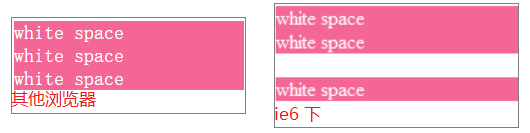
修复方法一、 给标签a定一个宽度,让声明的宽度来触发IE浏览器hasLayout,或者给定一个宽度 ul li a { width:100px; }
修复方法二、给标签a,设置浮动,并且清除浮动 ul li a { display: block;float: left;clear: left; }
修复方法三<推荐>、给标签a父级标签li的display属性设置inline
ul li {
display:inline;
}
ul li a {
display:bloack;
}
修复方法四、为每个li设置一个低实现<不推荐使用> ul li { border-bottom: solid 1px #00aabb;}
九、IE6的"藏猫猫"bug
"藏猫猫"(peek-a-boo)在IE6是一个很奇怪而且很烦人的bug,之所以起这个名字是因为在某些条件下文本看起来消失了,只有在重新加载页面时文本才出现出现该bug条件
1.一个浮动元素后面跟着一个非浮动元素,然后是清理元素
2.条件1中所有元素包含在一个设置了背景颜色与图像的父元素中
3.清理元素碰到浮动元素,中间非浮动元素消失了,隐藏到父元素的背景颜色或图片的后面,只有在重新刷新页面时重新出现(如下图所示)
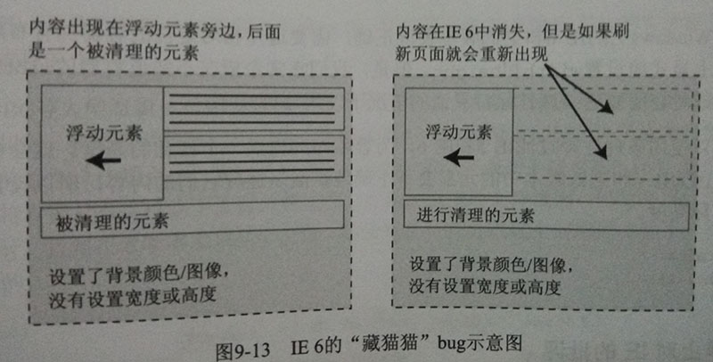
修复方法、避免浮动元素与清理元素接触,使用清除浮动clearfix
.clearfix:after {
visibility: hidden;
overflow: hidden;
display: block;
content: ".";
clear: both;
height: 0;
line-height: 0;
font-size: 0;
}
* html .clearfix {
zoom: 1;
}
*:first-child + html .clearfix {
zoom: 1;
} 十、IE浏览器部分版本不支持background-size的bug
background-size是CSS3新增的属性; background-size用来调整图片指定的大小,大小会由所在其区域宽度和高度决定及background-origin 的位置决定;很多浏览器都支持属性,但IE浏览器就不支持该属性了
background-size兼容性
IE8及IE以下浏览器和遨游不支持;
Firefox 添加私有属性 -moz-background-size 支持;
Safari 和 Chrome 添加私有属性 -webkit-background-size 支持;
Opera 不支持 background-size 属性,添加其私有属性 -o-background-size 也不支持
修复方法代码如下
.bg {
background: url("../images/login-bg.png") left top no-repeat;
background-size: 100% 100%;
-moz-background-size:100% 100%;
-webkit-background-size:100% 100%;
-o-background-size:100% 100%;
/*注意这background-image: url 与 filter:progid:DXImageTransform.Microsoft.AlphaImageLoader(src="", sizingMethod="scale")路径要一样,并且是绝对路径 */
background-image: url("http://localhost:8080/OA/plug-in/login/images/login-bg.jpg");
background-size: cover;
filter:progid:DXImageTransform.Microsoft.AlphaImageLoader(src="http://localhost:8080/OA/plug-in/login/images/login-bg.jpg",  sizingMethod="scale");
}
注意这background-image: url 与 filter:progid:DXImageTransform.Microsoft.AlphaImageLoader(src="", sizingMethod="scale")路径要一样,并且是绝对路径 可以是相对路径
十一、父元素overflow:auto与position:relative 属性相遇bug
为overflow父元素子元素中添加 position:relative后,在IE6中出现不能裁剪bug<div class="wrapper"> <div class="box"></div> </div>
.wrapper {
height: 150px;
width: 150px;
background-color: #8ce29b;
overflow: auto;
}
.box {
width: 100px;
height: 200px;
margin: 25px;
position: relative;
background-color: #ff9890;
}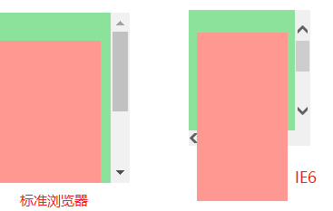
修复方法 为overflow父元素添加position: relative属性即可
十二、使用 HTTP meta 的 IE=edge标记
在<head>中添加 <meta http-equiv = "X-UA-Compatible" content = "IE=edge,chrome=1" />此处这个标记后面竟然出现了chrome这样的值,难道IE也可以模拟chrome了?
意思是不是微软增强了IE,而是谷歌做了个外挂:Google Chrome Frame(谷歌内嵌浏览器框架GCF)。
这个插件可以让用户的IE浏览器外不变,但用户在浏览网页时,实际上使用的是Google Chrome浏览器内核,而且支持IE6、7、8等多个版本的IE浏览器,谷歌这个墙角挖的真给力!
X-UA-Compatible? 是针对IE8的一个设置,只有IE8能识别,为IE8指定不同的页面渲染模式(标准)
这样做的效果是: 如果安装了GCF,则使用GCF来渲染页面,如果未安装GCF,则使用最高版本的IE内核进行渲染
作者:Avenstar
出处:http://www.cnblogs.com/zjf-1992/p/6691816.html
关于作者:专注于前端开发、喜欢阅读
本文版权归作者所有,转载请标明原文链接
【资料参考】
http://liuyu405.iteye.com/blog/478269 http://www.w3cplus.com/css/ten-most-common-ie-bugs-and-how-to-fix-them-part-3 http://www.w3cplus.com/ten-most-common-ie-bugs-and-how-to-fix-them-part-2 http://www.w3cplus.com/css/ten-most-common-ie-bugs-and-how-to-fix-them-part-1 http://www.tuicool.com/articles/a2QNF3
精通CSS 高级WEB标准解决方案 (第2版)
http://www.oschina.net/question/54100_17414 http://lightcss.com/add-x-ua-compatible-meta-to-your-website/

相关文章推荐
- 几个常见的IE渲染Bug及其修复方法 转
- 最常见IE的Bug及其fix修复方法
- 常见前端Bug及其修复方法
- 常见浏览器bug(针对IE6及更低版本)及其修复方法
- 浏览器兼容之旅第四站:IE常见Bug总结及修复方法―part2
- IEbug:20个常见的bug及其修复方法
- 常见IE浏览器bug及其修复方案(双外边距、3像素偏移、绝对定位)
- 使用CSS修正一切:20多个常见Bug及其修正方法
- 10个糟糕的IE Bug及其修复(2)
- 9个最常见IE的Bug及其fix
- 9个最常见IE的Bug及其fix
- 10个JavaScript常见BUG及修复方法
- 9个最常见IE的Bug及其fix
- 10个JavaScript常见BUG及修复方法
- [经典]9个最常见IE的Bug及其fix
- 10个糟糕的IE Bug及其修复
- [转]9 种常见的 IE css Bug和修正方法
- <转>IE常见的BUG及解决方法
- 常见的U盘,内存卡修复工具及其修复方法