CSS动画:旋转卡片效果
2017-03-25 17:15
429 查看
<!DOCTYPE html>
<html>
<head>
<title>demo</title>
</head>
<body>
<style type="text/css">
@-webkit-keyframes rotate{
from{-webkit-transform:rotateY(0);}
to{-webkit-transform:rotateY(-360deg);}
}
@keyframes rotate{
from{-webkit-transform:rotateY(0);}
to{-webkit-transform:rotateY(-360deg);}
}
.rect{
width: 200px;
height: 200px;
margin: 0 auto;
border-radius: 5px;
border: 1px solid #ccc;
font-size: 125pt;
text-align: center;
line-height: 200px;
background-color: #bbb;
opacity: 0.5;
animation: rotate 8s infinite linear;
-webkit-animation:rotate 8s infinite linear;
}
.rect:hover{
animation-play-state: paused;
}
.stop{
animation-play-state: paused;
}
#control{
margin: 0 auto;
text-align: center;
margin-top: 10px;
}
</style>
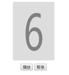
<div id="number" class ="rect">6</div>
<div id="control">
<button id="run" onclick="frun()">播放</button>
<button id="pause" onclick="fpause()">暂停</button>
</div>
<script type="text/javascript">
var obj=document.getElementById('number');
function fpause(){
if (obj) {
obj.style.setProperty('animation-play-state',"paused");
//obj.classList.add('stop');//方法二
}
}
function frun(){
if (obj) {
obj.style.setProperty('animation-play-state',"running");
//obj.classList.remove('stop');//方法二
}
}
</script>
</body>
</html>效果展示:

相关文章推荐
- 前端的小玩意(8)——旋转的盒子(纯CSS动画效果)+可自由拖动(js)
- 关于css旋转动画效果的简单实现
- google曾经的首页小图标,JS+CSS实现的动画效果
- 模仿google首页图片动画效果 (css+javascript)
- CSS伪类的动画和过渡效果应用
- Android 3D旋转动画效果
- 浏览器展示CSS伪类的动画和过渡效果应用
- 动画效果css导航栏
- Android之ViewFlipper:平移、旋转、伸缩、翻页四种动画效果
- Transit – 超平滑的 CSS 过渡和变换动画效果插件
- 纯CSS制作圆形旋转菜单效果
- css 动画效果
- Android 中 画图与动画旋转效果(中级)
- CSS3动画效果-animate.css
- 10个CSS和jQuery的加载中(loading)动画效果实现
- Android Tween动画之RotateAnimation实现图片不停旋转效果实例介绍
- JS+CSS实现Google首页的动画效果
- DIV+CSS:DHTML动画效果_改变指定DIV背景颜色;
- Html5学习--运动且旋转并放大缩小的动画效果
- CSS伪类的动画和过渡效果应用