Android笔记--一个图片+文字的自定义按钮
2017-03-10 00:00
633 查看
样图:
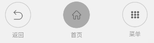
功能说明,大概意思就是,没按的时候是描边,按下之后是填充,可以自定义设置颜色和文本文字。
代码:
布局:
调用:
http:doutugongchang.com
功能说明,大概意思就是,没按的时候是描边,按下之后是填充,可以自定义设置颜色和文本文字。
代码:
package com.imxiaoyu.common.widget;

import android.content.Context;
import android.graphics.Bitmap;
import android.graphics.Canvas;
import android.graphics.Paint;
import android.graphics.RectF;
import android.util.AttributeSet;
import android.view.LayoutInflater;
import android.view.MotionEvent;
import android.widget.ImageView;
import android.widget.RelativeLayout;
import android.widget.TextView;

import com.imxiaoyu.common.R;
import com.imxiaoyu.common.utils.ImageUtils;

import java.util.Date;

/**
* 通用的图片+ 文字按钮
* Created by 庞光渝 on 2017/2/18.
*/

public class ImgAndTvButton extends RelativeLayout {

/**
* UI
*/
private RelativeLayout rlyIcon;
private ImageView ivBottom;
private ImageView ivIcon;
private TextView tvTitle;

/**
* 变量
*/
private boolean isClick = true;//是否可以点击,不可点击状态的话自动设置透明度为半透明
private long touchTime;//按下时间,抬起的时候判定一下,超过300毫秒算点击
private int colorNormal = 0xffcccccc;//正常icon描边颜色
private int colorPress = 0xff999999;//文字按下之后的颜色

/**
* 接口
*/
private OnClickListener onClickListener;

public ImgAndTvButton(Context context) {
super(context);
initView(context);
}

public ImgAndTvButton(Context context, AttributeSet attrs) {
super(context, attrs);
initView(context);
}

public ImgAndTvButton(Context context, AttributeSet attrs, int defStyleAttr) {
super(context, attrs, defStyleAttr);
initView(context);
}

private void initView(Context context) {
// 加载布局
LayoutInflater.from(context).inflate(R.layout.layout_image_and_txt_buttom, this);
rlyIcon = (RelativeLayout) findViewById(R.id.rly_icon);
ivBottom = (ImageView) findViewById(R.id.iv_bottom);
ivIcon = (ImageView) findViewById(R.id.iv_icon);
tvTitle = (TextView) findViewById(R.id.tv_title);

rlyIcon.post(new Runnable() {
@Override
public void run() {
//保持rlyIcon是正方形
LayoutParams para = (LayoutParams) rlyIcon.getLayoutParams();
para.width = rlyIcon.getHeight();
rlyIcon.setLayoutParams(para);
LayoutParams para1 = (LayoutParams) ivBottom.getLayoutParams();
para.width = rlyIcon.getHeight();
para.height = rlyIcon.getHeight();
ivBottom.setLayoutParams(para1);
setRoundStroke(ivBottom, colorNormal);
if (isClick) {
ivIcon.setAlpha((float) 1);
ivBottom.setAlpha((float) 1);
tvTitle.setAlpha((float) 1);
} else {
ivIcon.setAlpha((float) 0.5);
ivBottom.setAlpha((float) 0.5);
tvTitle.setAlpha((float) 0.5);
}
tvTitle.setTextColor(colorNormal);
}
});
}

/**
* 设置图标
*
* @param icon
*/
public void setButtonIcon(int icon) {
ivIcon.setImageResource(icon);
}

/**
* 设置图标
*
* @param bitmap
*/
public void setButtonIcon(Bitmap bitmap) {
ivIcon.setImageBitmap(bitmap);
}

/**
* 设置点击时间
*
* @param onButtomClickListener
*/
public void setOnButtonClickListener(OnClickListener onButtomClickListener) {
onClickListener = onButtomClickListener;
}

/**
* 设置是否可以点击
*
* @param bln
*/
public void setIsClick(boolean bln) {
isClick = bln;
if (isClick) {
ivIcon.setAlpha((float) 1);
ivBottom.setAlpha((float) 1);
tvTitle.setAlpha((float) 1);
} else {
ivIcon.setAlpha((float) 0.5);
ivBottom.setAlpha((float) 0.5);
tvTitle.setAlpha((float) 0.5);
}
}

/**
* 返回TextView对象,需要怎么设置样式自己设置
*
* @return
*/
public TextView getTvTitle() {
return tvTitle;
}

/**
* 设置文字
*
* @param str
*/
public void setTitle(String str) {
if (str == null) {
str = "";
}
tvTitle.setText(str);
}

/**
* 设置图标背景颜色样式
*
* @param roundColor
*/
public void setIconColorStyle(int roundColor) {
this.colorNormal = roundColor;
setRoundStroke(ivBottom, roundColor);
}

/**
* 设置文字颜色样式
*
* @param normalColorTv
* @param pressColorTv
*/
public void setTvColorStyle(int normalColorTv, int pressColorTv) {
this.colorPress = pressColorTv;
tvTitle.setTextColor(normalColorTv);
}

/**
* 给一个控件设置一个纯色的圆形背景图片
*
* @param iv
* @param color
*/
private void setRoundColor(final ImageView iv, final int color) {
rlyIcon.post(new Runnable() {
@Override
public void run() {
Bitmap bitmap = Bitmap.createBitmap(rlyIcon.getWidth(), rlyIcon.getHeight(),
Bitmap.Config.ARGB_8888);
bitmap.eraseColor(color);//填充颜色
bitmap = ImageUtils.bitmap2RoundBitmap(bitmap);
iv.setImageBitmap(bitmap);
}
});
}

/**
* 画一个描边
*
* @param iv
* @param color
*/
private void setRoundStroke(final ImageView iv, final int color) {
rlyIcon.post(new Runnable() {
@Override
public void run() {
int number = 4;//描边宽度
Bitmap bitmap = Bitmap.createBitmap(rlyIcon.getHeight(), rlyIcon.getHeight(),
Bitmap.Config.ARGB_8888);
Canvas canvas = new Canvas(bitmap);
RectF rect1 = new RectF(number, number, rlyIcon.getHeight() - number, rlyIcon.getHeight() - number);
Paint paint = new Paint();
paint.setAntiAlias(true);
paint.setStrokeWidth(number);
paint.setStyle(Paint.Style.STROKE);
paint.setColor(color);
canvas.drawArc(rect1, 0, 360, true, paint);
iv.setImageBitmap(bitmap);
}
});
}

/**
* 监听触摸时间,用于更新状态以及响应点击监听
* @param event
* @return
*/
public boolean onTouchEvent(MotionEvent event) {
switch (event.getAction()) {
case MotionEvent.ACTION_DOWN:
touchTime = new Date().getTime();
if (isClick) {
setRoundColor(ivBottom, colorNormal);
tvTitle.setTextColor(colorPress);
}
break;
case MotionEvent.ACTION_UP:
if (new Date().getTime() - touchTime < 300) {
//点击回调
if (onClickListener != null) {
onClickListener.onClick(ImgAndTvButton.this);
}
}

if (isClick) {
setRoundStroke(ivBottom, colorNormal);
tvTitle.setTextColor(colorNormal);
}
break;
}
return true;
}
}
布局:
<?xml version="1.0" encoding="utf-8"?>
<RelativeLayout xmlns:android="http://schemas.android.com/apk/res/android"
android:id="@+id/rly_bg"
android:layout_width="match_parent"
android:layout_height="match_parent">

<LinearLayout
android:layout_width="match_parent"
android:layout_height="match_parent"
android:orientation="vertical">

<RelativeLayout
android:layout_width="match_parent"
android:layout_height="0dp"
android:layout_weight="4">

<RelativeLayout
android:id="@+id/rly_icon"
android:layout_width="wrap_content"
android:layout_height="match_parent"
android:layout_centerHorizontal="true"
android:layout_centerVertical="true">

<ImageView
android:id="@+id/iv_bottom"
android:layout_width="match_parent"
android:layout_height="match_parent" />

<ImageView
android:layout_centerVertical="true"
android:layout_centerHorizontal="true"
android:id="@+id/iv_icon"
android:layout_width="wrap_content"
android:layout_height="wrap_content" />

<ImageView
android:id="@+id/iv_top"
android:layout_width="match_parent"
android:layout_height="match_parent" />
</RelativeLayout>

</RelativeLayout>

<RelativeLayout
android:layout_width="match_parent"
android:layout_height="0dp"
android:layout_weight="2">

<TextView
android:id="@+id/tv_title"
android:layout_width="wrap_content"
android:layout_height="wrap_content"
android:layout_centerHorizontal="true"
android:layout_centerVertical="true"
android:textColor="@color/gray_9999"
android:textSize="12dp" />
</RelativeLayout>

</LinearLayout>
</RelativeLayout>
调用:
itbPower.setButtonIcon(R.drawable.ic_infrared_power);
itbPower.setTitle("电源");
itbPower.setOnButtonClickListener(new View.OnClickListener() {
@Override
public void onClick(View view) {
ToastUtils.showToast(getActivity(), "电源");
}
});
http:doutugongchang.com

相关文章推荐
- Android笔记--一个图片+文字的自定义按钮
- 自定义一个文字居左图片居右的按钮
- 自定义一个按钮,使按钮为上面图片下面文字
- Swift里自定义一个文字在左、图片在右的,标题按钮
- 自定义一个图片在上,文字在下的按钮
- [转]android自定义控件 一个带图片和文字的按钮
- android实现自定义图片+文字按钮
- Android应用开发笔记(10):制作自定义背景Button按钮、自定义形状Button的全攻略
- 自定义Android带图片的按钮
- android图片位于文字上方只需要一个Button就能搞定
- Android中的ListView实现图片文字和按钮
- 【自定义Android带图片和文字的ImageButton】
- 自定义Dialog(图片,文字说明,单选按钮)----类ListPreference实现(2)
- Android的自定义图片按钮ImageButton【第一篇】
- Android自定义“图片+文字”控件四种实现方法之 二--------个人最推荐的一种
- Android中的ListView实现图片文字和按钮
- android 单选按钮 RadioButton 自定义图片左边距
- 【自定义Android带图片和文字的ImageButton】
- Android自定义GridView之实现一个图片加多个文本框
- android中的按钮,图形按钮,带文字的图片按钮