用css来写一个背景图片的切换
2017-03-09 12:37
816 查看
代码如下:
<!DOCTYPE HTML>
<htmllang="en-US">
<head>
<meta charset="UTF-8">
<title>CSS3 Full Background Slider </title>
<style type="text/css">
/*字体效果*/
@import url("http://www.w3cplus.com/demo/css3/base.css");
@import url("http://fonts.googleapis.com/css?family=Yesteryear");
html,body {
height: 100%;
}
/*设置背景图片全屏显示,并且居中*/
img.bg {
min-height: 100%;
min-width: 1024px;
width: 100%;
height: auto !important;
height: 100%;
position: fixed;
top: 0;
left: 0;
z-index:1;
-webkit-transform: translateX(-0);
-moz-transform: translateX(-0);
-o-transform: translateX(-0);
-ms-transform: translateX(-0);
}
/*设置背景图片从左向右移入显示的动画效果*/
/* Slide Left */
@-webkit-keyframes 'slideLeft' {
0% { left: -500px; }
100% { left: 0; }
}
@-moz-keyframes 'slideLeft' {
0% { left: -500px; }
100% { left: 0; }
}
@-o-keyframes 'slideLeft' {
0% { left: -500px; }
100% { left: 0; }
}
@-ms-keyframes 'slideLeft' {
0% { left: -500px; }
100% { left: 0; }
}
@keyframes 'slideLeft' {
0% { left: -500px; }
100% { left: 0; }
}
/*设置背景图像从底部向顶部移入的动画效果*/
/* Slide Bottom */
@-webkit-keyframes 'slideBottom' {
0% { top: 350px; }
100% { top: 0; }
}
@-moz-keyframes 'slideBottom' {
0% { top: 350px; }
100% { top: 0; }
}
@-ms-keyframes 'slideBottom' {
0% { top: 350px; }
100% { top: 0; }
}
@-o-keyframes 'slideBottom' {
0% { top: 350px; }
100% { top: 0; }
}
@keyframes 'slideBottom' {
0% { top: 350px; }
100% { top: 0; }
}
/*设置背景图片由小到大放大动画效果*/
/* Zoom In */
@-webkit-keyframes 'zoomIn' {
0% { -webkit-transform: scale(0.1); }
100% { -webkit-transform: none; }
}
@-moz-keyframes 'zoomIn' {
0% { -moz-transform: scale(0.1); }
100% { -moz-transform: none; }
}
@-ms-keyframes 'zoomIn' {
0% { -ms-transform: scale(0.1); }
100% { -ms-transform: none; }
}
@-o-keyframes 'zoomIn' {
0% { -o-transform: scale(0.1); }
100% { -o-transform: none; }
}
@keyframes 'zoomIn' {
0% { transform: scale(0.1); }
100% { transform: none; }
}
/*设置背景图像由大到小缩小动画效果*/
/* Zoom Out */
@-webkit-keyframes 'zoomOut' {
0% { -webkit-transform: scale(2); }
100% { -webkit-transform: none; }
}
@-moz-keyframes 'zoomOut' {
0% { -moz-transform: scale(2); }
100% { -moz-transform: none; }
}
@-ms-keyframes 'zoomOut' {
0% { -ms-transform: scale(2); }
100% { -ms-transform: none; }
}
@-o-keyframes 'zoomOut' {
0% { -o-transform: scale(2); }
100% { -o-transform: none; }
}
@keyframes 'zoomOut' {
0% { transform: scale(2); }
100% { transform: none; }
}
/*背景图像旋转出现动画效果*/
/* Rotate */
@-webkit-keyframes 'rotate' {
0% { -webkit-transform: rotate(-360deg) scale(0.1); }
100% { -webkit-transform: none; }
}
@-moz-keyframes 'rotate' {
0% { -moz-transform: rotate(-360deg) scale(0.1); }
100% { -moz-transform: none; }
}
@-ms-keyframes 'rotate' {
0% { -ms-transform: rotate(-360deg) scale(0.1); }
100% { -ms-transform: none; }
}
@-o-keyframes 'rotate' {
0% { -o-transform: rotate(-360deg) scale(0.1); }
100% { -o-transform: none; }
}
@keyframes 'rotate' {
0% { transform: rotate(-360deg) scale(0.1); }
100% { transform: none; }
}
/*设置背景图像不显示动画效果*/
@-webkit-keyframes 'notTarget' {
0% { z-index: 75; }
100% { z-index: 75; }
}
@-moz-keyframes 'notTarget' {
0% { z-index: 75; }
100% { z-index: 75; }
}
@-ms-keyframes 'notTarget' {
0% { z-index: 75; }
100% { z-index: 75; }
}
@-o-keyframes 'notTarget' {
0% { z-index: 75; }
100% { z-index: 75; }
}
@keyframes 'notTarget' {
0% { z-index: 75; }
100% { z-index: 75; }
}
.slider {
position: absolute;
width: 100%;
text-align: center;
z-index: 9999;
bottom: 100px;
}
.slider li {
display: inline-block;
width: 170px;
height: 130px;
margin-right: 15px;
}
.slider a {
display: inline-block;
width: 170px;
padding-top: 70px;
padding-bottom: 20px;
position: relative;
cursor: pointer;
border: 2px solid #fff;
border-radius: 5px;
vertical-align: top;
color: #fff;
text-decoration: none;
font-size: 22px;
font-family: 'Yesteryear', cursive;
text-shadow: -1px -1px 1px rgba(0, 0, 0, 0.8),-2px -2px 1px rgba(0, 0, 0, 0.3),-3px -3px 1px rgba(0, 0, 0, 0.3);
}
/*任务一、设置不同列表的背景色*/
.slider li:nth-of-type(1) a{
background-color: #02646e;
}
.slider li:nth-of-type(2) a{
background-color: #eb0837;
}
.slider li:nth-of-type(3) a{
background-color: #67b374;
}
.slider li:nth-of-type(4) a{
background-color: #e6674a;
}
.slider li:nth-of-type(5) a{
background-color: #e61061;
}
/*任务二、设置缩略图形状*/
.slider li:nth-of-type(n) a::after{
content:"";
display: block;
height: 120px;
width: 120px;
border: 5px solid #fff;
border-radius: 50%;
position: absolute;
left: 50%;
margin-left: -60px;
z-index: 9999;
top: -80px;
}
/*任务三、设置缩略图背景图像*/
li:nth-of-type(1) a::after{
background: url(http://www.w3cplus.com/demo/css3/CSS3Fullbackground/sbg1.jpg) no-repeat center;
}
li:nth-of-type(2) a::after{
background: url(http://www.w3cplus.com/demo/css3/CSS3Fullbackground/sbg2.jpg) no-repeat center;
}
li:nth-of-type(3) a::after{
background: url(http://www.w3cplus.com/demo/css3/CSS3Fullbackground/sbg3.jpg) no-repeat center;
}
li:nth-of-type(4) a::after{
background: url(http://www.w3cplus.com/demo/css3/CSS3Fullbackground/sbg4.jpg) no-repeat center;
}
li:nth-of-type(5) a::after{
background: url(http://www.w3cplus.com/demo/css3/CSS3Fullbackground/sbg5.jpg) no-repeat center;
}
/*任务四、给缩略图添加蒙板效果*/
.slider li:nth-of-type(n) a::before{
content:"";
display: block;
height: 120px;
width: 120px;
border: 5px solid #fff;
border-radius: 50%;
position: absolute;
left: 50%;
margin-left: -60px;
z-index: 99999;
top: -80px;
background: rgba(0,0,0,0.3);
}
/*任务五、鼠标悬浮时,修改缩略图蒙板透明度*/
a:hover:before{
opacity:0;
}
/*任务六、点击综略图,切换背景图*/
/*背景图从左向右出现*/
.slideLeft:target{
z-index: 100;
-webkit-animation-name: slideLeft;
-webkit-animation-duration: 1s;
-webkit-animation-iteration-count: 1;
-moz-animation-name: slideLeft;
-moz-animation-duration: 1s;
-moz-animation-iteration-count: 1;
-ms-animation-name: slideLeft;
-ms-animation-duration: 1s;
-ms-animation-iteration-count: 1;
-o-animation-name: slideLeft;
-o-animation-duration: 1s;
-o-animation-iteration-count: 1;
animation-name: slideLeft;
animation-duration: 1s;
animation-iteration-count: 1;
}
/*背景图从下向上出现*/
.slideBottom:target{
z-index: 100;
-webkit-animation-name: slideBottom;
-webkit-animation-duration: 1s;
-webkit-animation-iteration-count: 1;
-moz-animation-name: slideBottom;
-moz-animation-duration: 1s;
-moz-animation-iteration-count: 1;
-ms-animation-name: slideBottom;
-ms-animation-duration: 1s;
-ms-animation-iteration-count: 1;
-o-animation-name: slideBottom;
-o-animation-duration: 1s;
-o-animation-iteration-count: 1;
animation-name: slideBottom;
animation-duration: 1s;
animation-iteration-count: 1;
}
/*背景图由小到大出现*/
.zoomIn:target{
z-index: 100;
-webkit-animation-name: zoomIn;
-webkit-animation-duration: 1s;
-webkit-animation-iteration-count: 1;
-moz-animation-name: zoomIn;
-moz-animation-duration: 1s;
-moz-animation-iteration-count: 1;
-ms-animation-name: zoomIn;
-ms-animation-duration: 1s;
-ms-animation-iteration-count: 1;
-o-animation-name: zoomIn;
-o-animation-duration: 1s;
-o-animation-iteration-count: 1;
animation-name: zoomIn;
animation-duration: 1s;
animation-iteration-count: 1;
}
/*背景图由大到小出现*/
.zoomOut:target{
z-index: 100;
-webkit-animation-name: zoomOut;
-webkit-animation-duration: 1s;
-webkit-animation-iteration-count: 1;
-moz-animation-name: zoomOut;
-moz-animation-duration: 1s;
-moz-animation-iteration-count: 1;
-ms-animation-name: zoomOut;
-ms-animation-duration: 1s;
-ms-animation-iteration-count: 1;
-o-animation-name: zoomOut;
-o-animation-duration: 1s;
-o-animation-iteration-count: 1;
animation-name: zoomOut;
animation-duration: 1s;
animation-iteration-count: 1;
}
/*背景图旋转出现*/
.rotate:target{
z-index: 100;
-webkit-animation-name: rotate;
-webkit-animation-duration: 1s;
-webkit-animation-iteration-count: 1;
-moz-animation-name: rotate;
-moz-animation-duration: 1s;
-moz-animation-iteration-count: 1;
-ms-animation-name: rotate;
-ms-animation-duration: 1s;
-ms-animation-iteration-count: 1;
-o-animation-name: rotate;
-o-animation-duration: 1s;
-o-animation-iteration-count: 1;
animation-name: rotate;
animation-duration: 1s;
animation-iteration-count: 1;
}
/*任务七、设置不显示的背景图层级*/
/* Not Target */
.bg:not(:target){
-webkit-animation-name: notTarget;
-webkit-animation-duration: 1s;
-webkit-animation-iteration-count: 1;
-moz-animation-name: notTarget;
-moz-animation-duration: 1s;
-moz-animation-iteration-count: 1;
-ms-animation-name: notTarget;
-ms-animation-duration: 1s;
-ms-animation-iteration-count: 1;
-o-animation-name: notTarget;
-o-animation-duration: 1s;
-o-animation-iteration-count: 1;
animation-name: notTarget;
animation-duration: 1s;
animation-iteration-count: 1;
}
</style>
</head>
<body>
<div class="slider">
<ul class="clearfix">
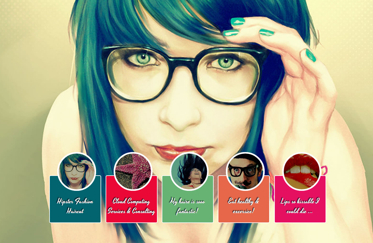
<li><a href="#bg1">Hipster Fashion Haircut </a></li>
<li><a href="#bg2">Cloud Computing Services & Consulting</a></li>
<li><a href="#bg3">My haire is sooo fantastic!</a></li>
<li><a href="#bg4">Eat healthy & excersice!</a></li>
<li><a href="#bg5">Lips so kissable I could die ...</a></li>
</ul>
</div>
<img src="http://www.w3cplus.com/demo/css3/CSS3Fullbackground/bg1.jpg" alt="" class="bg slideLeft" id="bg1" />
<img src="http://www.w3cplus.com/demo/css3/CSS3Fullbackground/bg2.jpg" alt="" class="bg slideBottom" id="bg2" />
<img src="http://www.w3cplus.com/demo/css3/CSS3Fullbackground/bg3.jpg" alt="" class="bg zoomIn" id="bg3" />
<img src="http://www.w3cplus.com/demo/css3/CSS3Fullbackground/bg4.jpg" alt="" class="bg zoomOut" id="bg4" />
<img src="http://www.w3cplus.com/demo/css3/CSS3Fullbackground/bg5.jpg" alt="" class="bg rotate" id="bg5" />
</body>
</html>
View Code
效果如图:

相关文章推荐
- 巧妙的有css合并图片解决tab切换的背景图片
- 一个使用锚点的纯css图片切换
- 分享一个Css3效果---无比惊艳的全屏图片切换效果(Css浏览器Only)
- 背景图片每次刷新以后随机切换和背景图片隔一段时间换一个
- 点击一个按钮后可以切换按钮的背景图片并执行不同的点击事件
- 自定义TabHost 一个avtiviy 多个标签 ,实现背景图片随选项卡切换滑动效果
- HTML&CSS——css sprites技术将多个背景集成到一个png图片上css定位
- ios:点击一个button不断切换背景图片
- css从有多个图片的背景图片上取出某一个图片
- 对话框不同情况下切换背景图片,就是两个类公用一个对话框,只是背景图片不一样;
- 用html+css+js实现的一个简单的图片切换特效
- 用html+css+jQuery实现的一个简单的图片切换特效
- HTML-利用CSS和JavaScript制作一个切换图片的网页
- CSS 实现鼠标指向切换背景图片
- 用html+css+js实现的一个简单的图片切换特效
- CSS图片分割 CSS Sprites 将多个背景集成到一个png图片上CSS定位
- css一些东西(这里主要有一个方法就是背景渐变,一般我们处理的时候是用图片)
- 纯CSS实现背景图片切换(CSS3伪类实现背景图片切换)
- 今天写项目的时候看到了一个DIV+CSS图片切换蛮好的,拿来玩玩
- 一个简单且丑陋的js切换背景图片基础示例