水平垂直居中
2017-03-07 10:59
127 查看
1.法一
<!DOCTYPE html>
<html lang="en">
<head>
<meta charset="UTF-8">
<title>居中</title>
<style>
.parent{
position: absolute;
height:100%;
width:100%;
background: grey;
}
.child{
height:300px;
width: 200px;
position: relative;
/*position: absolute;也可*/
top:50%;
left:50%;
margin: -150px 0 0 -100px;
/*块内文字水平垂直居中*/
text-align: center;
line-height: 300px;/*与height保持同值*/
background:green;
}
</style>
</head>
<body>
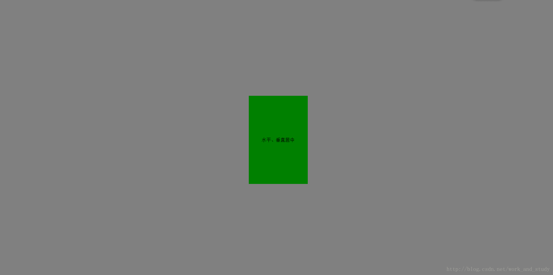
<div class="parent">
<div class="child">水平、垂直居中</div>
</div>
</body>
</html>执行:
2.法二
将.child中的margin: -150px 0 0 -100px;换成transform: translate(-50%,-50%);
transform为CSS3属性,它可以向元素使用2D 或 3D 转换,进行旋转、缩放、移动或倾斜。
translate(x,y)定义了 2D 转换。
3.法三
使用flex
justify-content:center;定义容器中项目在主轴上(即水平方向上)居中。
align-items:center;定义容器中项目在交叉轴上(即垂直方向上)居中。
.parent{
position: absolute;
height:100%;
width:100%;

display: flex;
justify-content:center;
align-items:center;

background: grey;
}
.child{
height:300px;
width: 200px;

/*!*块内文字水平垂直居中*!*/
text-align: center;
line-height: 300px;/*与height保持同值*/

background:green;
}
4.法四
使用定位与margin.parent{
position: absolute;
height:100%;
width:100%;
background: grey;
}
.child{
height:300px;
width: 200px;
position: absolute;
top: 0;
bottom:0;
right:0;
left:0;;
margin: auto;
/*!*块内文字水平垂直居中*!*/
text-align: center;
line-height: 300px;/*与height保持同值*/
background:green;
}

相关文章推荐
- 使元素水平垂直居中的实现方法
- 盘点8种CSS实现垂直居中水平居中的绝对定位居中技术
- CSS布局——水平垂直居中
- DIV水平垂直居中css实现代码
- CSS垂直水平居中多种方案实现
- jQuery创建水平和垂直居中的div窗口
- CSS样式设计小技巧(水平居中,垂直居中)
- css图片居中(水平居中和垂直居中)
- 小tip: margin:auto实现绝对定位元素的水平垂直居中
- 自适应宽度盒子水平垂直居中css
- 【前端攻略】最全面的水平垂直居中方案与flexbox布局
- java 中JLabel中的内容垂直居中和水平居中问题
- div水平居中与垂直居中的方法【摘自美浩工作室官方博客 】
- 块级元素在父级元素中水平居中、垂直居中
- 最全面的水平垂直居中方案与flexbox布局
- css/css3实现未知宽高元素的垂直居中和水平居中
- CSS:使 DIV 在浏览器窗口中水平垂直居中
- 设置div水平垂直居中方法
- 关于css中两层div的水平垂直居中问题
- 实现div水平、垂直居中的几种方法