Android布局——线性布局、相对布局
2017-03-02 20:59
344 查看
Android布局——线性布局、相对布局、内外边距
Android布局线性布局相对布局内外边距ViewGroup
什么是ViewGroup
Android官方描述为
视图层次
LinearLayout线性布局
常用属性
weight权重用于等比例划分可用区域
RelativeLayout相对布局
常用属性
内外边距填充偏移
ViewGroup
什么是ViewGroup?
通俗的来说,ViewGroup就是一个放置View(以及ViewGroup)的容器。一般不直接使用,最常用的是其派生类Layout(布局)。Android官方描述为:
在android APP中所有的UI界面都是由View和ViewGroup的对象组成的。View是一个用于在屏幕上绘制能够与用户交互事物的对象。ViewGroup则是一个用于存放其他View(以及ViewGroup)对象的布局容器。Android提供了一组 视图 和 ViewGroup 子类提供您常见的输入控件(如按钮和文本 字段)和各种布局模型(如线性或相对布局)。视图层次:

LinearLayout(线性布局)
LinearLayout是android中最常用的一种布局,多在界面布局相对简单,没有太过于复杂的嵌套时使用。顾名思义,就是所有的组件都按照预先制定的排列方式,排列在一条线上,谁也不会覆盖掉谁。但是,当组件的显示内容超出边界时,会出现内容的丢失。常用属性
android:orientation——布局中组件排列方式,horizontal(水平)、vertical(垂直)android:gravity——控制组件子元素的对齐方式
android:layout_gravity——控制该组件在父容器中的对其方式
android:layout_width——布局的宽度,wrap_content(自适应)、match_parent(充满父容器)或者fill_parent。
android:layout_height——布局的高度,同上。
android:background——布局的背景颜色
在下面的代码中,在一个主布局中定义了三个子布局,分别用于演示LinearLayout 的水平排列、垂直排列、组件对齐方式。
<LinearLayout xmlns:android="http://schemas.android.com/apk/res/android"
android:orientation="vertical"
android:layout_width="match_parent"
android:layout_height="match_parent"
android:background
4000
="@android:color/darker_gray">

<LinearLayout
android:orientation="vertical"
android:layout_width="match_parent"
android:layout_height="160dp"
android:background="@android:color/holo_green_light">
<TextView
android:text="垂直放置"
android:textSize="36sp"
android:layout_width="wrap_content"
android:layout_height="wrap_content" />
<TextView
android:text="垂直放置"
android:textSize="36sp"
android:layout_width="wrap_content"
android:layout_height="wrap_content" />
</LinearLayout>

<LinearLayout
android:layout_width="match_parent"
android:layout_height="160dp"
android:background="@android:color/holo_orange_light">
<TextView
android:text="水平放置"
android:textSize="36sp"
android:layout_width="wrap_content"
android:layout_height="wrap_content" />
<TextView
android:text="水平放置"
android:textSize="36sp"
android:layout_width="wrap_content"
android:layout_height="wrap_content" />

</LinearLayout>

<LinearLayout
android:layout_width="match_parent"
android:layout_height="160dp"
android:gravity="center"
android:background="@android:color/holo_blue_dark">
<TextView
android:text="对齐方式"
android:textSize="36sp"
android:layout_width="wrap_content"
android:layout_height="wrap_content" />
<TextView
android:text="对齐方式"
android:textSize="36sp"
android:layout_width="wrap_content"
android:layout_height="wrap_content" />

</LinearLayout>

</LinearLayout>
运行效果图:

weight(权重)——用于等比例划分可用区域
在android视图中,weight(权重)属性只能用于LinearLayout 布局中,换句话说就是该属性只能在LinearLayout 布局中生效在定义weight属性时,Google的推荐用法是将对应的layout_wight(或者layout_height)的值设置为0dp(或者wrap_content)。否则,显示效果需要按照另外的方法重新计算。
<?xml version="1.0" encoding="utf-8"?>
<LinearLayout xmlns:android="http://schemas.android.com/apk/res/android"
android:orientation="vertical"
android:layout_width="match_parent"
android:layout_height="match_parent"
android:background="@android:color/darker_gray">

<LinearLayout
android:layout_width="match_parent"
android:layout_height="0dp"
android:layout_weight="1">

<TextView
android:text="等比例分割"
android:textSize="36sp"
android:layout_width="0dp"
android:layout_weight="1"
android:layout_height="match_parent"
android:background="@android:color/holo_blue_dark"/>
<TextView
android:text="等比例分割"
android:textSize="36sp"
android:layout_width="0dp"
android:layout_weight="1"
android:layout_height="match_parent"
android:background="@android:color/white"/>
<TextView
android:text="等比例分割"
android:textSize="36sp"
android:layout_width="0dp"
android:layout_weight="1"
android:layout_height="match_parent"
android:background="@android:color/darker_gray"/>

</LinearLayout>
<LinearLayout
android:orientation="vertical"
android:layout_width="match_parent"
android:layout_height="0dp"
android:layout_weight="1">
<TextView
android:text="2:1分割"
android:textSize="36sp"
android:layout_width="match_parent"
android:layout_height="0dp"
android:layout_weight="2"
android:background="@android:color/holo_green_light"/>
<TextView
android:text="2:1分割"
android:textSize="36sp"
android:layout_width="match_parent"
android:layout_height="0dp"
android:layout_weight="1"
android:background="@android:color/holo_orange_light" />

</LinearLayout>

</LinearLayout>
运行效果图

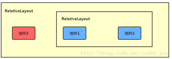
RelativeLayout(相对布局)
采用LinearLayout情况下,当界面比较复杂的时候,就需要嵌套多层的 LinearLayout,这样就会降低UI Render的效率(渲染速度),另外太多层LinearLayout嵌套会占用更多的系统资源,还有可能引发栈溢出。这时就需要使用RelativeLayout。如果我们使用如果我们使用RelativeLayout的话,可能仅仅需要一层就可以完成了的话,配合父容器和组件的相对位置参照,以及margin、padding就可以很容易的实现很复杂的布局设计。
相对布局 RelativeLayout 允许子元素指定它们相对于其父元素或兄弟元素的位置,这是实际布局中最常用的布局方式之一。它灵活性大很多,当然属性也多,操作难度也大,属性之间产生冲突的的可能性也大,使用相对布局时要多做些测试。
相对布局,就像是把手机屏幕当成一个坐标图,所有的组件、容器的位置都是通过彼此的相对位置来表示。又分为父容器定位和兄弟组件定位。
父容器定位

兄弟组件定位
常用属性
android:layout_centerHrizontal 水平居中android:layout_centerVertical 垂直居中
android:layout_centerInparent 相对于父元素完全居中
android:layout_alignParentBottom 贴紧父元素的下边缘
android:layout_alignParentLeft 贴紧父元素的左边缘
android:layout_alignParentRight 贴紧父元素的右边缘
android:layout_alignParentTop 贴紧父元素的上边缘
android:layout_alignWithParentIfMissing 如果对应的兄弟元素找不到的话就以父元素做参照物
下面的属性值设定必须为id的引用名“@id/id-name”
android:layout_below 在某元素的下方
android:layout_above 在某元素的的上方
android:layout_toLeftOf 在某元素的左边
android:layout_toRightOf 在某元素的右边
android:layout_alignTop 本元素的上边缘和某元素的的上边缘对齐
android:layout_alignLeft 本元素的左边缘和某元素的的左边缘对齐
android:layout_alignBottom 本元素的下边缘和某元素的的下边缘对齐
android:layout_alignRight 本元素的右边缘和某元素的的右边缘对齐
下面是对相对布局的基础用法演示:
<?xml version="1.0" encoding="utf-8"?>
<RelativeLayout xmlns:android="http://schemas.android.com/apk/res/android"
android:id="@+id/activity_main"
android:layout_width="match_parent"
android:layout_height="match_parent"
android:background="@android:color/darker_gray">

<TextView
android:layout_width="wrap_content"
android:layout_height="wrap_content"
android:textSize="24sp"
android:layout_centerHorizontal="true"
android:text="水平居中"
android:background="@android:color/holo_blue_bright"/>
<TextView

a4c2
android:id="@+id/center_tv"
android:layout_width="wrap_content"
android:layout_height="wrap_content"
android:layout_centerHorizontal="true"
android:layout_centerVertical="true"
android:textSize="24sp"
android:text="正中"
android:background="@android:color/holo_blue_bright"
/>
<TextView
android:layout_width="wrap_content"
android:layout_height="wrap_content"
android:layout_centerVertical="true"
android:layout_alignParentRight="true"
android:textSize="24sp"
android:text="右侧垂直居中"
android:background="@android:color/holo_blue_bright"/>
<TextView
android:layout_width="wrap_content"
android:layout_height="wrap_content"
android:layout_toLeftOf="@id/center_tv"
android:layout_above="@id/center_tv"
android:textSize="24sp"
android:text="正中左上"
android:background="@android:color/holo_blue_bright"/>
</RelativeLayout>
运行效果图:

内、外边距(填充、偏移)
margin(偏移)为外边距,表示组件离父容器的距离padding(填充)为内边距,表示该组件的内容距离该组件的距离
图示如下:

在下面的代码中,为了更清晰的对比margin和padding,分别用两种方式来实现相同的效果
演示代码:
<LinearLayout xmlns:android="http://schemas.android.com/apk/res/android"
android:orientation="vertical"
android:layout_width="match_parent"
android:layout_height="match_parent"
android:padding="15dp"
android:background="@android:color/black">

<LinearLayout
android:orientation="vertical"
android:layout_width="match_parent"
android:layout_height="0dp"
android:layout_weight="1"
android:background="@android:color/holo_green_light">

<LinearLayout
android:orientation="vertical"
android:layout_width="match_parent"
android:layout_height="match_parent"
android:layout_margin="30dp"
android:background="@android:color/holo_red_light">

<LinearLayout
android:orientation="vertical"
android:layout_width="match_parent"
android:layout_height="match_parent"
android:layout_margin="30dp"
android:background="@android:color/white">

</LinearLayout>
</LinearLayout>
</LinearLayout>

<LinearLayout
android:layout_width="match_parent"
android:layout_height="0dp"
android:layout_weight="1"
android:padding="30dp"
android:background="@android:color/holo_orange_light">
<LinearLayout
android:orientation="vertical"
android:layout_width="match_parent"
android:layout_height="match_parent"
android:padding="30dp"
android:background="@android:color/holo_red_light">
<LinearLayout
android:orientation="vertical"
android:layout_width="match_parent"
android:layout_height="match_parent"
android:background="@android:color/white">
</LinearLayout>
</LinearLayout>

</LinearLayout>
</LinearLayout>
运行效果:


相关文章推荐
- Android 布局之线性布局、相对布局、表格布局、帧布局
- Android 布局(一):相对布局和线性布局
- Android——excise(用线性布局、表格布局、相对布局做发送邮件界面)
- 初学Android——相对和线性布局的使用与程序的国际化
- android_线性布局_相对布局的方法汇总
- android的五大布局(LinearLayout(线性布局)、FrameLayout(单帧布局)、RelativeLayout(相对布局)、AbsoluteLayout(绝对布局)和TableLa)
- android:个人简历的三种布局(相对,线性,表格)
- 【Android】线性布局和相对布局的比较
- android 线性布局LinearLayout 和 相对布局RelativeLayout
- android 中的线性布局与相对布局
- android开发4:Android布局管理器1(线性布局,相对布局RelativeLayout-案例)
- android 线性布局加载的效率不如相对布局
- Android -- UI布局管理,相对布局,线性布局,表格布局,绝对布局,帧布局
- 学习android第四周总结相对布局和线性布局常用属性的作用
- Android布局(线性布局 Linear Layout )(相对布局 Relative Layout)
- Android学习.1(线性布局和相对布局)
- 浅谈android 的五大布局---LinearLayout(线性布局)、FrameLayout(单帧布局)、RelativeLayout(相对布局)、AbsoluteLayout(绝对布局)和Tab
- 修改Android开发新建工程默认相对布局为线性布局
- Android常用布局(FrameLayout(框架布局)、LinearLayout(线性布局)、RelativeLayout(相对布局))详解
- Android手机开发 使用线性布局和相对布局实现Button垂直水平居中