[Ext JS 6 By Example 翻译] 第7章 - 图表(chart)
2016-12-27 11:28
309 查看
转载自:http://www.jeeboot.com/archives/1229.html
本章中将探索在 ExtJS 中使用不同类型的图表并使用一个名为费用分析的示例项目结束本章所学。以下是将要所学的内容:
图表类型
条形图 和 柱形图 图表
区域 和 折线 图表
饼图 图表
3 D 图表
费用分析 – 示例项目
一个笛卡尔图表具有两个方向:X 和 Y 。默认 X 是水平的,Y 是垂直的。使用笛卡尔坐标图表有柱形图,条形图,区域,折线和散射。
这个图表有两个轴:角向和径向。图表的标绘值用极坐标来表达,有饼图和雷达图。
这个图表填充图表的面积。
使用 Ext.chart.CartesianChart (xtype: cartesian 或 chart ) 创建图表并应用上面所创建的 store 。
前面代码中比较重要的是 axes ,series ,和 sprite 。axes 有三种类型:numeric ,time ,和 category 。
而在 series 中,你可以看到设置类型为 bar 。在 ExtJS 中,将会呈现为柱状图或条形图, 虽然你指定了类型为 bar ,但是默认是作为柱状图展示的,如果你想要条形图,需要在图表配置中设置 flipXY 为 true。
这里 sprites 的配置相当简单。sprites 是一个可选项,不是必须的。sprites 这里使用的 text 的类型,就是画出来一个图形,设置字体 25 号,宽度 120,高度 35,并且 x 的位置为 100 ,y 的位置是 40 ,sprites 是ExtJS 中画图的一个对象,这里我们只是用来写了一行字。sprites 也可以接受一个数组,但是这里我们只用一个设置。
这个 insetPadding 属性是用于指定图表的 padding 。
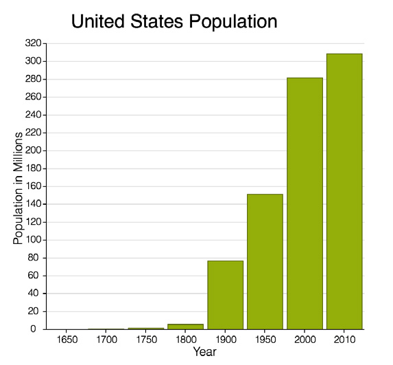
以下截图为输出结果:
条形图
如之前所说,为了得到条形图,你可以使用同样的代码,但要指定 flipXY 为 true 并改变相应坐标的位置,下面把原来 year 换到了左边。如以下代码所示:
下列截图为以上的代码的输出结果:

我们更新柱状图例子来展示一个堆叠图表。为此我们需要在 store 中额外添加一个数值字段,同时在 series 中我们需要为 yField 指定两个字段。你也可以堆叠超过两个字段,但是本例中我们只用两个字段,看看下面的代码:
堆叠柱状图的输出如下列截图:
如果你想呈现多个字段,并且让它们未叠加,那么只需要简单的设置 series 的 stacked 属性为 false 即可,请看以下输出:
在图表中还有很多可用的选项。让我们瞧一瞧一些常用的选项:
tooltip: 这个属性可以在 series 里添加一个提示信息,鼠标放在每个柱状图上是会提示相应的信息。
legend: 这可以呈现图表的说明到任意的四个边上
sprites: 这个可以接收一个数组对象,上面介绍过啦,它是可以在你图标上添加一些图形,文本等等。
下面这是使用的相同的 store ,只是用了一些上面提的其他的选项:
输出你看到页脚,提示信息和说明信息都在下图:


以上代码所示的输出:

类似于堆叠柱状图,你也可以在 series 中设置 stacked 为true 来实现堆叠。如果你在之前例子上将 stacked 改为 true ,那么将获得下列结果输出:


我们使用同样的 model 和 store 使用前面饼图的例子创建一个 3D 饼图,如下:
下面的图片显示了上面代码的输出:


我们使用 Sencha Cmd 来构建应用。运行下列命令:
之后我们移除所有不必要的文件和代码,添加一些额外的文件。目录结构如下:
这里只有一些重要文件的代码,完整的代码在这里 https://github. com/ananddayalan/extjs-by-example-expense-analyzer
下列代码是创建 grid 。这个 List 视图继承自 Ext.grid.Panel ,数据使用 expense store ,它有三列:
我并没有在这里使用分页。maxHeight 是用于限制 grid 的高度,同时开启滚动条,因为有更多的数据。
以下代码创建了 expense store 。这个 store 使用了内嵌数据。这里我们并没有单独为 store 创建 model :
继续创建柱状图。在柱状图中我们将使用另外一个 store 叫做 expensebyMonth store ,我们将从 expense 的数据填充进来。
下列 3D 柱状图有两个 axis 类型: numeric 和 category 。我们使用日期字段的月部分作为 category 。renderer 属性用于呈现日期字段的月份部分:
现在为上面的柱状图创建 store 。model 为 MyApp.model.ExpensebyMonth 。这个 store 将用来显示每个月的花费总数。数据是通过对 expense store 的日期字段进行分组后填充的,现在我们瞧一瞧 data 属性是如何配置填充数据的:
以下代码用于生成饼图。这个图表使用的的 store 是 expense ,但只显示了一次选择一个月的数据。在主视图上添加了一个下拉框用于选择月份。
这个 beforerender 事件是用于过滤 expense store 里用于显示的数据,只加载一月份的数据:
截止目前,我们创建好了 grid ,柱状图,饼图,和这个应用所需要的 store 。现在需要在主视图上把他们联系起来。以下代码展示了 main 视图的经典工具包里的片段。main 视图是一个选项卡控件,为每个选项卡指定视图:
本章中将探索在 ExtJS 中使用不同类型的图表并使用一个名为费用分析的示例项目结束本章所学。以下是将要所学的内容:
图表类型
条形图 和 柱形图 图表
区域 和 折线 图表
饼图 图表
3 D 图表
费用分析 – 示例项目
图表
在第一章中提过,我说 ExtJS 是一站式的几乎能满足你对所有的 JavaScript 框架的需求。这当然还包括了图表功能。图表类型
有三种类型的图表:笛卡尔图表,极坐标图表, 和 空间图表。笛卡尔图表
Ext.chart.CartesianChart (xtype: cartesian or chart)一个笛卡尔图表具有两个方向:X 和 Y 。默认 X 是水平的,Y 是垂直的。使用笛卡尔坐标图表有柱形图,条形图,区域,折线和散射。
极坐标图表
Ext.chart.PolarChart (xtype: polar)这个图表有两个轴:角向和径向。图表的标绘值用极坐标来表达,有饼图和雷达图。
空间图表
Ext.chart.SpaceFillingChart (xtype: spacefilling)这个图表填充图表的面积。
条形图和柱状图
使用条形图和柱状图,你至少需要提供 store ,axes ,series。基本的柱状图
首先,我们创建一个 store 使用硬编码的内置数据,如以下代码所示:Ext.define('MyApp.model.Population', {
extend : 'Ext.data.Model',
fields : [ 'year', 'population' ]
});
Ext.define('MyApp.store.Population', {
extend : 'Ext.data.Store',
storeId : 'population',
model : 'MyApp.model.Population',
data : [{
"year" : "1610",
"population" : 350
},{
"year" : "1650",
"population" : 50368
},{
"year" : "1700",
"population" : 250888
},{
"year" : "1750",
"population" : 1170760
},{
"year" : "1800",
"population" : 5308483
},{
"year" : "1900",
"population" : 76212168
},{
"year" : "1950",
"population" : 151325798
},{
"year" : "2000",
"population" : 281421906
},{
"year" : "2010",
"population" : 308745538
}]
});
var store = Ext.create("MyApp.store.Population");使用 Ext.chart.CartesianChart (xtype: cartesian 或 chart ) 创建图表并应用上面所创建的 store 。
Ext.create('Ext.Container', {
renderTo : Ext.getBody(),
width : 500,
height : 500,
layout : 'fit',
items : [ {
xtype : 'chart',
insetPadding : {
top : 60,
bottom : 20,
left : 20,
right : 40
},
store : store,
axes : [ {
type : 'numeric',
position : 'left',
grid : true,
title : {
text : 'Population in Millions',
fontSize : 16
}
}, {
type : 'category',
title : {
text : 'Year',
fontSize : 16
},
position : 'bottom'
}],
series : [ {
type : 'bar',
xField : 'year',
yField : [ 'population' ]
} ],
sprites : {
type : 'text',
text : 'United States Population',
font : '25px Helvetica',
width : 120,
height : 35,
x : 100,
y : 40
}
}]
});
前面代码中比较重要的是 axes ,series ,和 sprite 。axes 有三种类型:numeric ,time ,和 category 。
而在 series 中,你可以看到设置类型为 bar 。在 ExtJS 中,将会呈现为柱状图或条形图, 虽然你指定了类型为 bar ,但是默认是作为柱状图展示的,如果你想要条形图,需要在图表配置中设置 flipXY 为 true。
这里 sprites 的配置相当简单。sprites 是一个可选项,不是必须的。sprites 这里使用的 text 的类型,就是画出来一个图形,设置字体 25 号,宽度 120,高度 35,并且 x 的位置为 100 ,y 的位置是 40 ,sprites 是ExtJS 中画图的一个对象,这里我们只是用来写了一行字。sprites 也可以接受一个数组,但是这里我们只用一个设置。
这个 insetPadding 属性是用于指定图表的 padding 。
以下截图为输出结果:
条形图
如之前所说,为了得到条形图,你可以使用同样的代码,但要指定 flipXY 为 true 并改变相应坐标的位置,下面把原来 year 换到了左边。如以下代码所示:Ext.create('Ext.Container', {
renderTo : Ext.getBody(),
width : 500,
height : 500,
layout : 'fit',
items : [ {
xtype : 'chart',
flipXY : true,
insetPadding : {
top : 60,
bottom : 20,
left : 20,
right : 40
},
store : store,
axes : [ {
type : 'numeric',
position : 'bottom',
grid : true,
title : {
text : 'Population in Millions',
fontSize : 16
}
}, {
type : 'category',
title : {
text : 'Year',
fontSize : 16
},
position : 'left'
}],
series : [ {
type : 'bar',
xField : 'year',
yField : [ 'population' ]
}],
sprites : {
type : 'text',
text : 'United States Population',
font : '25px Helvetica',
width : 120,
height : 35,
x : 100,
y : 40
}
}]
});下列截图为以上的代码的输出结果:
堆叠条形图
现在假设你想在柱状图的每一个分类上标绘两个值。 你可以将他们堆叠起来或者在每个分类上使用两条图形。我们更新柱状图例子来展示一个堆叠图表。为此我们需要在 store 中额外添加一个数值字段,同时在 series 中我们需要为 yField 指定两个字段。你也可以堆叠超过两个字段,但是本例中我们只用两个字段,看看下面的代码:
Ext.define('MyApp.model.Population', {
extend : 'Ext.data.Model',
fields : [ 'year', 'total', 'slaves' ]
});
Ext.define('MyApp.store.Population', {
extend : 'Ext.data.Store',
storeId : 'population',
model : 'MyApp.model.Population',
data : [{
"year" : "1790",
"total" : 3.9,
"slaves" : 0.7
},{
"year" : "1800",
"total" : 5.3,
"slaves" : 0.9
},{
"year" : "1810",
"total" : 7.2,
"slaves" : 1.2
},{
"year" : "1820",
"total" : 9.6,
"slaves" : 1.5
},{
"year" : "1830",
"total" : 12.9,
"slaves" : 2
},{
"year" : "1840",
"total" : 17,
"slaves" : 2.5
},{
"year" : "1850",
"total" : 23.2,
"slaves" : 3.2
},{
"year" : "1860",
"total" : 31.4,
"slaves" : 4
}]
});
var store = Ext.create("MyApp.store.Population");
Ext.create('Ext.Container', {
renderTo : Ext.getBody(),
width : 500,
height : 500,
layout : 'fit',
items : [ {
xtype : 'cartesian',
store : store,
insetPadding : {
top : 60,
bottom : 20,
left : 20,
right : 40
},
axes : [ {
type : 'numeric',
position : 'left',
grid : true,
title : {
text : 'Population in Millions',
fontSize : 16
}
}, {
type : 'category',
title : {
text : 'Year',
fontSize : 16
},
position : 'bottom'
}],
series : [ {
type : 'bar',
xField : 'year',
yField : [ 'total', 'slaves' ]
}],
sprites : {
type : 'text',
text : 'United States Slaves Distribution 1790 to 1860',
font : '20px Helvetica',
width : 120,
height : 35,
x : 60,
y : 40
}
}]
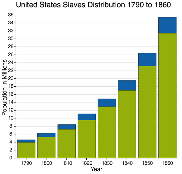
});堆叠柱状图的输出如下列截图:
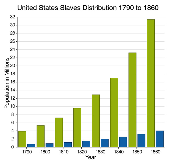
如果你想呈现多个字段,并且让它们未叠加,那么只需要简单的设置 series 的 stacked 属性为 false 即可,请看以下输出:
在图表中还有很多可用的选项。让我们瞧一瞧一些常用的选项:
tooltip: 这个属性可以在 series 里添加一个提示信息,鼠标放在每个柱状图上是会提示相应的信息。
legend: 这可以呈现图表的说明到任意的四个边上
sprites: 这个可以接收一个数组对象,上面介绍过啦,它是可以在你图标上添加一些图形,文本等等。
下面这是使用的相同的 store ,只是用了一些上面提的其他的选项:
Ext.create('Ext.Container', {
renderTo: Ext.getBody(),
width: 500,
height: 500,
layout: 'fit',
items: [{
xtype: 'chart',
legend: { docked: 'bottom' },
insetPadding: {
top: 60,
bottom: 20,
left: 20,
right: 40
},
store: store,
axes: [{
type: 'numeric',
position: 'left',
grid: true,
title: {
text: 'Population in Millions',
fontSize: 16
},
minimum: 0,
}, {
type: 'category',
title: {
text: 'Year',
fontSize: 16
},
position: 'bottom',
}],
series: [{
type: 'bar',
xField: 'year',
stacked: false,
title: ['Total', 'Slaves'],
yField: ['total', 'slaves'],
tooltip: {
trackMouse: true,
style: 'background: #fff',
renderer: function (storeItem, item) {
this.setHtml('In ' + storeItem.get('year') + ' ' + item. field + ' population was ' + storeItem.get(item.field) + ' m');
}
}
}],
sprites: [{
type: 'text',
text: 'United States Slaves Distribution 1790 to 1860',
font: '20px Helvetica',
width: 120,
height: 35,
x: 60,
y: 40
},{
type: 'text',
text: 'Source: http://www.wikipedia.org', fontSize: 10,
x: 12,
y: 440
}]
}]
});
输出你看到页脚,提示信息和说明信息都在下图:
3D 柱状图
如果你改变 series 的类型为 bar3d ,就能获得 3D 的柱状图,如下列截图所示:区域和折线图
区域和折线图也属于是笛卡尔图表。区域图表
呈现一个区域图,使用下列代码简单的替换前面的例子里的 series :series: [ {
type : 'area',
xField : 'year',
stacked : false,
title : [ 'Total', 'slaves' ],
yField : [ 'total', 'slaves' ],
style : {
stroke : "#94ae0a",
fillOpacity : 0.6,
}
} ]以上代码所示的输出:
类似于堆叠柱状图,你也可以在 series 中设置 stacked 为true 来实现堆叠。如果你在之前例子上将 stacked 改为 true ,那么将获得下列结果输出:
折线图
使用下列的配置在上面的例子中的 series ,折线图显示图下图:series: [ {
type : 'line',
xField : 'year',
title : [ 'Total' ],
yField : [ 'total' ]
},{
type : 'line',
xField : 'year',
title : [ 'Slaves' ],
yField : [ 'slaves' ]
}]饼图
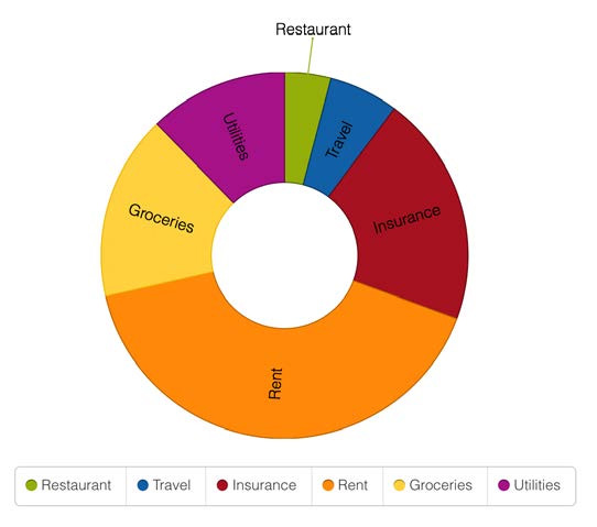
这是一个在很多应用中都很常用的图表和报表工具。呈现一个饼图使用 Ext.chart.PolarChart (xtype: polar) 。基本的饼图
指定类型为 pie ,还要指定 angleField 和 label 来呈现饼图。angleField 这是角度字段,如以下代码所示:Ext.define('MyApp.store.Expense', {
extend : 'Ext.data.Store',
alias : 'store.expense',
fields : [ 'cat', 'spent' ],
data : [ {
"cat" : "Restaurant",
"spent" : 100
}, {
"cat" : "Travel",
"spent" : 150
}, {
"cat" : "Insurance",
"spent" : 500
}, {
"cat" : "Rent",
"spent" : 1000
}, {
"cat" : "Groceries",
"spent" : 400
}, {
"cat" : "Utilities",
"spent" : 300
} ]
});
var store = Ext.create("MyApp.store.Expense");
Ext.create('Ext.Container',{
renderTo : Ext.getBody(),
width : 600,
height : 500,
layout : 'fit',
items : [ {
xtype : 'polar',
legend : {
docked : 'bottom'
},
insetPadding : {
top : 100,
bottom : 20,
left : 20,
right : 40
},
store : store,
series : [ {
type : 'pie',
angleField : 'spent',
label : {
field : 'cat',
},
tooltip : {
trackMouse : true,
renderer : function(storeItem, item) {
var value = ((parseFloat(storeItem.get('spent')/ storeItem.store.sum('spent')) * 100.0).toFixed(2));
this.setHtml(storeItem.get('cat') + ': ' + value + '%');
}
}
} ]
} ]
});圆环饼图
这仅需要在之前的例子中设置 donut 属性的值为 40 ,你将获取下列图表。donut 这个值是半径的百分比:3D饼图
在 ExtJS 6 中,对 3D 饼图做出了一些改进。现在 3D 饼图支持 label 和可配置的 3D 切面,例如厚度,变形等等。我们使用同样的 model 和 store 使用前面饼图的例子创建一个 3D 饼图,如下:
Ext.create('Ext.Container',{
renderTo : Ext.getBody(),
width : 600,
height : 500,
layout : 'fit',
items : [ {
xtype : 'polar',
legend : {
docked : 'bottom'
},
insetPadding : {
top : 100,
bottom : 20,
left : 80,
right : 80
},
store : store,
series : [ {
type : 'pie3d',
donut : 50,
thickness : 70,
distortion : 0.5,
angleField : 'spent',
label : {
field : 'cat'
},
tooltip : {
trackMouse : true,
renderer : function(storeItem, item) {
var value = ((parseFloat(storeItem.get('spent')/ storeItem.store.sum('spent')) * 100.0).toFixed(2));
this.setHtml(storeItem.get('cat') + ': ' + value+ '%');
}
}
} ]
} ]
});
下面的图片显示了上面代码的输出:
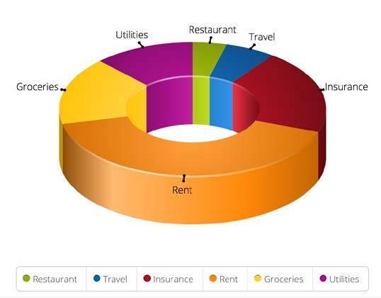
费用分析器 – 示例项目
又是项目时间,现在你已经了解了 ExtJS 中不同的图表类型,我们来创建一个示例项目名为 费用分析器。下面是最终设计效果:我们使用 Sencha Cmd 来构建应用。运行下列命令:
sencha -sdk <path to SDK>/ext-6.0.0.415/ generate app EA ./expenseanalyzer
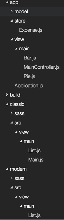
之后我们移除所有不必要的文件和代码,添加一些额外的文件。目录结构如下:
这里只有一些重要文件的代码,完整的代码在这里 https://github. com/ananddayalan/extjs-by-example-expense-analyzer
下列代码是创建 grid 。这个 List 视图继承自 Ext.grid.Panel ,数据使用 expense store ,它有三列:
Ext.define('EA.view.main.List', {
extend : 'Ext.grid.Panel',
xtype : 'mainlist',
maxHeight : 400,
requires : [ 'EA.store.Expense' ],
title : 'Year to date expense by category',
store : {
type : 'expense'
},
columns : {
defaults : {
flex : 1
},
items : [ {
text : 'Category',
dataIndex : 'cat'
}, {
formatter : "date('F')",
text : 'Month',
dataIndex : 'date'
}, {
text : 'Spent',
dataIndex : 'spent'
} ]
}
});
我并没有在这里使用分页。maxHeight 是用于限制 grid 的高度,同时开启滚动条,因为有更多的数据。
以下代码创建了 expense store 。这个 store 使用了内嵌数据。这里我们并没有单独为 store 创建 model :
Ext.define('EA.store.Expense', {
extend : 'Ext.data.Store',
alias : 'store.expense',
storeId : 'expense',
fields : [ {
name : 'date',
type : 'date'
},
'cat',
'spent'
],
data : {
items : [{
"date" : "1/1/2015",
"cat" : "Restaurant",
"spent" : 100
},{
"date" : "1/1/2015",
"cat" : "Travel",
"spent" : 22
},{
"date" : "1/1/2015",
"cat" : "Insurance",
"spent" : 343
}]
},
proxy : {
type : 'memory',
reader : {
type : 'json',
rootProperty : 'items'
}
}
});
继续创建柱状图。在柱状图中我们将使用另外一个 store 叫做 expensebyMonth store ,我们将从 expense 的数据填充进来。
下列 3D 柱状图有两个 axis 类型: numeric 和 category 。我们使用日期字段的月部分作为 category 。renderer 属性用于呈现日期字段的月份部分:
Ext.define('EA.view.main.Bar', {
extend : 'Ext.chart.CartesianChart',
requires : [ 'Ext.chart.axis.Category',
'Ext.chart.series.Bar3D',
'Ext.chart.axis.Numeric',
'Ext.chart.interactions.ItemHighlight' ],
xtype : 'mainbar',
height : 500,
padding : {
top : 50,
bottom : 20,
left : 100,
right : 100
},
legend : {
docked : 'bottom'
},
insetPadding : {
top : 100,
bottom : 20,
left : 20,
right : 40
},
store : {
type : 'expensebyMonthStore'
},
axes : [ {
type : 'numeric',
position : 'left',
grid : true,
minimum : 0,
title : {
text : 'Spendings in $',
fontSize : 16
}
}, {
type : 'category',
position : 'bottom',
title : {
text : 'Month',
fontSize : 16
},
label : {
font : 'bold Arial',
rotate : {
degrees : 300
}
},
renderer : function(date) {
return [ "Jan", "Feb", "Mar", "Apr", "May" ][date.getMonth()];
}
} ],
series : [ {
type : 'bar3d',
xField : 'date',
stacked : false,
title : [ 'Total' ],
yField : [ 'total' ]
} ],
sprites : [ {
type : 'text',
text : 'Expense by Month',
font : '20px Helvetica',
width : 120,
height : 35,
x : 60,
y : 40
} ]
});
现在为上面的柱状图创建 store 。model 为 MyApp.model.ExpensebyMonth 。这个 store 将用来显示每个月的花费总数。数据是通过对 expense store 的日期字段进行分组后填充的,现在我们瞧一瞧 data 属性是如何配置填充数据的:
Ext.define('MyApp.model.ExpensebyMonth', {
extend : 'Ext.data.Model',
fields : [ {
name : 'date',
type : 'date'
}, 'total' ]
});

Ext.define('MyApp.store.ExpensebyMonth', {
extend : 'Ext.data.Store',
alias : 'store.expensebyMonthStore',
model : 'MyApp.model.ExpensebyMonth',
data : (function() {
var data = [];
var expense = Ext.createByAlias('store.expense');
expense.group('date');
var groups = expense.getGroups();
groups.each(function(group) {
data.push({
date : group.config.groupKey,
total :group.sum('spent')
});
});
return data;
})()
});
以下代码用于生成饼图。这个图表使用的的 store 是 expense ,但只显示了一次选择一个月的数据。在主视图上添加了一个下拉框用于选择月份。
这个 beforerender 事件是用于过滤 expense store 里用于显示的数据,只加载一月份的数据:
Ext.define('EA.view.main.Pie', {
extend : 'Ext.chart.PolarChart',
requires : [ 'Ext.chart.series.Pie3D' ],
xtype : 'mainpie',
height : 800,
legend : {
docked : 'bottom'
},
insetPadding : {
top : 100,
bottom : 20,
left : 80,
right : 80
},
listeners : {
beforerender : function() {
var dateFiter = new Ext.util.Filter({
filterFn : function(item) {
return item.data.date.getMonth() == 0;
}
});
Ext.getStore('expense').addFilter(dateFiter);
}
},
store : {
type : 'expense'
},
series : [ {
type : 'pie3d',
donut : 50,
thickness : 70,
distortion : 0.5,
angleField : 'spent',
label : {
field : 'cat',
}
} ]
});
截止目前,我们创建好了 grid ,柱状图,饼图,和这个应用所需要的 store 。现在需要在主视图上把他们联系起来。以下代码展示了 main 视图的经典工具包里的片段。main 视图是一个选项卡控件,为每个选项卡指定视图:
Ext.define('EA.view.main.Main', {
extend : 'Ext.tab.Panel',
xtype : 'app-main',
requires : [
'Ext.plugin.Viewport',
'Ext.window.MessageBox',
'EA.view.main.MainController',
'EA.view.main.List',
'EA.view.main.Bar',
'EA.view.main.Pie'
],
controller : 'main',
autoScroll : true,
ui : 'navigation',
// Truncated code
items : [ {
title : 'Year to Date',
iconCls : 'fa-bar-chart',
items : [ {
html : '<h3>Your average expense per month is: ' +Ext.createByAlias('store.expensebyMonthStore').average('total') +'</h3>',
height : 70,
},{
xtype : 'mainlist'
},{
xtype : 'mainbar'
}]
},{
title : 'By Month',
iconCls : 'fa-pie-chart',
items : [ {
xtype : 'combo',
value : 'Jan',
fieldLabel : 'Select Month',
store : [ 'Jan', 'Feb', 'Mar', 'Apr', 'May' ],
listeners : {
select : 'onMonthSelect'
}
}, {
xtype : 'mainpie'
} ]
} ]
});
总结
在本章中,我们在 ExtJS 中学习到不同的图表。并且创建了一个示例项目来演示他们的应用。
相关文章推荐
- [Ext JS 6 By Example 翻译] 第7章 - 图表(chart)
- Highcharts详细翻译系列一:chart 图表选项篇
- [Ext JS 6 By Example 翻译] 第8章 - 主题和响应式设计
- android开源图表库MPAndroidChart文档翻译(下)
- [Ext JS 6 By Example 翻译] 第1章 – 入门指南
- [Ext JS 6 By Example 翻译] 第2章 - 核心概念
- [Ext JS 6 By Example 翻译] 第2章 - 核心概念
- [Ext JS 6 By Example 翻译] 第3章 - 基础组件
- [Ext JS 6 By Example 翻译] 第3章 - 基础组件
- [Ext JS 6 By Example 翻译] 第4章 - 数据包装
- [Ext JS 6 By Example 翻译] 第4章 - 数据包装
- [Ext JS 6 By Example 翻译] 第5章 - 表格组件(grid)
- [Ext JS 6 By Example 翻译] 第5章 - 表格组件(grid)
- [Ext JS 6 By Example 翻译] 第6章 - 高级组件
- [Ext JS 6 By Example 翻译] 第6章 - 高级组件
- [Ext JS 6 By Example 翻译] 第1章 – 入门指南
- [Ext JS 6 By Example 翻译] 第8章 - 主题和响应式设计
- android开源图表库MPAndroidChart文档翻译(上)
- android开源图表库MPAndroidChart文档翻译(中)
- Sencha-组件-Chart(图表)(官网文档翻译17)