Pandas 时间序列数据绘制X轴主要刻度和次要刻度
2016-12-01 13:51
323 查看
Pandas 时间序列数据绘制X轴主要刻度和次要刻度
先上效果图吧(图中Tue表示周二):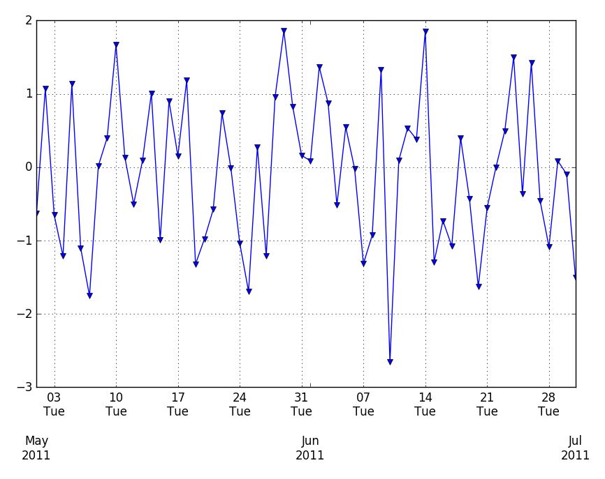
Pandas和matplotlib.dates都是使用matplotlib.units来定位刻度。
matplotlib.dates可以方便的手动设置刻度,同时pandas似乎可以自动调整格式。
直接上代码吧:
# -*- coding: utf-8 -*-
"""
Created on Tue Dec 15 10:43:01 2015

@author: vgis
"""

import numpy as np
import pandas as pd
import matplotlib.pyplot as plt
import matplotlib.dates as dates

idx = pd.date_range('2011-05-01', '2011-07-01')
s = pd.Series(np.random.randn(len(idx)), index=idx)

fig, ax = plt.subplots()
ax.plot_date(idx.to_pydatetime(), s, 'v-')
ax.xaxis.set_minor_locator(dates.WeekdayLocator(byweekday=(1),
interval=1))
ax.xaxis.set_minor_formatter(dates.DateFormatter('%d\n%a'))
ax.xaxis.grid(True, which="minor")
ax.yaxis.grid()
ax.xaxis.set_major_locator(dates.MonthLocator())
ax.xaxis.set_major_formatter(dates.DateFormatter('\n\n\n%b\n%Y'))
plt.tight_layout()
plt.show()
#参考#
http://stackoverflow.com/questions/12945971/pandas-timeseries-plot-setting-x-axis-major-and-minor-ticks-and-labels

相关文章推荐
- Pandas 时间序列数据绘制X轴主要刻度和次要刻度
- [置顶] python绘制双Y轴时间序列数据曲线图
- Python绘制时间序列数据的时序图、自相关图和偏自相关图
- matplotlib如何在绘制时间序列时跳过无数据的区间
- Python+pandas实现时间序列数据扩展案例一则
- Pandas:时间序列数据基本操作和分组
- 使用matplotlib绘制不连续时间序列的OHLC数据
- 人工智能:python 实现 第十一章,使用Pandas处理时间序列数据
- 利用Python进行数据分析——时间序列[十](1) .
- 使用R进行数据可视化套路之-散点图、图形分隔、时间序列
- 时间序列数据挖掘综述
- R语言与数据分析之七:时间序列简单指数平滑
- DWT小波变换及其在时间序列数据预测中的应用
- 利用Python进行数据分析--时间序列
- R语言与数据分析之九:时间内序列--HoltWinters指数平滑法
- MetricGraphics.js – 时间序列数据的可视化
- 预测和分解时间序列数据(小时)Forecast and STL hourly time series data
- 时间序列数据挖掘
- Python 收集Twitter时间序列数据
- 时间序列数据挖掘综述