前端开发笔记(4)css基础(下)
2016-11-24 21:02
344 查看
标签定位
相对定位
相对定位是用来微调元素位置的,让元素相对于原来的位置进行调整。<head>
<meta http-equiv="Content-Type" content="text/html;charset=UTF-8">
<title>Document</title>
<style type="text/css">
div{
width:100px;
height:100px;
}
.box1{
background-color:green;
}
.box2{
background-color:blue;
position:relative;
left:30px;
top:30px;
}
.box3{
background-color:red;
}
</style>
</head>
<body>
<div class="box1"></div>
<div class="box2"></div>
<div class="box3"></div>
</body>
绝对定位
绝对定位比相对定位更灵活绝对定位脱离标准流:绝对定位的盒子,是脱离标准文档流的。所以,所有的标准文档流的性质,绝对定位之后都不遵守了。绝对定位之后,标签就不区分所谓的行内元素、块级元素了,不需要display:block;就可以设置宽、高了。
<head>
<meta http-equiv="Content-Type" content="text/html;charset=UTF-8">
<title>Document</title>
<style type="text/css">
.box1{
width:100px;
height:100px;
background-color:green;
}
span{
width:100px;
height:100px;
background-color:red;
position:absolute;
left: 50px;
top: 50px;
}
</style>
</head>
<body>
<div class="box1"></div>
<span>行内元素</span>
</body>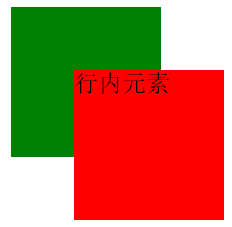
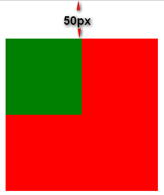
2. 绝对定位的参考点,如果用top描述,那么定位参考点就是页面的左上角,而不是浏览器的左上角。
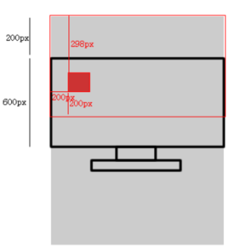
上面图中浏览器高600px, 窗口已经卷动了200px,现在有一个div标签,有下面样式
width:100px;
height:100px;
border:1px solid black;
position:absolute;
bottom:200px;
left:200px;
请在图中画出盒子的位置并标出必要的尺寸。
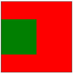
以盒子为参考点:一个绝对定位的元素,如果父辈元素中出现了也定位了的元素,那么将以父辈这个元素,为参考点。
<head>
<meta http-equiv="Content-Type" content="text/html;charset=UTF-8">
<title>Document</title>
<style type="text/css">
.box1{
width:200px;
height:200px;
border:1px solid red;
position:relative;
left:50px;
top:50px;
}
.box2{
width:100px;
height:100px;
border:1px solid green;
}
span{
width:100px;
height:100px;
background-color:red;
position:absolute;
left: 50px;
top: 50px;
}
</style>
</head>
<body>
<div class="box1">
<div class="box2">
<span>行内元素</span>
</div>
</div>
</body>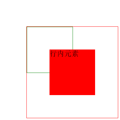
4. 绝对定位的儿子,无视参考的那个盒子的padding。
5. 绝对定位的盒子居中:绝对定位之后,所有标准流的规则,都不适用了。所以margin:0 auto;失效。
width: 600px;
height: 60px;
position: absolute;
left: 50%;
top: 0;
margin-left: -300px;   /* 宽度的一半 */
固定定位
固定定位,就是相对浏览器窗口定位。页面如何滚动,这个盒子显示的位置不变。固定定位是脱离标准文档流的。margin属性
margin塌陷现象
标准文档流中,竖直方向的margin不叠加,以较大的为准。<head>
<meta http-equiv="Content-Type" content="text/html;charset=UTF-8">
<title>Document</title>
<style type="text/css">
.box1{
width:100px;
height:100px;
margin-bottom:50px; /* 注意这一行 */
background-color:red;
}
.box2{
width:100px;
height:100px;
margin-top:30px; /* 注意这一行 */
background-color:green;
}
</style>
</head>
<body>
<div class="box1"></div>
<div class="box2"></div>
</body>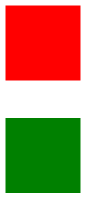
上图中两个div分别设置了margin为向上30px向下50px,实际上间距只有50px.如果两个div脱离标准流就会是80px.
使用margin盒子居中
margin的值可以为auto,表示自动。当left、right两个方向,都是auto的时候,盒子居中了:margin-left: auto; margin-right: auto;
简写为
margin:0 auto;
使用margin:0 auto; 的盒子,必须有width,有明确的width
只有标准流的盒子,才能使用margin:0 auto; 居中。
也就是说,当一个盒子浮动了、绝对定位了、固定定位了,都不能使用margin:0 auto;
margin:0 auto;是在居中盒子,不是居中文本。
文本的居中,要使用text-align:center;
善用父亲的padding而不是儿子的margin
<head>
<meta http-equiv="Content-Type" content="text/html;charset=UTF-8">
<title>Document</title>
<style type="text/css">
.box1{
width:200px;
height:200px;
margin-bottom:50px;
background-color:red;
}
.box2{
width:100px;
height:100px;
margin-top:30px;
background-color:green;
margin-top:50px;
}

</style>
</head>
<body>
<div class="box1">
<div class="box2"></div>
</div>
</body>
上面代码你会发现如果父亲没有border,那么儿子的margin实际上踹的是“流”,踹的是这“行”。所以,父亲整体也掉下来了
设置border后
.box1{
width:200px;
height:200px;
margin-bottom:50px;
background-color:red;
border:1px solid black;
}
.box2{
width:100px;
height:100px;
margin-top:30px;
background-color:green;
margin-top:50px;
}
margin这个属性,本质上描述的是兄弟和兄弟之间的距离; 最好不要用这个marign表达父子之间的距离。
margin的IE6兼容问题
IE6双倍margin bug当出现连续浮动的元素,携带和浮动方向相同的margin时,队首的元素,会双倍marign。
解决方法:使浮动的方向和margin的方向,相反。
IE6 3px bug
ie6中margin-right:10px;你就会发现实际上距离右边是13px,这恶只能通过使用容器div的padding来设置解决。
background系列属性
background-color
设置背景颜色,建议使用第二种background-color: rgb(0,255,0); background-color: #ff0000;
background-image
background-image:url(images/test.jpg);
background-repeat
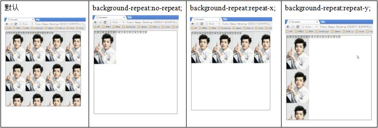
background-position
“css精灵”,英语css sprite,所以也叫做“css雪碧”技术。是一种CSS图像合并技术,该方法是将小图标和背景图像合并到一张图片上,然后利用css的背景定位来显示需要显示的图片部分。css精灵有什么优点,就是减少了http请求。比如4张小图片,原本需要4个http请求。但是用了css精灵,小图片变为了一张图,http请求只有1个了。background-position: 描述左右的词儿 描述上下的词儿; 描述左右的词儿: left、 center、right 描述上下的词儿: top 、center、bottom
background-attachment
background-attachment:fixed;
背景就会被固定住,不会被滚动条滚走。
background综合属性
background:red url(1.jpg) no-repeat 100px 100px fixed;
等价于
background-color:red;
background-image:url(1.jpg);
background-repeat:no-repeat;
background-position:100px 100px;
background-attachment:fixed;
行高和字号
文字,是在自己的行里面居中的。比如,现在文字字号14px,行高是24px。那么: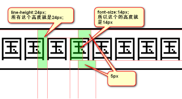
为了严格保证字在行里面居中,我们的工程师有一个约定: 行高、字号,一般都是偶数。这样,它们的差,就是偶数,就能够被2整除。
单行文本垂直居中
p{
height:60px;
line-height:60px;
}
只适用于单行文本垂直居中,不适用于多行。如果想让多行文本垂直居中,需要设置盒子的padding:
font属性
使用font属性,能够将字号、行高、字体,能够一起设置。font: 14px/24px “宋体”;
为了防止用户电脑里面,没有微软雅黑这个字体。就要用英语的逗号,隔开备选字体。我们要将英语字体,放在最前面,这样所有的中文,就不能匹配英语字体,就自动的变为后面的中文字体。
font-family: "Times New Roman","微软雅黑","宋体";
行高可以用百分比,表示字号的百分之多少。一般来说,都是大于100%的,因为行高一定要大于字号。
font:12px/200% “宋体”
超链接美化
伪类:同一个标签,根据用户的某种状态不同,有不同的样式。这就叫做“伪类”。a标签有4种伪类
a:link{       /* 从未访问过 */
color:red;
}
a:visited{    /* 访问过 */
color:orange;
}
a:hover{      /* 鼠标悬停 */
color:green;
}
a:active{     /* 鼠标点击未离开 */
color:black;
}
z-index属性
只有定位的盒子里面才有z-indexz-index值表示谁压着谁。数值大的压盖住数值小的。
只有定位了的元素,才能有z-index值。也就是说,不管相对定位、绝对定位、固定定位,都可以使用z-index值。而浮动的东西不能用。
z-index值没有单位,就是一个正整数。默认的z-index值是0。
如果大家都没有z-index值,或者z-index值一样,那么谁写在HTML后面,谁在上面能压住别人。定位了的元素,永远能够压住没有定位的元素。

相关文章推荐
- 前端开发笔记(2)css基础(上)
- 前端开发笔记(3)css基础(中)
- 前端开发笔记(3)css基础(中)
- 〖前端开发〗HTML/CSS基础知识学习笔记
- 前端开发笔记(4)css基础(下)
- 前端开发笔记(2)css基础(上)
- [开发笔记]-页面切图、CSS前端设计、JS
- Web前端开发基础 第四课(CSS小技巧)
- Web前端开发css基础样式总结
- 20150726 Web前端开发基础html+css
- 前端基础学习-css基础笔记
- Web前端开发css基础样式总结
- 前端开发入门:html和css基础知识回顾2
- Web前端开发基础 第四课(CSS一些性质)
- 前端开发笔记(1)html基础
- 前端开发:css基础知识之盒模型以及浮动布局。
- 一、HTML和CSS基础--开发工具--Sublime前端开发工具技巧介绍
- Web前端开发基础 第四课(CSS元素模型)
- Web前端开发基础 第一天(Html和CSS)
- Web前端开发工具(html+css基础)