Bootstrap模态框(modal)垂直居中
2016-11-23 16:11
507 查看
在使用Bootstrap框架中遇到的一个问题分享一下,在产品开发的过程中使用了大量的弹出窗口(modal)。
刚开始学习使用的过程中就发现此窗口不能垂直居中,总是偏上,并且不能拖动,看了一下使用说明也没有提供过多的属性设置和方法,就这样使用默认的方式一直用着。最近,客户却提出了一个要求:能不能让弹出窗口居中,因为一些小的窗口偏上总感觉整体页面失衡,大一点的还过得去。
因为之前对Bootstrap也不是很熟悉,便开始baidu、google,发现只有很少的解决方案,如下:
参考地址:http://www.g2w.me/2012/06/bootstrap-modal-shown-in-the-center/
这种方法自己试了一下,并不能完全居中,并且窗口的大小不一样的话,每次显示的margin-top值也会改变,遮盖层还会出现滚动条,效果也不好看。
自己也试了改了几种方式也不容乐观,发现在窗口弹出之前是获取不到$(this).height()的值,本想着是用($(window).height()-$(this).height())/2,发现还是不可行。
最终只能研究一下源码了,发现可以在bootstrap.js文件900行后面添加如下代码,便可以实现垂直居中。
页面代码如下:
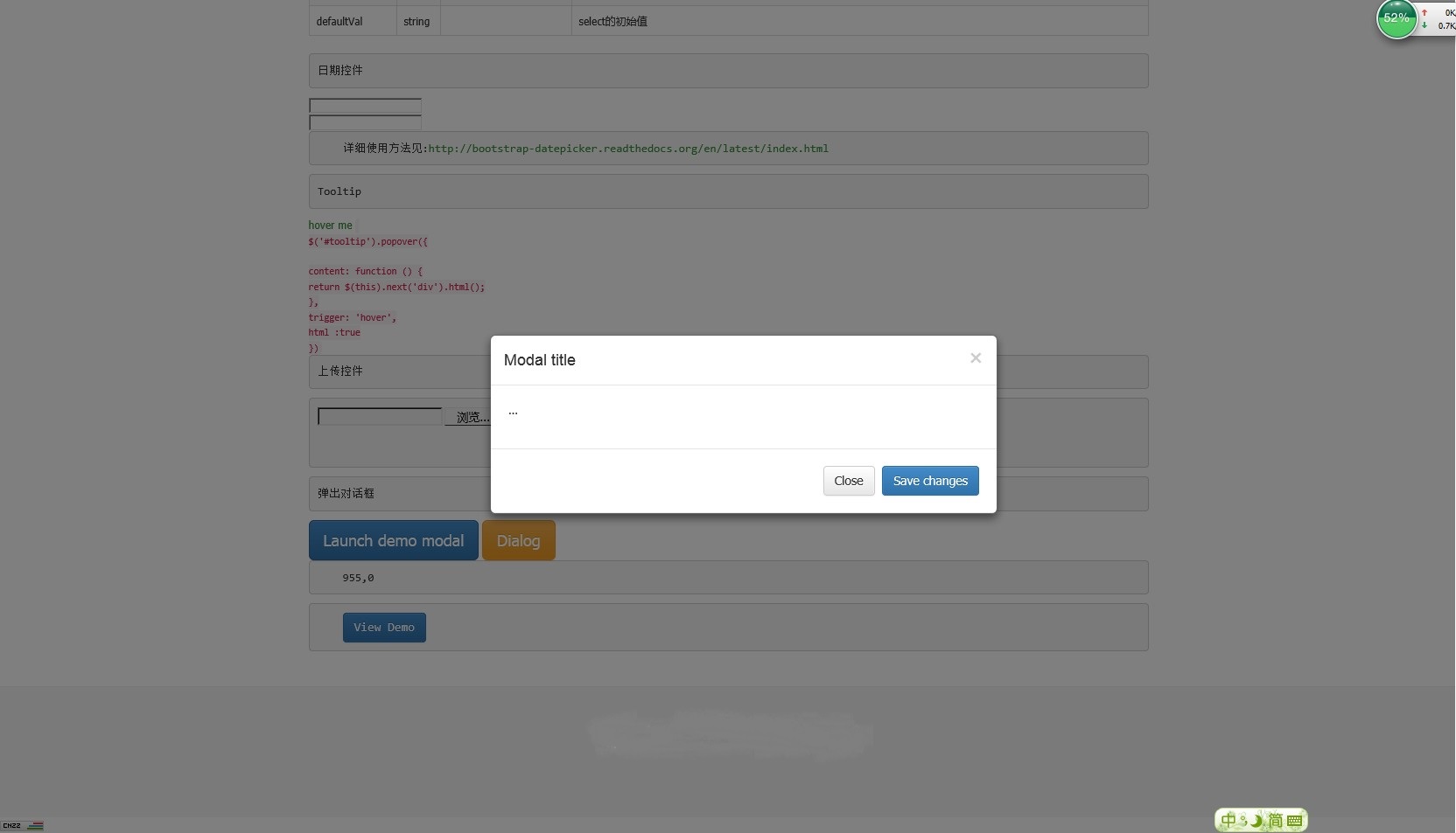
效果图如下:
刚开始学习使用的过程中就发现此窗口不能垂直居中,总是偏上,并且不能拖动,看了一下使用说明也没有提供过多的属性设置和方法,就这样使用默认的方式一直用着。最近,客户却提出了一个要求:能不能让弹出窗口居中,因为一些小的窗口偏上总感觉整体页面失衡,大一点的还过得去。
因为之前对Bootstrap也不是很熟悉,便开始baidu、google,发现只有很少的解决方案,如下:
1 $("#myModal").modal().css({
2       "margin-top": function () {
3               return - ($(this).height() / 2);
4         }
5 });参考地址:http://www.g2w.me/2012/06/bootstrap-modal-shown-in-the-center/
这种方法自己试了一下,并不能完全居中,并且窗口的大小不一样的话,每次显示的margin-top值也会改变,遮盖层还会出现滚动条,效果也不好看。
自己也试了改了几种方式也不容乐观,发现在窗口弹出之前是获取不到$(this).height()的值,本想着是用($(window).height()-$(this).height())/2,发现还是不可行。
最终只能研究一下源码了,发现可以在bootstrap.js文件900行后面添加如下代码,便可以实现垂直居中。
1 that.$element.children().eq(0).css("position", "absolute").css({
2           "margin":"0px",
3           "top": function () {
4               return (that.$element.height() - that.$element.children().eq(0).height()-40) / 2 + "px";
5           },
6           "left": function () {
7               return (that.$element.width() - that.$element.children().eq(0).width()) / 2 + "px";
8           }
9       });
页面代码如下:
1 <div>
2     <button class="btn btn-primary btn-lg" data-toggle="modal" data-target="#myModal">
3         Launch demo modal
4     </button>
5     <!-- Modal -->
6     <div class="modal fade" id="myModal" tabindex="-1" role="dialog" aria-labelledby="myModalLabel" aria-hidden="true">
7         <div class="modal-dialog">
8             <div class="modal-content">
9                 <div class="modal-header">
10                     <button type="button" class="close" data-dismiss="modal" aria-hidden="true">×</button>
11                     <h4 class="modal-title" id="myModalLabel">Modal title</h4>
12                 </div>
13                 <div class="modal-body">
14                     ...
15                 </div>
16                 <div class="modal-footer">
17                     <button type="button" class="btn btn-default" data-dismiss="modal">Close</button>
18                     <button type="button" class="btn btn-primary">Save changes</button>
19                 </div>
20             </div><!-- /.modal-content -->
21         </div><!-- /.modal-dialog -->
22     </div><!-- /.modal -->
23 </div>
效果图如下:

相关文章推荐
- Bootstrap modal 模态框垂直居中
- Bootstrap 模态框(modal)实现水平垂直居中显示
- bootstrap多个modal模态框同时设置垂直居中的方法
- Bootstrap(v3.2.0)模态框(modal)垂直居中
- bootstrap 模态框(modal)实现水平垂直居中显示
- Bootstrap模态框(modal)垂直居中
- bootstrap 模态框(modal)实现水平垂直居中显示 含具体分析
- Bootstrap模态框(modal)垂直居中
- bootstrap 模态框(modal)实现水平垂直居中显示的方法
- bootstrap modal弹出框的垂直居中
- Bootstrap 弹出框modal 垂直居中(适用各种分辨率窗口)
- 通过纯css样式将bootstrap模态框垂直居中
- BootStrap模态框不垂直居中的解决方法
- bootstrap modal弹出框的垂直居中
- bootstrap 3.3 模态框垂直居中问题
- bootstrap模态框 垂直居中
- bootstrap modal垂直居中
- BootStrap3.X模态框垂直居中显示
- Bootstrap模态框水平垂直居中与增加拖拽功能
- Bootstrap 模态框垂直居中处理