深度剖析之 PagerSlidingTabStrip
2016-11-17 17:15
232 查看
剖析项目名称: Android PagerSlidingTabStrip (default Material
Design)
剖析原项目地址:https://codeload.github.com/jpardogo/PagerSlidingTabStrip/zip/master
剖析理由:只知其然而不知其所以然,如此不好。想要快速的进阶,不走寻常路,剖析开源项目,深入理解扩展知识,仅仅这样还不够,还需要如此:左手爱哥的设计模式,右手重构改善既有设计,如此漫长打坐,回过头再看来时的路,书已成山,相信翔哥说的,量变引起质变。
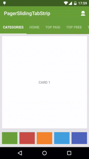
话不多说,献上Gif(没有Gif就是耍流氓了O(∩_∩)O~)
Android studio 导入项目里面一键搞定(AS的魅力真的很大,我都把持不住啦)
1
作为一个依赖导入到自己项目,xml布局调用实例:
2
3
4
5
1
2
3
4
5
PagerSlidingTabStrip配合ViewPager一起使用,当ViewPager的onPagerChangeListener回调时,PagerSlidingTabStrip也一起随之变动,具体做法都已封装到了PagerSlidingTabStrip.setViewPager()方法里,使用时调用实例如下:
2
3
4
5
6
7
1
2
3
4
5
6
7
如果你需要监听PagerSlidingTabStrip的check状态变化,只需要如此:
2
1
2
下面是一些关于自定义属性的简短说明,如果你需要定制化的UI可以通过引用这些属性帮助你实现你想要的效果。
android:textColorPrimary 文字颜色
pstsIndicatorColor 滑动指示器颜色
pstsIndicatorHeight 滑动指示器高度
pstsUnderlineColor 视图的底部的全宽线的颜色
pstsUnderlineHeight 视图的底部的全宽线的高度
pstsDividerColor 选项卡之间的分隔线的颜色
pstsDividerWidth 选项卡之间的分隔线的宽度
pstsDividerPadding 选项卡之间的分隔线的Pading填充
pstsShouldExpand 如果设置为true,每个选项卡都是相同的weight,即LinearLayout的权重一样,默认为false
pstsScrollOffset 滑动Tab的偏移量
pstsPaddingMiddle 如果true,视图的标签会以居中显示的方式呈现。
pstsTabPaddingLeftRight 每个标签左右填充宽度
pstsTabBackground 每个标签的背景,应该是一个selector,checked=”true/false”对应不同的背景
pstsTabTextSize Tab标签的文字大小
pstsTabTextColor Tab标签的文字颜色
pstsTabTextStyle
pstsTabTextAllCaps 如果为true,所有标签都是大写字母,默认为true
pstsTabTextAlpha 设置文本alpha透明度不选中的选项卡。0 . . 255之间,150是默认值。
pstsTabTextFontFamily Tab标签文字的字体
setTypeface(Typeface typeface, int style) 设置字体,把字体放入assets里通过该方法调用
先看看github上作者提供的compile:
2
3
4
5
6
7
8
9
10
1
2
3
4
5
6
7
8
9
10
用了V7包,状态栏和标题栏的颜色修改需要,cardView稍后细说,butterknife第三方注解框架,我比较喜欢用xutils,用法都差不多,这里就不细说,不解就看官方文档说明,systembartint这个是一个关于沉浸式状态栏的兼容包,向下兼容到4.4,nineoldandroids动画库。这里简单的提一下,沉浸式状态栏,在不同的手机和系统上可能存在兼容性问题,这里以5.1系统的手机为实例,做个简单的demo
2
3
4
5
6
7
8
9
10
11
12
13
14
15
1
2
3
4
5
6
7
8
9
10
11
12
13
14
15
Value-v19里面设置透明属性并在activity_main里面设置一个属性fitsSystemWindows(给状态栏预留空间,如果开发中遇到兼容问题建议这里通过style引用该属性):
2
3
4
5
1
2
3
4
5
Activity测试类调用systembartint设置沉浸式状态栏相关属性
2
3
4
5
6
7
8
9
10
11
12
13
14
15
16
17
1
2
3
4
5
6
7
8
9
10
11
12
13
14
15
16
17

demo太简单了,就不上传资源了,作者github上demo底部动态控制沉浸式状态栏,通过onClick获取颜色值,调用changeColor重新赋值,在开发中结合抽屉控件可以达到意想不到的效果。不过这些都不是本文重点,还是回到主题PagerSlidingTabStrip.Java
2
3
4
5
6
7
8
9
10
11
12
13
14
15
16
17
18
19
20
21
22
23
24
25
26
27
28
29
30
31
32
33
34
35
36
37
38
39
40
41
42
43
44
45
46
47
48
49
50
51
52
53
54
55
56
57
58
59
60
61
62
63
64
65
66
67
68
69
70
71
72
73
74
75
76
77
78
79
80
81
82
83
84
85
86
87
88
89
90
91
92
93
1
2
3
4
5
6
7
8
9
10
11
12
13
14
15
16
17
18
19
20
21
22
23
24
25
26
27
28
29
30
31
32
33
34
35
36
37
38
39
40
41
42
43
44
45
46
47
48
49
50
51
52
53
54
55
56
57
58
59
60
61
62
63
64
65
66
67
68
69
70
71
72
73
74
75
76
77
78
79
80
81
82
83
84
85
86
87
88
89
90
91
92
93
onAttachedToWindow方法给传入的ViewPager的Adapter注册观察者,onDetachedFromWindow则注销观察者,当Adapter数据发生变化时,通过观察者调用onChanged方法调用该类里定义的刷新方法,当数据集失效时,会调用DataSetObserver的onINvalidated()方法。
2
3
4
5
6
7
8
9
10
11
12
13
14
15
16
17
18
19
20
21
1
2
3
4
5
6
7
8
9
10
11
12
13
14
15
16
17
18
19
20
21
View视图的测量,onLayout重新计算width,并添加OnGlobalLayoutListener
2
3
4
5
6
7
8
9
10
11
12
13
14
15
16
17
18
19
20
21
22
23
24
25
26
27
28
1
2
3
4
5
6
7
8
9
10
11
12
13
14
15
16
17
18
19
20
21
22
23
24
25
26
27
28
再来看看大功臣onDraw方法
2
3
4
5
6
7
8
9
10
11
12
13
14
15
16
17
18
19
20
21
22
23
24
25
26
27
28
29
30
31
32
33
34
35
36
1
2
3
4
5
6
7
8
9
10
11
12
13
14
15
16
17
18
19
20
21
22
23
24
25
26
27
28
29
30
31
32
33
34
35
36
对外公开的方法setViewPager(),该方法的调用必须在ViewPager设置Adapter之后不然会抛出异常。
2
3
4
5
6
7
8
9
10
11
12
1
2
3
4
5
6
7
8
9
10
11
12
这里的PagerChangerListener代码如下:
2
3
4
5
6
7
8
9
10
11
12
13
14
15
16
17
18
19
20
21
22
23
24
25
26
27
28
29
30
31
32
33
34
35
36
37
38
39
40
41
42
43
44
45
46
47
48
49
50
51
52
53
1
2
3
4
5
6
7
8
9
10
11
12
13
14
15
16
17
18
19
20
21
22
23
24
25
26
27
28
29
30
31
32
33
34
35
36
37
38
39
40
41
42
43
44
45
46
47
48
49
50
51
52
53
自定义方法notifyDataSetChanged做了三件事,先移除现有的childView,再遍历addView,设置每个Tab的属性(TextView)
2
3
4
5
6
7
8
9
10
11
12
13
14
15
16
17
1
2
3
4
5
6
7
8
9
10
11
12
13
14
15
16
17
在调用addTab方法传入了tab的位置position,当点击了当前Tab即当前TextView响应了onClick事件,选中了该Tab,就会掉当前position
2
3
4
5
6
7
8
9
10
11
12
13
14
15
16
17
18
19
20
21
22
23
24
1
2
3
4
5
6
7
8
9
10
11
12
13
14
15
16
17
18
19
20
21
22
23
24
看完这个开源项目,大致理顺思路:自定义横向ScrollView,构造参数设置ScrollView属性,解析自定义属性,onLayout测量视图绑定OnGlobalLayoutListener监听,在其回调函数里调用notifyDataSetChanged,onDraw方法绘制分割线指示器等,在我们调用setViewPager是通过notifyDataSetChanged添加子视图,并绑定监听事件。
总结:这个开源项目自定义属性比较多,定制扩展方便比较MaterialTabs开源项目,虽然原理都差不多。通过这个项目,加深了我对ViewTreeObserver、OnGlobalLayoutListener等相关类的理解createColorStateList方法可以写一个工具类封装类似的selector。
参考资料:
http://www.aiuxian.com/article/p-638915.html
http://blog.csdn.net/caesardadi/article/details/8307449
Design)
剖析原项目地址:https://codeload.github.com/jpardogo/PagerSlidingTabStrip/zip/master
剖析理由:只知其然而不知其所以然,如此不好。想要快速的进阶,不走寻常路,剖析开源项目,深入理解扩展知识,仅仅这样还不够,还需要如此:左手爱哥的设计模式,右手重构改善既有设计,如此漫长打坐,回过头再看来时的路,书已成山,相信翔哥说的,量变引起质变。
话不多说,献上Gif(没有Gif就是耍流氓了O(∩_∩)O~)
Android studio 导入项目里面一键搞定(AS的魅力真的很大,我都把持不住啦)
compile 'com.jpardogo.materialtabstrip:library:1.1.0'1
1
作为一个依赖导入到自己项目,xml布局调用实例:
<com.astuetz.PagerSlidingTabStrip
android:id="@+id/tabs"
android:layout_width="match_parent"
android:layout_height="?attr/actionBarSize"
android:background="?attr/colorPrimary" />
1
2
3
4
5
1
2
3
4
5
PagerSlidingTabStrip配合ViewPager一起使用,当ViewPager的onPagerChangeListener回调时,PagerSlidingTabStrip也一起随之变动,具体做法都已封装到了PagerSlidingTabStrip.setViewPager()方法里,使用时调用实例如下:
// Initialize the ViewPager and set an adapter
ViewPager pager = (ViewPager) findViewById(R.id.pager);
pager.setAdapter(new TestAdapter(getSupportFragmentManager()));

// Bind the tabs to the ViewPager
PagerSlidingTabStrip tabs = (PagerSlidingTabStrip) findViewById(R.id.tabs);
tabs.setViewPager(pager);
1
2
3
4
5
6
7
1
2
3
4
5
6
7
如果你需要监听PagerSlidingTabStrip的check状态变化,只需要如此:
// continued from above
tabs.setOnPageChangeListener(mPageChangeListener);
1
2
1
2
下面是一些关于自定义属性的简短说明,如果你需要定制化的UI可以通过引用这些属性帮助你实现你想要的效果。
android:textColorPrimary 文字颜色
pstsIndicatorColor 滑动指示器颜色
pstsIndicatorHeight 滑动指示器高度
pstsUnderlineColor 视图的底部的全宽线的颜色
pstsUnderlineHeight 视图的底部的全宽线的高度
pstsDividerColor 选项卡之间的分隔线的颜色
pstsDividerWidth 选项卡之间的分隔线的宽度
pstsDividerPadding 选项卡之间的分隔线的Pading填充
pstsShouldExpand 如果设置为true,每个选项卡都是相同的weight,即LinearLayout的权重一样,默认为false
pstsScrollOffset 滑动Tab的偏移量
pstsPaddingMiddle 如果true,视图的标签会以居中显示的方式呈现。
pstsTabPaddingLeftRight 每个标签左右填充宽度
pstsTabBackground 每个标签的背景,应该是一个selector,checked=”true/false”对应不同的背景
pstsTabTextSize Tab标签的文字大小
pstsTabTextColor Tab标签的文字颜色
pstsTabTextStyle
pstsTabTextAllCaps 如果为true,所有标签都是大写字母,默认为true
pstsTabTextAlpha 设置文本alpha透明度不选中的选项卡。0 . . 255之间,150是默认值。
pstsTabTextFontFamily Tab标签文字的字体
setTypeface(Typeface typeface, int style) 设置字体,把字体放入assets里通过该方法调用
先看看github上作者提供的compile:
dependencies {
compile fileTree(dir: 'libs', include: ['*.jar'])
testCompile 'junit:junit:4.12'
compile "com.android.support:appcompat-v7:22.2.0"
compile 'com.android.support:cardview-v7:22.2.0'
compile 'com.jakewharton:butterknife:6.0.0'
compile 'com.readystatesoftware.systembartint:systembartint:1.0.3'
compile 'com.nineoldandroids:library:2.4.0'
compile 'com.jpardogo.materialtabstrip:library:1.1.0'
}12
3
4
5
6
7
8
9
10
1
2
3
4
5
6
7
8
9
10
用了V7包,状态栏和标题栏的颜色修改需要,cardView稍后细说,butterknife第三方注解框架,我比较喜欢用xutils,用法都差不多,这里就不细说,不解就看官方文档说明,systembartint这个是一个关于沉浸式状态栏的兼容包,向下兼容到4.4,nineoldandroids动画库。这里简单的提一下,沉浸式状态栏,在不同的手机和系统上可能存在兼容性问题,这里以5.1系统的手机为实例,做个简单的demo
<style name="AppBaseTheme" parent="Theme.AppCompat.Light.NoActionBar">
<!-- window 背景色 -->
<item name="android:windowBackground">@color/background_window</item>
<!-- ...and here we setting appcompat’s color theming attrs -->
<!-- 标题栏的颜色 -->
<item name="colorPrimary">@color/colorPrimary</item>
<!-- 状态栏颜色-->
<item name="colorPrimaryDark">@color/colorPrimaryDark</item>
<!-- 控件颜色 -->
<item name="colorAccent">@color/colorAccent</item>
<!-- 控件文字颜色 -->
<item name="android:textColorPrimary">@android:color/white</item>
</style>

<style name="AppTheme" parent="AppBaseTheme" />
1
2
3
4
5
6
7
8
9
10
11
12
13
14
15
1
2
3
4
5
6
7
8
9
10
11
12
13
14
15
Value-v19里面设置透明属性并在activity_main里面设置一个属性fitsSystemWindows(给状态栏预留空间,如果开发中遇到兼容问题建议这里通过style引用该属性):
<style name="AppTheme" parent="AppBaseTheme">
<item name="android:windowTranslucentStatus">true</item>
</style>

android:fitsSystemWindows="true"
1
2
3
4
5
1
2
3
4
5
Activity测试类调用systembartint设置沉浸式状态栏相关属性
public class MainActivity extends ActionBarActivity {

private SystemBarTintManager mTintManager;

@Override
protected void onCreate(Bundle savedInstanceState) {
super.onCreate(savedInstanceState);
setContentView(R.layout.activity_main);
// create our manager instance after the content view is set
mTintManager = new SystemBarTintManager(this);
// enable status bar tint
mTintManager.setStatusBarTintEnabled(true);

//changeColor(getResources().getColor(R.color.green));
mTintManager.setTintColor(getResources().getColor(R.color.colorPrimary));
}
}12
3
4
5
6
7
8
9
10
11
12
13
14
15
16
17
1
2
3
4
5
6
7
8
9
10
11
12
13
14
15
16
17
demo太简单了,就不上传资源了,作者github上demo底部动态控制沉浸式状态栏,通过onClick获取颜色值,调用changeColor重新赋值,在开发中结合抽屉控件可以达到意想不到的效果。不过这些都不是本文重点,还是回到主题PagerSlidingTabStrip.Java
public class PagerSlidingTabStrip extends HorizontalScrollView {

//透明度,如果没有传入自定义属性文字颜色透明度,那么默认值为150
public static final int DEF_VALUE_TAB_TEXT_ALPHA = 150;
private int mTabBackgroundResId = R.drawable.psts_background_tab;

public PagerSlidingTabStrip(Context context) {
this(context, null);
}

public PagerSlidingTabStrip(Context context, AttributeSet attrs) {
this(context, attrs, 0);
}

public PagerSlidingTabStrip(Context context, AttributeSet attrs, int defStyle) {
super(context, attrs, defStyle);
//当你想让一个高度值不足scrollview的子控件fillparent的时候,单独的定义android:layout_height="fill_parent"是不起作用的,必须加上fillviewport属性,当子控件的高度值大于scrollview的高度时,这个标签就没有任何意义了
setFillViewport(true);
//控制是否执行OnDraw方法绘制
setWillNotDraw(false);
//添加ScrollView的唯一子布局LinearLayout
mTabsContainer = new LinearLayout(context);
mTabsContainer.setOrientation(LinearLayout.HORIZONTAL);
addView(mTabsContainer);

//初始化画笔
mRectPaint = new Paint();
mRectPaint.setAntiAlias(true);
mRectPaint.setStyle(Style.FILL);

//获取屏幕相关属性
DisplayMetrics dm = getResources().getDisplayMetrics();
//解析自定义属性值
mScrollOffset = (int) TypedValue.applyDimension(TypedValue.COMPLEX_UNIT_DIP, mScrollOffset, dm);
//............此处略..............

//初始化分割线画笔
mDividerPaint = new Paint();
mDividerPaint.setAntiAlias(true);
mDividerPaint.setStrokeWidth(mDividerWidth);

// get system attrs for container 解析属性
TypedArray a = context.obtainStyledAttributes(attrs, ANDROID_ATTRS);
int textPrimaryColor = a.getColor(TEXT_COLOR_PRIMARY, getResources().getColor(android.R.color.black));
mUnderlineColor = textPrimaryColor;
mDividerColor = textPrimaryColor;
mIndicatorColor = textPrimaryColor;
int padding = a.getDimensionPixelSize(PADDING_INDEX, 0);
mPaddingLeft = padding > 0 ? padding : a.getDimensionPixelSize(PADDING_LEFT_INDEX, 0);
mPaddingRight = padding > 0 ? padding : a.getDimensionPixelSize(PADDING_RIGHT_INDEX, 0);
a.recycle();

String tabTextTypefaceName = "sans-serif";
// Use Roboto Medium as the default typeface from API 21 onwards
if (Build.VERSION.SDK_INT >= Build.VERSION_CODES.LOLLIPOP) {
//走版本分支设置字体,在android 21后提供了这个字体
tabTextTypefaceName = "sans-serif-medium";
mTabTextTypefaceStyle = Typeface.NORMAL;
}

// get custom attrs for tabs and container 解析自定义属性值
a = context.obtainStyledAttributes(attrs, R.styleable.PagerSlidingTabStrip);
mIndicatorColor = a.getColor(R.styleable.PagerSlidingTabStrip_pstsIndicatorColor, mIndicatorColor);
//............此处略..............
//释放
a.recycle();

//Tab text color selector 创建tab文字的selector
if (mTabTextColor == null) {
mTabTextColor = createColorStateList(
textPrimaryColor,
textPrimaryColor,
Color.argb(tabTextAlpha,
Color.red(textPrimaryColor),
Color.green(textPrimaryColor),
Color.blue(textPrimaryColor)));
}

//Tab text typeface and style
if (fontFamily != null) {
tabTextTypefaceName = fontFamily;
}
mTabTextTypeface = Typeface.create(tabTextTypefaceName, mTabTextTypefaceStyle);

//Bottom padding for the tabs container parent view to show indicator and underline 底部填充的容器父视图选项卡显示指示器和下划线
setTabsContainerParentViewPaddings();

//Configure tab's container LayoutParams for either equal divided space or just wrap tabs  配置选项卡的容器LayoutParams,设置权重
mTabLayoutParams = isExpandTabs ?
new LinearLayout.LayoutParams(0, LayoutParams.MATCH_PARENT, 1.0f) :
new LinearLayout.LayoutParams(LayoutParams.WRAP_CONTENT, LayoutParams.MATCH_PARENT);
}
}12
3
4
5
6
7
8
9
10
11
12
13
14
15
16
17
18
19
20
21
22
23
24
25
26
27
28
29
30
31
32
33
34
35
36
37
38
39
40
41
42
43
44
45
46
47
48
49
50
51
52
53
54
55
56
57
58
59
60
61
62
63
64
65
66
67
68
69
70
71
72
73
74
75
76
77
78
79
80
81
82
83
84
85
86
87
88
89
90
91
92
93
1
2
3
4
5
6
7
8
9
10
11
12
13
14
15
16
17
18
19
20
21
22
23
24
25
26
27
28
29
30
31
32
33
34
35
36
37
38
39
40
41
42
43
44
45
46
47
48
49
50
51
52
53
54
55
56
57
58
59
60
61
62
63
64
65
66
67
68
69
70
71
72
73
74
75
76
77
78
79
80
81
82
83
84
85
86
87
88
89
90
91
92
93
onAttachedToWindow方法给传入的ViewPager的Adapter注册观察者,onDetachedFromWindow则注销观察者,当Adapter数据发生变化时,通过观察者调用onChanged方法调用该类里定义的刷新方法,当数据集失效时,会调用DataSetObserver的onINvalidated()方法。
@Override
protected void onAttachedToWindow() {
super.onAttachedToWindow();
if (mPager != null) {
if (!mAdapterObserver.isAttached()) {
mPager.getAdapter().registerDataSetObserver(mAdapterObserver);
mAdapterObserver.setAttached(true);
}
}
}

@Override
protected void onDetachedFromWindow() {
super.onDetachedFromWindow();
if (mPager != null) {
if (mAdapterObserver.isAttached()) {
mPager.getAdapter().unregisterDataSetObserver(mAdapterObserver);
mAdapterObserver.setAttached(false);
}
}
}12
3
4
5
6
7
8
9
10
11
12
13
14
15
16
17
18
19
20
21
1
2
3
4
5
6
7
8
9
10
11
12
13
14
15
16
17
18
19
20
21
View视图的测量,onLayout重新计算width,并添加OnGlobalLayoutListener
@Override
protected void onLayout(boolean changed, int l, int t, int r, int b) {
if (isPaddingMiddle || mPaddingLeft > 0 || mPaddingRight > 0) {
//重新计算宽度
int width;
if (isPaddingMiddle) {
width = getWidth();
} else {
// Account for manually set padding for offsetting tab start and end positions.
width = getWidth() - mPaddingLeft - mPaddingRight;
}

//Make sure tabContainer is bigger than the HorizontalScrollView to be able to scroll    设置mTabsContainer的最小宽度>父布局宽度,确保能横屏滑动
mTabsContainer.setMinimumWidth(width);
//Clipping padding to false to see the tabs while we pass them swiping
setClipToPadding(false);
}

if (mTabsContainer.getChildCount() > 0) {
//当在一个视图树中全局布局发生改变或者视图树中的某个视图的可视状态发生改变时,所要调用的回调函数的接口类
mTabsContainer
.getChildAt(0)
.getViewTreeObserver()
.addOnGlobalLayoutListener(firstTabGlobalLayoutListener);
}

super.onLayout(changed, l, t, r, b);
}12
3
4
5
6
7
8
9
10
11
12
13
14
15
16
17
18
19
20
21
22
23
24
25
26
27
28
1
2
3
4
5
6
7
8
9
10
11
12
13
14
15
16
17
18
19
20
21
22
23
24
25
26
27
28
再来看看大功臣onDraw方法
@Override
protected void onDraw(Canvas canvas) {
super.onDraw(canvas);
if (isInEditMode() || mTabCount == 0) {
return;
}

final int height = getHeight();
// draw divider
if (mDividerWidth > 0) {
mDividerPaint.setStrokeWidth(mDividerWidth);
mDividerPaint.setColor(mDividerColor);
for (int i = 0; i < mTabCount - 1; i++) {
//绘制tab间每条分割线
View tab = mTabsContainer.getChildAt(i);
canvas.drawLine(tab.getRight(), mDividerPadding, tab.getRight(), height - mDividerPadding, mDividerPaint);
}
}

// draw underline
if (mUnderlineHeight > 0) {
//视图的底部的全宽线的颜色
mRectPaint.setColor(mUnderlineColor);
canvas.drawRect(mPaddingLeft, height - mUnderlineHeight, mTabsContainer.getWidth() + mPaddingRight, height, mRectPaint);
}

// draw indicator line
if (mIndicatorHeight > 0) {
//绘制滑动条
mRectPaint.setColor(mIndicatorColor);
//Pair用于存储一组数据的,该类位于v4下util包,这里调用getIndicatorCoordinates方法通过当前Tab和NextTab计算出距离存放入Pair,个人感觉比数组集合map那些好用多了

Pair<Float, Float> lines = getIndicatorCoordinates();
canvas.drawRect(lines.first + mPaddingLeft, height - mIndicatorHeight, lines.second + mPaddingLeft, height, mRectPaint);
}
}12
3
4
5
6
7
8
9
10
11
12
13
14
15
16
17
18
19
20
21
22
23
24
25
26
27
28
29
30
31
32
33
34
35
36
1
2
3
4
5
6
7
8
9
10
11
12
13
14
15
16
17
18
19
20
21
22
23
24
25
26
27
28
29
30
31
32
33
34
35
36
对外公开的方法setViewPager(),该方法的调用必须在ViewPager设置Adapter之后不然会抛出异常。
public void setViewPager(ViewPager pager) {
this.mPager = pager;
if (pager.getAdapter() == null) {
throw new IllegalStateException("ViewPager does not have adapter instance.");
}

isCustomTabs = pager.getAdapter() instanceof CustomTabProvider;
pager.setOnPageChangeListener(mPageListener);
pager.getAdapter().registerDataSetObserver(mAdapterObserver);
mAdapterObserver.setAttached(true);
notifyDataSetChanged();
}12
3
4
5
6
7
8
9
10
11
12
1
2
3
4
5
6
7
8
9
10
11
12
这里的PagerChangerListener代码如下:
private class PageListener implements OnPageChangeListener {

@Override
public void onPageScrolled(int position, float positionOffset, int positionOffsetPixels) {
//重新赋值当前选中位置和偏移量
mCurrentPosition = position;
mCurrentPositionOffset = positionOffset;
//根据positionOffset计算出mTabsContainer实际的偏移值,再通过scrollTo方法实现滑动到指定位置,并调用重绘指示器位置
int offset = mTabCount > 0 ? (int) (positionOffset * mTabsContainer.getChildAt(position).getWidth()) : 0;
scrollToChild(position, offset);
invalidate();
if (mDelegatePageListener != null) {
mDelegatePageListener.onPageScrolled(position, positionOffset, positionOffsetPixels);
}
}

@Override
public void onPageScrollStateChanged(int state) {
if (state == ViewPager.SCROLL_STATE_IDLE) {
scrollToChild(mPager.getCurrentItem(), 0);
}
//Full tabTextAlpha for current item
View currentTab = mTabsContainer.getChildAt(mPager.getCurrentItem());
//改变选中tab的文字颜色 不透明
select(currentTab);
//Half transparent for prev item

if (mPager.getCurrentItem() - 1 >= 0) {
View prevTab = mTabsContainer.getChildAt(mPager.getCurrentItem() - 1);
//取消上一个选中Tab状态 让该Tab处于半透明状态
unSelect(prevTab);
}

//Half transparent for next item
if (mPager.getCurrentItem() + 1 <= mPager.getAdapter().getCount() - 1) {
View nextTab = mTabsContainer.getChildAt(mPager.getCurrentItem() + 1);
unSelect(nextTab);
}

if (mDelegatePageListener != null) {
mDelegatePageListener.onPageScrollStateChanged(state);
}
}

@Override
public void onPageSelected(int position) {
updateSelection(position);
if (mDelegatePageListener != null) {
mDelegatePageListener.onPageSelected(position);
}
}

}12
3
4
5
6
7
8
9
10
11
12
13
14
15
16
17
18
19
20
21
22
23
24
25
26
27
28
29
30
31
32
33
34
35
36
37
38
39
40
41
42
43
44
45
46
47
48
49
50
51
52
53
1
2
3
4
5
6
7
8
9
10
11
12
13
14
15
16
17
18
19
20
21
22
23
24
25
26
27
28
29
30
31
32
33
34
35
36
37
38
39
40
41
42
43
44
45
46
47
48
49
50
51
52
53
自定义方法notifyDataSetChanged做了三件事,先移除现有的childView,再遍历addView,设置每个Tab的属性(TextView)
public void notifyDataSetChanged() {
mTabsContainer.removeAllViews();
mTabCount = mPager.getAdapter().getCount();
View tabView;
for (int i = 0; i < mTabCount; i++) {
if (isCustomTabs) {
tabView = ((CustomTabProvider) mPager.getAdapter()).getCustomTabView(this, i);
} else {
tabView = LayoutInflater.from(getContext()).inflate(R.layout.psts_tab, this, false);
}

CharSequence title = mPager.getAdapter().getPageTitle(i);
addTab(i, title, tabView);
}

updateTabStyles();
}12
3
4
5
6
7
8
9
10
11
12
13
14
15
16
17
1
2
3
4
5
6
7
8
9
10
11
12
13
14
15
16
17
在调用addTab方法传入了tab的位置position,当点击了当前Tab即当前TextView响应了onClick事件,选中了该Tab,就会掉当前position
private void addTab(final int position, CharSequence title, View tabView) {
TextView textView = (TextView) tabView.findViewById(R.id.psts_tab_title);
if (textView != null) {
if (title != null) textView.setText(title);
}

tabView.setFocusable(true);
tabView.setOnClickListener(new OnClickListener() {
@Override
public void onClick(View v) {
//如果点击该Tab之前,该Tab是未选中状态,要修改相应的ui
if (mPager.getCurrentItem() != position) {
View tab = mTabsContainer.getChildAt(mPager.getCurrentItem());
unSelect(tab);
mPager.setCurrentItem(position);
} else if (mTabReselectedListener != null) {
//如果是重复选择就调用TabReselectedListener接口的回调函数
mTabReselectedListener.onTabReselected(position);
}
}
});

mTabsContainer.addView(tabView, position, mTabLayoutParams);
}12
3
4
5
6
7
8
9
10
11
12
13
14
15
16
17
18
19
20
21
22
23
24
1
2
3
4
5
6
7
8
9
10
11
12
13
14
15
16
17
18
19
20
21
22
23
24
看完这个开源项目,大致理顺思路:自定义横向ScrollView,构造参数设置ScrollView属性,解析自定义属性,onLayout测量视图绑定OnGlobalLayoutListener监听,在其回调函数里调用notifyDataSetChanged,onDraw方法绘制分割线指示器等,在我们调用setViewPager是通过notifyDataSetChanged添加子视图,并绑定监听事件。
总结:这个开源项目自定义属性比较多,定制扩展方便比较MaterialTabs开源项目,虽然原理都差不多。通过这个项目,加深了我对ViewTreeObserver、OnGlobalLayoutListener等相关类的理解createColorStateList方法可以写一个工具类封装类似的selector。
参考资料:
http://www.aiuxian.com/article/p-638915.html
http://blog.csdn.net/caesardadi/article/details/8307449

相关文章推荐
- [置顶] 深度剖析之 PagerSlidingTabStrip
- 深度剖析之 PagerSlidingTabStrip
- 自定义PagerSlidingTabStrip使用中的选中状态改变颜色等问题问题
- 滑动导航栏(PagerSlidingTabStrip)实践
- Android之官方导航栏之Toolbar(Toolbar+DrawerLayout+ViewPager+PagerSlidingTabStrip)
- PagerSlidingTabStrip介绍及使用,让ViewPager更绚丽
- PagerSlidingTabStrip
- Android典型界面设计(8) ——ViewPager+PagerSlidingTabStrip实现双导航
- PagerSlidingTabStrip介绍及使用
- android PagerSlidingTabStrip 文字选中颜色
- PagerSlidingTabStrip(改良版)
- 使用PagerSlidingTabStrip实现顶部导航栏
- 【Android界面实现】使用PagerSlidingTabStrip实现滑动标签同步的ViewPager效果
- Android之官方导航栏之Toolbar(Toolbar+DrawerLayout+ViewPager+PagerSlidingTabStrip)
- PagerSlidingTabStrip
- Android两级导航菜单栏的实现--FragmentTabHost结合ViewPager与Android 开源项目PagerSlidingTabStrip
- 在AndroidStudio中使用PagerSlidingTabStrip
- 使用最广泛的Android爬虫指示器PagerSlidingTabStrip遇到的相关问题的解决,并源码修改
- 002android初级篇之ViewPager及PagerSlidingTabStrip listview的使用
- 关于阅读Android开源项目PagerSlidingTabStrip的理解