微信小程序-表单组件
2016-11-14 14:29
459 查看
button 按钮

注:
button-hover默认为
{background-color: rgba(0, 0, 0, 0.1); opacity: 0.7;}示例代码:
/** wxss **/
/** 修改button默认的点击态样式类**/
.button-hover {
background-color: red;
}
/** 添加自定义button点击态样式类**/
.other-button-hover {
background-color: blur;
}
<button type="default" size="{{defaultSize}}" loading="{{loading}}" plain="{{plain}}"
disabled="{{disabled}}" bindtap="default" hover-class="other-button-hover"> default </button>
<button type="primary" size="{{primarySize}}" loading="{{loading}}" plain="{{plain}}"
disabled="{{disabled}}" bindtap="primary"> primary </button>
<button type="warn" size="{{warnSize}}" loading="{{loading}}" plain="{{plain}}"
disabled="{{disabled}}" bindtap="warn"> warn </button>
<button bindtap="setDisabled">点击设置以上按钮disabled属性</button>
<button bindtap="setPlain">点击设置以上按钮plain属性</button>
<button bindtap="setLoading">点击设置以上按钮loading属性</button>var types = ['default', 'primary', 'warn']
var pageObject = {
data: {
defaultSize: 'default',
primarySize: 'default',
warnSize: 'default',
disabled: false,
plain: false,
loading: false
},
setDisabled: function(e) {
this.setData({
disabled: !this.data.disabled
})
},
setPlain: function(e) {
this.setData({
plain: !this.data.plain
})
},
setLoading: function(e) {
this.setData({
loading: !this.data.loading
})
}
}
for (var i = 0; i < types.length; ++i) {
(function(type) {
pageObject[type] = function(e) {
var key = type + 'Size'
var changedData = {}
changedData[key] =
this.data[key] === 'default' ? 'mini' : 'default'
this.setData(changedData)
}
})(types[i])
}
Page(pageObject)checkbox-group 多项选择器,内部由多个checkbox
组成。

checkbox 多选项目

示例:
<checkbox-group bindchange="checkboxChange">
<label class="checkbox" wx:for="{{items}}">
<checkbox value="{{item.name}}" checked="{{item.checked}}"/>{{item.value}}
</label>
</checkbox-group>
Page({
data: {
items: [
{name: 'USA', value: '美国'},
{name: 'CHN', value: '中国', checked: 'true'},
{name: 'BRA', value: '巴西'},
{name: 'JPN', value: '日本'},
{name: 'ENG', value: '英国'},
{name: 'TUR', value: '法国'},
]
},
checkboxChange: function(e) {
console.log('checkbox发生change事件,携带value值为:', e.detail.value)
}
})form 表单
表单,将组件内的用户输入的<switch/>
<input/>
<checkbox/>
<slider/>
<radio/>
<picker/>提交。

示例代码:
<form bindsubmit="formSubmit" bindreset="formReset">
<view class="section section_gap">
<view class="section__title">switch</view>
<switch name="switch"/>
</view>
<view class="section section_gap">
<view class="section__title">slider</view>
<slider name="slider" show-value ></slider>
</view>

<view class="section">
<view class="section__title">input</view>
<input name="input" placeholder="please input here" />
</view>
<view class="section section_gap">
<view class="section__title">radio</view>
<radio-group name="radio-group">
<label><radio value="radio1"/>radio1</label>
<label><radio value="radio2"/>radio2</label>
</radio-group>
</view>
<view class="section section_gap">
<view class="section__title">checkbox</view>
<checkbox-group name="checkbox">
<label><checkbox value="checkbox1"/>checkbox1</label>
<label><checkbox value="checkbox2"/>checkbox2</label>
</checkbox-group>
</view>
<view class="btn-area">
<button formType="submit">Submit</button>
<button formType="reset">Reset</button>
</view>
</form>
Page({
formSubmit: function(e) {
console.log('form发生了submit事件,携带数据为:', e.detail.value)
},
formReset: function() {
console.log('form发生了reset事件')
}
})
input 输入框

示例代码:
<!--input.wxml-->
<view class="section">
<input placeholder="这是一个可以自动聚焦的input" auto-focus/>
</view>
<view class="section">
<input placeholder="这个只有在按钮点击的时候才聚焦" focus="{{focus}}" />
<view class="btn-area">
<button bindtap="bindButtonTap">使得输入框获取焦点</button>
</view>
</view>
<view class="section">
<input  maxlength="10" placeholder="最大输入长度10" />
</view>
<view class="section">
<view class="section__title">你输入的是:{{inputValue}}</view>
<input  bindinput="bindKeyInput" placeholder="输入同步到view中"/>
</view>
<view class="section">
<input  bindinput="bindReplaceInput" placeholder="连续的两个1会变成2" />
</view>
<view class="section">
<input  bindinput="bindHideKeyboard" placeholder="输入123自动收起键盘" />
</view>
<view class="section">
<input password type="number" />
</view>
<view class="section">
<input password type="text" />
</view>
<view class="section">
<input type="digit" placeholder="带小数点的数字键盘"/>
</view>
<view class="section">
<input type="idcard" placeholder="身份证输入键盘" />
</view>
<view class="section">
<input placeholder-style="color:red" placeholder="占位符字体是红色的" />
</view>
//input.js
Page({
data: {
focus: false,
inputValue: ''
},
bindButtonTap: function() {
this.setData({
focus: true
})
},
bindKeyInput: function(e) {
this.setData({
inputValue: e.detail.value
})
},
bindReplaceInput: function(e) {
var value = e.detail.value
var pos = e.detail.cursor
if(pos != -1){
//光标在中间
var left = e.detail.value.slice(0,pos)
//计算光标的位置
pos = left.replace(/11/g,'2').length
}
//直接返回对象,可以对输入进行过滤处理,同时可以控制光标的位置
return {
value: value.replace(/11/g,'2'),
cursor: pos
}
//或者直接返回字符串,光标在最后边
//return value.replace(/11/g,'2'),
},
bindHideKeyboard: function(e) {
if (e.detail.value === '123') {
//收起键盘
wx.hideKeyboard()
}
}
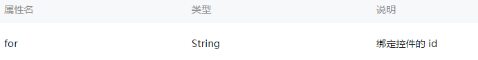
})label
用来改进表单组件的可用性,使用for属性找到对应的
id,或者将控件放在该标签下,当点击时,就会触发对应的控件。
for优先级高于内部控件,内部有多个控件的时候默认触发第一个控件。
目前可以绑定的控件有:
<button/>,
<checkbox/>,
<radio/>,
<switch/>。
示例代码:
<view class="section section_gap">
<view class="section__title">表单组件在label内</view>
<checkbox-group class="group" bindchange="checkboxChange">
<view class="label-1" wx:for="{{checkboxItems}}">
<label>
<checkbox hidden value="{{item.name}}" checked="{{item.checked}}"></checkbox>
<view class="label-1__icon">
<view class="label-1__icon-checked" style="opacity:{{item.checked ? 1: 0}}"></view>
</view>
<text class="label-1__text">{{item.value}}</text>
</label>
</view>
</checkbox-group>
</view>

<view class="section section_gap">
<view class="section__title">label用for标识表单组件</view>
<radio-group class="group" bindchange="radioChange">
<view class="label-2" wx:for="{{radioItems}}">
<radio id="{{item.name}}" hidden value="{{item.name}}" checked="{{item.checked}}"></radio>
<view class="label-2__icon">
<view class="label-2__icon-checked" style="opacity:{{item.checked ? 1: 0}}"></view>
</view>
<label class="label-2__text" for="{{item.name}}"><text>{{item.name}}</text></label>
</view>
</radio-group>
</view>
Page({
data: {
checkboxItems: [
{name: 'USA', value: '美国'},
{name: 'CHN', value: '中国', checked: 'true'},
{name: 'BRA', value: '巴西'},
{name: 'JPN', value: '日本', checked: 'true'},
{name: 'ENG', value: '英国'},
{name: 'TUR', value: '法国'},
],
radioItems: [
{name: 'USA', value: '美国'},
{name: 'CHN', value: '中国', checked: 'true'},
{name: 'BRA', value: '巴西'},
{name: 'JPN', value: '日本'},
{name: 'ENG', value: '英国'},
{name: 'TUR', value: '法国'},
],
hidden: false
},
checkboxChange: function(e) {
var checked = e.detail.value
var changed = {}
for (var i = 0; i < this.data.checkboxItems.length; i ++) {
if (checked.indexOf(this.data.checkboxItems[i].name) !== -1) {
changed['checkboxItems['+i+'].checked'] = true
} else {
changed['checkboxItems['+i+'].checked'] = false
}
}
this.setData(changed)
},
radioChange: function(e) {
var checked = e.detail.value
var changed = {}
for (var i = 0; i < this.data.radioItems.length; i ++) {
if (checked.indexOf(this.data.radioItems[i].name) !== -1) {
changed['radioItems['+i+'].checked'] = true
} else {
changed['radioItems['+i+'].checked'] = false
}
}
this.setData(changed)
}
}).label-1, .label-2{
margin-bottom: 15px;
}
.label-1__text, .label-2__text {
display: inline-block;
vertical-align: middle;
}
.label-1__icon {
position: relative;
margin-right: 10px;
display: inline-block;
vertical-align: middle;
width: 18px;
height: 18px;
background: #fcfff4;
}
.label-1__icon-checked {
position: absolute;
top: 3px;
left: 3px;
width: 12px;
height: 12px;
background: #1aad19;
}
.label-2__icon {
position: relative;
display: inline-block;
vertical-align: middle;
margin-right: 10px;
width: 18px;
height: 18px;
background: #fcfff4;
border-radius: 50px;
}
.label-2__icon-checked {
position: absolute;
left: 3px;
top: 3px;
width: 12px;
height: 12px;
background: #1aad19;
border-radius: 50%;
}
.label-4_text{
text-align: center;
margin-top: 15px;
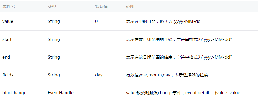
}picker
滚动选择器,现支持三种选择器,通过mode来区分,分别是普通选择器,时间选择器,日期选择器,默认是普通选择器。普通选择器:mode = selector

时间选择器:mode = time

日期选择器:mode = date
示例代码:
<view class="section">
<view class="section__title">地区选择器</view>
<picker bindchange="bindPickerChange" value="{{index}}" range="{{array}}">
<view class="picker">
当前选择:{{array[index]}}
</view>
</picker>
</view>
<view class="section">
<view class="section__title">时间选择器</view>
<picker mode="time" value="{{time}}" start="09:01" end="21:01" bindchange="bindTimeChange">
<view class="picker">
当前选择: {{time}}
</view>
</picker>
</view>

<view class="section">
<view class="section__title">日期选择器</view>
<picker mode="date" value="{{date}}" start="2015-09-01" end="2017-09-01" bindchange="bindDateChange">
<view class="picker">
当前选择: {{date}}
</view>
</picker>
</view>
Page({
data: {
array: ['美国', '中国', '巴西', '日本'],
index: 0,
date: '2016-09-01',
time: '12:01'
},
bindPickerChange: function(e) {
console.log('picker发送选择改变,携带值为', e.detail.value)
this.setData({
index: e.detail.value
})
},
bindDateChange: function(e) {
this.setData({
date: e.detail.value
})
},
bindTimeChange: function(e) {
this.setData({
time: e.detail.value
})
}
})radio-group
单项选择器,内部由多个<radio/>组成。

radio
单选项目
<radio-group class="radio-group" bindchange="radioChange">
<label class="radio" wx:for="{{items}}">
<radio value="{{item.name}}" checked="{{item.checked}}"/>{{item.value}}
</label>
</radio-group>
Page({
data: {
items: [
{name: 'USA', value: '美国'},
{name: 'CHN', value: '中国', checked: 'true'},
{name: 'BRA', value: '巴西'},
{name: 'JPN', value: '日本'},
{name: 'ENG', value: '英国'},
{name: 'TUR', value: '法国'},
]
},
radioChange: function(e) {
console.log('radio发生change事件,携带value值为:', e.detail.value)
}
})slider 滑动选择器。

示例代码:
<view class="section section_gap">
<text class="section__title">设置left/right icon</text>
<view class="body-view">
<slider bindchange="slider1change" left-icon="cancel" right-icon="success_no_circle"/>
</view>
</view>

<view class="section section_gap">
<text class="section__title">设置step</text>
<view class="body-view">
<slider bindchange="slider2change" step="5"/>
</view>
</view>

<view class="section section_gap">
<text class="section__title">显示当前value</text>
<view class="body-view">
<slider bindchange="slider3change" show-value/>
</view>
</view>

<view class="section section_gap">
<text class="section__title">设置最小/最大值</text>
<view class="body-view">
<slider bindchange="slider4change" min="50" max="200" show-value/>
</view>
</view>
var pageData = {}
for (var i = 1; i < 5; i++) {
(function (index) {
pageData['slider' + index + 'change'] = function(e) {
console.log('slider' + 'index' + '发生 change 事件,携带值为', e.detail.value)
}
})(i)
}
Page(pageData)
switch
开关选择器。
<view class="body-view">
<switch checked bindchange="switch1Change"/>
<switch bindchange="switch2Change"/>
</view>
Page({
switch1Change: function (e){
console.log('switch1 发生 change 事件,携带值为', e.detail.value)
},
switch2Change: function (e){
console.log('switch2 发生 change 事件,携带值为', e.detail.value)
}
})
textarea
多行输入框。
示例代码:
<!--textarea.wxml-->
<view class="section">
<textarea bindblur="bindTextAreaBlur" auto-height placeholder="自动变高" />
</view>
<view class="section">
<textarea placeholder="placeholder颜色是红色的" placeholder-style="color:red;"  />
</view>
<view class="section">
<textarea placeholder="这是一个可以自动聚焦的textarea" auto-focus />
</view>
<view class="section">
<textarea placeholder="这个只有在按钮点击的时候才聚焦" focus="{{focus}}" />
<view class="btn-area">
<button bindtap="bindButtonTap">使得输入框获取焦点</button>
</view>
</view>
//textarea.js
Page({
data: {
height: 20,
focus: false
},
bindButtonTap: function() {
this.setData({
focus: true
})
},
bindTextAreaBlur: function(e) {
console.log(e.detail.value)
}
})

相关文章推荐
- 用微信小程序开店之七——小程序组件3:“表单”(1)
- 微信小程序form表单组件示例代码
- 用微信小程序开店之八——小程序组件4:“表单”(2)
- 微信小程序 3----表单组件
- 微信小程序开发—(十四)表单组件1
- 微信小程序表单组件picker-view(嵌入页面的滚动选择器)
- 用微信小程序开店之九——小程序组件5:“表单”(3)
- 2.3.2微信小程序表单组件 checkbox
- 微信小程序开发(6)-表单数据组件的使用(picker,form,input,button)
- 微信小程序把玩(十二)text组件
- 微信小程序把玩(二十七)audio组件
- 微信小程序把玩(二十四)toast组件
- 微信小程序把玩(二十九)video组件
- 微信小程序把玩(二十八)image组件
- 微信小程序把玩(十八)picker组件
- 微信小程序(十)swiper组件详细介绍
- 微信小程序把玩(二十一)switch组件
- 微信小程序把玩(二十)slider组件
- 微信小程序 (八)View组件详细介绍
- 微信小程序把玩(十四)button组件