CSS3选择器:属性、:root、:not、:empty、:target、first-child、last-child....
2016-11-11 12:42
771 查看
属性、:root、:not、:empty、:target、first-child、last-child、:nth-child(n)、:nth-last-child(n)、:first-of-type、:nth-of-type(n)、:last-of-type、:nth-last-of-type(n)、:only-child、:only-of-type、:enabled、 :disabled、:checked、::selection、:read-only、:read-write、::before和::after
CSS3选择器 属性选择器
在HTML中,通过各种各样的属性可以给元素增加很多附加的信息。例如,通过id属性可以将不同div元素进行区分。在CSS2中引入了一些属性选择器,而CSS3在CSS2的基础上对属性选择器进行了扩展,新增了3个属性选择器,使得属性选择器有了通配符的概念,这三个属性选择器与CSS2的属性选择器共同构成了CSS功能强大的属性选择器。如下表所示:
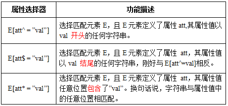
(单击可放大)
实例展示:
html代码:
<a href="xxx.pdf">我链接的是PDF文件</a>
<a href="#" class="icon">我类名是icon</a>
<a href="#" title="我的title是more">我的title是more</a>
css代码
a[class^=icon]{
background: green;
color:#fff;
}
a[href$=pdf]{
background: orange;
color: #fff;
}
a[title*=more]{
background: blue;
color: #fff;
}
结果显示:

CSS3 结构性伪类选择器—root
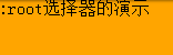
:root选择器,从字面上我们就可以很清楚的理解是根选择器,他的意思就是匹配元素E所在文档的根元素。在HTML文档中,根元素始终是<html>。
示例演示:
通过“:root”选择器设置背景颜色
HTML代码:
<div>:root选择器的演示</div>
CSS代码:
:root {
background:orange;
}
演示结果:
“:root”选择器等同于<html>元素,简单点说:
:root{background:orange}html {background:orange;}得到的效果等同。
建议使用:root方法。
另外在IE9以下还可以借助“:root”实现hack功能。
CSS3 结构性伪类选择器—not
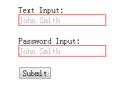
:not选择器称为否定选择器,和jQuery中的:not选择器一模一样,可以选择除某个元素之外的所有元素。就拿form元素来说,比如说你想给表单中除submit按钮之外的input元素添加红色边框,CSS代码可以写成:
form {
width: 200px;
margin: 20px auto;
}
div {
margin-bottom: 20px;
}
input:not([type="submit"]){
border:1px solid red;
}
相关HTML代码:
<form action="#"> <div> <label for="name">Text Input:</label> <input type="text" name="name" id="name" placeholder="John Smith" /> </div> <div> <label for="name">Password Input:</label> <input type="text" name="name" id="name" placeholder="John Smith" /> </div> <div> <input type="submit" value="Submit" /> </div> </form>
演示结果:
CSS3 结构性伪类选择器—empty
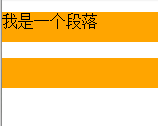
:empty选择器表示的就是空。用来选择没有任何内容的元素,这里没有内容指的是一点内容都没有,哪怕是一个空格。
示例显示:
比如说,你的文档中有三个段落p元素,你想把没有任何内容的P元素隐藏起来。我们就可以使用“:empty”选择器来控制。
HTML代码:
<p>我是一个段落</p> <p> </p> <p></p>
CSS代码:
p{
background: orange;
min-height: 30px;
}
p:empty {
display: none;
}演示结果:
CSS3 结构性伪类选择器—target
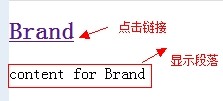
:target选择器称为目标选择器,用来匹配文档(页面)的url的某个标志符的目标元素。我们先来上个例子,然后再做分析。
示例展示
点击链接显示隐藏的段落。
HTML代码:
<h2><a href="#brand">Brand</a></h2>
<div class="menuSection" id="brand">
content for Brand
</div>
CSS代码:
.menuSection{
display: none;
}
:target{/*这里的:target就是指id="brand"的div对象*/
display:block;
}
演示结果:
分析:
1、具体来说,触发元素的URL中的标志符通常会包含一个#号,后面带有一个标志符名称,上面代码中是:
#brand
2、:target就是用来匹配id为“brand”的元素(id="brand"的元素),上面代码中是那个div元素。
多个url(多个target)处理:
就像上面的例子,#brand与后面的id="brand"是对应的,当同一个页面上有很多的url的时候你可以取不同的名字,只要#号后对的名称与id=""中的名称对应就可以了。
如下面例子:
html代码:
<h2><a href="#brand">Brand</a></h2>
<div class="menuSection" id="brand">
content for Brand
</div>
<h2><a href="#jake">Brand</a></h2>
<div class="menuSection" id="jake">
content for jake
</div>
<h2><a href="#aron">Brand</a></h2>
<div class="menuSection" id="aron">
content for aron
</div>
css代码:
#brand:target {
background: orange;
color: #fff;
}
#jake:target {
background: blue;
color: #fff;
}
#aron:target {
background: red;
color: #fff;
}
上面的代码可以对不同的target对象分别设置不的样式。
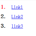
CSS3 结构性伪类选择器—first-child
“:first-child”选择器表示的是选择父元素的第一个子元素的元素E。简单点理解就是选择元素中的第一个子元素,记住是子元素,而不是后代元素。示例演示
通过“:first-child”选择器定位列表中的第一个列表项,并将序列号颜色变为红色。
HTML代码:
<ol>
<li><a href="##">Link1</a></li>
<li><a href="##">Link2</a></li>
<li><a href="##">link3</a></li>
</ol>
CSS代码:
ol > li{
font-size:20px;
font-weight: bold;
margin-bottom: 10px;
}

ol a {
font-size: 16px;
font-weight: normal;
}

ol > li:first-child{
color: red;
}
演示结果:
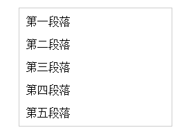
CSS3 结构性伪类选择器—last-child
“:last-child”选择器与“:first-child”选择器作用类似,不同的是“:last-child”选择器选择的是元素的最后一个子元素。例如,需要改变的是列表中的最后一个“li”的背景色,就可以使用这个选择器,ul>li:last-child{background:blue;}示例演示
在博客的排版中,每个段落都有15px的margin-bottom,假设不想让博客“post”中最后一个段落不需要底部的margin值,可以使用“:last-child”选择器。
HTML代码:
<div class="post"> <p>第一段落</p> <p>第二段落</p> <p>第三段落</p> <p>第四段落</p> <p>第五段落</p> </div>
CSS代码:
.post {
padding: 10px;
border: 1px solid #ccc;
width: 200px;
margin: 20px auto;
}
.post p {
margin:0 0 15px 0;
}

.post p:last-child {
margin-bottom:0;
}
演示结果:
CSS3 结构性伪类选择器—nth-child(n)
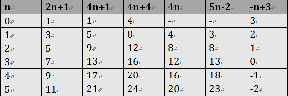
“:nth-child(n)”选择器用来定位某个父元素的一个或多个特定的子元素。其中“n”是其参数,而且可以是整数值(1,2,3,4),也可以是表达式(2n+1、-n+5)和关键词(odd、even),但参数n的起始值始终是1,而不是0。也就是说,参数n的值为0时,选择器将选择不到任何匹配的元素。经验与技巧:当“:nth-child(n)”选择器中的n为一个表达式时,其中n是从0开始计算,当表达式的值为0或小于0的时候,不选择任何匹配的元素。如下表所示:
案例演示
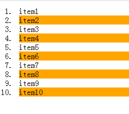
通过“:nth-child(n)”选择器,并且参数使用表达式“2n”,将偶数行列表背景色设置为橙色。
HTML代码:
<ol> <li>item1</li> <li>item2</li> <li>item3</li> <li>item4</li> <li>item5</li> <li>item6</li> <li>item7</li> <li>item8</li> <li>item9</li> <li>item10</li> </ol>
CSS代码:
ol > li:nth-child(2n){
background: orange;
}
演示结果:
CSS3 结构性伪类选择器—nth-last-child(n)
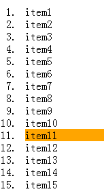
“:nth-last-child(n)”选择器和前面的“:nth-child(n)”选择器非常的相似,只是这里多了一个“last”,所起的作用和“:nth-child(n)”选择器有所区别,从某父元素的最后一个子元素开始计算,来选择特定的元素。案例演示
选择列表中倒数第五个列表项,将其背景设置为橙色。
HTML代码:
<ol> <li>item1</li> <li>item2</li> <li>item3</li> <li>item4</li> <li>item5</li> <li>item6</li> <li>item7</li> <li>item8</li> <li>item9</li> <li>item10</li> <li>item11</li> <li>item12</li> <li>item13</li> <li>item14</li> <li>item15</li> </ol>
CSS代码:
ol > li:nth-last-child(5){
background: orange;
}
演示结果:
CSS3 first-of-type选择器
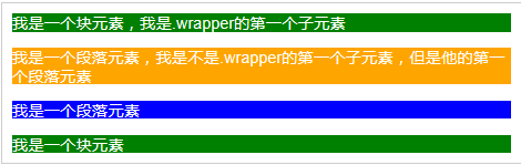
“:first-of-type”选择器类似于“:first-child”选择器,不同之处就是指定了元素的类型,其主要用来定位一个父元素下的某个类型的第一个子元素。示例演示:
通过“:first-of-type”选择器,定位div容器中的第一个p元素(p不一定是容器中的第一个子元素),并设置其背景色为橙色。
HTML代码:
<div class="wrapper">
<div>我是一个块元素,我是.wrapper的第一个子元素</div>
<p>我是一个段落元素,我是不是.wrapper的第一个子元素,但是他的第一个段落元素</p>
<p>我是一个段落元素</p>
<div>我是一个块元素</div>
</div>
CSS代码:
.wrapper {
width: 500px;
margin: 20px auto;
padding: 10px;
border: 1px solid #ccc;
color: #fff;
}
.wrapper > div {
background: green;
}
.wrapper > p {
background: blue;
}
/*我要改变第一个段落的背景为橙色*/
.wrapper > p:first-of-type {
background: orange;
}
演示结果:
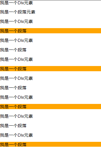
CSS3 nth-of-type(n)选择器
“:nth-of-type(n)”选择器和“
:nth-child(n)”选择器非常类似,不同的是它只计算父元素中指定的某种类型的子元素。当某个元素中的子元素不单单是同一种类型的子元素时,使用“:nth-of-type(n)”选择器来定位于父元素中某种类型的子元素是非常方便和有用的。在“:nth-of-type(n)”选择器中的“n”和“:nth-child(n)”选择器中的“n”参数也一样,可以是具体的整数,也可以是表达式,还可以是关键词。
示例演示
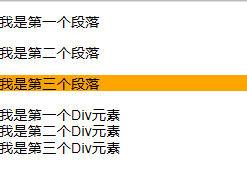
通过“:nth-of-type(2n)”选择器,将容器“div.wrapper”中偶数段数的背景设置为橙色。
HTML代码:
<div class="wrapper">
<div>我是一个Div元素</div>
<p>我是一个段落元素</p>
<div>我是一个Div元素</div>
<p>我是一个段落</p>
<div>我是一个Div元素</div>
<p>我是一个段落</p>
<div>我是一个Div元素</div>
<p>我是一个段落</p>
<div>我是一个Div元素</div>
<p>我是一个段落</p>
<div>我是一个Div元素</div>
<p>我是一个段落</p>
<div>我是一个Div元素</div>
<p>我是一个段落</p>
<div>我是一个Div元素</div>
<p>我是一个段落</p>
</div>
CSS代码:
.wrapper > p:nth-of-type(2n){
background: orange;
}
演示结果:
CSS3 last-of-type选择器
“:last-of-type”选择器和“
:first-of-type”选择器功能是一样的,不同的是他选择是父元素下的某个类型的
最后一个子元素。
示例演示
通过“:last-of-type”选择器,将容器“div.wrapper”中最后一个段落元素背景设置为橙色
(提示:这个段落不是“div.wrapper”容器的最后一个子元素)。
HTML代码:
<div class="wrapper">
<p>我是第一个段落</p>
<p>我是第二个段落</p>
<p>我是第三个段落</p>
<div>我是第一个Div元素</div>
<div>我是第二个Div元素</div>
<div>我是第三个Div元素</div>
</div>
CSS代码:
.wrapper > p:last-of-type{
  background: orange;
}
演示结果:
CSS3 nth-last-of-type(n)选择器
“:nth-last-of-type(n)”选择器和“
:nth-of-type(n)”选择器是一样的,选择父元素中指定的某种子元素类型,但它的起始方向是从最后一个子元素开始,而且它的使用方法类似于上节中介绍的“
:nth-last-child(n)”选择器一样。
示例演示
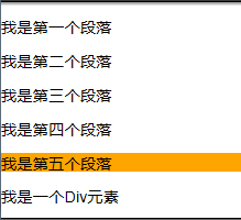
通过“:nth-last-of-type(n)”选择器将容器“div.wrapper”中的倒数第三个段落背景设置为橙色。
HTML代码:
<div class="wrapper">
<p>我是第一个段落</p>
<p>我是第二个段落</p>
<p>我是第三个段落</p>
<p>我是第四个段落</p>
<p>我是第五个段落</p>
<div>我是一个Div元素</div>
<p>我是第六个段落</p>
<p>我是第七个段落</p>
</div>
CSS代码:
.wrapper > p:nth-last-of-type(3){
background: orange;
}
演示结果:
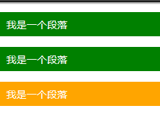
CSS3 only-child选择器
“:only-child”选择器选择的是父元素中只有一个子元素,而且只有唯一的一个子元素。也就是说,匹配的元素的父元素中仅有一个子元素,而且是一个唯一的子元素。
示例演示
通过“:only-child”选择器,来控制仅有一个子元素的背景样式,为了更好的理解,我们这个示例通过对比的方式来向大家演示。
HTML代码:
<div class="post">
<p>我是一个段落</p>
<p>我是一个段落</p>
</div>
<div class="post">
<p>我是一个段落</p>
</div>
CSS代码:
.post p {
background: green;
color: #fff;
padding: 10px;
}
.post p:only-child {
background: orange;
}
演示结果:
CSS3 only-of-type选择器
“:only-of-type”选择器用来选择一个元素是它的父元素的唯一一个相同类型的子元素。这样说或许不太好理解,换一种说法。
“:only-of-type”是表示一个元素他有很多个子元素,而其中只有一种类型的子元素是唯一的,使用“:only-of-type”选择器就可以选中这个元素中的唯一一个类型子元素。
示例演示
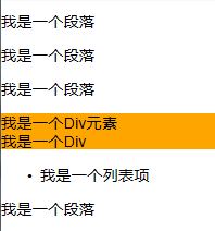
通过“:only-of-type”选择器来修改容器中仅有一个div元素的背景色为橙色。
HTML代码:
<div class="wrapper">
<p>我是一个段落</p>
<p>我是一个段落</p>
<p>我是一个段落</p>
<div>我是一个Div元素</div>
</div>
<div class="wrapper">
<div>我是一个Div</div>
<ul>
<li>我是一个列表项</li>
</ul>
<p>我是一个段落</p>
</div>
CSS代码:
.wrapper > div:only-of-type {
background: orange;
}
演示结果:
CSS3选择器 :enabled选择器
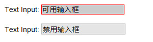
在Web的表单中,有些表单元素有可用(“:enabled”)和不可用(“:disabled”)状态,比如输入框,密码框,复选框等。在默认情况之下,这些表单元素都处在可用状态。那么我们可以通过伪选择器“:enabled”对这些表单元素设置样式。示例演示
通过“:enabled”选择器,修改文本输入框的边框为2像素的红色边框,并设置它的背景为灰色。
HTML代码:
<form action="#">
  <div>
    <label for="name">Text Input:</label>
    <input type="text" name="name" id="name" placeholder="可用输入框"  />
  </div>
   <div>
    <label for="name">Text Input:</label>
    <input type="text" name="name" id="name" placeholder="禁用输入框"  disabled="disabled" />
  </div>
</form>
CSS代码:
div{
  margin: 20px;
}
input[type="text"]:enabled {
  background: #ccc;
  border: 2px solid red;
}
结果演示
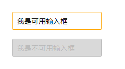
CSS3选择器 :disabled选择器
“:disabled”选择器刚好与“:enabled”选择器相反,用来选择不可用表单元素。要正常使用“:disabled”选择器,需要在表单元素的HTML中设置“disabled”属性。示例演示
通过“:disabled”选择器,给不可用输入框设置明显的样式。
HTML代码:
<form action="#">
<div>
<input type="text" name="name" id="name" placeholder="我是可用输入框" />
</div>
<div>
<input type="text" name="name" id="name" placeholder="我是不可用输入框" disabled />
</div>
</form>
CSS代码
form {
margin: 50px;
}
div {
margin-bottom: 20px;
}
input {
background: #fff;
padding: 10px;
border: 1px solid orange;
border-radius: 3px;
}
input[type="text"]:disabled {
background: rgba(0,0,0,.15);
border: 1px solid rgba(0,0,0,.15);
color: rgba(0,0,0,.15);
}
结果演示:
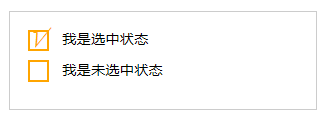
CSS3选择器 :checked选择器
在表单元素中,单选按钮和复选按钮都具有选中和未选中状态。(大家都知道,要覆写这两个按钮默认样式比较困难)。在CSS3中,我们可以通过状态选择器“:checked”配合其他标签实现自定义样式。而“:checked”表示的是选中状态。示例演示:
通过“:checked”状态来自定义复选框效果。
HTML代码
<form action="#">
<div class="wrapper">
<div class="box">
<input type="checkbox" checked="checked" id="usename" /><span>√</span>
</div>
<lable for="usename">我是选中状态</lable>
</div>

<div class="wrapper">
<div class="box">
<input type="checkbox"  id="usepwd" /><span>√</span>
</div>
<label for="usepwd">我是未选中状态</label>
</div>
</form>
CSS代码:
form {
border: 1px solid #ccc;
padding: 20px;
width: 300px;
margin: 30px auto;
}

.wrapper {
margin-bottom: 10px;
}

.box {
display: inline-block;
width: 20px;
height: 20px;
margin-right: 10px;
position: relative;
border: 2px solid orange;
vertical-align: middle;
}

.box input {
opacity: 0;
position: absolute;
top:0;
left:0;
}

.box span {
position: absolute;
top: -10px;
right: 3px;
font-size: 30px;
font-weight: bold;
font-family: Arial;
-webkit-transform: rotate(30deg);
transform: rotate(30deg);
color: orange;
}

input[type="checkbox"] + span {
opacity: 0;
}

input[type="checkbox"]:checked + span {
opacity: 1;
}
结果演示
CSS3选择器 ::selection选择器
“::selection”伪元素是用来匹配突出显示的文本(用鼠标选择文本时的文本)。浏览器默认情况下,用鼠标选择网页文本是以“深蓝的背景,白色的字体”显示的,效果如下图所示: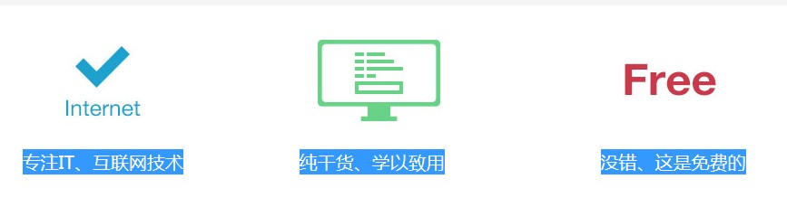
从上图中可以看出,用鼠标选中“专注IT、互联网技术”、“纯干货、学以致用”、“没错、这是免费的”这三行文本中,默认显示样式为:蓝色背景、白色文本。
有的时候设计要求,不使用上图那种浏览器默认的突出文本效果,需要一个与众不同的效果,此时“::selection”伪元素就非常的实用。不过在Firefox浏览器还需要添加前缀。
示例演示:
通过“::selection”选择器,将Web中选中的文本背景变成红色,文本变成绿色。
HTML代码:
<p>“::selection”伪元素是用来匹配突出显示的文本。浏览器默认情况下,选择网站文本是深蓝的背景,白色的字体,</p>
CSS代码:
::-moz-selection {
background: red;
color: green;
}
::selection {
background: red;
color: green;
}
结果演示:

注意:
1、IE9+、Opera、Google Chrome 以及 Safari 中支持 ::selection 选择器。
2、Firefox 支持替代的 ::-moz-selection。
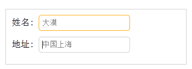
CSS3选择器 :read-only选择器
“:read-only”伪类选择器用来指定处于只读状态元素的样式。简单点理解就是,元素中设置了“readonly=’readonly’”示例演示
通过“:read-only”选择器来设置地址文本框的样式。
HTML代码:
<form action="#">
<div>
<label for="name">姓名:</label>
<input type="text" name="name" id="name" placeholder="大漠" />
</div>
<div>
<label for="address">地址:</label>
<input type="text" name="address" id="address" placeholder="中国上海" readonly="readonly" />
</div>
</form>
CSS代码:
form {
width: 300px;
padding: 10px;
border: 1px solid #ccc;
margin: 50px auto;
}
form > div {
margin-bottom: 10px;
}

input[type="text"]{
border: 1px solid orange;
padding: 5px;
background: #fff;
border-radius: 5px;
}

input[type="text"]:-moz-read-only{
border-color: #ccc;
}
input[type="text"]:read-only{
border-color: #ccc;
}
结果演示
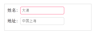
CSS3选择器 :read-write选择器
“:read-write”选择器刚好与“:read-only”选择器相反,主要用来指定当元素处于非只读状态时的样式。示例演示
使用“:read-write”选择器来设置不是只读控件的文本框样式。
HTML代码:
<form action="#">
<div>
<label for="name">姓名:</label>
<input type="text" name="name" id="name" placeholder="大漠" />
</div>
<div>
<label for="address">地址:</label>
<input type="text" name="address" id="address" placeholder="中国上海" readonly="readonly" />
</div>
</form>
CSS代码:
form {
width: 300px;
padding: 10px;
border: 1px solid #ccc;
margin: 50px auto;
}
form > div {
margin-bottom: 10px;
}

input[type="text"]{
border: 1px solid orange;
padding: 5px;
background: #fff;
border-radius: 5px;
}

input[type="text"]:-moz-read-only{
border-color: #ccc;
}
input[type="text"]:read-only{
border-color: #ccc;
}

input[type="text"]:-moz-read-write{
border-color: #f36;
}
input[type="text"]:read-write{
border-color: #f36;
}
结果演示:
CSS3选择器 ::before和::after
::before和::after这两个主要用来给元素的前面或后面插入内容,这两个常和"content"配合使用,使用的场景最多的就是清除浮动。.clearfix::before,
.clearfix::after {
content: ".";
display: block;
height: 0;
visibility: hidden;
}
.clearfix:after {clear: both;}
.clearfix {zoom: 1;}当然可以利用他们制作出其他更好的效果,比如右侧中的阴影效果,也是通过这个来实现的。
关键代码分析:
.effect::before, .effect::after{
    content:"";
    position:absolute;
    z-index:-1;
    -webkit-box-shadow:0 0 20px rgba(0,0,0,0.8);
    -moz-box-shadow:0 0 20px rgba(0,0,0,0.8);
    box-shadow:0 0 20px rgba(0,0,0,0.8);
    top:50%;
    bottom:0;
    left:10px;
    right:10px;
    -moz-border-radius:100px / 10px;
    border-radius:100px / 10px;
}
上面代码作用在class名叫.effect上的div的前(before)后(after)都添加一个空元素,然后为这两个空元素添加阴影特效。

相关文章推荐
- 【CSS3】---结构性伪类选择器-root+not+empty+target
- CSS3中结构伪类选择器——root、not、empty、target选择器
- CSS3常用的结构性伪类选择器①:root not empty target
- 【CSS3】---结构性伪类选择器-root+not+empty+target
- 【CSS3】---结构性伪类选择器-root+not+empty+target
- CSS3中结构伪类选择器——root、not、empty、target选择器
- 【CSS3】---结构性伪类选择器-first-child+last-child
- CSS3伪类选择器之结构选择器root,not,empty,target
- 【CSS3】---结构性伪类选择器-first-child+last-child
- CSS 3 选择器root、not、empty、target
- css3 - 选择器first-child、last-child、nth-child、nth-last-child、nth-of-type
- 让IE7/8使用CSS中first-child和last-child样式属性
- CSS3中first-child、last-child、nth-child、nth-last-child
- jquery基本过滤选择器:first :last :not(.myclass) :even :odd :eq(1) :gt(5) :lt(1) :header :animated :focus
- 第二章 CSS3新增的选器之 选择器 last-child last-of-type区别
- 【CSS3】---结构性伪类选择器—nth-child(n)+nth-last-child(n)
- 【CSS3】结构性伪类选择器—last-child
- CSS3:nth-child()伪类选择器,奇偶数行自定义样式first-child
- 【CSS3】---结构性伪类选择器—nth-child(n)+nth-last-child(n)
- CSS nth-child、first-child、last-child、nth-of-type、first-of-type和last-of-type选择器使用