纯css制作带三角border篇(兼容所有浏览器)
2016-11-02 20:45
471 查看
以前写过一篇纯CSS制作带三角的边框,那篇文章是用HTML特殊字符来制作三角的,今天介绍下,如何用 border 来制作三角。
html 代码如下:
复制代码
代码如下:
<div class="arrow-up"></div>
<div class="arrow-down"></div>
<div class="arrow-left"></div>
<div class="arrow-right"></div>
css 代码如下:
复制代码
代码如下:
.arrow-up {
width: 0;
height: 0;
border-left: 5px solid transparent;
border-right: 5px solid transparent;
_border-left: 5px solid white;
_border-right: 5px solid white;
border-bottom: 5px solid black;
overflow:hidden;
}
.arrow-down {
width: 0;
height: 0;
border-left: 20px solid transparent;
border-right: 20px solid transparent;
_border-left: 20px solid white;
_border-right: 20px solid white;
border-top: 20px solid #f00;
overflow:hidden;
}
.arrow-right {
width: 0;
height: 0;
border-top: 60px solid transparent;
border-bottom: 60px solid transparent;
_border-top: 60px solid white;
_border-bottom: 60px solid white;
border-left: 60px solid green;
overflow:hidden;
}
.arrow-left {
width: 0;
height: 0;
border-top: 10px solid transparent;
border-bottom: 10px solid transparent;
_border-top: 10px solid white;
_border-bottom: 10px solid white;
border-right:10px solid blue;
overflow:hidden;
}
效果图如下:
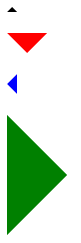
测试浏览器:chrome,firefox,ie8,ie7,ie6,safari,opera
PS:
1、原文并没有兼容 ie6 浏览器,所以我改了下,现在的版本已经可以兼容所有浏览器了。
2、相对于用 border 来做三角,我更加喜欢用 html 特殊字符来制作三角。
html 代码如下:
复制代码
代码如下:
<div class="arrow-up"></div>
<div class="arrow-down"></div>
<div class="arrow-left"></div>
<div class="arrow-right"></div>
css 代码如下:
复制代码
代码如下:
.arrow-up {
width: 0;
height: 0;
border-left: 5px solid transparent;
border-right: 5px solid transparent;
_border-left: 5px solid white;
_border-right: 5px solid white;
border-bottom: 5px solid black;
overflow:hidden;
}
.arrow-down {
width: 0;
height: 0;
border-left: 20px solid transparent;
border-right: 20px solid transparent;
_border-left: 20px solid white;
_border-right: 20px solid white;
border-top: 20px solid #f00;
overflow:hidden;
}
.arrow-right {
width: 0;
height: 0;
border-top: 60px solid transparent;
border-bottom: 60px solid transparent;
_border-top: 60px solid white;
_border-bottom: 60px solid white;
border-left: 60px solid green;
overflow:hidden;
}
.arrow-left {
width: 0;
height: 0;
border-top: 10px solid transparent;
border-bottom: 10px solid transparent;
_border-top: 10px solid white;
_border-bottom: 10px solid white;
border-right:10px solid blue;
overflow:hidden;
}
效果图如下:
测试浏览器:chrome,firefox,ie8,ie7,ie6,safari,opera
PS:
1、原文并没有兼容 ie6 浏览器,所以我改了下,现在的版本已经可以兼容所有浏览器了。
2、相对于用 border 来做三角,我更加喜欢用 html 特殊字符来制作三角。

相关文章推荐
- 纯css制作带三角border篇(兼容所有浏览器)
- 纯css制作带三角border篇(兼容所有浏览器)
- 纯css制作带三角border篇(兼容所有浏览器)
- 纯css制作带三角(兼容所有浏览器)
- Css:背景色透明,内容不透明之终极方法!兼容所有浏览器
- 关于css透明度的设置兼容所有浏览器~~
- CSS美化 input type=”file” 兼容所有浏览器
- 纯CSS模拟带有立体效果的圆角按钮,长度自适应,兼容所有浏览器,无CSS Hack!
- 【转】纯CSS制作带三角(border篇)
- 使用css制作三角,兼容IE6,用到的标签<div><s><span>
- css实现图片圆角 兼容所有浏览器实现代码
- css透明度的设置 (兼容所有浏览器)
- css设置笼罩层透明(兼容所有浏览器)
- 纯CSS打造一个顶部工具条(兼容所有浏览器)
- 纯CSS打造一个顶部工具条(兼容所有浏览器)
- css实现图片圆角 兼容所有浏览器实现代码
- 兼容所有浏览器的半透明背景且不透明文字的CSS写法
- 兼容所有浏览器的半透明背景且不透明文字的CSS写法
- 兼容所有浏览器的网页制作方法
- js轮播广告,CSS兼容所有浏览器,无Bug