Android自定义控件系列(一)—Button七十二变
2016-10-28 20:26
309 查看
忙了一段时间,终于有时间整理整理之前所用到的一些知识,分享给大家,希望给同学们有些帮助,同时也是对自己的知识有个巩固的过程。
在Android的开发中比较常用的控件就是Button了,但是我们平时使用Button时是怎样来设置按下和抬起显示不同的效果呢?我想一般的实现方式就是定义一个selector的xml文件,然后在里面根据不同的state来设置不同的图片,但是当Button控件非常多的时候,就要写对应数量的xml文件,导致大码非常臃肿。
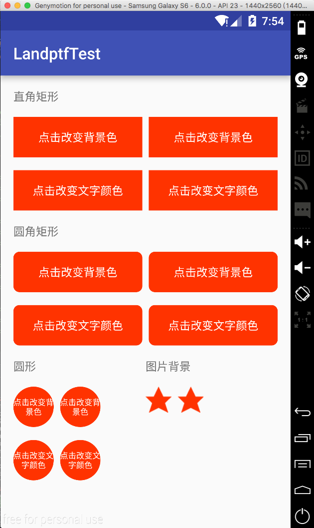
今天我们换种方式来改变这个样式,只需要两行代码即可实现按下的效果,同时支持圆角和圆形的按钮的样式。先看下效果图,这是我写的一个demo
接下来讲一下主要代码:
第一步 自定义属性
在res/values/目录下新建attrs.xml文件,
具体属性的含义在java代码中都有描述
第二步 创建ButtonM类使其继承Button,代码如下:
注释基本上写的比较详细,下面主要说一下这里面涉及的一些知识点
1 关于onTouch返回值问题,如果返回true表示要消费该点击事件,后续的所有事件都交给他处理,同时onTouchEvent将不会执行,因此onClick也得不到执行,在这里通过重写setOnClickListener设置变量来改变返回值。具体关于View的事件分发机制可以查阅有关文档,网上很多这方面的教程。
2 如果想要通过java代码来设置圆角或者圆形时,必须先设置setFillet(true),然后再设置背景色,形状或者角度等参数。通过xml文件则无限制
最后讲一下怎么使用,这里以设置圆角矩形为例,分别通过xml和java代码实现,其他的可参考源码。
1 xml
2 java
代码已托管到开源中国的码云上,欢迎下载,地址:https://git.oschina.net/landptf/landptf.git
在Android的开发中比较常用的控件就是Button了,但是我们平时使用Button时是怎样来设置按下和抬起显示不同的效果呢?我想一般的实现方式就是定义一个selector的xml文件,然后在里面根据不同的state来设置不同的图片,但是当Button控件非常多的时候,就要写对应数量的xml文件,导致大码非常臃肿。
今天我们换种方式来改变这个样式,只需要两行代码即可实现按下的效果,同时支持圆角和圆形的按钮的样式。先看下效果图,这是我写的一个demo
接下来讲一下主要代码:
第一步 自定义属性
在res/values/目录下新建attrs.xml文件,
<?xml version="1.0" encoding="utf-8"?>
<resources>
<!--公共属性-->
<attr name="backColor" format="color" />
<attr name="backColorPress" format="color" />
<attr name="backGroundImage" format="reference" />
<attr name="backGroundImagePress" format="reference" />
<attr name="textColor" format="color" />
<attr name="textColorPress" format="color" />

<declare-styleable name="buttonM">
<attr name="backColor" />
<attr name="backColorPress" />
<attr name="backGroundImage"  />
<attr name="backGroundImagePress" />
<attr name="textColor" />
<attr name="textColorPress" />
<attr name="fillet" format="boolean" />
<attr name="radius" format="float" />
<attr name="shape">
<enum name="rectangle" value="0" />
<enum name="oval" value="1" />
<enum name="line" value="2" />
<enum name="ring" value="3" />
</attr>
</declare-styleable>

</resources>
具体属性的含义在java代码中都有描述
第二步 创建ButtonM类使其继承Button,代码如下:
package com.landptf.view;

import android.content.Context;
import android.content.res.ColorStateList;
import android.content.res.TypedArray;
import android.graphics.drawable.Drawable;
import android.graphics.drawable.GradientDrawable;
import android.util.AttributeSet;
import android.view.MotionEvent;
import android.view.View;
import android.widget.Button;

import com.landptf.R;

/**
* Created by landptf on 2016/10/25.
* 自定义Button,支持圆角矩形,圆形按钮等样式,可通过配置文件改变按下后的样式
* 若通过代码设置圆角或者圆形,需要先调用setFillet方法将fillet设置为true
*/
public class ButtonM extends Button {
private static String TAG = "ButtonM";
/**
* 按钮的背景色
*/
private int backColor = 0;
/**
* 按钮被按下时的背景色
*/
private int backColorPress = 0;
/**
* 按钮的背景图片
*/
private Drawable backGroundDrawable = null;
/**
* 按钮被按下时显示的背景图片
*/
private Drawable backGroundDrawablePress = null;
/**
* 按钮文字的颜色
*/
private ColorStateList textColor = null;
/**
* 按钮被按下时文字的颜色
*/
private ColorStateList textColorPress = null;
private GradientDrawable gradientDrawable = null;
/**
* 是否设置圆角或者圆形等样式
*/
private boolean fillet = false;
/**
* 标示onTouch方法的返回值,用来解决onClick和onTouch冲突问题
*/
private boolean isCost = true;

public ButtonM(Context context) {
super(context, null);
}

public ButtonM(Context context, AttributeSet attrs) {
this(context, attrs, 0);
}

public ButtonM(Context context, AttributeSet attrs, int defStyle) {
super(context, attrs, defStyle);
TypedArray a = context.obtainStyledAttributes(attrs,
ed3e
R.styleable.buttonM, defStyle, 0);
if (a != null) {
//设置背景色
ColorStateList colorList = a.getColorStateList(R.styleable.buttonM_backColor);
if (colorList != null) {
backColor = colorList.getColorForState(getDrawableState(), 0);
if (backColor != 0) {
setBackgroundColor(backColor);
}
}
//记录按钮被按下时的背景色
ColorStateList colorListPress = a.getColorStateList(R.styleable.buttonM_backColorPress);
if (colorListPress != null){
backColorPress = colorListPress.getColorForState(getDrawableState(), 0);
}
//设置背景图片,若backColor与backGroundDrawable同时存在,则backGroundDrawable将覆盖backColor
backGroundDrawable = a.getDrawable(R.styleable.buttonM_backGroundImage);
if (backGroundDrawable != null){
setBackgroundDrawable(backGroundDrawable);
}
//记录按钮被按下时的背景图片
backGroundDrawablePress = a.getDrawable(R.styleable.buttonM_backGroundImagePress);
//设置文字的颜色
textColor = a.getColorStateList(R.styleable.buttonM_textColor);
if (textColor != null){
setTextColor(textColor);
}
//记录按钮被按下时文字的颜色
textColorPress = a.getColorStateList(R.styleable.buttonM_textColorPress);
//设置圆角或圆形等样式的背景色
fillet = a.getBoolean(R.styleable.buttonM_fillet, false);
if (fillet){
getGradientDrawable();
if (backColor != 0) {
gradientDrawable.setColor(backColor);
setBackgroundDrawable(gradientDrawable);
}
}
//设置圆角矩形的角度,fillet为true时才生效
float radius = a.getFloat(R.styleable.buttonM_radius, 0);
if (fillet && radius != 0){
setRadius(radius);
}
//设置按钮形状,fillet为true时才生效
int shape = a.getInteger(R.styleable.buttonM_shape, 0);
if (fillet && shape != 0) {
setShape(shape);
}
a.recycle();
}
setOnTouchListener(new OnTouchListener() {
@Override
public boolean onTouch(View arg0, MotionEvent event) {
//根据touch事件设置按下抬起的样式
return setTouchStyle(event.getAction());
}
});
}

/**
* 根据按下或者抬起来改变背景和文字样式
* @param state
* @return isCost
*  为解决onTouch和onClick冲突的问题
*  根据事件分发机制,如果onTouch返回true,则不响应onClick事件
*  因此采用isCost标识位,当用户设置了onClickListener则onTouch返回false
*/
private boolean setTouchStyle(int state){
if (state == MotionEvent.ACTION_DOWN) {
if (backColorPress != 0) {
if (fillet){
gradientDrawable.setColor(backColorPress);
setBackgroundDrawable(gradientDrawable);
}else {
setBackgroundColor(backColorPress);
}
}
if (backGroundDrawablePress != null) {
setBackgroundDrawable(backGroundDrawablePress);
}
if (textColorPress != null) {
setTextColor(textColorPress);
}
}
if (state == MotionEvent.ACTION_UP) {
if (backColor != 0) {
if (fillet){
gradientDrawable.setColor(backColor);
setBackgroundDrawable(gradientDrawable);
}else {
setBackgroundColor(backColor);
}
}
if (backGroundDrawable != null) {
setBackgroundDrawable(backGroundDrawable);
}
if (textColor != null) {
setTextColor(textColor);
}
}
return isCost;
}

/**
* 重写setOnClickListener方法,解决onTouch和onClick冲突问题
* @param l
*/
@Override
public void setOnClickListener(OnClickListener l) {
super.setOnClickListener(l);
isCost = false;
}

/**
* 设置按钮的背景色
* @param backColor
*/
public void setBackColor(int backColor) {
this.backColor = backColor;
if (fillet){
gradientDrawable.setColor(backColor);
setBackgroundDrawable(gradientDrawable);
}else {
setBackgroundColor(backColor);
}
}

/**
* 设置按钮被按下时的背景色
* @param backColorPress
*/
public void setBackColorPress(int backColorPress) {
this.backColorPress = backColorPress;
}

/**
* 设置按钮的背景图片
* @param backGroundDrawable
*/
public void setBackGroundDrawable(Drawable backGroundDrawable) {
this.backGroundDrawable = backGroundDrawable;
setBackgroundDrawable(backGroundDrawable);
}

/**
* 设置按钮被按下时的背景图片
* @param backGroundDrawablePress
*/
public void setBackGroundDrawablePress(Drawable backGroundDrawablePress) {
this.backGroundDrawablePress = backGroundDrawablePress;
}

/**
* 设置文字的颜色
* @param textColor
*/
public void setTextColor(int textColor) {
if (textColor == 0) return;
this.textColor = ColorStateList.valueOf(textColor);
//此处应加super关键字,调用父类的setTextColor方法,否则会造成递归导致内存溢出
super.setTextColor(this.textColor);
}

/**
* 设置按钮被按下时文字的颜色
* @param textColorPress
*/
public void setTextColorPress(int textColorPress) {
if (textColorPress == 0) return;
this.textColorPress = ColorStateList.valueOf(textColorPress);
}

/**
* 设置按钮是否设置圆角或者圆形等样式
* @param fillet
*/
public void setFillet(boolean fillet){
this.fillet = fillet;
getGradientDrawable();
}

/**
* 设置圆角按钮的角度
* @param radius
*/
public void setRadius(float radius){
if (!fillet) return;
getGradientDrawable();
gradientDrawable.setCornerRadius(radius);
setBackgroundDrawable(gradientDrawable);
}

/**
* 设置按钮的形状
* @param shape
*/
public void setShape(int shape){
if (!fillet) return;
getGradientDrawable();
gradientDrawable.setShape(shape);
setBackgroundDrawable(gradientDrawable);
}

private void getGradientDrawable() {
if (gradientDrawable == null){
gradientDrawable = new GradientDrawable();
}
}

}
注释基本上写的比较详细,下面主要说一下这里面涉及的一些知识点
1 关于onTouch返回值问题,如果返回true表示要消费该点击事件,后续的所有事件都交给他处理,同时onTouchEvent将不会执行,因此onClick也得不到执行,在这里通过重写setOnClickListener设置变量来改变返回值。具体关于View的事件分发机制可以查阅有关文档,网上很多这方面的教程。
2 如果想要通过java代码来设置圆角或者圆形时,必须先设置setFillet(true),然后再设置背景色,形状或者角度等参数。通过xml文件则无限制
最后讲一下怎么使用,这里以设置圆角矩形为例,分别通过xml和java代码实现,其他的可参考源码。
1 xml
<com.landptf.view.ButtonM
android:id="@+id/btm_radius_color_xml"
android:layout_width="0dp"
android:layout_height="50dp"
android:layout_weight="1"
android:gravity="center"
android:text="点击改变背景色"
landptf:backColor="#ff3300"
landptf:backColorPress="#ff33ff"
landptf:fillet="true"
landptf:radius="30"
landptf:textColor="@android:color/white" />
2 java
ButtonM btmRadiusColorJava = (ButtonM) findViewById(R.id.btm_radius_color_java);
if (btmRadiusColorJava != null) {
btmRadiusColorJava.setFillet(true);
btmRadiusColorJava.setRadius(30);
btmRadiusColorJava.setTextColor(Color.parseColor("#ffffff"));
btmRadiusColorJava.setBackColor(Color.parseColor("#ff3300"));
btmRadiusColorJava.setBackColorPress(Color.parseColor("#ff33ff"));
btmRadiusColorJava.setOnClickListener(new View.OnClickListener() {
@Override
public void onClick(View v) {
Toast.makeText(ButtonMTestActivity.this, "java代码实现", Toast.LENGTH_SHORT).show();
}
});
}代码已托管到开源中国的码云上,欢迎下载,地址:https://git.oschina.net/landptf/landptf.git

相关文章推荐
- Android自定义控件系列(一)—Button七十二变
- Android自定义控件系列(一)—Button七十二变
- android自定义控件系列教程----真正的圆角button来了
- Android控件系列之RadioButton&RadioGroup
- Android控件系列之Button以及Android监听器
- Android控件系列之RadioButton&RadioGroup
- Android控件系列之Button以及Android监听器
- Android控件系列之Button以及Android监听器
- Android开发之自定义控件-自定义Button
- 【Android开发:自定义控件系列二】关于PopupWindow的注意点
- 完美实现Android自定义控件---以自定义带图片和文本的Button为例
- Android 自定义控件 EditText输入框两边加减按钮Button
- Android ApiDemos 系列解析【View-ImageView/ImageButton】
- 【Android开发:自定义控件系列一】仿android4.0 Spinner下拉效果
- 【android自定义控件】button样式自定义<二>
- Android控件系列之Button以及Android监听器
- Android 2.2 r1 API 中文文档系列(12) —— Button
- Android 2.2 r1 API 中文文档系列(12) —— Button
- android系列3.Button学习
- Android控件系列之Button以及Android监听器