Android布局与CSS的Flex布局的对应关系
2016-10-20 09:48
316 查看
@Author:莫川
2.1.1 方向
(1).垂直方向(从上到下)
android:
flex:
(2).水平方向(从左向右)
android:
flex:
比如,写一个左右方向的布局:
效果为:
2.1.2 权重
在android中,线性布局LinearLayout可以设置android:weightSum属性,其子元素可以设置android:layout_weight属性,用于等分的效果。比如:
在flex中,则使用flex属性即可。比如:
效果为:
在这里,与android类似,flex的优先级是高于width的。
分别对应的是在某某元素的左、右、下、上等方位。这种布局,可以使用嵌套式的线性div实现。但是,也有例外,比如覆盖效果。如下:
一个蓝色的方块,覆盖在一个红色的方块之上,并且在右下角,分别距右方和下方40像素。如果使用android的相对布局,非常好写:
使用的布局主要有:
实现上述效果的xml代码:
使用CSS布局,应该怎么写呢?
这里引入如下一些CSS属性
首先看一下子元素的postion属性,使用的是absolute绝对布局。然后使用bottom和right属性,定位该元素在上级的最近一个使用了position为relative的div中的位置。这里的bottom,是指距底部的距离,right是指距右边的距离。同样的,如果使用top和left,则可以定位其上、左的位置。说明:如果left和right同时使用,这时,要看是否有width属性,如果没有指定width属性,则left和right同时生效,宽度这会根据left和right自动计算;如果指定了宽度,则只有left和width生效,忽略right,应避免这种情况。
在Flex中,居中为:
除居中之外,justify-content和align-items还有其他属性可选:
具体含义,可以查阅文档,在次不再赘述。
也就是说,为元素指定的任何内边距和边框都将在已设定的宽度和高度内进行绘制。通过从已设定的宽度和高度分别减去边框和内边距才能得到内容的宽度和高度。这就和android的padding一致了。
对应css
android中的边框一般需要写shape实现。而css中则相对简单。
在CSS中,与其类似:
注意:
在android中,只能背景设置shape,而控件本身的内容并不会改变的。而CSS中的border-radius既可以用于设置背景,也可以改变控件本身的内容。比如:要实现一个显示圆形的图片控件,在android上,无论你对ImageView怎么设置属性,都不可以,只能重新开发一个圆角控件CircleImageView。CSS中直接使用border-radius即可。
2.6.1 背景色
其中:
R:红色值。正整数 | 百分数
G:绿色值。正整数 | 百分数
B:蓝色值。正整数| 百分数
A:透明度。取值0~1之间
2.6.2 文本内容
直接放到标签中即可
- 2.6.3 文本颜色
2.6.4 文本大小
2.6.5 风格
2.6.6 行数限制
普通的web前端:
(1).单行限制,多余的部分显示点点点…
css为:
部分浏览器还需要width限制。
(2).限制多行,多余部分显示…
比如,限制3行:
(3).Weex
weex的text组件,添加了属性lines用于限制行数。比如:
限制单行和多行时:
2.6.7 文本对齐方式
android中TextView的android:gravity属性,对应的left,center,right。在CSS中则为:
left 把文本排列到左边。默认值:由浏览器决定。
right 把文本排列到右边。
center 把文本排列到中间。
justify 实现两端对齐文本效果。
2.6.8 图片scaleType
android中ImageView控件的scaleType属性,常用的有centerCrop和fitXY;
在CSS中实现fitXY的效果是非常简单的,只需要使用img标签,然后设置宽高即可。
而实现centerCrop的效果则需要下面三个样式配合:
最关键点属性就是background-position,当为center的时候,就是居中。当然,它还可以有很多其他值,比如left,right等。
weex的话则使用image组件的resize属性即可。
gone是既不可见,也不占位
visible是既可见,又占位
invisible是不可见,但占位
在CSS中,可见并占位当然是默认状态;
android中gone对应的不可见可以通过设置display属性实现:
android中的invisible可以设置visibility属性实现。
在React当中,我们可以通过数据源实现对div的可见性控制,比如:

图片上覆盖了一个div的蒙层,而div蒙层内部的布局,又可以分解为一个垂直方向的线性布局。
2 weex文档
一、前言
作为一个android开发者,使用xml写UI,实在是太方便了。最近学习Weex,需要使用css来布局。学成之后,发现使用CSS的Flex布局样式也非常方便。在css中,使用flex布局,需要添加display属性,当然,Weex默认使用的display属性就是flex。.box{
display: -webkit-flex; /* Safari */
display: flex;
}二、使用CSS写布局
2.1 线性布局实现
对于android开发者而言,使用LinearLayout写线性布局;使用CSS的话,无论是线性或者相对,都是使用div标签。div标签有点相当于android的ViewGroup一样。2.1.1 方向
(1).垂直方向(从上到下)
android:
android:orientation=“vertical”
flex:
flex-direction: column;
(2).水平方向(从左向右)
android:
android:orientation=“horizontal”
flex:
flex-direction: row;
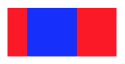
比如,写一个左右方向的布局:
<div style="display:flex;flex-direction:row;">

<div style="width:40px;height:100px;background-color:#ff0000;">
</div>

<div style="width:100px;height:100px;background-color:#fffff">
</div>

<div style="width:80px;height:100px;background-color:#ff0000">
</div>

</div>
效果为:
2.1.2 权重
在android中,线性布局LinearLayout可以设置android:weightSum属性,其子元素可以设置android:layout_weight属性,用于等分的效果。比如:
<LinearLayout
android:layout_width="match_parent"
android:layout_height="100px"
android:background="#ffffff"
android:orientation="horizontal"
android:weightSum="3" >

<TextView
android:layout_width="0dip"
android:layout_height="match_parent"
android:layout_weight="1"
android:gravity="center"
android:text="1"
android:background="#ff0000"
android:textColor="#000000" />

<TextView
android:layout_width="0dip"
android:layout_height="match_parent"
android:layout_weight="2"
android:gravity="center"
android:text="2"
android:background="#0000ff"
android:textColor="#000000" />
</LinearLayout>
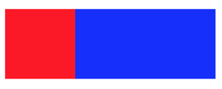
在flex中,则使用flex属性即可。比如:
<div style="display:flex;flex-direction:row;width:300px">
<div style="height:100px;flex:1;background-color:#ff0000;">
</div>
<div style="height:100px;flex:2;background-color:#0000ff;">
</div>
</div>
效果为:
在这里,与android类似,flex的优先级是高于width的。
2.2 相对布局实现
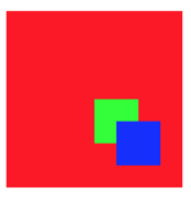
在android中,使用RelativeLayout实现相对布局。一般来说,相对布局能实现的样式,大多都可以使用多层嵌套的线性布局实现。比如android里的toLeft,toRightOf,below,above。分别对应的是在某某元素的左、右、下、上等方位。这种布局,可以使用嵌套式的线性div实现。但是,也有例外,比如覆盖效果。如下:
一个蓝色的方块,覆盖在一个红色的方块之上,并且在右下角,分别距右方和下方40像素。如果使用android的相对布局,非常好写:
使用的布局主要有:
//与父布局的相对关系属性
android:layout_alignParentLeft
android:layout_alignParentTop
android:layout_alignParentRight
android:layout_alignParentBottom

//外边距
android:layout_marginLeft
android:layout_marginTop
android:layout_marginRight
android:layout_marginBottom
实现上述效果的xml代码:
<RelativeLayout
android:layout_width="160dp"
android:layout_height="160dp"
android:background="#ff0000">

<View
android:layout_width="40dp"
android:layout_height="40dp"
android:layout_alignParentBottom="true"
android:layout_alignParentRight="true"
android:layout_marginBottom="40dp"
android:layout_marginRight="40dp"
android:background="#00ff00" />

<View
android:layout_width="40dp"
android:layout_height="40dp"
android:layout_alignParentBottom="true"
android:layout_alignParentRight="true"
android:layout_marginBottom="20dp"
android:layout_marginRight="20dp"
android:background="#0000ff" />
</RelativeLayout>
使用CSS布局,应该怎么写呢?
<div style="position:relative;height:160px;width:160px;background-color:#ff0000;">
<div style="position:absolute;height:40px;width:40px;background-color:#00ff00;right:40px;bottom:40px">
</div>
<div style="position:absolute;width:40px;height:40px;background-color:#0000ff;right:20px;bottom:20px">
</div>
</div>
这里引入如下一些CSS属性
positon: relative或absolute
top,left,bottom,right
首先看一下子元素的postion属性,使用的是absolute绝对布局。然后使用bottom和right属性,定位该元素在上级的最近一个使用了position为relative的div中的位置。这里的bottom,是指距底部的距离,right是指距右边的距离。同样的,如果使用top和left,则可以定位其上、左的位置。说明:如果left和right同时使用,这时,要看是否有width属性,如果没有指定width属性,则left和right同时生效,宽度这会根据left和right自动计算;如果指定了宽度,则只有left和width生效,忽略right,应避免这种情况。
2.3 居中问题
在android中,线性布局和相对布局的居中是不一样的。线性布局LinearLayout使用android:gravity和android:layout_gravity确定。而相对布局RelativeLayout则使用:水平居中 android:layout_centerHorizontal 垂直居中 android:layout_centerVertical 全居中 android:layout_centerInParent
在Flex中,居中为:
水平居中
justify-content:center;
垂直居中
align-items:center;
全居中:
同时使用
justify-content:center;
align-items:center;
除居中之外,justify-content和align-items还有其他属性可选:
.box {
justify-content: flex-start | flex-end | center | space-between | space-around;
}
.box {
align-items: flex-start | flex-end | center | baseline | stretch;
}具体含义,可以查阅文档,在次不再赘述。
2.4 边距
为了使内边距和外边距的含义和android一致,需要在css的样式中添加box-sizing:border-box;
也就是说,为元素指定的任何内边距和边框都将在已设定的宽度和高度内进行绘制。通过从已设定的宽度和高度分别减去边框和内边距才能得到内容的宽度和高度。这就和android的padding一致了。
//android内边距
android:padding
android:paddingLeft
android:paddingRight
android:paddingTop
android:paddingBottom
//android外边距
android:margin
android:layout_marginLeft
android:layout_marginTop
android:layout_marginRight
android:layout_marginBottom
对应css
/* css内边距 */
padding
padding-top
padding-right
padding-bottom
padding-left
/* css外边距 */
margin
margin-top
margin-right
margin-bottom
margin-left
android中的边框一般需要写shape实现。而css中则相对简单。
/* css边框 */
border
border-width
border-style
border-color
2.5 圆角弧度
android中如果写一个圆角的shape还是非常简单的,只需要使用shape即可。//android中背景的radius属性 radius; topLeftRadius topRightRadius bottomLeftRadius bottomRightRadius
在CSS中,与其类似:
/* css中圆角属性 */
border-radius
border-top-left-radius
border-top-right-radius
border-bottom-right-radius
border-bottom-left-radius
注意:
在android中,只能背景设置shape,而控件本身的内容并不会改变的。而CSS中的border-radius既可以用于设置背景,也可以改变控件本身的内容。比如:要实现一个显示圆形的图片控件,在android上,无论你对ImageView怎么设置属性,都不可以,只能重新开发一个圆角控件CircleImageView。CSS中直接使用border-radius即可。
2.6 其他属性
//背景
public static final String VIEW_BACKGROUND = "android:background";
//文本
public static final String VIEW_TEXT = "android:text";
//文本颜色
public static final String VIEW_TEXT_COLOR = "android:textColor";
//文本大小
public static final String VIEW_TEXT_SIZE = "android:textSize";
//文本风格
public static final String VIEW_TEXT_STYLE = "android:textStyle";

//单行显示
public static final String VIEW_SINGLE_LINE = "android:singleLine";
//多行显示
public static final String VIEW_MAX_LINE = "android:maxLines";
//默认值显示
public static final String VIEW_HINT = "android:hint";
//图片的缩放方式
public static final String VIEW_SCALE_TYPE = "android:scaleType";
//文本属性
public static final String VIEW_ELLIPSIZE = "android:ellipsize";
2.6.1 背景色
background-color: #dddddd;
background-color: rgba(0,0,0,0.5);
其中:
R:红色值。正整数 | 百分数
G:绿色值。正整数 | 百分数
B:蓝色值。正整数| 百分数
A:透明度。取值0~1之间
2.6.2 文本内容
直接放到标签中即可
- 2.6.3 文本颜色
color:#ff0000;
2.6.4 文本大小
font-size:24px;
2.6.5 风格
.normal {font-style:normal;}/* 默认,正常*/
.italic {font-style:italic;}/* 斜体*/
.oblique {font-style:oblique;}/* 倾斜*/

.normal {font-weight:normal;}/* 默认,正常*/
.thick {font-weight:bold;}/* 加粗*/
.thicker {font-weight:900;}/* 加粗*/
2.6.6 行数限制
普通的web前端:
(1).单行限制,多余的部分显示点点点…
css为:
overflow: hidden;
text-overflow:ellipsis;
white-space: nowrap;
部分浏览器还需要width限制。
(2).限制多行,多余部分显示…
比如,限制3行:
display: -webkit-box;
-webkit-box-orient: vertical;
-webkit-line-clamp: 3;
overflow: hidden;
(3).Weex
weex的text组件,添加了属性lines用于限制行数。比如:
限制单行和多行时:
.togetherTitle {
width: 500px;
text-overflow: ellipsis;
margin-top: 10px;
font-size: 28px;
color: #4a4a4a;
lines: 1; /*weex 属性,限制文本为2行*/
}

.togetherContent {
text-overflow: ellipsis;
height: 100px;
width: 500px;
margin-top: 5px;
font-size: 26px;
color: #9f9f9f;
lines: 2; /*weex 属性,限制文本为2行*/
}
2.6.7 文本对齐方式
android中TextView的android:gravity属性,对应的left,center,right。在CSS中则为:
text-align:center;
left 把文本排列到左边。默认值:由浏览器决定。
right 把文本排列到右边。
center 把文本排列到中间。
justify 实现两端对齐文本效果。
2.6.8 图片scaleType
android中ImageView控件的scaleType属性,常用的有centerCrop和fitXY;
在CSS中实现fitXY的效果是非常简单的,只需要使用img标签,然后设置宽高即可。
而实现centerCrop的效果则需要下面三个样式配合:
background-image:url('xxxx');
background-size:80px 120px;
background-position:center;
最关键点属性就是background-position,当为center的时候,就是居中。当然,它还可以有很多其他值,比如left,right等。
weex的话则使用image组件的resize属性即可。
2.7 可见性控制
在android中,我们使用visibility属性,控制可见性。//控件可见性属性 android:visibility="gone|visible|invisible";
gone是既不可见,也不占位
visible是既可见,又占位
invisible是不可见,但占位
在CSS中,可见并占位当然是默认状态;
android中gone对应的不可见可以通过设置display属性实现:
dispaly:none;
android中的invisible可以设置visibility属性实现。
visibility:hidden;
在React当中,我们可以通过数据源实现对div的可见性控制,比如:
{status?<div>xxxx</div>:none}2.8 Demo
图片上覆盖了一个div的蒙层,而div蒙层内部的布局,又可以分解为一个垂直方向的线性布局。
<div class="container" onclick="playVideo">
<image class="img" src="{{item.images[0]}}"></image>
<div class="center-container">
<image class="icon" src="{{item.feature.videoIconBig}}"></image>
<text class="text">{{item.title}}</text>
<text class="text">{{item.feature.playTime}}</text>
</div>
</div>

...

.img {
width: 750px;
height: 350px;
}

.center-container {
position: absolute;
flex-direction: column;
top: 0;
left: 0;
width: 750px;
height: 350px;
background-color: rgba(0, 0, 0, 0.3);
align-items: center;
justify-content: center;
}

.text {
position: relative;
margin-top: 20px;
margin-bottom: 0px;
font-size: 25px;
color: #ffffff;
}

.icon {
position: relative;
margin-top: 70px;
margin-bottom: 10px;
width: 50px;
height: 50px;
}

.container {
position: relative;
width: 750px;
height: 350px;
align-items: center;
justify-content: center;
}
三、参考文章
1 Flex 布局教程:语法篇2 weex文档

相关文章推荐
- flex中各个数据类型和java中的各个数据类型的对应关系
- FLEX数据类型和JAVA数据类型对应关系表
- Android 版本与Kernel的对应关系
- Android 代码名字-API级别-版本号-NDK版本对应关系
- Android 代码名字-API级别-版本号-NDK版本对应关系
- Flex Java Object对应关系
- Android 代码名字-版本号-API级别-NDK版本对应关系
- [Android] Jni中C++和Java的数据类型的对应关系
- Android版本和API对应关系
- Android代码名字-版本号-API级别-NDK版本对应关系
- FLEX数据类型和JAVA数据类型对应关系表
- 积少成多Flash(9) - Flex 3.0 布局控件, 样式(css), 皮肤(skin)
- Flex Java Object对应关系
- Android 代码名字-版本号-API级别-NDK版本对应关系
- PAIP.FLEX与JAVA数据对应关系.txt
- FLEX数据类型和JAVA数据类型对应关系表
- 积少成多Flash(9) - Flex 3.0 布局控件, 样式(css), 皮肤(skin)
- flex中各个数据类型和java中的各个数据类型的对应关系
- Android 代码名字-版本号-API级别-NDK版本对应关系
- Android 代码名字-版本号-API级别-NDK版本对应关系