使用CSS完成元素居中的七种方法
2016-09-29 18:02
162 查看
在网页布局中元素水平居中比元素垂直居中要简单不少,同时实现水平居中和垂直居中往往是最难的。现在是响应式设计的时代,我们很难确切的知道元素的准确高度和宽度,所以一些方案不大适用。据我所知, 在CSS中至少有六种实现居中的方法。我将使用下面的HTML结构从简单到复杂开始讲解:
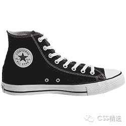
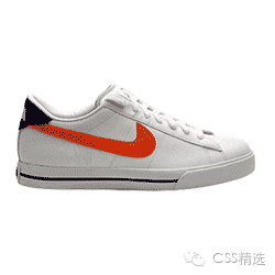
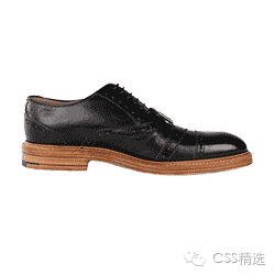
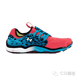
鞋子图片会改变,但是他们都会保持500pxX500px的大小。 HSL colors 用于使背景颜色保持一致。
有时显而易见的方案是最佳的选择:
这种方案没有使图片垂直居中:你需要给<div> 添加 padding 或者给内容添加margin-top 和 margin-bottom使容器与内容之间有一定的距离。
这种方式实现水平居中和上面使用text-align的方法有相同局限性。
注意: 必须使用display: block使 margin: 0 auto对img元素生效。
使用 display: table-cell, 而不是使用table标签; 可以实现水平居中和垂直居中,但是这种方法需要添加额外的元素作为外部容器。
CSS:
注意:为了使div 不折叠必须加上 width: 100%,外部容器元素也需要加上一定高度使得内容垂直居中。给html和body设置高度后,也可以使元素在body垂直居中。此方法在IE8+浏览器上生效。
这种 方案 有非常好的跨浏览器支持。有一个缺点就是必须显式声明外部容器元素的height:
Chris Coiyer 提出了一个使用 CSS transforms 的新方案。 同样支持水平居中和垂直居中:
但是有以下几种缺点:
CSS transform 在部分就浏览器上需要使用 前缀。
不支持 IE9 以下的浏览器。
外部容器需要设置height (或者用其他方式设置),因为不能获取 绝对定位 的内容的高度。
如果内容包含文字,现在的浏览器合成技术会使文字模糊不清。
当新旧语法差异和浏览器前缀消失时,这种方法会成为主流的居中方案。
在很多方面 flexbox 是一种简单的方案, 但是它有新旧两种语法以及早期版本的IE缺乏支持 (尽管可以使用 display: table-cell作为降级方案)。
现在规范已经最终确定,现代浏览器也大都支持。
在某些情况下比flexbox更全面:
很简单,calc 允许你基于当前的页面布局计算尺寸。在上面的简单计算中, 50% 是容器元素的中心点,但是如果只设置50%会使图片的左上角对齐div的中心位置。 我们需要把图片向左和向上各移动图片宽高的一半。计算公式为:
在现在的浏览其中你会发现,这种方法更适用于当内容的宽高为固定尺寸:
我在 这篇文章 中详细讲解了calc。
这种方案和flex一样有许多相同的缺点: 虽然在现代浏览器中有良好的支持,但是在较早的版本中仍然需要浏览器前缀,并且不支持IE8。
当然还有 其他更多的方案。理解这六种方案之后,web开发人员在面对元素居中的时候会有更多的选择。
出自:http://www.zcfy.cc/article/439
<div class="center">
<img src="jimmy-choo-shoe.jpg" alt>
</div>
鞋子图片会改变,但是他们都会保持500pxX500px的大小。 HSL colors 用于使背景颜色保持一致。
使用text-align水平居中
有时显而易见的方案是最佳的选择:
div.center {
text-align: center;
background: hsl(0, 100%, 97%);
}
div.center img {
width: 33%; height: auto;
}
这种方案没有使图片垂直居中:你需要给<div> 添加 padding 或者给内容添加margin-top 和 margin-bottom使容器与内容之间有一定的距离。
使用 margin: auto 居中
这种方式实现水平居中和上面使用text-align的方法有相同局限性。
div.center {
background: hsl(60, 100%, 97%);
}
div.center img {
display: block;
width: 33%;
height: auto;
margin: 0 auto;}
注意: 必须使用display: block使 margin: 0 auto对img元素生效。
使用table-cell居中
使用 display: table-cell, 而不是使用table标签; 可以实现水平居中和垂直居中,但是这种方法需要添加额外的元素作为外部容器。
<div class="center-aligned">
<div class="center-core">
<img src="jimmy-choo-shoe.jpg">
</div>
</div>
CSS:
.center-aligned {
display: table;
background: hsl(120, 100%, 97%);
width: 100%;
}
.center-core {
display: table-cell;
text-align: center;
vertical-align: middle;
}
.center-core img {
width: 33%;
height: auto;
}
注意:为了使div 不折叠必须加上 width: 100%,外部容器元素也需要加上一定高度使得内容垂直居中。给html和body设置高度后,也可以使元素在body垂直居中。此方法在IE8+浏览器上生效。
使用absolute定位居中
这种 方案 有非常好的跨浏览器支持。有一个缺点就是必须显式声明外部容器元素的height:
.absolute-aligned {
position: relative;
min-height: 500px;
background: hsl(200, 100%, 97%);}
.absolute-aligned img {
width: 50%;
min-width: 200px;
height: auto;
overflow: auto;
margin: auto;
position: absolute;
top: 0; left: 0;
bottom: 0; right: 0;}
使用translate居中
Chris Coiyer 提出了一个使用 CSS transforms 的新方案。 同样支持水平居中和垂直居中:
.center {
background: hsl(180, 100%, 97%);
position: relative;
min-height: 500px;}
.center img {
position: absolute;
top: 50%; left: 50%;
transform: translate(-50%, -50%);
width: 30%; height: auto;
}
但是有以下几种缺点:
CSS transform 在部分就浏览器上需要使用 前缀。
不支持 IE9 以下的浏览器。
外部容器需要设置height (或者用其他方式设置),因为不能获取 绝对定位 的内容的高度。
如果内容包含文字,现在的浏览器合成技术会使文字模糊不清。
使用Flexbox居中
当新旧语法差异和浏览器前缀消失时,这种方法会成为主流的居中方案。
.center {
background: hsl(240, 100%, 97%);
display: flex;
justify-content: center;
align-items: center;
}
.center img {
width: 30%; height: auto;}
在很多方面 flexbox 是一种简单的方案, 但是它有新旧两种语法以及早期版本的IE缺乏支持 (尽管可以使用 display: table-cell作为降级方案)。
现在规范已经最终确定,现代浏览器也大都支持。
使用calc居中
在某些情况下比flexbox更全面:
.center {
background: hsl(300, 100%, 97%);
min-height: 600px;
position: relative;}
.center img {
width: 40%;
height: auto;
position: absolute;
top: calc(50% - 20%);
left: calc(50% - 20%);
}
很简单,calc 允许你基于当前的页面布局计算尺寸。在上面的简单计算中, 50% 是容器元素的中心点,但是如果只设置50%会使图片的左上角对齐div的中心位置。 我们需要把图片向左和向上各移动图片宽高的一半。计算公式为:
top: calc(50% - (40% / 2));
left: calc(50% - (40% / 2));
在现在的浏览其中你会发现,这种方法更适用于当内容的宽高为固定尺寸:
.center img {
width: 500px; height: 500px;
position: absolute;
top: calc(50% - (300px / 2));
left: calc(50% - (300px – 2));
}
我在 这篇文章 中详细讲解了calc。
这种方案和flex一样有许多相同的缺点: 虽然在现代浏览器中有良好的支持,但是在较早的版本中仍然需要浏览器前缀,并且不支持IE8。
.center img {
width: 40%;
height: auto;
position: absolute;
top: calc(50% - 20%);
left: calc(50% - 20%);}
当然还有 其他更多的方案。理解这六种方案之后,web开发人员在面对元素居中的时候会有更多的选择。
出自:http://www.zcfy.cc/article/439

相关文章推荐
- 使用CSS完成元素居中的七种方法
- 使用CSS完成元素居中的七种方法
- 使用CSS居中浮动元素的方法
- 使用CSS完美实现垂直居中的方法
- 使用CSS让元素居中显示的技巧
- 网页设计:CSS中元素水平居中显示的方法
- CSS设置元素居中的方法
- html css 元素居中的方法
- 使用CSS让DIV水平垂直居中的方法。
- CSS 元素垂直居中的 6种方法
- CSS中元素水平居中显示的方法
- CSS文字图片div元素居中方法之水平居中
- CSS实现元素水平、垂直居中的方法
- jquery之修改元素样式(获取和设置样式,使用css(),width(),height()方法)
- 利用CSS让元素垂直居中的两种实现方法
- 使用CSS完美实现垂直居中的方法
- CSS:CSS中元素水平居中显示的方法
- 不用table,两种div+css页面元素居中方法
- 元素水平居中显示方法 CSS
- css 元素居中方法