【Win10】UAP/UWP/通用 开发之 SplitView
2016-09-27 15:00
375 查看
[Some information relates to pre-released product which may be substantially modified before it's commercially released. Microsoft makes no warranties, express or implied, with respect to the information provided here.]
[涉及某信息预发布的版本可能在它的商业版本大幅修改。对于这里提供的信息,微软不作任何担保。]
在MSDN中,Windows 10 SDK 的东东上,都会声明这一句话,我也引过来吧啦,他不担保,我也保不了。
SplitView,这个控件,好像在WinJs中早早就有了,我们好多人也在WPF/WinRT 等Xaml环境中实现过,但官方的才姗姗来迟,泪奔中。
我猜测,因为我们的在Xaml太强大了,这么弱小的功能,分分种搞出来一个,微软的工程师们就觉得没必要啦(YY中。。。。)。
一、效果
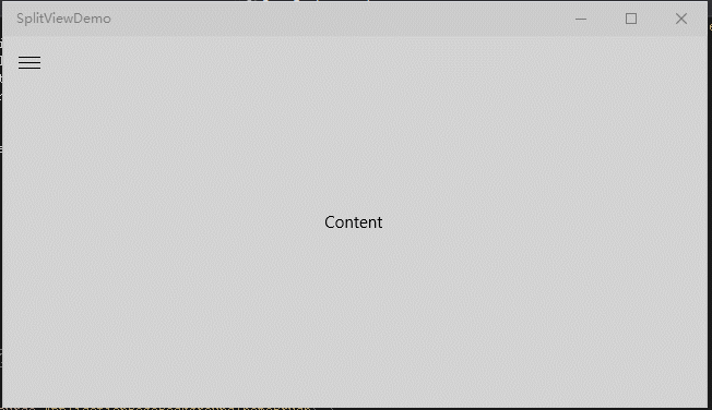
二、SplitView
在效果的Gif中,一共展示了四种方式,通过设置DisplayMode来改变,分别是:
Inline
Overlay
CompactInline
CompactOverlay
前两种模式当IsOpen 为False 时,是完全隐藏的.
后两种模式,当IsOpen为False时,不会完全隐藏,剩余的大小是由 CompactPaneLength 属性决定,默认值为48.
还有一个 OpenPaneLength,当名字就知啦,展开的Pane长度。
三、示例核心代码
示例下载
本文地址:http://www.cnblogs.com/gaoshang212/p/4536453.html
本文原创手打,转载请注明出处。
[涉及某信息预发布的版本可能在它的商业版本大幅修改。对于这里提供的信息,微软不作任何担保。]
在MSDN中,Windows 10 SDK 的东东上,都会声明这一句话,我也引过来吧啦,他不担保,我也保不了。
SplitView,这个控件,好像在WinJs中早早就有了,我们好多人也在WPF/WinRT 等Xaml环境中实现过,但官方的才姗姗来迟,泪奔中。
我猜测,因为我们的在Xaml太强大了,这么弱小的功能,分分种搞出来一个,微软的工程师们就觉得没必要啦(YY中。。。。)。
一、效果
二、SplitView
在效果的Gif中,一共展示了四种方式,通过设置DisplayMode来改变,分别是:
Inline
Overlay
CompactInline
CompactOverlay
前两种模式当IsOpen 为False 时,是完全隐藏的.
后两种模式,当IsOpen为False时,不会完全隐藏,剩余的大小是由 CompactPaneLength 属性决定,默认值为48.
还有一个 OpenPaneLength,当名字就知啦,展开的Pane长度。
三、示例核心代码
<Grid Background="{ThemeResource ApplicationPageBackgroundThemeBrush}">
<SplitView IsPaneOpen="{x:Bind splitViewToggle.IsChecked,Mode=TwoWay,Converter={StaticResource NullableBooleanToBooleanKey}}"
PaneBackground="Green"
DisplayMode="CompactOverlay"
CompactPaneLength="">
<SplitView.Pane>
<Grid>
<Grid.RowDefinitions>
<RowDefinition Height="48" />
<RowDefinition Height="*" />
<RowDefinition Height="Auto" />
</Grid.RowDefinitions>
<ListView Grid.Row="1">
<ListViewItem>
<StackPanel Orientation="Horizontal" >
<SymbolIcon Symbol="People" />
<TextBlock Text="People"
Margin="24,0,0,0"
VerticalAlignment="Center" />
</StackPanel>
</ListViewItem>
<ListViewItem>
<StackPanel Orientation="Horizontal" >
<SymbolIcon Symbol="Globe" />
<TextBlock Text="Globe"
Margin="24,0,0,0"
VerticalAlignment="Center" />
</StackPanel>
</ListViewItem>
<ListViewItem>
<StackPanel Orientation="Horizontal" >
<SymbolIcon Symbol="Message" />
<TextBlock Text="Message"
Margin="24,0,0,0"
VerticalAlignment="Center" />
</StackPanel>
</ListViewItem>
<ListViewItem>
<StackPanel Orientation="Horizontal" >
<SymbolIcon Symbol="Mail" />
<TextBlock Text="Mail"
Margin="24,0,0,0"
VerticalAlignment="Center" />
</StackPanel>
</ListViewItem>
<ListViewItem>
<StackPanel Orientation="Horizontal" >
<SymbolIcon Symbol="Video" />
<TextBlock Text="Video"
Margin="24,0,0,0"
VerticalAlignment="Center" />
</StackPanel>
</ListViewItem>
</ListView>

</Grid>
</SplitView.Pane>
<Border Background="LightGray">
<TextBlock Text="Content" HorizontalAlignment="Center" VerticalAlignment="Center"/>
</Border>
</SplitView>

<ToggleButton x:Name="splitViewToggle" Style="{StaticResource SplitViewTogglePaneButtonStyle}" />
</Grid>
示例下载
本文地址:http://www.cnblogs.com/gaoshang212/p/4536453.html
本文原创手打,转载请注明出处。

相关文章推荐
- 【Win10】UAP/UWP/通用 开发之 SplitView
- 【Win10】UAP/UWP/通用 开发之 SplitView
- 【Win10】UAP/UWP (通用程序) 开发初体验(1) 之 开发准备
- 【Win10】UAP/UWP/通用 开发之 RelativePanel
- 【Win10】UAP/UWP (通用程序) 开发初体验(1) 之 开发准备
- 【Win10】UAP/UWP/通用 开发之 x:Bind
- 【Win10】UAP/UWP/通用 开发之 x:DeferLoadStrategy
- Win10 UWP 开发系列:使用SplitView实现汉堡菜单及页面内导航
- win10开发中 UWP SplitView 控件讲解
- UWP开发入门(一)——SplitView
- Win10通用程序 UWP版HtmlAgilityPack UWP应用使用示例
- 【UWP通用应用开发】文件选取器、获取文件属性、写入和读取、保存读取和删除应用数据
- Win10 UWP 开发系列:使用SQLite
- “Win10 UAP 开发系列”之主题模式切换
- Win10/UWP开发—凭据保险箱PasswordVault
- 【UWP通用应用开发】控件、应用栏
- 【UWP通用应用开发】集合控件与数据绑定
- Win10 UWP 开发系列:支持异步的SQLite
- Win10 UWP开发中的重复性静态UI绘制小技巧 2
- Win10开发:SplitView控件