CSS3实现一个开关按钮控件
2016-09-06 22:03
375 查看
之前有写过自定义一个复选框的样式。
链接:http://blog.csdn.net/u014291497/article/details/52081774
又做了一个左右滑动开关效果的复选框。
效果图:
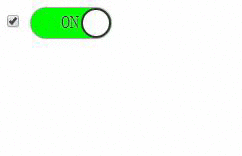
上图左侧为了显示数据变化所以显示出来,实际使用中设置
本示例中全部使用HTML及CSS实现。
github地址:https://github.com/justforuse/HTML-CSS-JS/tree/master/customize-radio
代码:
此文档的作者:justforuse
Github Pages:justforuse
链接:http://blog.csdn.net/u014291497/article/details/52081774
又做了一个左右滑动开关效果的复选框。
效果图:
上图左侧为了显示数据变化所以显示出来,实际使用中设置
display:none属性就可以了。
本示例中全部使用HTML及CSS实现。
github地址:https://github.com/justforuse/HTML-CSS-JS/tree/master/customize-radio
代码:
<!DOCTYPE html>
<html lang="en">

<head>
<meta charset="UTF-8">
<title></title>
<script></script>
<style>
.text {
display: none;
}
.on{
color:#333;
}
.off{
color:#eee;
}
.circle {
position: absolute;
display: inline-block;
}

#radio ~label {
background-color: grey;
}

#radio ~label .circle {
left: 0;
transition: all 0.3s;
--webkit-transition: all 0.3s;
}

#radio ~label .on {
display: none;
}

#radio ~ label .off {
display: inline-block;
}

#radio:checked ~ label {
background: lime;
}

#radio:checked ~label .circle {
left: 50px;
}
#radio:checked ~label .on {
display: inline-block;
}

#radio:checked ~ label .off {
display: none;
}

label {
display: inline-block;
position: relative;
height: 30px;
width: 80px;
border-top-left-radius: 15px 50%;
border-bottom-left-radius: 15px 50%;
border-top-right-radius: 15px 50%;
border-bottom-right-radius: 15px 50%;
box-shadow: 0 0 2px black;
}

label .circle {
display: inline-block;
height: 26px;
width: 26px;
border-radius: 50%;
border: 2px solid #333;
background-color: #eee;
}

label .text {
text-indent: 30px;
line-height: 28px;
font-size: 18px;
font-family: sans-serif;
text-shadow: 0 0 2px #ddd;
}
</style>
</head>

<body>
<div class="container">
<input type="checkbox" id="radio" name="switch">
<label for="radio" class="radio">
<span class="circle"></span>
<span class="text on">ON</span>
<span class="text off">OFF</span>
</label>
</div>
</body>

</html>此文档的作者:justforuse
Github Pages:justforuse

相关文章推荐
- css3实现按钮开关效果
- 怎样实现一个潮流的开关按钮
- 自定义dialog,实现右上角显示一个控件按钮
- C#第十周任务之最后一项之创建一个如下的窗体,并在窗体上放置一个菜单、一个工具栏控件。菜单内容如第二个图所示。工具栏上有两个按钮,分别对应“打开文本文件”、“保存文本文件”。菜单和工具栏具体功能实现可
- jQuery 如何实现一个滑动按钮开关
- css3实现switch开关按钮
- 如何实现一个frame中的按钮事件调用另一个frame的服务器控件
- 在窗体上放置一个标签、一个按钮、一个fontDialog控件。标签内容改为“烟台大学”。实现功能:1)程序运行时,单击打开字体对话框按钮,可选择字体,并以所选字体作为标签字体。
- CSS3实现开关按钮效果
- ZoomControls控件是一个可以缩放控件,可以实现两个按钮控制图片的大小
- Android 自定义dialog,实现右上角显示一个控件按钮
- 纯css3实现的switch开关按钮
- 重写QLineEdit,实现编辑框内添加删除按钮的功能(随时把控件Move到一个地方,然后show就可以了,这是万能的办法)
- jQuery 如何实现一个滑动按钮开关
- GWT 把FileUpload控件替换为一个按钮实现
- 创建一个如下的窗体,并在窗体上放置colorDialog控件。实现功能:1)程序运行时,单击打开颜色对话框按钮,可选择颜色,并以所选颜色作为窗体背景色
- css3实现的简单开关按钮代码实例:
- 一个控件几行代码实现换肤(可支持菜单)
- [DevExpress控件应用]XtraGrid: 实现按钮列
- 动态创建一个CButton按钮并实现其ON_BN_CLICKED消息