CSS伪元素 :before :after
2016-09-02 10:53
246 查看
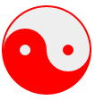
1、八卦制作
转载自:http://www.hulufei.com/post/about-before-and-after-pseudo-element
css:
html:
效果:
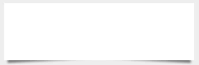
2、阴影制作
转载自https://paulund.co.uk/playground/demo/css_box_shadow/sass-box-shadow.php
css:
html:
效果:
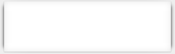
3、左右阴影
效果:
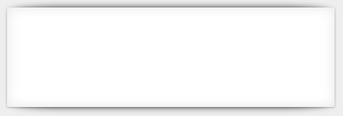
3、上下阴影
效果:
转载自:http://www.hulufei.com/post/about-before-and-after-pseudo-element
css:
#ba{
width: 96px;
height: 48px;
background: #eee;
border-color: red;
border-style: solid;
border-width: 2px 2px 50px 2px;
border-radius: 100%;
position: relative;
}
#ba:after,#ba:before{
content: '';
position: absolute;
top: 50%;
width: 12px;
height: 12px;
border-radius: 100%;
}
#ba:after{
border: 18px solid red;
left: 0;
background: #eee;
}
#ba:before{
border: 18px solid #eee;
right: 0;
background: red;
}
html:
<div id="ba"></div>
效果:
2、阴影制作
转载自https://paulund.co.uk/playground/demo/css_box_shadow/sass-box-shadow.php
css:
body{
background: #eee;
}
div.box{
width: 50%;
height: 200px;
background: #FFF;
margin: 40px auto;
position: relative;
}
div.box:before,div.box:after{
position: absolute;
content: "";
bottom: 15px;
top: 80%;
width: 50%;
background: #777;
box-shadow: 0 15px 10px #777;
z-index: -1;
}
div.box:before{
left: 10px;
transform: rotate(-3deg);
}
div.box:after{
right: 10px;
transform: rotate(3deg);
}
html:
<div class="box"></div>
效果:
3、左右阴影
body{
background: #eee;
}
div.box{
width: 50%;
height: 200px;
background: #FFF;
margin: 40px auto;
position: relative;
box-shadow: 0 1px 4px rgba(0, 0, 0, 0.3), 0 0 40px rgba(0, 0, 0, 0.1) inset;
}
div.box:before{
content: "";
position: absolute;
box-shadow: 0 0 20px rgba(0, 0, 0, 0.8);
top: 10px;
bottom: 10px;
left: 0;
right: 0;
border-radius: 100px / 10px;
z-index: -1;
}
div.box:after{
right: 10px;
left: auto;
transform: skew(8deg) rotate(3deg);
}
效果:
3、上下阴影
body{
background: #eee;
}
div.box{
width: 50%;
height: 200px;
background: #FFF;
margin: 40px auto;
position: relative;
box-shadow: 0 1px 4px rgba(0, 0, 0, 0.3), 0 0 40px rgba(0, 0, 0, 0.1) inset;
}
div.box:before{
content: "";
position: absolute;
box-shadow: 0 0 20px rgba(0, 0, 0, 0.8);
top: 0;
bottom: 0;
left: 10px;
right: 10px;
border-radius: 100px / 10px;
z-index: -1;
}
div.box:after{
right: 10px;
left: auto;
transform: skew(8deg) rotate(3deg);
}
效果:

相关文章推荐
- css伪元素:before和:after用法详解
- js如何控制css伪元素内容(before,after)
- 大家好,我给大家介绍一下,这是CSS伪元素:before与:after
- CSS伪元素BEFORE、AFTER妙用:制作时尚焦点图相框
- js如何控制css伪元素内容(before,after)
- css伪元素:before和:after用法详解
- CSS伪元素before、after用法 给图片四角加边框
- CSS伪元素before、after妙用:制作时尚焦点图相框
- JavaScript修改CSS伪元素:after和:before的样式
- js如何控制css伪元素内容(before,after)
- css伪元素before/after和画三角形的搭配应用
- CSS伪元素 CSS:before CSS伪元素(Pseudo Element):after与:before
- CSS伪元素--:after-:before的炫酷用法
- css伪元素研究(::before/::after)
- CSS伪元素 after AND before
- CSS伪元素样式 :before 和 :after
- CSS伪元素 :before, :after, box-shadow应用
- CSS伪元素before和after
- ::before和::after的用法 css伪元素
- CSS伪元素选择器:before和:after