记录一些WPF常用样式方便以后复用(转)
2016-08-12 16:38
323 查看
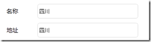
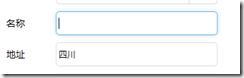
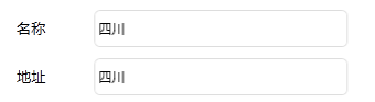
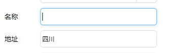
TextBox文本框
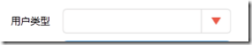
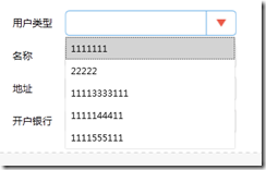
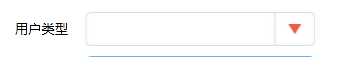
ComboBox下拉框
<Style x:Key="TextBoxStyle1" BasedOn="{x:Null}" TargetType="{x:Type TextBox}">
<Setter Property="Foreground" Value="{DynamicResource {x:Static SystemColors.ControlTextBrushKey}}"/>
<Setter Property="Background" Value="{DynamicResource {x:Static SystemColors.WindowBrushKey}}"/>
<Setter Property="BorderBrush" Value="{StaticResource TextBoxBorder}"/>
<Setter Property="BorderThickness" Value="1"/>
<Setter Property="Padding" Value="1"/>
<Setter Property="AllowDrop" Value="true"/>
<Setter Property="FocusVisualStyle" Value="{x:Null}"/>
<Setter Property="ScrollViewer.PanningMode" Value="VerticalFirst"/>
<Setter Property="Stylus.IsFlicksEnabled" Value="False"/>
<Setter Property="Template">
<Setter.Value>
<ControlTemplate TargetType="{x:Type TextBox}">
<Border x:Name="Bd" SnapsToDevicePixels="true" BorderBrush="#FFDDDDDD" BorderThickness="1" ClipToBounds="False" CornerRadius="5">
<Border.Effect>
<DropShadowEffect Color="White" Direction="0" ShadowDepth="0" BlurRadius="10"/>
</Border.Effect>
<!--这个Border主要用来遮挡框内的阴影,只要外阴影,如果只要内阴影不要外阴影,那么设置border的 ClipToBounds="True"  剪切外部内容,即可实现内阴影-->
<Border Background="White" CornerRadius="5">
<ScrollViewer x:Name="PART_ContentHost" SnapsToDevicePixels="{TemplateBinding SnapsToDevicePixels}" Background="{x:Null}" BorderBrush="{x:Null}" Foreground="{x:Null}">
</ScrollViewer>
</Border>
</Border>
<ControlTemplate.Triggers>

<Trigger Property="IsMouseOver" Value="True">
<Setter Property="BorderBrush" TargetName="Bd" Value="#FF66AFE9"/>
</Trigger>

<Trigger Property="IsFocused" Value="True">
<Setter Property="Effect" TargetName="Bd">
<Setter.Value>
<DropShadowEffect BlurRadius="10" Color="#FFE5F2FC" Direction="0" ShadowDepth="0"/>
</Setter.Value>
</Setter>
<Setter Property="BorderBrush" TargetName="Bd" Value="#FF66AFE9"/>
</Trigger>

</ControlTemplate.Triggers>
</ControlTemplate>
</Setter.Value>
</Setter>
</Style>

<TextBox Text="四川"   Grid.Column="1" Grid.Row="2" BorderBrush="{x:Null}" Background="{x:Null}"  SelectionBrush="#FFE237EA" HorizontalAlignment="Left" VerticalAlignment="Center" VerticalContentAlignment="Center" Style="{DynamicResource TextBoxStyle1}" Height="34" Width="230" Margin="4,5,0,5"  />
ComboBox下拉框

<Style x:Key="ComboBoxStyle1" TargetType="{x:Type ComboBox}">
<Setter Property="BorderThickness" Value="1"/>
<Setter Property="ScrollViewer.HorizontalScrollBarVisibility" Value="Auto"/>
<Setter Property="ScrollViewer.VerticalScrollBarVisibility" Value="Auto"/>
<Setter Property="Padding" Value="4,3"/>
<Setter Property="ScrollViewer.CanContentScroll" Value="true"/>
<Setter Property="ScrollViewer.PanningMode" Value="Both"/>
<Setter Property="Stylus.IsFlicksEnabled" Value="False"/>
<Setter Property="ItemContainerStyle">
<Setter.Value>
<!--ComBoxItem-->
<Style TargetType="ComboBoxItem">
<Setter Property="MinHeight" Value="22"></Setter>
<Setter Property="MinWidth" Value="60"></Setter>
<Setter Property="Template">
<Setter.Value>
<ControlTemplate TargetType="ComboBoxItem">
<Border Name="Back" Background="Transparent"  BorderThickness="0,0,0,0" BorderBrush="#81D779"  Height="30" >
<ContentPresenter ContentSource="{Binding Source}" VerticalAlignment="Center"  HorizontalAlignment="Left" Margin="5,0,0,0"></ContentPresenter>
</Border>
<ControlTemplate.Triggers>
<Trigger Property="IsMouseOver" Value="True">
<Setter TargetName="Back" Property="Background" Value="LightGray"></Setter>
</Trigger>
<Trigger Property="IsHighlighted" Value="True">
<Setter TargetName="Back" Property="Background" Value="LightGray"></Setter>
</Trigger>
</ControlTemplate.Triggers>
</ControlTemplate>
</Setter.Value>
</Setter>
</Style>
</Setter.Value>
</Setter>
<Setter Property="Template">
<Setter.Value>
<ControlTemplate TargetType="{x:Type ComboBox}">
<Grid x:Name="MainGrid" SnapsToDevicePixels="true" FocusVisualStyle="{x:Null}" Background="White" >
<Grid.ColumnDefinitions>
<ColumnDefinition Width="*"/>
<ColumnDefinition MinWidth="{DynamicResource {x:Static SystemParameters.VerticalScrollBarWidthKey}}" Width="0"/>
</Grid.ColumnDefinitions>
<Popup IsOpen="{TemplateBinding IsDropDownOpen}" Placement="Bottom" x:Name="Popup" Focusable="False" AllowsTransparency="True" PopupAnimation="Slide">
<Border CornerRadius="1" MaxHeight="{TemplateBinding MaxDropDownHeight}" MinWidth="{TemplateBinding ActualWidth}" x:Name="DropDown" SnapsToDevicePixels="True">
<Border.Effect>
<DropShadowEffect Color="Black" BlurRadius="2" ShadowDepth="0" Opacity="0.5"/>
</Border.Effect>
<ScrollViewer Margin="1,2,2,6"  MaxHeight="{TemplateBinding MaxDropDownHeight}" SnapsToDevicePixels="True" HorizontalScrollBarVisibility="Auto" VerticalScrollBarVisibility="Auto" CanContentScroll="True">
<!-- StackPanel 用于显示子级,方法是将 IsItemsHost 设置为 True -->
<StackPanel IsItemsHost="True" KeyboardNavigation.DirectionalNavigation="Contained" Background="White"/>
</ScrollViewer>
</Border>
</Popup>

<ToggleButton x:Name="toggleButton" FocusVisualStyle="{x:Null}" BorderBrush="#FFDDDDDD"  Grid.ColumnSpan="2" IsChecked="{Binding IsDropDownOpen, Mode=TwoWay, RelativeSource={RelativeSource TemplatedParent}}" Style="{StaticResource ComboBoxReadonlyToggleButton}" />
<TextBox Text="{TemplateBinding SelectionBoxItem}" HorizontalAlignment="Left" VerticalAlignment="Center" Margin="5,0,0,0" BorderThickness="0" BorderBrush="{x:Null}" Background="Transparent" SelectionBrush="#FFFF334F" IsReadOnly="True" Cursor="Arrow" FocusVisualStyle="{x:Null}" ></TextBox>
<!--<ContentPresenter ContentTemplate="{TemplateBinding SelectionBoxItemTemplate}" ContentTemplateSelector="{TemplateBinding ItemTemplateSelector}" Content="{TemplateBinding SelectionBoxItem}" ContentStringFormat="{TemplateBinding SelectionBoxItemStringFormat}" HorizontalAlignment="{TemplateBinding HorizontalContentAlignment}" IsHitTestVisible="false" Margin="{TemplateBinding Padding}" SnapsToDevicePixels="{TemplateBinding SnapsToDevicePixels}" VerticalAlignment="{TemplateBinding VerticalContentAlignment}"/>-->
</Grid>
<ControlTemplate.Triggers>

<Trigger Property="IsMouseOver" Value="True">
<Setter Property="BorderBrush" TargetName="toggleButton" Value="#FF66AFE9"/>
</Trigger>

<Trigger Property="IsEnabled" Value="false">
<Setter Property="Foreground" Value="{DynamicResource {x:Static SystemColors.GrayTextBrushKey}}"/>
<Setter Property="Background" Value="#FFF4F4F4"/>
</Trigger>
<Trigger Property="IsGrouping" Value="true">
<Setter Property="ScrollViewer.CanContentScroll" Value="false"/>
</Trigger>

</ControlTemplate.Triggers>
</ControlTemplate>
</Setter.Value>
</Setter>
<Style.Triggers>
<Trigger Property="IsEditable" Value="true">
<Setter Property="BorderBrush" Value="{StaticResource TextBoxBorder}"/>
<Setter Property="Background" Value="{DynamicResource {x:Static SystemColors.WindowBrushKey}}"/>
<Setter Property="IsTabStop" Value="false"/>
<Setter Property="Padding" Value="3"/>
</Trigger>
</Style.Triggers>
</Style>
<!--Combobox里ToggleButton的样式-->

<Style x:Key="ComboBoxReadonlyToggleButton" TargetType="{x:Type ToggleButton}">
<Setter Property="OverridesDefaultStyle" Value="true"/>
<Setter Property="ClickMode" Value="Press"/>
<Setter Property="Background" Value="Transparent"/>
<Setter Property="Template">
<Setter.Value>
<ControlTemplate TargetType="{x:Type ToggleButton}">
<Border x:Name="border1" ClipToBounds="True"  BorderBrush="{TemplateBinding BorderBrush}"  BorderThickness="1" CornerRadius="5" >
<Border.Effect>
<DropShadowEffect BlurRadius="5" ShadowDepth="0" Color="#FFF9F7F7" />
</Border.Effect>

<Grid>
<Grid.ColumnDefinitions>
<ColumnDefinition />
<ColumnDefinition Width="40" />
</Grid.ColumnDefinitions>

<Border x:Name="border" Grid.Column="1" BorderBrush="{TemplateBinding BorderBrush}" BorderThickness="1,0,0,0" Background="{x:Null}">
<Path x:Name="Arrow" Grid.Column="1" HorizontalAlignment="Center" VerticalAlignment="Center" Width="13" Height="10.25" Data="M 0 0 L 4 4 L 8 0 Z"  Stretch="Fill" Fill="#FFEB5948"  />
</Border>
</Grid>
</Border>
<ControlTemplate.Triggers>
<Trigger Property="IsMouseOver" Value="True">
<Setter Property="BorderBrush" TargetName="border1"  Value="#FF66AFE9"/>
</Trigger>
<Trigger Property="IsMouseOver" Value="True">
<Setter Property="BorderBrush" TargetName="border1" Value="#FF66AFE9"/>
</Trigger>
<Trigger Property="IsMouseOver" Value="True" SourceName="border">
<Setter Property="Fill" TargetName="Arrow" Value="#FFC91E64"/>
</Trigger>
<Trigger Property="IsChecked" Value="true">
<!--<Setter Property="RenderPressed" TargetName="Chrome" Value="true"/>-->
</Trigger>
<Trigger Property="IsEnabled" Value="false">
<Setter Property="Fill" TargetName="Arrow" Value="#AFAFAF"/>
</Trigger>
</ControlTemplate.Triggers>
</ControlTemplate>
</Setter.Value>
</Setter>
</Style>

<!--引用样式-->
<ComboBox Grid.Row="3" Grid.Column="1" Height="33" Width="230" FocusVisualStyle="{x:Null}" Style="{DynamicResource ComboBoxStyle1}" HorizontalAlignment="Left" VerticalAlignment="Center" Margin="4,5,0,5">
<ListBoxItem>1111111</ListBoxItem>
<ListBoxItem>22222</ListBoxItem>
<ListBoxItem>11113333111</ListBoxItem>
<ListBoxItem>1111144411</ListBoxItem>
<ListBoxItem>1111555111</ListBoxItem>
</ComboBox>
相关文章推荐
- 记录一些WPF常用样式方便以后复用
- 记录一些WPF常用样式方便以后复用(二)(Button、CheckBox、输入账号密码框)(转)
- .net一些常用功能(记录下,方便以后查询,慢慢完善)
- 常用的一些Oracle命令,做个备份,以后方便查看。
- 使用Sass预定义一些常用的样式,非常方便
- 实习三个月整,记录自己的成长,主要是保留一些这段时间学习flex的链接,方便以后查看
- 使用Sass预定义一些常用的样式,非常方便(转)
- 一些常用记录
- 本人服务器遭受黑客长期攻击,特把这几天做的一些有用的安全方面总结出来,以方便以后查阅
- 记录一些莫名奇妙的问题,方便自己帮助大家
- 表中重复记录的一些常用脚本
- 我常用的一些注入命令,方便一下大家
- 记录一些WPF
- 关于一些Silverlight中常用的尺寸,慢慢记录
- 记录一些常用的iphone网站
- 记录一些网站一些常用英文
- 我常用的一些注入命令,方便一下大家
- GridView常用增删改的示例(以后方便备用)
- [note]贴一些常用的串指令,方便查阅
- Javascript 获得元素位置&&获得元素样式值-网上找的,方便以后查阅