一个简单的TabItem样式。
2016-07-08 11:51
281 查看
分享一个以前项目中用到的简单的TabItem样式。
效果图如下:
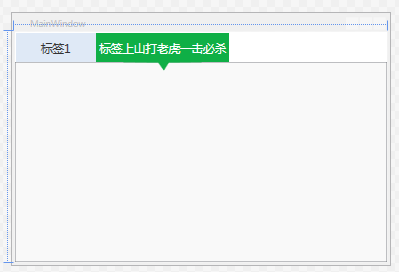
这里只实现了标签方向在Top的实现,其它动画或者显示效果都是可以随意增加的!
效果图如下:
<SolidColorBrush x:Key="TabItemDisabledBackground" Color="#F4F4F4"/>
<SolidColorBrush x:Key="TabItemDisabledBorderBrush" Color="#FFC9C7BA"/>

<Style  TargetType="{x:Type TabItem}">
<!--<Setter Property="FocusVisualStyle" Value="{x:null}"/>-->
<Setter Property="Foreground" Value="#333333"/>
<Setter Property="FontSize" Value="16"/>
<Setter Property="BorderBrush" Value="{StaticResource TabControlNormalBorderBrush}"/>
<Setter Property="Background" Value="{StaticResource ButtonNormalBackground}"/>
<Setter Property="HorizontalContentAlignment" Value="Stretch"/>
<Setter Property="VerticalContentAlignment" Value="Stretch"/>
<Setter Property="Template">
<Setter.Value>
<ControlTemplate TargetType="{x:Type TabItem}">
<Grid SnapsToDevicePixels="true" Height="40" MinWidth="110">
<Path Margin="0 0 0 -12" x:Name="PATH" Visibility="Collapsed" Data="M0.5,0.5 L109.5,0.5 109.5,39.5 64,40 57,51 49,40 0.5,39.5 z" Fill="#FF0FAF46"  Height="51.5"  Stretch="Fill" Stroke="Transparent"  Width="110"/>
<Border x:Name="Bd" Background="#dfe9f6">
<ContentPresenter Margin="5 0 5 0" x:Name="Content" ContentSource="Header" HorizontalAlignment="{Binding HorizontalContentAlignment, RelativeSource={RelativeSource AncestorType={x:Type ItemsControl}}}" RecognizesAccessKey="True" SnapsToDevicePixels="{TemplateBinding SnapsToDevicePixels}" VerticalAlignment="{Binding VerticalContentAlignment, RelativeSource={RelativeSource AncestorType={x:Type ItemsControl}}}"/>
</Border>
</Grid>
<ControlTemplate.Triggers>
<MultiTrigger>
<MultiTrigger.Conditions>
<Condition Property="IsSelected" Value="true"/>
<Condition Property="TabStripPlacement" Value="Top"/>
</MultiTrigger.Conditions>
<Setter Property="Visibility" Value="visible" TargetName="PATH"/>
<Setter Property="Foreground" Value="White"></Setter>
<Setter Property="Background" Value="#FF0FAF46" TargetName="Bd"/>
</MultiTrigger>
<Trigger Property="IsEnabled" Value="false">
<Setter Property="Background" TargetName="Bd" Value="{StaticResource TabItemDisabledBackground}"/>
<Setter Property="BorderBrush" TargetName="Bd" Value="{StaticResource TabItemDisabledBorderBrush}"/>
<Setter Property="Foreground" Value="{DynamicResource {x:Static SystemColors.GrayTextBrushKey}}"/>
</Trigger>
</ControlTemplate.Triggers>
</ControlTemplate>
</Setter.Value>
</Setter>
</Style>
这里只实现了标签方向在Top的实现,其它动画或者显示效果都是可以随意增加的!

相关文章推荐
- css3中边框的4种样式
- 欢迎使用CSDN-markdown编辑器
- HTML&CSS基础学习笔记1.9-添加图片
- HTML/CSS 快速编写必备 - emmet插件
- 改变 input file 样式的两种方法
- CSS:span元素margin-top无效的根源
- CSS教程:div垂直居中的N种方法[转]
- CSS3中背景的四个新的属性
- CSS样式选中子元素中的某一个
- (谷歌浏览器等)解决css中点击input输入框时出现外边框方法【outline:medium;】
- CSS强制等比例缩小图片
- CSS将图片自动变为圆角
- css实现强制不换行/自动换行/强制换行
- 这可能是史上最全的CSS自适应布局总结教程
- CSS中盒子模型详解
- CSS中交集选择器详解
- 为背景添加渐变样式(线性和放射性两种)
- css字体图标iconfont 使用方法
- 解决ie8 css :nth-child(3n) 不兼容问题
- Zen Coding: 一种快速编写HTML/CSS代码的方法