『ExtJS』表单(一)常用表单控件及内置验证
2016-07-05 10:15
609 查看
几点说明
关于ExtJS的表单,我打算分为三个部分来写
常用表单控件及内置验证 —— 这里主要是JS代码
表单行为与Asp.NET页面的消息回复 —— 这里既有JS代码,与有C#代码,我主要是使用Asp.NET来写程序
表单控件的自定义验证与事件侦听
其实还应该有一块是关于ExtJS中「代理」的使用的,我打算单独来写。
这里使用的代码不可以直接复制运行,因为我们的环境多多少少会有一些不同,所以代码部分仅供参考。
代码运行结果

代码
IDE: VS2010 SP1
ExtJS 版本:3.4.0
操作系统:Windows 7 32位 旗舰版
代码说明
代码中的关键配置项我已经注释好了,注释的内容来自官方API文档,所以请对其正确性放心。
以下是我个人对这段代码的解释,仅供参考……
Ext.QuickTips.init(); 这个是用于配合验证的,添加上这句话之后,就可以实现所谓的「气泡」提示了。
var classesStore = new Ext.data.SimpleStore 这里我实例化了一个数据源(请暂且这么认为),目的是在之后给Combox绑定下拉数据项。
url: '../jsonresponse.aspx' 这个 url 是指示将form提交到什么地方,又从什么地方获取到回复。
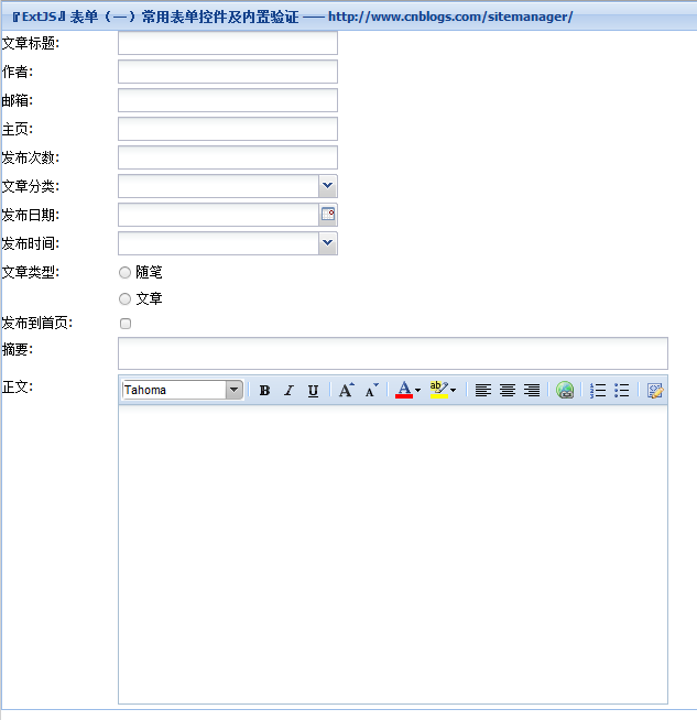
表单的常用控件,用于标注在 xtype 处:
文本框:textfield
数字文本框:numberfield
下拉列表:combo
单选按钮:radio —— 这里注意,我们可以指定多个同名的radio,从而达到从多个值中只能选择一个的效果
复选框:checkbox
日期选择:datefield
disabledDays 配置项表示不可选择的日期,值为「0~6」,分别对应「周日~周六」
时间选择:timefield
increment 配置顶表示间隔时间
文本域:textarea 或 htmleditor
textarea 是纯文本编辑
htmleditor 是富文本编辑器
vtype 这个是验证用的,常用的是 email url alpha(字符型)
listeners 是控件事件的侦听器,有关内容请见官方文档,之后我也会整理出一个最简单的使用方法
其他
注意:这里只列出了表单的xtype所对应的组件,想要知道更多的,还是要到官方的API文档中查询。

关于ExtJS的表单,我打算分为三个部分来写
常用表单控件及内置验证 —— 这里主要是JS代码
表单行为与Asp.NET页面的消息回复 —— 这里既有JS代码,与有C#代码,我主要是使用Asp.NET来写程序
表单控件的自定义验证与事件侦听
其实还应该有一块是关于ExtJS中「代理」的使用的,我打算单独来写。
这里使用的代码不可以直接复制运行,因为我们的环境多多少少会有一些不同,所以代码部分仅供参考。
代码运行结果
代码
IDE: VS2010 SP1
ExtJS 版本:3.4.0
操作系统:Windows 7 32位 旗舰版

后台Asp.NET页面代码<!DOCTYPE html PUBLIC "-//W3C//DTD XHTML 1.0 Transitional//EN" "http://www.w3.org/TR/xhtml1/DTD/xhtml1-transitional.dtd">
<html xmlns="http://www.w3.org/1999/xhtml">
<head>
<title>『ExtJS』表单(一)常用表单控件及内置验证</title>
<!-- Common Libs -->
<link href="../Common/ext-all.css" rel="stylesheet" type="text/css" />
<script src="../Common/ext-base-debug.js" type="text/javascript"></script>
<script src="../Common/ext-all-debug-w-comments.js" type="text/javascript"></script>
</head>
<body>
<script type="text/javascript">
Ext.onReady(function () {
// Provides attractive and customizable tooltips for any element.
Ext.QuickTips.init();

var classesStore = new Ext.data.SimpleStore({
fields: ['id', 'class'],
data: [['0', 'ExtJS 3.3.0'], ['1', 'ExtJS 3.4.0'], ['2', 'ExtJS 4.0']]
});

var firstForm = new Ext.FormPanel({
// Specify the id of the element, a DOM element or an existing Element that this component will be rendered into.
renderTo: document.body,
title: '『ExtJS』表单(一)常用表单控件及内置验证 —— http://www.cnblogs.com/sitemanager/', url: '../jsonresponse.aspx',
autoWidth: 'true',
items: [{
xtype: 'textfield',
fieldLabel: '文章标题',
name: 'title',
// Specify false to validate that the value's length is > 0 (defaults to true)
allowBlank: 'false',
width: 200,
// A config object containing one or more event handlers to be added to this object during initialization.
listeners: {
specialkey: function (f, e) {
if (e.getKey() == e.ENTER) {
Ext.Msg.alert('Listen Success!',e.getKey);
}
}
}
}, {
xtype: 'textfield',
fieldLabel: '作者',
name: 'author',
width: 200
}, {
xtype: 'textfield',
fieldLabel: '邮箱',
name: 'email',
// The error text to display when the email validation function returns false.
vtype: 'emailText',
allowBlank: 'true',
width: 200
}, {
xtype: 'textfield',
fieldLabel: '主页',
name: 'site',
// The error text to display when the url validation function returns false.
vtype: 'urlText',
allowBlank: 'true',
width: 200
}, {
xtype: 'numberfield',
fieldLabel: '发布次数',
name: 'publishNumber',
width: 200
}, {
xtype: 'combo',
fieldLabel: '文章分类',
name: 'class',
/* Acceptable values are: * 'remote' : Default * Automatically loads the store the first time the trigger is clicked. If you do not want the store to be automatically loaded the first time the trigger is clicked, set to 'local' and manually load the store. To force a requery of the store every time the trigger is clicked see lastQuery. * 'local' : * ComboBox loads local data */
mode: 'local',
// The data source to which this combo is bound (defaults to undefined).
store: classesStore,
// The underlying data field name to bind to this ComboBox
displayField: 'class',
width: 200
}, {
xtype: 'datefield',
fieldLabel: '发布日期',
name: 'publishDate',
// An array of days to disable, 0 based (defaults to null).
// disable Sunday and Saturday:
disabledDays: [0, 6],
width: 200
}, {
xtype: 'timefield',
fieldLabel: '发布时间',
increment: 15,
name: 'publishTime',
width: 200
}, {
xtype: 'radio',
boxLabel: '随笔',
fieldLabel: '文章类型',
// Radio grouping is handled automatically by the browser if you give each radio in a group the same name.
name: 'essayClass',
width: 200
}, {
xtype: 'radio',
boxLabel: '文章',
name: 'essayClass',
width: 200
}, {
xtype: 'checkbox',
fieldLabel: '发布到首页',
name: 'publishToSiteHome',
width: 200
}, {
xtype: 'textarea',
fieldLabel: '摘要',
name: 'abstract',
width: 500,
allowBlank: 'true',
autoScroll: 'true',
height: 30
}, {
// Provides a lightweight HTML Editor component.
xtype: 'htmleditor',
fieldLabel: '正文',
name: 'content',
width: 500,
allowBlank: 'false',
autoScroll: 'true',
height: 300
}]
});
});
</script>
</body>
</html>
代码说明
代码中的关键配置项我已经注释好了,注释的内容来自官方API文档,所以请对其正确性放心。
以下是我个人对这段代码的解释,仅供参考……
Ext.QuickTips.init(); 这个是用于配合验证的,添加上这句话之后,就可以实现所谓的「气泡」提示了。
var classesStore = new Ext.data.SimpleStore 这里我实例化了一个数据源(请暂且这么认为),目的是在之后给Combox绑定下拉数据项。
url: '../jsonresponse.aspx' 这个 url 是指示将form提交到什么地方,又从什么地方获取到回复。
表单的常用控件,用于标注在 xtype 处:
文本框:textfield
数字文本框:numberfield
下拉列表:combo
单选按钮:radio —— 这里注意,我们可以指定多个同名的radio,从而达到从多个值中只能选择一个的效果
复选框:checkbox
日期选择:datefield
disabledDays 配置项表示不可选择的日期,值为「0~6」,分别对应「周日~周六」
时间选择:timefield
increment 配置顶表示间隔时间
文本域:textarea 或 htmleditor
textarea 是纯文本编辑
htmleditor 是富文本编辑器
vtype 这个是验证用的,常用的是 email url alpha(字符型)
listeners 是控件事件的侦听器,有关内容请见官方文档,之后我也会整理出一个最简单的使用方法
其他
注意:这里只列出了表单的xtype所对应的组件,想要知道更多的,还是要到官方的API文档中查询。


相关文章推荐
- JavaScript实现的9大排序算法
- JS(去掉前后空格或去掉所有空格)的用法
- javascript:console.log()是什么js库里的?
- JavaScript跨域调用基于JSON的RESTful API
- JavaScript数组方法大全(推荐)
- js第一天知识总结
- js算法: 图的两种表示方法以及广度优先算法
- angular js 页面初始化 和 分页
- JS刷新页面的几种方法
- javascript Date format(js日期格式化) 转载
- javascript Date format(js日期格式化) 转载
- js可编辑表格
- angular js 下拉框
- js利用正则表达式检验输入内容是否为网址
- js正则表达式
- angular js 日期时间插件
- angular js 页面跳转
- angular js 左右选择框 Freemarker+js
- angular js 集合序号处理
- JS小总结