Android中的Shape使用总结
2016-07-03 20:00
363 查看
原文:http://blog.csdn.net/bear_huangzhen/article/details/24488337
在Android程序开发中,我们经常会去用到Shape这个东西去定义各种各样的形状,首先我们了解一下Shape下面有哪些标签,都代表什么意思:
solid:填充
android:color指定填充的颜色
gradient:渐变
android:startColor和android:endColor分别为起始和结束颜色,
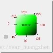
android:angle是渐变角度,必须为45的整数倍。
另外渐变默认的模式为android:type="linear",即线性渐变,
可以指定渐变为径向渐变,android:type="radial",径向渐变需要指定半径android:gradientRadius="50"。
angle值对应的位置如图:
stroke:描边
android:width="2dp" 描边的宽度,android:color 描边的颜色。
我们还可以把描边弄成虚线的形式,设置方式为:
android:dashWidth="5dp"
android:dashGap="3dp"
其中android:dashWidth表示'-'这样一个横线的宽度,android:dashGap表示之间隔开的距离
corners:圆角
android:radius为角的弧度,值越大角越圆。
我们还可以把四个角设定成不同的角度,
同时设置五个属性,则Radius属性无效
android:Radius="20dp" 设置四个角的半径
android:topLeftRadius="20dp" 设置左上角的半径
android:topRightRadius="20dp" 设置右上角的半径
android:bottomLeftRadius="20dp" 设置右下角的半径
android:bottomRightRadius="20dp" 设置左下角的半径
padding:间隔
可以设置上下左右四个方向的间隔
在这里我们来看一个简单的小例子,ShapDemo,在drawable文件夹下面先定义两个xml文件:
button_bg.xml的内容如下:
[html] view
plain copy


<?xml version="1.0" encoding="utf-8"?>
<shape xmlns:android="http://schemas.android.com/apk/res/android" >
<!-- 填充 -->
<solid android:color="#ff9d77" /> <!-- 定义填充的颜色值 -->
<!-- 描边 -->
<stroke
android:width="2dp"
android:color="#fad3cf" /> <!-- 定义描边的宽度和描边的颜色值 -->
<!-- 圆角 -->
<corners
android:bottomLeftRadius="5dp"
android:bottomRightRadius="5dp"
android:topLeftRadius="5dp"
android:topRightRadius="5dp" /> <!-- 设置四个角的半径 -->
<!-- 间隔 -->
<padding
android:bottom="10dp"
android:left="10dp"
android:right="10dp"
android:top="10dp" /> <!-- 设置各个方向的间隔 -->
</shape>
button_pressed_bg.xml的内容如下:
[html] view
plain copy
<?xml version="1.0" encoding="utf-8"?>
<shape xmlns:android="http://schemas.android.com/apk/res/android" >
<!-- 渐变 -->
<gradient
android:endColor="#FFFFFF"
android:gradientRadius="50"
android:startColor="#ff8c00"
android:type="radial" />
<!-- 描边 -->
<stroke
android:dashGap="3dp"
android:dashWidth="5dp"
android:width="2dp"
android:color="#dcdcdc" />
<!-- 圆角 -->
<corners android:radius="5dp" />
<!-- 间隔 -->
<padding
android:bottom="10dp"
android:left="10dp"
android:right="10dp"
android:top="10dp" />
</shape>
这里说明一点,在描边里面设置了dash参数,使得图形的边变成了虚线
在drawable文件夹下添加一个button.xml文件,内容如下:
[html] view
plain copy
<?xml version="1.0" encoding="utf-8"?>
<selector xmlns:android="http://schemas.android.com/apk/res/android">
<item android:drawable="@drawable/button_pressed_bg" android:state_pressed="true"></item>
<item android:drawable="@drawable/button_bg"></item>
</selector>
这个文件的意思以前讲过,normal(正常)情况下就显示button_bg,被press(按下)情况下就显示button_pressed_bg。
我们再来看一下layout目录下的activity_main.xml的内容:
[html] view
plain copy
<RelativeLayout xmlns:android="http://schemas.android.com/apk/res/android"
xmlns:tools="http://schemas.android.com/tools"
android:layout_width="match_parent"
android:layout_height="match_parent" >
<Button
android:layout_width="wrap_content"
android:layout_height="wrap_content"
android:background="@drawable/button"
android:text="TestShapeButton" />
</RelativeLayout>
直接将background指定为drawable文件夹下的button.xml。
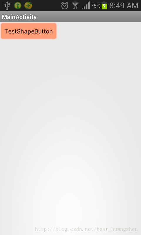
程序运行截图如下:
在Android程序开发中,我们经常会去用到Shape这个东西去定义各种各样的形状,首先我们了解一下Shape下面有哪些标签,都代表什么意思:
solid:填充
android:color指定填充的颜色
gradient:渐变
android:startColor和android:endColor分别为起始和结束颜色,
android:angle是渐变角度,必须为45的整数倍。
另外渐变默认的模式为android:type="linear",即线性渐变,
可以指定渐变为径向渐变,android:type="radial",径向渐变需要指定半径android:gradientRadius="50"。
angle值对应的位置如图:
stroke:描边
android:width="2dp" 描边的宽度,android:color 描边的颜色。
我们还可以把描边弄成虚线的形式,设置方式为:
android:dashWidth="5dp"
android:dashGap="3dp"
其中android:dashWidth表示'-'这样一个横线的宽度,android:dashGap表示之间隔开的距离
corners:圆角
android:radius为角的弧度,值越大角越圆。
我们还可以把四个角设定成不同的角度,
同时设置五个属性,则Radius属性无效
android:Radius="20dp" 设置四个角的半径
android:topLeftRadius="20dp" 设置左上角的半径
android:topRightRadius="20dp" 设置右上角的半径
android:bottomLeftRadius="20dp" 设置右下角的半径
android:bottomRightRadius="20dp" 设置左下角的半径
padding:间隔
可以设置上下左右四个方向的间隔
在这里我们来看一个简单的小例子,ShapDemo,在drawable文件夹下面先定义两个xml文件:
button_bg.xml的内容如下:
[html] view
plain copy
<?xml version="1.0" encoding="utf-8"?>
<shape xmlns:android="http://schemas.android.com/apk/res/android" >
<!-- 填充 -->
<solid android:color="#ff9d77" /> <!-- 定义填充的颜色值 -->
<!-- 描边 -->
<stroke
android:width="2dp"
android:color="#fad3cf" /> <!-- 定义描边的宽度和描边的颜色值 -->
<!-- 圆角 -->
<corners
android:bottomLeftRadius="5dp"
android:bottomRightRadius="5dp"
android:topLeftRadius="5dp"
android:topRightRadius="5dp" /> <!-- 设置四个角的半径 -->
<!-- 间隔 -->
<padding
android:bottom="10dp"
android:left="10dp"
android:right="10dp"
android:top="10dp" /> <!-- 设置各个方向的间隔 -->
</shape>
button_pressed_bg.xml的内容如下:
[html] view
plain copy
<?xml version="1.0" encoding="utf-8"?>
<shape xmlns:android="http://schemas.android.com/apk/res/android" >
<!-- 渐变 -->
<gradient
android:endColor="#FFFFFF"
android:gradientRadius="50"
android:startColor="#ff8c00"
android:type="radial" />
<!-- 描边 -->
<stroke
android:dashGap="3dp"
android:dashWidth="5dp"
android:width="2dp"
android:color="#dcdcdc" />
<!-- 圆角 -->
<corners android:radius="5dp" />
<!-- 间隔 -->
<padding
android:bottom="10dp"
android:left="10dp"
android:right="10dp"
android:top="10dp" />
</shape>
这里说明一点,在描边里面设置了dash参数,使得图形的边变成了虚线
在drawable文件夹下添加一个button.xml文件,内容如下:
[html] view
plain copy
<?xml version="1.0" encoding="utf-8"?>
<selector xmlns:android="http://schemas.android.com/apk/res/android">
<item android:drawable="@drawable/button_pressed_bg" android:state_pressed="true"></item>
<item android:drawable="@drawable/button_bg"></item>
</selector>
这个文件的意思以前讲过,normal(正常)情况下就显示button_bg,被press(按下)情况下就显示button_pressed_bg。
我们再来看一下layout目录下的activity_main.xml的内容:
[html] view
plain copy
<RelativeLayout xmlns:android="http://schemas.android.com/apk/res/android"
xmlns:tools="http://schemas.android.com/tools"
android:layout_width="match_parent"
android:layout_height="match_parent" >
<Button
android:layout_width="wrap_content"
android:layout_height="wrap_content"
android:background="@drawable/button"
android:text="TestShapeButton" />
</RelativeLayout>
直接将background指定为drawable文件夹下的button.xml。
程序运行截图如下:

相关文章推荐
- 使用C++实现JNI接口需要注意的事项
- Android IPC进程间通讯机制
- Android Manifest 用法
- [转载]Activity中ConfigChanges属性的用法
- Android之获取手机上的图片和视频缩略图thumbnails
- Android之使用Http协议实现文件上传功能
- Android学习笔记(二九):嵌入浏览器
- android string.xml文件中的整型和string型代替
- i-jetty环境搭配与编译
- android之定时器AlarmManager
- android wifi 无线调试
- Android Native 绘图方法
- Android java 与 javascript互访(相互调用)的方法例子
- android 代码实现控件之间的间距
- android FragmentPagerAdapter的“标准”配置
- Android"解决"onTouch和onClick的冲突问题
- android:installLocation简析
- android searchView的关闭事件
- SourceProvider.getJniDirectories