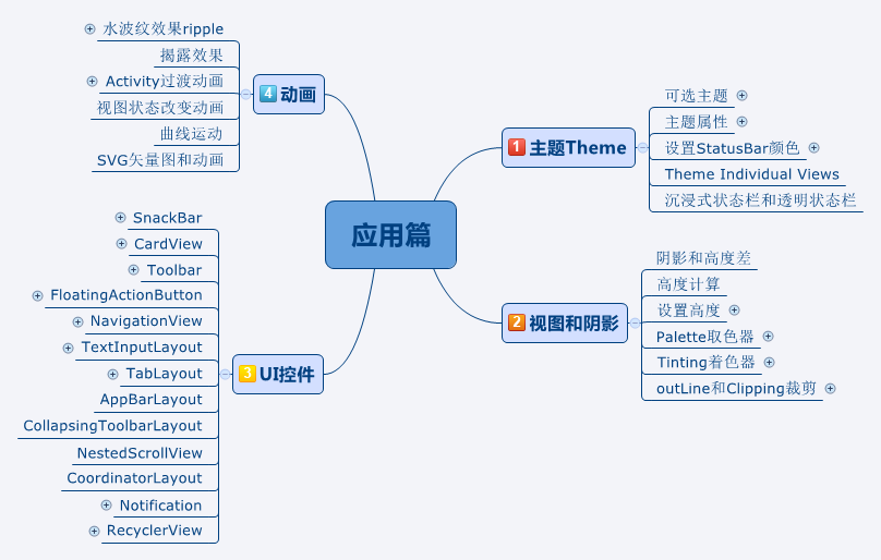
Material Design 最全解析_3 主题Theme
2016-06-27 13:56
537 查看
概述
前两篇文章讲了概述和设计,从这篇文章开始正式讲Material Design在实际开发中的应用。开发人员的重点来了!
先看一下大纲
对于开发人员,Android21新增了许多新控件和新特性,这些控件和特性都是基于Material Design的设计理念的,无论是设计感还是用户体验,都非常的赞!
这篇文章先来看看1主图Theme
主题和布局
Material提供了下面三种主题- @android:style/Theme.Material (dark version)
- @android:style/Theme.Material.Light (light version)
- @android:style/Theme.Material.Light.DarkActionBar
使用Material的主题必须Api在21及以上;如果要适配21以下的设备,可以使用兼容包:
Theme.AppCompat.Light

Theme.AppCompat.Light.NoActionBar
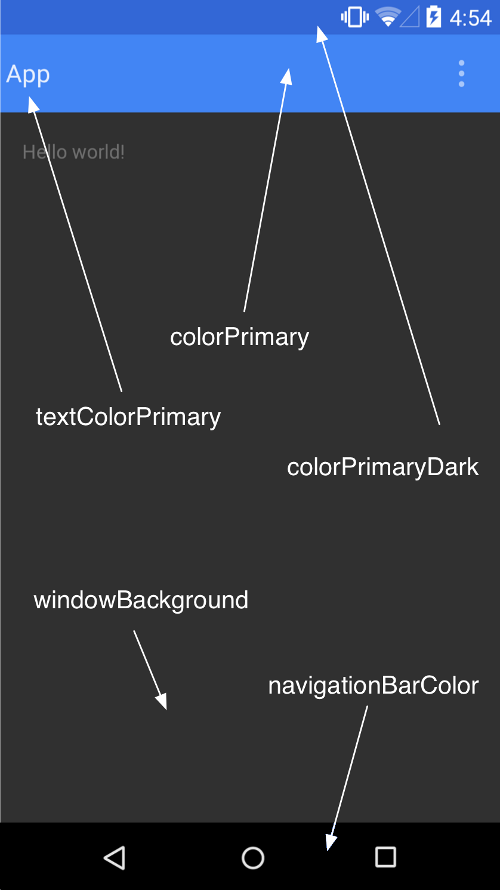
继承Material主题时,可以通过下面的属性来自定义调色板:
<style name="AppTheme" parent="android:Theme.Material">
<item name="colorPrimary"></item>
<item name="colorPrimaryDark"></item>
<item name="colorAccent"></item>
<item name="textColorPrimary"></item>
<item name="windowBackground"></item>
<item name="navigationBarColor"></item>
</style>
Android主题,Theme的层次结构
说到AppCompat主题,很多人可能不清楚究竟是个什么概念,这里顺便理一下。在 AppCompat 中,主题被划分为四个层次,每个层次继承自更低一层:
Level1 → Level2 → Level3 → Level4
除此之外,每个版本的安卓 API 都有一个对应的 values-v{api} 文件夹存放各自需要定义或覆写的样式和属性:
values, values-v11, values-v14, values-v21, values-v22, values-v23
Level 4 (最底层)
最底层包含了 Platform.AppCompat 主题。该主题总是继承自当前版本中的默认主题,例如:
values
Platform.AppCompat -> android:Theme
values-v11
Platform.AppCompat -> android:Theme.Holo
values-v21
Platform.AppCompat -> android:Theme.Material
Level 3
大部分工作在这一层被完成,Base.V7.Theme.AppCompat, Base.V11.Theme.AppCompat, Base.V21.Theme.AppCompat 等也是在这一层被定义。这些主题都继承自 Platform.AppCompat。
values
Base.V7.Theme.AppCompat* → Platform.AppCompat → android:Theme
values-v11
Base.V11.Theme.AppCompat → Platform.AppCompat → android:Theme.Holo
values-v21
Base.V21.ThemeAppCompat → Base.V7.ThemeAppCompat → Platform.AppCompat → android:Theme.Material
还包括 Base.V7.Theme.AppCompat.Light, Base.V7.Theme.AppCompat.Dialog 等变体。
绝大多数属性和几乎所有工作在 Base.V{api}.Theme.AppCompat 中被定义和完成。ActionBar, DropwDown, ActionMode, Panel, List, Spinner, Toolbar 等控件中的所有属性都在这里被定义。你可以在 这个链接 中查看更多详情。
Level 2
根据安卓的官方解释,我们在这一层拿到的主题只是第三层主题的别名:
There are the themes which are pointers to the correct third level theme.They can also be used to set attributes for that specific platform (and platforms up until the next declaration).
这些主题指向第三层中相应的主题。它们也可以用来配置那些特定平台的属性。
values
Base.Theme.AppCompat* → Base.V7.Theme.AppCompat
values-v21
Base.Theme.AppCompat → Base.V21.Theme.AppCompat
还包括 Base.Theme.AppCompat.Light, Base.Theme.AppCompat.Dialog 等变体。
Level 1 (最顶层)
Theme.AppCompat, Theme.AppCompat.Light, Theme.AppCompat.NoActionBar
等主题在这里被定义。开发者应该使用这些主题,而非那些更底层的。
设置StatusBar和系统NavigationBar的颜色
Andriod4.4 Holo主题使用主题:继承主题
Theme.Holo.Light.NoActionBar.TranslucentDecor;不继承这个也可以,设置下面属性即可:
getWindow().addFlags(WindowManager.LayoutParams.FLAG_TRANSLUCENT_STATUS);

getWindow().addFlags(WindowManager.LayoutParams.FLAG_TRANSLUCENT_NAVIGATION);
设置 fitsSystemWindows 属性为true来进行布局调整
使用SystemTintBar开源库设置颜色(其实就是自己画个View上去)
Android5.0及以上
使用主题:继承主题Theme.Material.Light,且SDK >= 21
设置属性或者调用方法:
colorPrimaryDark、navigationBarColor
getWindow().setStatusBarColor(Color.RED);
getWindow().setNavigationBarColor(Color.RED);
使用兼容包
Theme.AppCompat.Light和上面一样
Theme Individual Views 个人主题View
在layout的xml定义中,可以使用android:theme来指定该View所适用的主题,指定后,它将改变当前View及其子View的theme。<Button android:layout_width="match_parent" android:layout_height="wrap_content" android:text="个人主题" android:theme="@style/xxx" />
搞清沉浸式状态栏和透明状态栏
在这个人云亦云的时代,在技术迅猛发展的时代,我们来不及去好好学习,好好理解,就这样和着别人说话,都没有好好思考过。虽然说不大懂英文也是可以撸代码的,但是我总觉得此非长久之计也。英文还是得多学,免得阻碍了发展道路。由于很少有人真正去阅读英文文档,所以才有了将Translucent Bar(透明栏)和Immersive Mode(沉浸模式)混为一谈的说法。看官方文档:
Immersive full-screen mode
To provide your app with a layout that fills the entire screen, the new SYSTEM_UI_FLAG_IMMERSIVE flag for setSystemUiVisibility()(when combined with SYSTEM_UI_FLAG_HIDE_NAVIGATION enables a new immersivefull-screen mode. While immersive full-screen mode is enabled, your activity continues to receive all touch events. The user can reveal the system bars with an inward swipe along the region where the system bars normally appear. This clears the SYSTEM_UI_FLAG_HIDE_NAVIGATION flag (and the SYSTEM_UI_FLAG_FULLSCREEN flag, if applied) so the system bars remain visible. However, if you'd like the system bars to hide again after a few moments, you can instead use the SYSTEM_UI_FLAG_IMMERSIVE_STICKY flag.
Translucent system bars
You can now make the system bars partially translucent with new themes, Theme.Holo.NoActionBar.TranslucentDecor and Theme.Holo.Light.NoActionBar.TranslucentDecor.By enabling translucent system bars, your layout will fill the area behind the system bars, so you must also enable fitsSystemWindows for the portion of your layout that should not be covered by the system bars.
If you're creating a custom theme, set one of these themes as the parent theme or include the windowTranslucentNavigation and windowTranslucentStatus style properties in your theme.
简单翻译一下:
沉浸式全屏模式
隐藏status bar(状态栏)使屏幕全屏,让Activity接收所有的(整个屏幕的)触摸事件。
透明化系统栏
透明化系统栏,使得布局侵入系统栏的后面,必须启用fitsSystemWindows属性来调整布局才不至于被系统栏覆盖。
(1)在App中是可以动态切换状态栏的显示和隐藏,即沉浸式和非沉浸式。
显示状态栏:
view.setSystemUiVisibility(View.SYSTEM_UI_FLAG_VISIBLE);
隐藏状态栏:
view.setSystemUiVisibility(View.SYSTEM_UI_FLAG_LAYOUT_STABLE
| View.SYSTEM_UI_FLAG_HIDE_NAVIGATION
| View.SYSTEM_UI_FLAG_FULLSCREEN
| View.SYSTEM_UI_FLAG_LAYOUT_HIDE_NAVIGATION
| View.SYSTEM_UI_FLAG_LAYOUT_FULLSCREEN
| View.SYSTEM_UI_FLAG_IMMERSIVE_STICKY);
(2)透明状态栏上面已经说了。
OK,以上就是本期节目的全部内容,感谢大家收看,我们下期再见~

相关文章推荐
- 使用C++实现JNI接口需要注意的事项
- Android IPC进程间通讯机制
- Android Manifest 用法
- [转载]Activity中ConfigChanges属性的用法
- Android之获取手机上的图片和视频缩略图thumbnails
- Android之使用Http协议实现文件上传功能
- Android学习笔记(二九):嵌入浏览器
- android string.xml文件中的整型和string型代替
- i-jetty环境搭配与编译
- android之定时器AlarmManager
- android wifi 无线调试
- Android Native 绘图方法
- Android java 与 javascript互访(相互调用)的方法例子
- android 代码实现控件之间的间距
- android FragmentPagerAdapter的“标准”配置
- Android"解决"onTouch和onClick的冲突问题
- android:installLocation简析
- android searchView的关闭事件
- SourceProvider.getJniDirectories