css3实现的三种loading动画(转载)
2016-06-09 18:49
363 查看
收藏了:
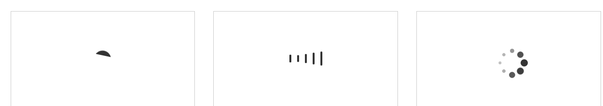
效果如下:
<!DOCTYPE html>
<html lang="en">
<head>
<meta charset="UTF-8">
<title>Document</title>
</head>
<style type="text/css">
.box {
width: 100%;
padding: 3%;
box-sizing: border-box;
overflow: hidden
}

.box .loader {
width: 30%;
float: left;
height: 200px;
margin-right: 3%;
border: 1px #ccc solid;
box-sizing: border-box;
display: flex;
align-items: center;
justify-content: center
}

@-webkit-keyframes loading-1 {
0% {
transform: rotate(0deg)
}
50% {
transform: rotate(180deg)
}
100% {
transform: rotate(360deg)
}
}

.loading-1 {
width: 35px;
height: 35px;
position: relative
}

.loading-1 i {
display: block;
width: 100%;
height: 100%;
border-radius: 50%;
background: linear-gradient(transparent 0, transparent 70%, #333 30%, #333 100%);
-webkit-animation: loading-1 .6s linear 0s infinite
}

@-webkit-keyframes loading-2 {
0% {
transform: scaleY(1)
}
50% {
transform: scaleY(.4)
}
100% {
transform: scaleY(1)
}
}

.loading-2 i {
display: inline-block;
width: 4px;
height: 35px;
border-radius: 2px;
margin: 0 2px;
background-color: #333
}

.loading-2 i:nth-child(1) {
-webkit-animation: loading-2 1s ease-in .1s infinite
}

.loading-2 i:nth-child(2) {
-webkit-animation: loading-2 1s ease-in .2s infinite
}

.loading-2 i:nth-child(3) {
-webkit-animation: loading-2 1s ease-in .3s infinite
}

.loading-2 i:nth-child(4) {
-webkit-animation: loading-2 1s ease-in .4s infinite
}

.loading-2 i:nth-child(5) {
-webkit-animation: loading-2 1s ease-in .5s infinite
}

@-webkit-keyframes loading-3 {
50% {
transform: scale(.4);
opacity: .3
}
100% {
transform: scale(1);
opacity: 1
}
}

.loading-3 {
position: relative
}

.loading-3 i {
display: block;
width: 15px;
height: 15px;
border-radius: 50%;
background-color: #333;
position: absolute
}

.loading-3 i:nth-child(1) {
top: 25px;
left: 0;
-webkit-animation: loading-3 1s ease 0s infinite
}

.loading-3 i:nth-child(2) {
top: 17px;
left: 17px;
-webkit-animation: loading-3 1s ease -.12s infinite
}

.loading-3 i:nth-child(3) {
top: 0;
left: 25px;
-webkit-animation: loading-3 1s ease -.24s infinite
}

.loading-3 i:nth-child(4) {
top: -17px;
left: 17px;
-webkit-animation: loading-3 1s ease -.36s infinite
}

.loading-3 i:nth-child(5) {
top: -25px;
left: 0;
-webkit-animation: loading-3 1s ease -.48s infinite
}

.loading-3 i:nth-child(6) {
top: -17px;
left: -17px;
-webkit-animation: loading-3 1s ease -.6s infinite
}

.loading-3 i:nth-child(7) {
top: 0;
left: -25px;
-webkit-animation: loading-3 1s ease -.72s infinite
}

.loading-3 i:nth-child(8) {
top: 17px;
left: -17px;
-webkit-animation: loading-3 1s ease -.84s infinite
}

</style>
<body>
<div class="box">
<div class="loader">
<div class="loading-1">
<i></i>
</div>
</div>

<div class="loader">
<div class="loading-2">
<i></i>
<i></i>
<i></i>
<i></i>
<i></i>
</div>
</div>

<div class="loader">
<div class="loading-3">
<i></i>
<i></i>
<i></i>
<i></i>
<i></i>
<i></i>
<i></i>
<i></i>
</div>
</div>
</div>
</body>
</html>
效果如下:

相关文章推荐
- CSS之颜色英文代码全集
- CSS3——让最后一行显示省略号
- js+css3实现一个环形进度条插件
- 自定义添加标注(大头针)样式,并使其适应屏幕
- CSS各种居中方法
- (9)css 链接
- MVC4怎么设置@Html.TextBoxFor这样的样式
- MVC 通过BundleConfig 将JS和CSS文件引入到视图中
- 定制椭圆形状
- CSS clip:rect用法
- 记一次css属性覆盖的问题
- PS切片高级教程
- CSS3基础总结
- safari 浏览器不支持input 样式
- [CSS] Targeting Elements with CSS Attribute Selectors
- CSS的background详解
- CSS3新特性box-shadow实现多重边框
- 20 个免费开源的 CSS3 用户界面工具包
- CSS中以图片为背景的文本例子
- HTML+css实现图片全屏