Android——EditText自定义边框、圆角和其常用属性总结
2016-06-06 17:30
591 查看
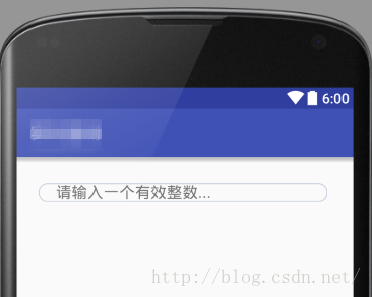
看下效果图:
执行步骤:
首先在/res/layout文件夹下创建custom_et_layout.xml布局文件,源代码如下:
属性总结:
---------------------------------------------------------------------------------------------
id: 控件的唯一标识,代码中通过id来找到控件
background: 控件的背景,可以通过该属性来自定义控件不同状态下的外观
padding: 控件中文本内容距离控件边框的距离。单位:dp
paddingLeft: 文本到左边框的距离
paddingRight 文本到有边框的距离
layout_marginTop:margin 指控件之间的距离,top指该控件与它上方控件的间距
layout_marginLeft 该控件与它左侧控件的间距
layout_marginRight 该控件与它右侧控件的间距
layout_marginBottom 该控件与它下方控件的间距
textColor 文本颜色
maxLength 文本最大长度,即字符个数
inputType 输入文本的类型,常用的有number:数字;phone:电话号码;email:电子邮件
layout_width 该控件的宽度
layout_height 该控件的高度
hint: 提示文本内容,在点击后自动消失
--------------------------------------------------------------------------------------------
再加上以下内容的渲染,才能得到一个有边框、圆角的EditText。
步骤:
1.在/res/drawable下创建文件bg_edittext_normal.xml,表示该文本框在常规情况下的样子,内容如下:
shape中如果不通过android:shape来指定形状时,默认是矩形,其中solid代表纯色,corners代表角,radius越大,圆角越大,stroke代表边框线
3.在/res/drawable下创建文件bg_edittext.xml,在选择器中应用以上编写的两个样式,内容如下
大功告成!
执行步骤:
首先在/res/layout文件夹下创建custom_et_layout.xml布局文件,源代码如下:
<?xml version="1.0" encoding="utf-8"?>
<RelativeLayout xmlns:android="http://schemas.android.com/apk/res/android"
android:layout_width="fill_parent"
android:layout_height="wrap_content" >
<EditText
android:id="@+id/alertDialog_et"
android:background="@drawable/bg_edittext"
android:paddingLeft="20dp"
android:paddingRight="20dp"
android:layout_marginTop="30dp"
android:layout_marginLeft="25dp"
android:layout_marginRight="30dp"
android:layout_marginBottom="30dp"
android:textColor="#008A00"
android:maxLength="3"
android:inputType="number"
android:layout_width="match_parent"
android:layout_height="wrap_content"
android:hint="请输入一个有效整数..."/>

</RelativeLayout>
属性总结:
---------------------------------------------------------------------------------------------
id: 控件的唯一标识,代码中通过id来找到控件
background: 控件的背景,可以通过该属性来自定义控件不同状态下的外观
padding: 控件中文本内容距离控件边框的距离。单位:dp
paddingLeft: 文本到左边框的距离
paddingRight 文本到有边框的距离
layout_marginTop:margin 指控件之间的距离,top指该控件与它上方控件的间距
layout_marginLeft 该控件与它左侧控件的间距
layout_marginRight 该控件与它右侧控件的间距
layout_marginBottom 该控件与它下方控件的间距
textColor 文本颜色
maxLength 文本最大长度,即字符个数
inputType 输入文本的类型,常用的有number:数字;phone:电话号码;email:电子邮件
layout_width 该控件的宽度
layout_height 该控件的高度
hint: 提示文本内容,在点击后自动消失
--------------------------------------------------------------------------------------------
再加上以下内容的渲染,才能得到一个有边框、圆角的EditText。
步骤:
1.在/res/drawable下创建文件bg_edittext_normal.xml,表示该文本框在常规情况下的样子,内容如下:
<span style="font-size:18px;"><?xml version="1.0" encoding="utf-8"?>
<shape xmlns:android="http://schemas.android.com/apk/res/android">
<solid android:color="@android:color/transparent" />
<corners android:radius="10dip"/>
<stroke
android:width="1dip"
android:color="#BDC7D8" />
</shape></span>
2.在/res/drawable下创建文件bg_edittext_focused.xml,表示该文本框在获得焦点情况下的样子,内容如下
<?xml version="1.0" encoding="utf-8"?>
<shape xmlns:android="http://schemas.android.com/apk/res/android">
<solid android:color="@android:color/transparent" />
<corners android:radius="10dip"/>
<stroke
android:width="1dip"
android:color="#728ea3" />
</shape>
shape中如果不通过android:shape来指定形状时,默认是矩形,其中solid代表纯色,corners代表角,radius越大,圆角越大,stroke代表边框线
3.在/res/drawable下创建文件bg_edittext.xml,在选择器中应用以上编写的两个样式,内容如下
<?xml version="1.0" encoding="utf-8"?>
<selector xmlns:android="http://schemas.android.com/apk/res/android">
<item
android:state_window_focused="false"
android:drawable="@drawable/bg_edittext_normal" />
<item
android:state_focused="true"
android:drawable="@drawable/bg_edittext_focused" />
</selector>
最后在布局文件的指定控件中的android:background中应用该选择器,例如android:background=“@drawable/bg_edittext”
大功告成!

相关文章推荐
- 使用C++实现JNI接口需要注意的事项
- Android IPC进程间通讯机制
- Android Manifest 用法
- [转载]Activity中ConfigChanges属性的用法
- Android之获取手机上的图片和视频缩略图thumbnails
- Android之使用Http协议实现文件上传功能
- Android学习笔记(二九):嵌入浏览器
- android string.xml文件中的整型和string型代替
- i-jetty环境搭配与编译
- android之定时器AlarmManager
- android wifi 无线调试
- Android Native 绘图方法
- Android java 与 javascript互访(相互调用)的方法例子
- android 代码实现控件之间的间距
- android FragmentPagerAdapter的“标准”配置
- Android"解决"onTouch和onClick的冲突问题
- android:installLocation简析
- android searchView的关闭事件
- SourceProvider.getJniDirectories