Android 星星评价
2016-06-03 16:09
387 查看
//下载地址
https://github.com/techery/ProperRatingBar

Inspired by stock android RatingBar. Simpler, has features that original lacks.
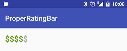
Whatever you need to display some rating or pricing category - just use ProperRatingBar so this:
becomes this:
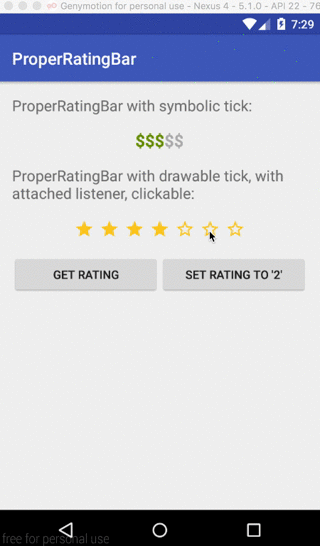
See video below for possible usage scenarios.
Why bother and design our own element?
Well, stock Android RatingBar lacks some styling attributes that you would expect from it and sometimes offers unexpected behavior.
Besides that, we needed to use symbols like '$' as rating bar ticks in our project - none of third-patry libraries out there provides that functionality.
Library's minSdkVersion is set to 14.
We use jitpack, so you can obtain made-up library right from our github sources in your module's
digits from here (e.g.
Also you need to add jitpack as repository in the same file:
So far we only support customising via xml layout. Here is the list of applicable attributes:
Default is 'false'
Default is '#FF888888' (gray)
(not rated). No default value
(gray)
Also there's a number of methods to operate on ProperRatingBar programmatically:
https://github.com/techery/ProperRatingBar
ProperRatingBar
Inspired by stock android RatingBar. Simpler, has features that original lacks.
What
is this about
Whatever you need to display some rating or pricing category - just use ProperRatingBar so this:<io.techery.properratingbar.ProperRatingBar android:layout_width="wrap_content" android:layout_height="wrap_content" android:textSize="22sp" android:textStyle="bold" app:prb_defaultRating="4" app:prb_symbolicTick="$" app:prb_symbolicTickNormalColor="@android:color/darker_gray" app:prb_symbolicTickSelectedColor="@android:color/holo_green_dark" app:prb_totalTicks="5" />
becomes this:
Example
See video below for possible usage scenarios.
Motivation
Why bother and design our own element?Well, stock Android RatingBar lacks some styling attributes that you would expect from it and sometimes offers unexpected behavior.
Besides that, we needed to use symbols like '$' as rating bar ticks in our project - none of third-patry libraries out there provides that functionality.
Installation
Library's minSdkVersion is set to 14.We use jitpack, so you can obtain made-up library right from our github sources in your module's
build.gradlefile:
compile 'com.github.techery:ProperRatingBar:{version_name}' where version_nameare
digits from here (e.g.
0.0.3)
Also you need to add jitpack as repository in the same file:
repositories {
// ...
maven { url "https://jitpack.io" }
}
API
Reference
So far we only support customising via xml layout. Here is the list of applicable attributes:prb_totalTicks: total number of ticks to show. Default is '5'
prb_defaultRating: use this to set rating from xml. Default is '3'
prb_clickable: if set to 'true' - use will be able to change rating by clicking.
Default is 'false'
prb_symbolicTick: symbol to be used as a tick. Default is '$'
android:textSize: text size of symbolic tick. Default is '15sp'
android:textStyle: text style of symbolic tick. Possible: 'bold', 'italic', 'normal'. Default is 'normal'
prb_symbolicTickNormalColor: color of symbolic tick that is not selected (not rated). Default is '#FF000000' (black)
prb_symbolicTickSelectedColor: color of symbolic tick that is selected (rated).
Default is '#FF888888' (gray)
prb_tickNormalDrawable: drawable resource to use as a tick that is not selected
(not rated). No default value
prb_tickSelectedDrawable: drawable resource to use as a tick that is selected (rated). No default value
prb_tickSpacing: margin to be applied to tick drawables. Only applies to drawable-type ticks. Default is '1dp'
(gray)
Also there's a number of methods to operate on ProperRatingBar programmatically:
/**

相关文章推荐
- Android版本和API Level对应关系
- Android View 的尺寸大小变化的时候要求有一个过度的动画
- Android listview与adapter用法
- Android图像处理(四)Xfermode和BitmapShader
- Android native code和Javascript通信
- JAV开发笔记系列--1-在MAC上利用Android Studio开发JAVA项目
- Android多个activity退出问题处理
- Picasso OOM浅谈。
- Android设置状态栏透明代码!!!!
- Android_异步加载2
- Android长按Power键弹出关机Dialog框GlobalActions解析
- 培训讲解——创建第一个工程
- Android仿外卖购物车
- Android sdk 全下载
- android 账户管理实现
- AndroidAnnotations框架详解
- Android Fragment完全解析,关于碎片你所需知道的一切
- android 系统Dialog,自定义Dialog
- Android 5.0+ 解析(六)TextInputLayout控件
- 配置android.support.v7.widget.Toolbar 搜索框样式