Python-Matplotlib安装及简单使用
2016-05-24 17:18
801 查看
转自:http://my.oschina.net/bery/blog/203595
在使用NumPy进行学习统计计算时是枯燥的,大量的数据令我们很头疼,所以我们需要把它图形化显示。
Matplotlib是一个Python的图形框架,类似于MATLAB和R语言。
Matplotlib的官网地址是 http://matplotlib.org/ ,下载地址为 http://matplotlib.org/downloads.html,选择对应的版本即可安装,我选择的版本为 matplotlib-1.3.1.win32-py2.7.exe。
由于我之前已经安装过NumPy1.8,所以安装Matplotlib后只需要安装 dateutil 和 pyparsing,win32的安装文件可以在这里找到 http://www.lfd.uci.edu/~gohlke/pythonlibs/。
所有配套组件都安装成功后如果执行 import matplotlib.pyplot as plt 出错,请参考这篇文章 http://blog.csdn.net/yang6464158/article/details/18546871#comments
安装 scipy,然后把C:\Python27\Lib\site-packages\scipy\lib中的six.py
six.pyc six.pyo三个文件拷贝到C:\Python27\Lib\site-packages目录下。
运行上面代码,执行后如下图所示。
在使用NumPy进行学习统计计算时是枯燥的,大量的数据令我们很头疼,所以我们需要把它图形化显示。
Matplotlib是一个Python的图形框架,类似于MATLAB和R语言。
Matplotlib的官网地址是 http://matplotlib.org/ ,下载地址为 http://matplotlib.org/downloads.html,选择对应的版本即可安装,我选择的版本为 matplotlib-1.3.1.win32-py2.7.exe。
由于我之前已经安装过NumPy1.8,所以安装Matplotlib后只需要安装 dateutil 和 pyparsing,win32的安装文件可以在这里找到 http://www.lfd.uci.edu/~gohlke/pythonlibs/。
所有配套组件都安装成功后如果执行 import matplotlib.pyplot as plt 出错,请参考这篇文章 http://blog.csdn.net/yang6464158/article/details/18546871#comments
安装 scipy,然后把C:\Python27\Lib\site-packages\scipy\lib中的six.py
six.pyc six.pyo三个文件拷贝到C:\Python27\Lib\site-packages目录下。
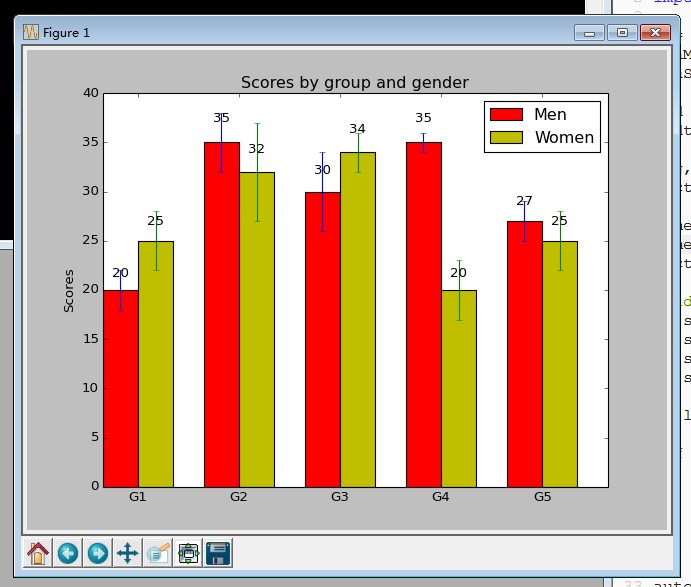
import numpy as np
import matplotlib.pyplot as plt

N = 5
menMeans = (20, 35, 30, 35, 27)
menStd =   (2, 3, 4, 1, 2)

ind = np.arange(N)  # the x locations for the groups
width = 0.35       # the width of the bars

fig, ax = plt.subplots()
rects1 = ax.bar(ind, menMeans, width, color='r', yerr=menStd)

womenMeans = (25, 32, 34, 20, 25)
womenStd =   (3, 5, 2, 3, 3)
rects2 = ax.bar(ind+width, womenMeans, width, color='y', yerr=womenStd)

# add some
ax.set_ylabel('Scores')
ax.set_title('Scores by group and gender')
ax.set_xticks(ind+width)
ax.set_xticklabels( ('G1', 'G2', 'G3', 'G4', 'G5') )

ax.legend( (rects1[0], rects2[0]), ('Men', 'Women') )

def autolabel(rects):
# attach some text labels
for rect in rects:
height = rect.get_height()
ax.text(rect.get_x()+rect.get_width()/2., 1.05*height, '%d'%int(height),
ha='center', va='bottom')

autolabel(rects1)
autolabel(rects2)

plt.show()
运行上面代码,执行后如下图所示。

相关文章推荐
- 计蒜客难题题库之二 奇怪的国家 python解答
- Python 文件迭代器
- leetcode 137. Single Number II-寻找单身狗
- python解析发往本机的数据包示例 (解析数据包)
- 用python扩展包matplotlib画图
- Python实现C代码统计工具(三)
- 拉格朗日插值 python scipy
- python操作MySQL数据库
- 最小二乘法及其python实现
- 机器学习算法---Logistic回归
- Python-argparse模块
- python开发使用sentry捕获未知异常
- python数据分析5:双色球 两个红球哪组合比例高
- Python中函数的使用
- 2.python的变量与赋值
- Python解析excel文件并存入sqlite数据库
- Python爬虫框架scrapy批量获取腾讯招聘网上面的信息
- python pip源配置
- 关于python3实现cookie登录问题
- Python代码性能优化技巧