Quick Tip: Don’t Forget the Viewport Meta Tag
2016-04-15 12:56
676 查看
This post is part of a series called Strange
and Unusual HTML.
Explaining
the “Details” and “Summary” Elements
I remember my maiden voyage into responsive web design; I'd used a classic grid, wrestled with a flexible layout, and tackled media queries for the first time. Stretching and shrinking the browser
window resulted in the satisfying sight of my design responding to its surroundings. Then I tested it on a mobile. It didn't work - I was looking at a shrunken down version of the full-screen design. The solution, as it turned out, was simple..
Note: This tutorial was first published in February 2012, but it's often used as a reference in other tutorials (and things have changed) so I felt it warranted an update.
If you read nothing else within this post, take one bit of advice away: if you're designing flexibly, use the viewport meta tag in your <head>. In its basic form, it will set you up for cross-device
layout peace of mind:
Let's use an example
layout I've whipped together. Take a look; you'll see it shrink and grow as you alter the size of your browser. There's also a single media query which makes the text larger and gives the heading a bright
on wider screens. Lovely.
Here's how it looks in OSX Chrome:
And here's how it appears when the browser window is squished:

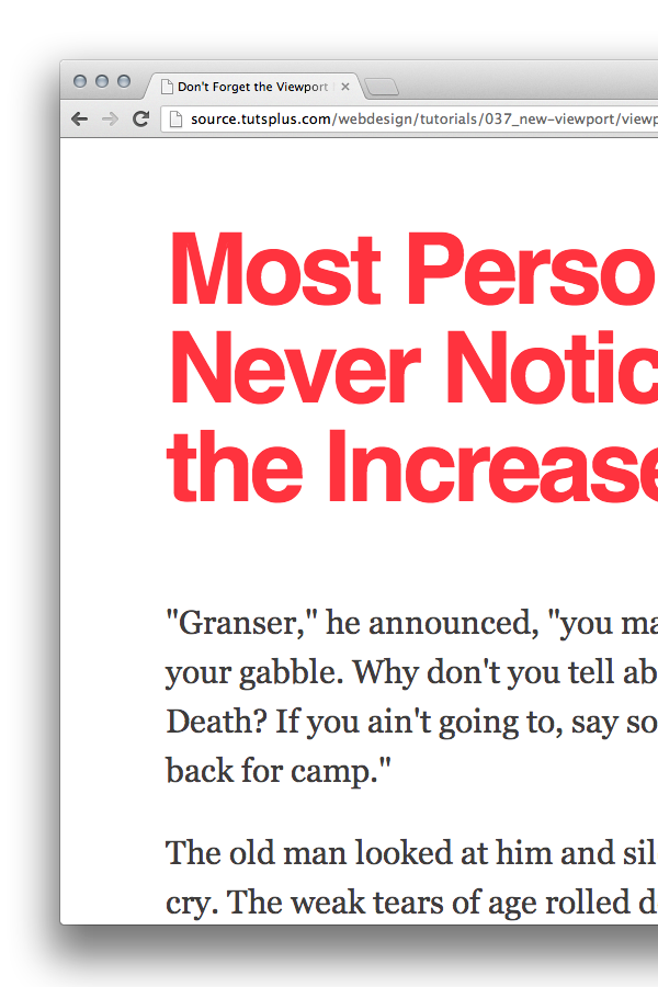
Now let's see how that looks on a smartphone (in this case iOS Safari on an iPhone 4):

The first thing you'll notice is the red heading; a dead giveaway that we're not looking at the narrow layout that we would expect. We're actually looking at a zoomed-out version.
iOS Safari assumes a webpage is 980px wide, zooming out in order to fit the whole lot within the available (iPhone 4) 320px. The content is then much less readable, unless you zoom in.
As they say, assumption is the mother
of all… something but that's exactly what mobile browsers have to do if you don't specifically instruct them. When you visit a website via a mobile browser it will assume that you're viewing a big desktop experience and that you want to see all of it,
not just the top left corner. It will therefore set the viewport width at (in the case of iOS Safari) 980px, shoe-horning everything into its little display.
Enter the viewport
meta tag, introduced by Apple, then adopted and developed further by others.
It looks like this:
Within the
of comma delimited values, but we're going to to focus on the fundamental ones for now.
For example, if your mobile design is purposely laid out at 320px you can specify the viewport width:
For flexible layouts it's more practical to base your viewport width on the device in question, so to match your layout width to the device width you'd enter:
To be extra certain that your layout will be displayed as you intended it you can also set the zoom level. This, for example:
..will ensure that upon opening, your layout will be displayed properly at 1:1 scale. No zooming will be applied. You could even go further and prevent any zooming by the user:
Note: Before applying the maximum-scale parameter, consider whether you should really be preventing your users from zooming in. Can they read everything as well as possible?
Using the viewport meta tag the wrong way can hinder users with visual problems accessing your website
- The Accessibility Project
These values together give us a great default to work with:
Let's see how it affects our
example

As you can see, everything remains at the correct scale. The text is wrapping instead of shrinking, and our visual helper (the red heading) has disappeared.
Hat tip to Jason for pointing this out in the comments. By stating that the width of your layout is equal to the device width, you'll run into problems when a device is used in landscape. Take a look at how an iPhone
4 handles our demo, in landscape:

Ruined.
The browser feels obliged to zoom in, in order to match the width of the page.
To get around this, we could, as Jason points out, use JavaScript to conditionally choose which metatag attributes to go with, but the simplest solution seems to be simply to ignore the
By only setting the
new, simplified demo appears in landscape:

Much better.
The viewport metatag was Apple's solution to the problem. It was adopted quickly by other platforms, but it was never put forward by the W3C. Microsoft brought this to light when they chose for IE10
to ignore the viewport metatag under certain circumstances. Instead, they opted to use CSS Device
Adaptation, which iswhat the W3C are leaning on.
In short, similar viewport properties are defined within CSS using the
@viewport rule, instead of within the HTML.
Or, in accordance to our newer don't specify device width approach, we could set the following:
Given that it's a work in progress, IE10 requires the prefixed version of the proposal, which looks something like this:
It's a far more elegant solution than the metatag, but is a long way from being fully supported. Slot it into your CSS now, to make sure your responsive design behaves itself in IE10 "snap mode", and keep an eye
on its progress in the future. This is where viewport control is headed.
You can read more about this in Tim Kadlec's post IE10
Snap Mode and Responsive Design.
Responsive web design isn't just for people who enjoy watching their browsers grow and shrink, it's about catering for as many different devices, screens and resolutions as possible! Throw the viewport meta tag
into your
and you're good to go.
and Unusual HTML.
Explaining
the “Details” and “Summary” Elements
I remember my maiden voyage into responsive web design; I'd used a classic grid, wrestled with a flexible layout, and tackled media queries for the first time. Stretching and shrinking the browser
window resulted in the satisfying sight of my design responding to its surroundings. Then I tested it on a mobile. It didn't work - I was looking at a shrunken down version of the full-screen design. The solution, as it turned out, was simple..
Note: This tutorial was first published in February 2012, but it's often used as a reference in other tutorials (and things have changed) so I felt it warranted an update.
The Crux
If you read nothing else within this post, take one bit of advice away: if you're designing flexibly, use the viewport meta tag in your <head>. In its basic form, it will set you up for cross-devicelayout peace of mind:
The Problem
Let's use an examplelayout I've whipped together. Take a look; you'll see it shrink and grow as you alter the size of your browser. There's also a single media query which makes the text larger and gives the heading a bright
#ff333ecolor
on wider screens. Lovely.
Here's how it looks in OSX Chrome:
And here's how it appears when the browser window is squished:
Now let's see how that looks on a smartphone (in this case iOS Safari on an iPhone 4):
The first thing you'll notice is the red heading; a dead giveaway that we're not looking at the narrow layout that we would expect. We're actually looking at a zoomed-out version.
iOS Safari assumes a webpage is 980px wide, zooming out in order to fit the whole lot within the available (iPhone 4) 320px. The content is then much less readable, unless you zoom in.
Why?
As they say, assumption is the motherof all… something but that's exactly what mobile browsers have to do if you don't specifically instruct them. When you visit a website via a mobile browser it will assume that you're viewing a big desktop experience and that you want to see all of it,
not just the top left corner. It will therefore set the viewport width at (in the case of iOS Safari) 980px, shoe-horning everything into its little display.
The Viewport Meta Tag
Enter the viewportmeta tag, introduced by Apple, then adopted and developed further by others.
It looks like this:
content=""you can enter a load
of comma delimited values, but we're going to to focus on the fundamental ones for now.
For example, if your mobile design is purposely laid out at 320px you can specify the viewport width:
Using the viewport meta tag the wrong way can hinder users with visual problems accessing your website
- The Accessibility Project
Put it All Together
These values together give us a great default to work with:example
As you can see, everything remains at the correct scale. The text is wrapping instead of shrinking, and our visual helper (the red heading) has disappeared.
But!
Hat tip to Jason for pointing this out in the comments. By stating that the width of your layout is equal to the device width, you'll run into problems when a device is used in landscape. Take a look at how an iPhone4 handles our demo, in landscape:
Ruined.
The browser feels obliged to zoom in, in order to match the width of the page.
To get around this, we could, as Jason points out, use JavaScript to conditionally choose which metatag attributes to go with, but the simplest solution seems to be simply to ignore the
widthaltogether.
By only setting the
initial-scalethe width is inferred. This is how our
new, simplified demo appears in landscape:
Much better.
Not the Standard You're Looking For
The viewport metatag was Apple's solution to the problem. It was adopted quickly by other platforms, but it was never put forward by the W3C. Microsoft brought this to light when they chose for IE10to ignore the viewport metatag under certain circumstances. Instead, they opted to use CSS Device
Adaptation, which iswhat the W3C are leaning on.
In short, similar viewport properties are defined within CSS using the
@viewport rule, instead of within the HTML.
on its progress in the future. This is where viewport control is headed.
You can read more about this in Tim Kadlec's post IE10
Snap Mode and Responsive Design.
Conclusion
Responsive web design isn't just for people who enjoy watching their browsers grow and shrink, it's about catering for as many different devices, screens and resolutions as possible! Throw the viewport meta taginto your
<head>, plus the @viewport rule into your CSS when you're building flexible layouts
and you're good to go.

相关文章推荐
- Android 高级UI设计笔记10:瀑布流控件PinterestLikeAdapterView的使用
- LeetCode 304. Range Sum Query 2D - Immutable
- UIView 中常见的方法总结
- UIViewAnimationOptions类型
- oarcle sequence用法
- mysql 1366 Incorrect integer value错误
- MUI常用方法
- @RequestBody的正确使用方法
- 优先队列(priority_queue)
- angular 系列八 ui-router详细介绍及ngRoute工具区别
- @RequestParam @RequestBody @PathVariable 等参数绑定注解详解
- iOS UITextFieldDelegate 代理方法小结
- 导航栏使用不透明的图片时,控制器view的y值
- 关于SSIS包调用,把Execute out of Process 设成True后运行失败问题
- 详解iOS开发中UITableview cell 顶部空白的多种设置方法
- UIBezierPath类简介
- freemarker 获取select的value和内容
- UESTC 1137 邱老师选妹子
- Your build settings specify a provisioning profile with the UUID
- Quartz Quick Start Guide