15、响应式布局和BootStrap 全局CSS样式知识点总结-part2
2016-03-28 18:56
766 查看
1、表格
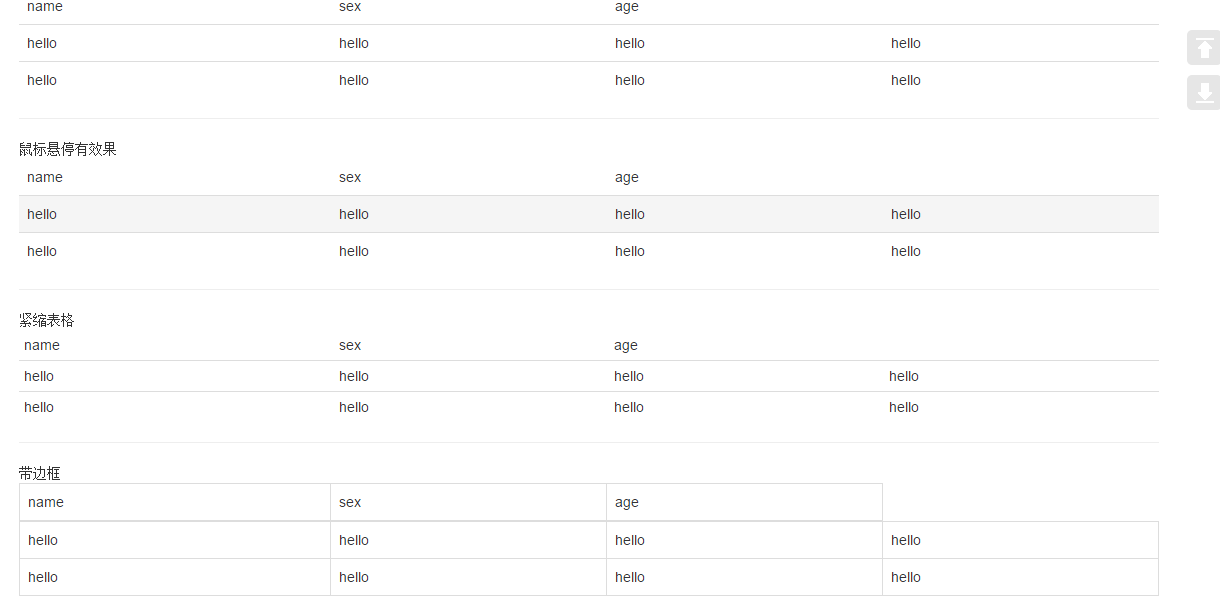

将任何
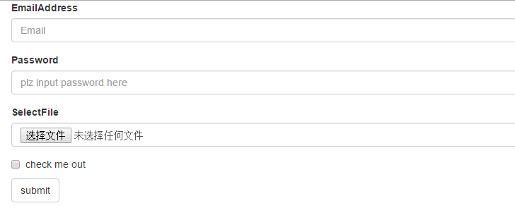
2、表单
单独的表单控件会被自动赋予一些全局样式。所有设置了
包括大部分表单控件、文本输入域控件,还支持所有 HTML5 类型的输入控件:
如果需要在表单中将一行纯文本和

下拉列表:
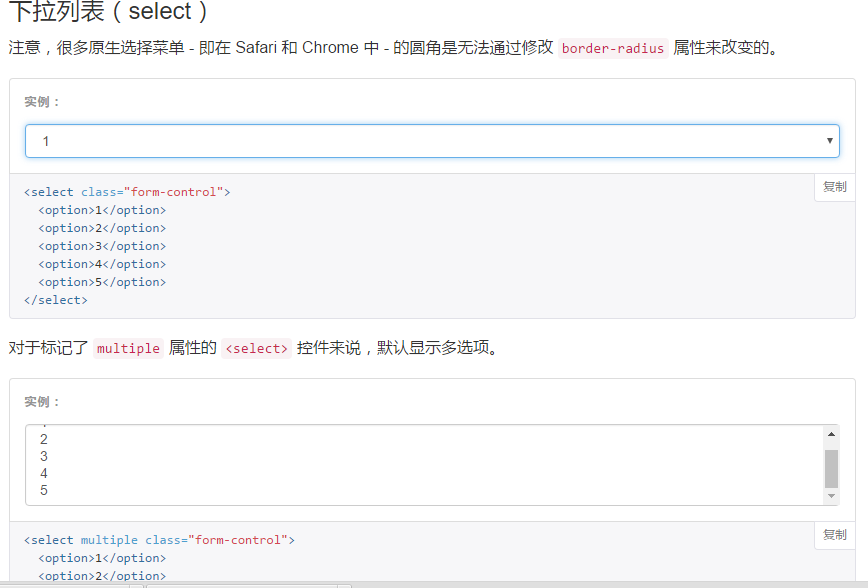
为
3、按钮
3.1 可作为按钮使用的标签或元素:
为
4、图片
5、辅助类

<div class="container">

<table class="table ">
<thead>
<td>name</td>
<td>sex</td>
<td>age</td>
</thead>
<tr>
<td>hello</td>
<td>hello</td>
<td>hello</td>
<td>hello</td>
</tr>
<tr>
<td>hello</td>
<td>hello</td>
<td>hello</td>
<td>hello</td>
</tr>
</table>

<hr/>
鼠标悬停有效果
<table class="table table-hover ">
<thead>
<td>name</td>
<td>sex</td>
<td>age</td>
</thead>
<tr>
<td>hello</td>
<td>hello</td>
<td>hello</td>
<td>hello</td>
</tr>
<tr>
<td>hello</td>
<td>hello</td>
<td>hello</td>
<td>hello</td>
</tr>
</table>

<hr/>  紧缩表格
<table class="table table-condensed ">
<thead>
<td>name</td>
<td>sex</td>
<td>age</td>
</thead>
<tr>
<td>hello</td>
<td>hello</td>
<td>hello</td>
<td>hello</td>
</tr>
<tr>
<td>hello</td>
<td>hello</td>
<td>hello</td>
<td>hello</td>
</tr>
</table>

<hr/> 带边框
<table class="table table-bordered">
<thead>
<td>name</td>
<td>sex</td>
<td>age</td>
</thead>
<tr>
<td>hello</td>
<td>hello</td>
<td>hello</td>
<td>hello</td>
</tr>
<tr>
<td>hello</td>
<td>hello</td>
<td>hello</td>
<td>hello</td>
</tr>
</table>

<hr/>带条纹效果
<table class="table table-striped">
<thead>
<td>name</td>
<td>sex</td>
<td>age</td>
</thead>
<tr>
<td>hello</td>
<td>hello</td>
<td>hello</td>
<td>hello</td>
</tr>
<tr>
<td>hello</td>
<td>hello</td>
<td>hello</td>
<td>hello</td>
</tr>
</table>

<table class="table">
<thead>
<td>name</td>
<td>sex</td>
<td>age</td>
</thead>
<tr class="active">
<td class="success">hello</td>
<td class="warning">hello</td>
<td class="danger">hello</td>
<td class="info">hello</td>
</tr>
<tr>
<td>hello</td>
<td>hello</td>
<td>hello</td>
<td>hello</td>
</tr>
</table>

<hr/>
</div>

其会在小屏幕设备上(小于768px)水平滚动。当屏幕大于 768px 宽度时,水平滚动条消失。
<div class="container table-responsive">
<table class="table">
<thead>
<td>name</td>
<td>sex</td>
<td>age</td>
<td>shit</td>
</thead>
<tr>
<td>hello</td>
<td>hello</td>
<td>hello</td>
<td>hello</td>
<td>hello</td>
<td>hello</td>
<td>hello</td>
<td>hello</td>
<td>hello</td>
<td>hello</td>
<td>hello</td>
<td>hello</td>
<td>hello</td>
<td>hello</td>
<td>hello</td>
<td>hello</td>
</tr>
</table>
</div>
将任何
.table元素包裹在
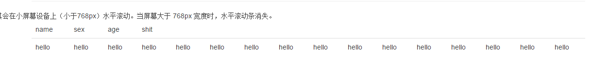
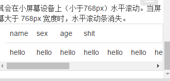
.table-responsive元素内,即可创建响应式表格,其会在小屏幕设备上(小于768px)水平滚动。当屏幕大于 768px 宽度时,水平滚动条消失。
2、表单
单独的表单控件会被自动赋予一些全局样式。所有设置了
.form-control类的
<input>、
<textarea>和
<select>元素都将被默认设置宽度属性为
width: 100%;。 将
label元素和前面提到的控件包裹在
.form-group中可以获得最好的排列。
.form-inline类可使其内容左对齐,只适用于视口(viewport)至少在 768px 宽度时(视口宽度再小的话就会使表单折叠)。
包括大部分表单控件、文本输入域控件,还支持所有 HTML5 类型的输入控件:
text、
password、
datetime、
datetime-local、
date、
month、
time、
week、
number、
url、
search、
tel和
color。
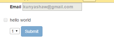
如果需要在表单中将一行纯文本和
label元素放置于同一行,为
<p>元素添加
.form-control-static类即可
<div class="container">
<div class="form-group">
<label for="exampleInputEmail1">EmailAddress</label>
<input type="email" class="form-control" placeholder="Email">
</div>

<div class="form-group">
<label for="Password1">Password</label>
<input type="password" class="form-control" placeholder="plz input password here">
</div>

<div class="form-group">
<label for="select">SelectFile</label>
<input type="file" class="form-control" placeholder="">
</div>

<div class="checkbox">
<label for="select">
<input type="checkbox"> check me out
</label>
</div>

<button type="submit" class="btn btn-default">submit</button>

</div>
<div class="checkbox">
<label>
<input type="checkbox">Option one is this and that—be sure to include why it's great
</label>
</div>

<div class="checkbox disabled" >
<label>
<input type="checkbox" disabled>Option two can't be checked
</label>

<!--redio为了保证同时只有一个被选中,需要在input里name设置为optionsRadios-->
<div class="radio ">
<lable>
<input type="radio" name="optionsRadios" checked > hello
</lable>
</div>
<div class="radio">
<lable>
<input type="radio" name="optionsRadios"> hello1
</lable>
</div>
<div class="radio disabled">
<lable>
<input type="radio" disabled> hello2
</lable>
</div>
下拉列表:
为
<fieldset>设置
disabled属性,可以禁用
<fieldset>中包含的所有控件。<a>标签链接功能不受影响
<form class="container">
<fieldset disabled>
<div class="form-group">
<label>Email
<input placeholder="kunyashaw@gmail.com">
</label>
</div>

<div class="checkbox">
<lable>
<input type="checkbox">hello world
</lable>
</div>

<select>
<option>1</option>
<option>1</option>
<option>1</option>
<option>1</option>
</select>

<a href="http://www.baidu.com">baidu</a>

<button type="submit" class="btn btn-primary">Submit</button>
</fieldset>
</form>
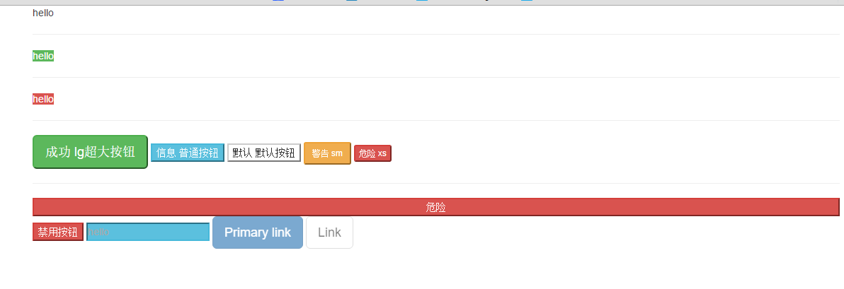
3、按钮
3.1 可作为按钮使用的标签或元素:
为
<a>、
<button>或
<input>元素添加按钮类(button class)即可使用 Bootstrap 提供的样式
<div class="container">
<a class="btn-default" href="#" role="button">hello</a>
<hr/>
<a class="btn-success" href="#" type="submit">hello</a>
<hr/>
<a class="btn-danger" href="#" type="button">hello</a>
<hr/>
<button class="btn-success btn-lg" role="button">成功 lg超大按钮</button>
<button class="btn-info btn-primary" role="button">信息 普通按钮</button>
<button class="btn-default" role="button">默认 默认按钮</button>
<button class="btn-warning btn-sm" role="button">警告 sm</button>
<button class="btn-danger btn-xs" role="button">危险 xs</button>

<hr/>
<button class="btn-danger btn-block" role="button">危险</button>

<button class="btn-danger" disabled="disabled">禁用按钮</button>

<input class="btn-info" placeholder="hello">

<a href="#" class="btn btn-primary btn-lg disabled" role="button">Primary link</a>
<a href="#" class="btn btn-default btn-lg disabled" role="button">Link</a>
</div>
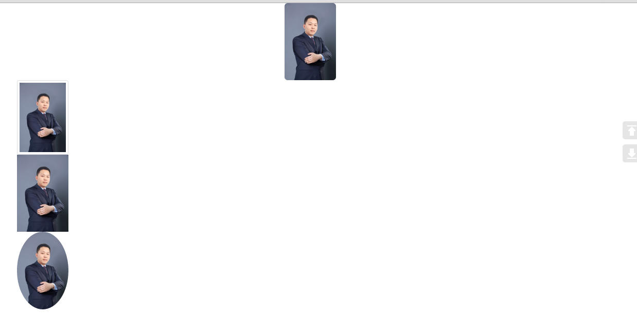
4、图片
<div class="container">
<!--圆角、响应式 布局、居中-->
<img src="zzl.jpg" width="100" height="200" class="img-rounded img-responsive center-block">
<!--缩略图、响应式布局-->
<img src="zzl.jpg" width="100" height="200" class="img-thumbnail img-responsive">
<!--原图、响应式布局-->
<img src="zzl.jpg" width="100" height="200" class="img-responsive">
<!--圆形图片、响应式布局-->
<img src="zzl.jpg" width="100" height="200" class="img-circle img-responsive">
</div>
5、辅助类
<div class="container">
<p class="text-success"> hello </p>
<span class="caret"></span>

<p class="bg-success">hello</p>
<button type="button" class="close" aria-label="Close">
<span aria-hidden="true">×</span>
</button>
</div>

相关文章推荐
- 【Bootstrap】Bootstrap-select多选下拉框实现
- [置顶] bootstrap框架下下拉框select搜索功能
- 14、响应式布局和BootStrap 全局CSS样式知识点总结-part1
- bootstrap+masonry.js写瀑布流
- bootstrap-fileinput的使用
- OMS开发(三):部署指南
- Bootstrap中的两个容器class
- bootstrapValidator如何重新初始化
- Boostrap模态窗口的学习小结
- Bootstrap 粘页脚效果
- Bootstrap学习1
- Bootstrap学习2
- 弹出框一 之 基于bootstrap和jquery的自定义弹出框
- Bootstrap 组件练习
- bootstrap 组件练习
- bootstrap 组件
- Bootstrap每天必学之级联下拉菜单
- bootstrap中按钮点击会自动刷新解决
- bootstrap modal 添加input Firefox报错
- bootstrap-datetimepicker时间插件使用