Android Design Support Library 兼容库使用详解
2016-03-21 10:38
471 查看
Android Design Support Library 介绍
常规控件的使用介绍
符合 MD 设计的菜单控件
具有过渡动画效果的布局Layout
Material Design几个要素
扁平化、简洁
水波反馈
良好体验的过渡动画
材料空间位置的直观变化
Android官方博客在IO大会释出兼容库-Android Design Support Library
MD的时代来临了! 详细介绍
如何使用?一句话搞定!
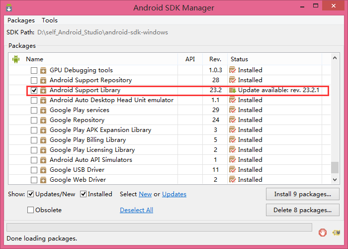
Android Design Support Library 兼容库的使用前提是下载Android Support Library(更新最新的Support Library,确保更新的Android Support Library是处于22.2以上的版本)
使用Android Studio创建一个新的项目
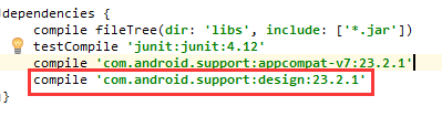
在build.gradle中添加 compile ‘com.android.support:design:23.2.1’(以下载的Support Library版本一致)
添加完后重新编译一下 Sync Now
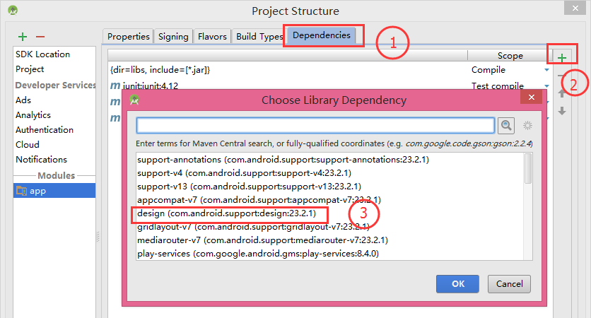
或者用工具添加
项目右键—–>Open Module Settings
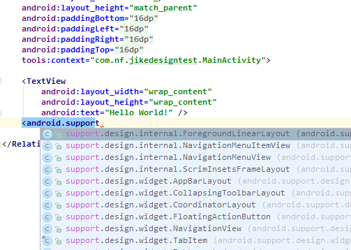
在layout布局中输入android.support是如下提示说明Design Support Library引入成功了
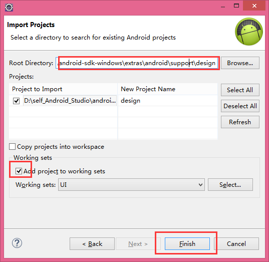
如果使用的开发工具是eclipse那么需要将Design Support Library引入到工作空间中
引入后修改一下sdk的版本以及引用库 Support-v7
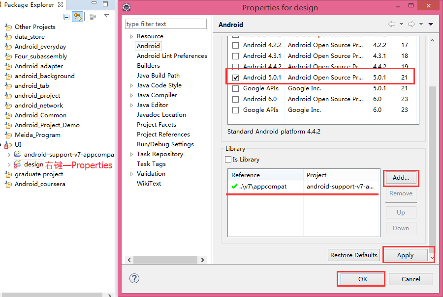
上面还应该将Is Library勾选上让它作为一个Library库存在
注:android-support-v7-appcompat是提前引入到工作空间中的library,该library的sdk版本必须与安装Android Support Library版本一致
在eclipse中新建工程并引入design和Support-v7库
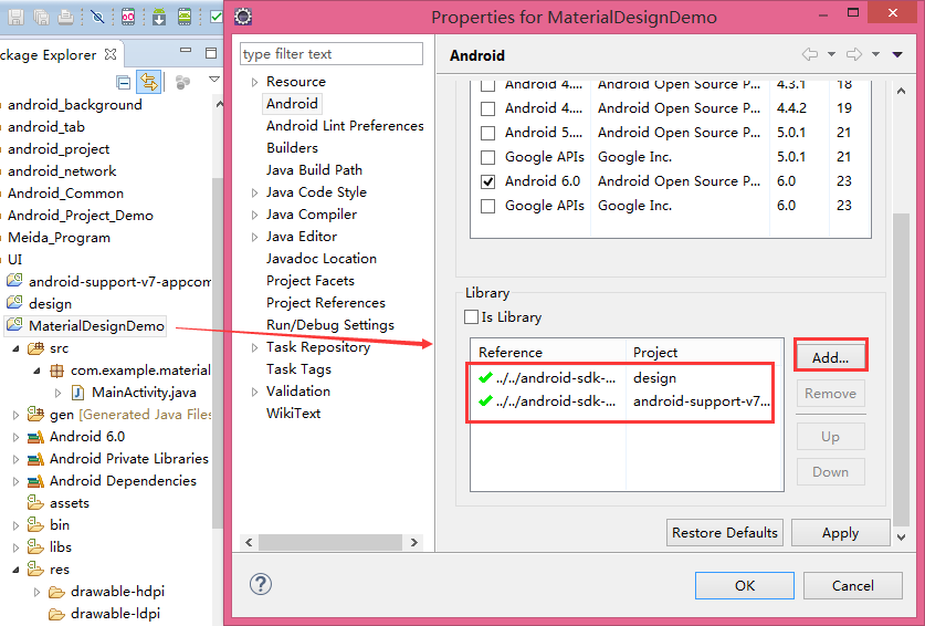
此时Android Design Support Library的开发环境已经搭建好了,我们就可以将Design Support Library的控件在eclipse中使用了
常规控件的使用介绍
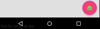
Floating Action Button-浮动的圆形按钮
Floating labels for editing text –完美体验的优化版EditText
Snackbar-可操作的提示框
FloatingActionButton有几个特殊的属性需要在布局文件中添加app的声明,下面就可以使用app设置一些特殊属性
app:fabSize有两种的属性mini and normal(default)
app:rippleColor=”#000000” 设置按钮点击时的颜色效果
也可以在代码中设置这些属性的值
此处使用的横屏展示,竖屏展示效果更好
Navigation View –美观的侧滑视图
app:tabSelectedTextColor=”@android:color/holo_red_light” 设置选中的字体颜色
app:tabIndicatorColor=”@android:color/holo_orange_light” 设置下标指示器的颜色
app:tabIndicatorHeight=”5dp” 设置下标指示器的高度
当标签比较多的时候TabLayout还支持横向的滑动,在代码中多添加几个标签,在布局中设置一个app:tabMode=”scrollable”属性(它有两个属性值scrollable and fixed(default)全屏没有进行滑动)
更多情况下Tab标签是和ViewPage结合使用的
辅助代码:
1.Fragment
2.Fragment布局文件(fm_tab.xml)只包含一个TextView
3.Adapter
在代码中控制侧滑菜单的显示和隐藏
AppBarLayout-可以随手势滑动的AppBar
Collapsing Toolbars-可以伸缩的ToolBar
此时从运行的效果看到,在点击FloatingActionButton时Snackbar是出来了但是他会挡住FloatingActionButton,在点击隐藏的时候也只能控制Snackbar的滑动,FloatingActionButton就没办法来做一些动效
我们要在布局中做一些变更,修改根节点为
运行:
我们可以看到当点击让Snackbar弹出或隐藏的时候FloatingActionButton也会对于的跟着向上向下移动回到原有的位置,这是一个很好的体验,这样我们就通过CoordinatorLayout来对布局中的几个控件做一个协作的展现。
进一步做更加强大的效果
在5.0之后Google提供了一个新的Toolbar控件来替代原有的Actionbar,因此在design support library中CoordinatorLayout也只能支持Toolbar的协作
运行:
从运行的效果来看这里有两个问题,toolbar下的一长串内容是叠加在toolbar上面的并且是不能上下滑动的,首先我们解决滑动问题:如果按我们的原有思路可以让他包含在一个ScrollView控件中,但是CoordinatorLayout对ScrollView的支持并不是很好,因此我们要使用兼容库中的NestedScrollView控件
此时这一长串内容就可以上下滑动了,但是他还是处于toolbar上面,我们要在NestedScrollView控件中添加一个属性

现在就可以做一些其他效果,给Toolbar设置一个属性
app:layout_scrollFlags属性有几个值
scroll:Toolbar跟随着滑动列表的内容滑动而滑动(一般都是要添加的)
这三个属性为Toolbar的返回方式
enterAlways:往下滑是Toolbar出现
enterAlwaysCollapsed:往下滑到顶端是Toolbar才出现
exitUntilCollapsed:这个属性值需要跟最小高度结合使用
什么意思就不在说了…
接下来要做的是让Toolbar有折叠效果(例如原有的高度是比较长的当往上滑动到Toolbar的高度时内容就成为了Toolbar的内容,类似于个人中心)

下面就来实现这种效果
首先要使用一个新的控件包含Toolbar
其他一些细节讲解:
1. 需要将Toolbar中的
2. 设置AppBarLayout的高度
3. 在Toolbar中设置属性
4. 在AppBarLayout中设置样式主题
5. 设置 在 collapsingToolbarLayout中设置属性
6. 在AppBarLayout添加一个背景图片ImageView(属性介绍:android:scaleType=”fitXY” 把原图按照指定的大小在View中显示,拉伸显示图片,不保持原比例,填满ImageView。app:layout_collapseMode=”parallax” 滑动式布局的折叠方式,app:layout_collapseParallaxMultiplier=”0.8” 折叠视差系数,具体效果请运行观察!!!)
7. 如果一开始只需显示图片则可把Toolbar中的背景颜色去掉, 当滑动到对应Toolbar大小时显示到Toolbar自身的颜色可以在collapsingToolbarLayout中设置属性
Android Design Support Library的环境搭建
熟练使用兼容库为我们提供的八个强大的控件,利用这些控件,我们能够让我们的APP更加的美观,拥有更好的用户交互体验。相信接下去,Google会提供更多符合MD设计规范的兼容库给开发者们使用。
常规控件的使用介绍
符合 MD 设计的菜单控件
具有过渡动画效果的布局Layout
Android Design Support Library 介绍
主要介绍 Android Design Support Library 的来历,以及Android Design Support Library开发的所需环境Material Design几个要素
扁平化、简洁
水波反馈
良好体验的过渡动画
材料空间位置的直观变化
Android官方博客在IO大会释出兼容库-Android Design Support Library
MD的时代来临了! 详细介绍
如何使用?一句话搞定!
Android Design Support Library 兼容库的使用前提是下载Android Support Library(更新最新的Support Library,确保更新的Android Support Library是处于22.2以上的版本)
使用Android Studio创建一个新的项目
在build.gradle中添加 compile ‘com.android.support:design:23.2.1’(以下载的Support Library版本一致)
添加完后重新编译一下 Sync Now
或者用工具添加
项目右键—–>Open Module Settings
在layout布局中输入android.support是如下提示说明Design Support Library引入成功了
如果使用的开发工具是eclipse那么需要将Design Support Library引入到工作空间中
引入后修改一下sdk的版本以及引用库 Support-v7
上面还应该将Is Library勾选上让它作为一个Library库存在
注:android-support-v7-appcompat是提前引入到工作空间中的library,该library的sdk版本必须与安装Android Support Library版本一致
在eclipse中新建工程并引入design和Support-v7库
此时Android Design Support Library的开发环境已经搭建好了,我们就可以将Design Support Library的控件在eclipse中使用了
常规控件的使用介绍
主要讲解 Floating Action Button 、Floating labels for editing text、Snackbar的基本使用方法常规控件的使用介绍
Floating Action Button-浮动的圆形按钮
Floating labels for editing text –完美体验的优化版EditText
Snackbar-可操作的提示框
在布局文件中使用FloatingActionButton控件
<android.support.design.widget.FloatingActionButton
android:layout_height="wrap_content"
android:layout_width="wrap_content"
android:src="@mipmap/ic_launcher"
/>
FloatingActionButton有几个特殊的属性需要在布局文件中添加app的声明,下面就可以使用app设置一些特殊属性
app:fabSize有两种的属性mini and normal(default)
app:rippleColor=”#000000” 设置按钮点击时的颜色效果
也可以在代码中设置这些属性的值
<?xml version="1.0" encoding="utf-8"?>
<LinearLayout xmlns:android="http://schemas.android.com/apk/res/android"
xmlns:tools="http://schemas.android.com/tools"
xmlns:app="http://schemas.android.com/apk/res-auto"
android:layout_width="match_parent"
android:layout_height="match_parent"
android:orientation="vertical">

<android.support.design.widget.FloatingActionButton
android:layout_height="wrap_content"
android:layout_width="wrap_content"
android:src="@mipmap/ic_launcher"
app:backgroundTint="#ff0000"
app:fabSize="normal"
app:elevation="5dp"
app:rippleColor="#000000"
/>

</LinearLayout>
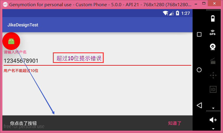
Floating labels for editing text –完美体验的优化版EditText
<android.support.design.widget.TextInputLayout
android:id="@+id/textInput"
android:layout_width="fill_parent"
android:layout_height="wrap_content"
>
<EditText
android:layout_width="fill_parent"
android:layout_height="wrap_content"
/>
</android.support.design.widget.TextInputLayout>
final TextInputLayout textInputLayout = (TextInputLayout) findViewById(R.id.textInput);
textInputLayout.setHint("请输入用户名");
EditText editText = textInputLayout.getEditText();//获取TextInputLayout底下的EditText
editText.addTextChangedListener(new TextWatcher() {
@Override
public void beforeTextChanged(CharSequence s, int start, int count, int after) {

}

@Override
public void onTextChanged(CharSequence s, int start, int before, int count) {
if(s.length()>10){
textInputLayout.setError("用户名不能超过10位");
textInputLayout.setErrorEnabled(true);
}else{
textInputLayout.setErrorEnabled(false);
}
}

@Override
public void afterTextChanged(Editable s) {

}
});
Snackbar-可操作的提示框
final FloatingActionButton floatingActionButton = (FloatingActionButton) findViewById(R.id.btn);
floatingActionButton.setOnClickListener(new View.OnClickListener() {
@Override
public void onClick(View v) {
//创建一个Snackbar对象
final Snackbar snackbar = Snackbar.make(floatingActionButton,"你点击了按钮",Snackbar.LENGTH_LONG);
snackbar.show();
//设置Snackbar的点击事件(参数为按钮和按钮的点击事件)
snackbar.setAction("知道了", new View.OnClickListener() {
@Override
public void onClick(View v) {
snackbar.dismiss();//隐藏Snackbar
}
});
}
});
此处使用的横屏展示,竖屏展示效果更好
符合 MD 设计的菜单控件
TabLayout-便捷实现标签Navigation View –美观的侧滑视图
TabLayout-便捷实现标签
app:tabTextColor=”@android:color/black” 设置未选中的字体颜色app:tabSelectedTextColor=”@android:color/holo_red_light” 设置选中的字体颜色
app:tabIndicatorColor=”@android:color/holo_orange_light” 设置下标指示器的颜色
app:tabIndicatorHeight=”5dp” 设置下标指示器的高度
<android.support.design.widget.TabLayout
android:id="@+id/tabs"
android:layout_width="match_parent"
android:layout_height="wrap_content"
android:background="@android:color/holo_green_dark"
app:tabTextColor="@android:color/black"
app:tabSelectedTextColor="@android:color/holo_red_light"
app:tabIndicatorColor="@android:color/holo_orange_light"
app:tabIndicatorHeight="5dp"
/>
TabLayout tabs = (TabLayout) findViewById(R.id.tabs);
//给TabLayout添加几个标签
tabs.addTab(tabs.newTab().setText("Tab1"));
tabs.addTab(tabs.newTab().setText("Tab2"));
tabs.addTab(tabs.newTab().setText("Tab3"));
tabs.addTab(tabs.newTab().setText("Tab4"));
当标签比较多的时候TabLayout还支持横向的滑动,在代码中多添加几个标签,在布局中设置一个app:tabMode=”scrollable”属性(它有两个属性值scrollable and fixed(default)全屏没有进行滑动)
更多情况下Tab标签是和ViewPage结合使用的
<?xml version="1.0" encoding="utf-8"?>
<LinearLayout xmlns:android="http://schemas.android.com/apk/res/android"
xmlns:app="http://schemas.android.com/apk/res-auto"
android:layout_width="match_parent"
android:layout_height="match_parent"
android:orientation="vertical">

<android.support.design.widget.TabLayout
android:id="@+id/tabs"
android:layout_width="match_parent"
android:layout_height="wrap_content"
android:background="@android:color/holo_green_dark"
app:tabTextColor="@android:color/black"
app:tabSelectedTextColor="@android:color/holo_red_light"
app:tabIndicatorColor="@android:color/holo_orange_light"
app:tabIndicatorHeight="5dp"
app:tabMode="fixed"
/>

<android.support.v4.view.ViewPager
android:id="@+id/viewpager"
android:layout_width="match_parent"
android:layout_height="match_parent"
/>
</android.support.design.widget.TextInputLayout>-->
</LinearLayout>
TabLayout tabs = (TabLayout) findViewById(R.id.tabs);

List<String> titles = new ArrayList<String>();
List<Fragment> fragments = new ArrayList<>();//Fragment使用android.support.v4.app.Fragment下的
for(int i=0;i<4;i++){
String title = "Tab"+(i+1);
tabs.addTab(tabs.newTab().setText(title));
titles.add(title);
Fragment fragment = new TabFragment(title);
fragments.add(fragment);
}

ViewPager viewPager = (ViewPager) findViewById(R.id.viewpager);
TabFragmentAdapter mAdapter = new TabFragmentAdapter(getSupportFragmentManager(),titles,fragments);
viewPager.setAdapter(mAdapter);
tabs.setupWithViewPager(viewPager);
tabs.setTabsFromPagerAdapter(mAdapter);
辅助代码:
1.Fragment
public class TabFragment extends Fragment {

String mTitle;
View view;
public TabFragment(String title){
mTitle = title;
}

@Nullable
@Override
public View onCreateView(LayoutInflater inflater, @Nullable ViewGroup container, @Nullable Bundle savedInstanceState) {
view = inflater.inflate(R.layout.fm_tab,container,false);

TextView textVeiw = (TextView) view.findViewById(R.id.textView);
textVeiw.setText(mTitle);

return view;
}
}
2.Fragment布局文件(fm_tab.xml)只包含一个TextView
3.Adapter
public class TabFragmentAdapter extends FragmentPagerAdapter {

List<String> titles;
List<Fragment> fragments;
public TabFragmentAdapter(FragmentManager fm,List<String> titles,List<Fragment> fragments) {
super(fm);
this.titles = titles;
this.fragments = fragments;
}

@Override
public Fragment getItem(int position) {
return fragments.get(position);
}

@Override
public int getCount() {
return fragments.size();
}

@Override
public CharSequence getPageTitle(int position) {
return titles.get(position);
}
}
Navigation View –美观的侧滑视图
1.布局文件<android.support.v4.widget.DrawerLayout xmlns:android="http://schemas.android.com/apk/res/android" xmlns:app="http://schemas.android.com/apk/res-auto" android:id="@+id/drawer_layout" android:layout_width="match_parent" android:layout_height="match_parent"> <include layout="@layout/activity_main"/> <!--侧滑菜单--> <android.support.design.widget.NavigationView android:id="@+id/navigationView" android:layout_height="match_parent" android:layout_width="wrap_content" android:layout_gravity="left" android:fitsSystemWindows="true" app:headerLayout="@layout/head_view" app:menu="@menu/menu_main" > </android.support.design.widget.NavigationView> </android.support.v4.widget.DrawerLayout>
在代码中控制侧滑菜单的显示和隐藏
DrawerLayout drawerLayout = (DrawerLayout) findViewById(R.id.drawer_layout);
//drawerLayout.openDrawer();
具有过渡动画效果的布局Layout
CoordinatorLayout-与手势完美结合的滑动视图AppBarLayout-可以随手势滑动的AppBar
Collapsing Toolbars-可以伸缩的ToolBar
CoordinatorLayout-与手势完美结合的滑动视图(完美协调子View工作的核心部件)
<FrameLayout xmlns:android="http://schemas.android.com/apk/res/android"
android:id="@+id/root"
android:layout_width="match_parent"
android:layout_height="match_parent"
xmlns:app="http://schemas.android.com/apk/res-auto">
<android.support.design.widget.FloatingActionButton
android:id="@+id/fab_btn"
android:layout_height="wrap_content"
android:layout_width="wrap_content"
android:layout_gravity="bottom|right"
android:layout_margin="10dp"
android:src="@mipmap/ic_launcher"
app:fabSize="normal"
/>
</FrameLayout>
public class CoordinatorLayoutActivity extends AppCompatActivity {

FloatingActionButton fab_btn;
FrameLayout root;

@Override
protected void onCreate(@Nullable Bundle savedInstanceState) {
super.onCreate(savedInstanceState);
setContentView(R.layout.activity_coordinator);

fab_btn = (FloatingActionButton) findViewById(R.id.fab_btn);
root = (FrameLayout) findViewById(R.id.root);
fab_btn.setOnClickListener(new View.OnClickListener() {
@Override
public void onClick(View v) {
Snackbar.make(root,"hi 我出来了",Snackbar.LENGTH_LONG).setAction("知道了", new View.OnClickListener() {
@Override
public void onClick(View v) {

}
}).show();
}
});
}
}
此时从运行的效果看到,在点击FloatingActionButton时Snackbar是出来了但是他会挡住FloatingActionButton,在点击隐藏的时候也只能控制Snackbar的滑动,FloatingActionButton就没办法来做一些动效
我们要在布局中做一些变更,修改根节点为
android.support.design.widget.CoordinatorLayout并在代码中把FrameLayout改为CoordinatorLayout
运行:
我们可以看到当点击让Snackbar弹出或隐藏的时候FloatingActionButton也会对于的跟着向上向下移动回到原有的位置,这是一个很好的体验,这样我们就通过CoordinatorLayout来对布局中的几个控件做一个协作的展现。
进一步做更加强大的效果
在5.0之后Google提供了一个新的Toolbar控件来替代原有的Actionbar,因此在design support library中CoordinatorLayout也只能支持Toolbar的协作
<android.support.v7.widget.Toolbar
android:id="@+id/toolbar"
android:layout_width="match_parent"
android:layout_height="?attr/actionBarSize"
android:background="#77db93"
app:popupTheme="@style/ThemeOverlay.AppCompat.Light"
app:theme="@style/ThemeOverlay.AppCompat.Dark.ActionBar"></android.support.v7.widget.Toolbar>
Toolbar toolbar;
toolbar = (Toolbar) findViewById(R.id.toolbar);
setSupportActionBar(toolbar);//使用toolbar做为标题栏
运行:
从运行的效果来看这里有两个问题,toolbar下的一长串内容是叠加在toolbar上面的并且是不能上下滑动的,首先我们解决滑动问题:如果按我们的原有思路可以让他包含在一个ScrollView控件中,但是CoordinatorLayout对ScrollView的支持并不是很好,因此我们要使用兼容库中的NestedScrollView控件
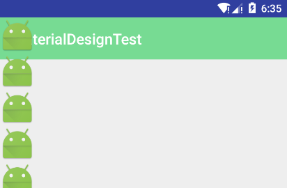
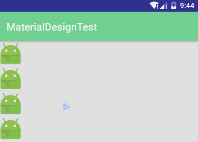
<android.support.v4.widget.NestedScrollView
android:layout_height="match_parent"
android:layout_width="match_parent"
>
<LinearLayout
android:layout_width="match_parent"
android:layout_height="wrap_content"
android:orientation="vertical">

<ImageView
android:layout_width="wrap_content"
android:layout_height="wrap_content"
android:src="@mipmap/ic_launcher" />

<ImageView
android:layout_width="wrap_content"
android:layout_height="wrap_content"
android:src="@mipmap/ic_launcher" />
.......
</LinearLayout>
</android.support.v4.widget.NestedScrollView>
此时这一长串内容就可以上下滑动了,但是他还是处于toolbar上面,我们要在NestedScrollView控件中添加一个属性
app:layout_behavior="@string/appbar_scrolling_view_behavior",Toolbar原先是设计在V7中的如果要和CoordinatorLayout结合使用我们需要在包裹在一个控件中
android.support.design.widget.AppBarLayout
现在就可以做一些其他效果,给Toolbar设置一个属性
app:layout_scrollFlags="scroll|enterAlways"当向上滑动式Toolbar会跟随者移出屏幕,向下滑动是又会跟随者出现
app:layout_scrollFlags属性有几个值
scroll:Toolbar跟随着滑动列表的内容滑动而滑动(一般都是要添加的)
这三个属性为Toolbar的返回方式
enterAlways:往下滑是Toolbar出现
enterAlwaysCollapsed:往下滑到顶端是Toolbar才出现
exitUntilCollapsed:这个属性值需要跟最小高度结合使用
android:minHeight="20dp"
app:layout_scrollFlags="scroll|exitUntilCollapsed"
什么意思就不在说了…
接下来要做的是让Toolbar有折叠效果(例如原有的高度是比较长的当往上滑动到Toolbar的高度时内容就成为了Toolbar的内容,类似于个人中心)
下面就来实现这种效果
首先要使用一个新的控件包含Toolbar
android.support.design.widget.CollapsingToolbarLayout
<?xml version="1.0" encoding="utf-8"?>
<android.support.design.widget.CoordinatorLayout xmlns:android="http://schemas.android.com/apk/res/android"
xmlns:app="http://schemas.android.com/apk/res-auto"
android:id="@+id/root"
android:layout_width="match_parent"
android:layout_height="match_parent">

<android.support.design.widget.AppBarLayout
android:layout_width="match_parent"
android:layout_height="300dp"
android:theme="@style/ThemeOverlay.AppCompat.Dark.ActionBar">

<android.support.design.widget.CollapsingToolbarLayout
android:id="@+id/collapsingToolbarLayout"
android:layout_width="match_parent"
android:layout_height="match_parent"
app:contentScrim="#77db93"
app:expandedTitleMarginStart="80dp"
app:layout_scrollFlags="scroll|exitUntilCollapsed">

<ImageView
android:layout_width="match_parent"
android:layout_height="match_parent"
android:scaleType="fitXY"
android:src="@drawable/ces"
app:layout_collapseMode="parallax"
app:layout_collapseParallaxMultiplier="0.8" />

<android.support.v7.widget.Toolbar
android:id="@+id/toolbar"
android:layout_width="match_parent"
android:layout_height="?attr/actionBarSize"
android:minHeight="20dp"
app:layout_collapseMode="pin"
app:popupTheme="@style/ThemeOverlay.AppCompat.Light"
app:theme="@style/ThemeOverlay.AppCompat.Dark.ActionBar"></android.support.v7.widget.Toolbar>

</android.support.design.widget.CollapsingToolbarLayout>
</android.support.design.widget.AppBarLayout>

<android.support.v4.widget.NestedScrollView
android:layout_width="match_parent"
android:layout_height="match_parent"
app:layout_behavior="@string/appbar_scrolling_view_behavior">

<LinearLayout
android:layout_width="match_parent"
android:layout_height="wrap_content"
android:orientation="vertical">

<ImageView
android:layout_width="wrap_content"
android:layout_height="wrap_content"
android:src="@mipmap/ic_launcher" />

<ImageView
android:layout_width="wrap_content"
android:layout_height="wrap_content"
android:src="@mipmap/ic_launcher" />

<ImageView
android:layout_width="wrap_content"
android:layout_height="wrap_content"
android:src="@mipmap/ic_launcher" />
...
</LinearLayout>
</android.support.v4.widget.NestedScrollView>

<android.support.design.widget.FloatingActionButton
android:id="@+id/fab_btn"
android:layout_width="wrap_content"
android:layout_height="wrap_content"
android:layout_gravity="bottom|right"
android:layout_margin="10dp"
android:src="@mipmap/ic_launcher"
app:fabSize="normal" />
</android.support.design.widget.CoordinatorLayout>
其他一些细节讲解:
1. 需要将Toolbar中的
app:layout_scrollFlags属性移动到
CollapsingToolbarLayout控件中
2. 设置AppBarLayout的高度
android:layout_height="300dp"
3. 在Toolbar中设置属性
app:layout_collapseMode="pin",向上滑动屏幕时Toolbar不随着滑出屏幕
4. 在AppBarLayout中设置样式主题
android:theme="@style/ThemeOverlay.AppCompat.Dark.ActionBar"让其中的字体颜色为白色
5. 设置 在 collapsingToolbarLayout中设置属性
app:expandedTitleMarginStart="80dp"控制其中的字体距离左边的距离
6. 在AppBarLayout添加一个背景图片ImageView(属性介绍:android:scaleType=”fitXY” 把原图按照指定的大小在View中显示,拉伸显示图片,不保持原比例,填满ImageView。app:layout_collapseMode=”parallax” 滑动式布局的折叠方式,app:layout_collapseParallaxMultiplier=”0.8” 折叠视差系数,具体效果请运行观察!!!)
7. 如果一开始只需显示图片则可把Toolbar中的背景颜色去掉, 当滑动到对应Toolbar大小时显示到Toolbar自身的颜色可以在collapsingToolbarLayout中设置属性
app:contentScrim="#77db93"
总结
以上我们学习了Android Design Support Library的详细使用。你应当掌握以下知识:Android Design Support Library的环境搭建
熟练使用兼容库为我们提供的八个强大的控件,利用这些控件,我们能够让我们的APP更加的美观,拥有更好的用户交互体验。相信接下去,Google会提供更多符合MD设计规范的兼容库给开发者们使用。

相关文章推荐
- flex 控件的重要属性
- DLL(Dynamic Linkable Library) 详解说明
- Delphi控件ListView的属性及使用方法详解
- web下载的ActiveX控件自动更新
- 识设计大师(Logo Design Studio) v3.1.0.0 零售版 下载
- WinForm实现按名称递归查找控件的方法
- C#中父窗口和子窗口之间控件互操作实例
- Android编程之Button控件用法实例分析
- Android控件之CheckBox、RadioButton用法实例分析
- 在Android开发中使用自定义组合控件的例子
- MFC中动态创建控件以及事件响应实现方法
- WinForm自定义函数FindControl实现按名称查找控件
- Android控件之ProgressBar用法实例分析
- WinForm拖拽控件生成副本的解决方法
- ASP.NET动态添加用户控件的方法
- ASP.NET的HtmlForm控件学习及Post与Get的区别概述
- WinForm实现移除控件某个事件的方法
- C#分屏控件用法实例
- 可以浮动某个物体的jquery控件用法实例
- jQuery操作基本控件方法实例分析